【精通篇】打造React Native鸿蒙跨平台开发高级复合组件库开发系列:Popup 弹出层(展示弹窗、信息提示等内容)
在鸿蒙系统(HarmonyOS)中,由于其是基于Android系统开发的,你可以使用Android的原生组件来实现React Native的Popup弹出层。由于React Native本身并不直接支持HarmonyOS的特定API,你可以通过使用一些桥接库或自定义模块来实现。
方法1:使用React Native的react-native-popup-menu
react-native-popup-menu是一个广泛使用的React Native库,可以用来创建弹出菜单。虽然它主要用于菜单,但也可以用于显示信息提示。
-
安装
react-native-popup-menunpm install react-native-popup-menu --save -
使用
react-native-popup-menuimport { Menu, MenuTrigger, RenderProps } from 'react-native-popup-menu'; const App = () => { return ( <Menu> <MenuTrigger customStyles={{ base: { backgroundColor: 'blue', padding: 10 } }}> <Text style={{ color: 'white' }}>点击我</Text> </MenuTrigger> <RenderProps> {({ show, hide }) => ( <View style={{ backgroundColor: 'white', padding: 10 }}> <Text>这是弹出内容</Text> <Button title="关闭" onPress={hide} /> </View> )} </RenderProps> </Menu> ); };
方法2:使用自定义模块(如react-native-modal)
react-native-modal是一个流行的React Native库,用于创建模态框(Modal),它可以用来实现弹出层的效果。
-
安装
react-native-modalnpm install react-native-modal --save -
使用
react-native-modalimport Modal from 'react-native-modal'; import { Button, Text, View } from 'react-native'; import { useState } from 'react'; const App = () => { const [isModalVisible, setModalVisible] = useState(false); return ( <View style={{ flex: 1, justifyContent: 'center', alignItems: 'center' }}> <Button title="打开模态框" onPress={() => setModalVisible(true)} /> <Modal isVisible={isModalVisible}> <View style={{ backgroundColor: 'white', padding: 20 }}> <Text>这是模态框内容</Text> <Button title="关闭" onPress={() => setModalVisible(false)} /> </View> </Modal> </View> ); };
方法3:直接使用Android原生代码(不推荐,除非必要)
如果你需要直接使用Android的原生代码,你可以创建一个原生模块。这涉及到编写Java/Kotlin代码,并在React Native中注册这个模块。这通常更复杂,需要深入了解React Native和Android开发。例如:
-
创建原生模块(Java/Kotlin):
// 在Android项目中创建新的Java/Kotlin类,例如PopupManager.java或PopupManager.kt。 -
在React Native中注册模块:
import { NativeModules } from 'react-native'; const { PopupManager } = NativeModules; // 确保模块名称正确对应。 -
调用原生模块:
PopupManager.showPopup(); // 假设你有一个方法来显示弹出层。
结论:
对于大多数应用场景,使用react-native-modal或react-native-popup-menu已经足够。这些库提供了良好的跨平台支持和丰富的配置选项。如果你需要更深层次的集成或特定的HarmonyOS功能,考虑直接使用原生代码或查找是否有针对HarmonyOS优化的React Native库。
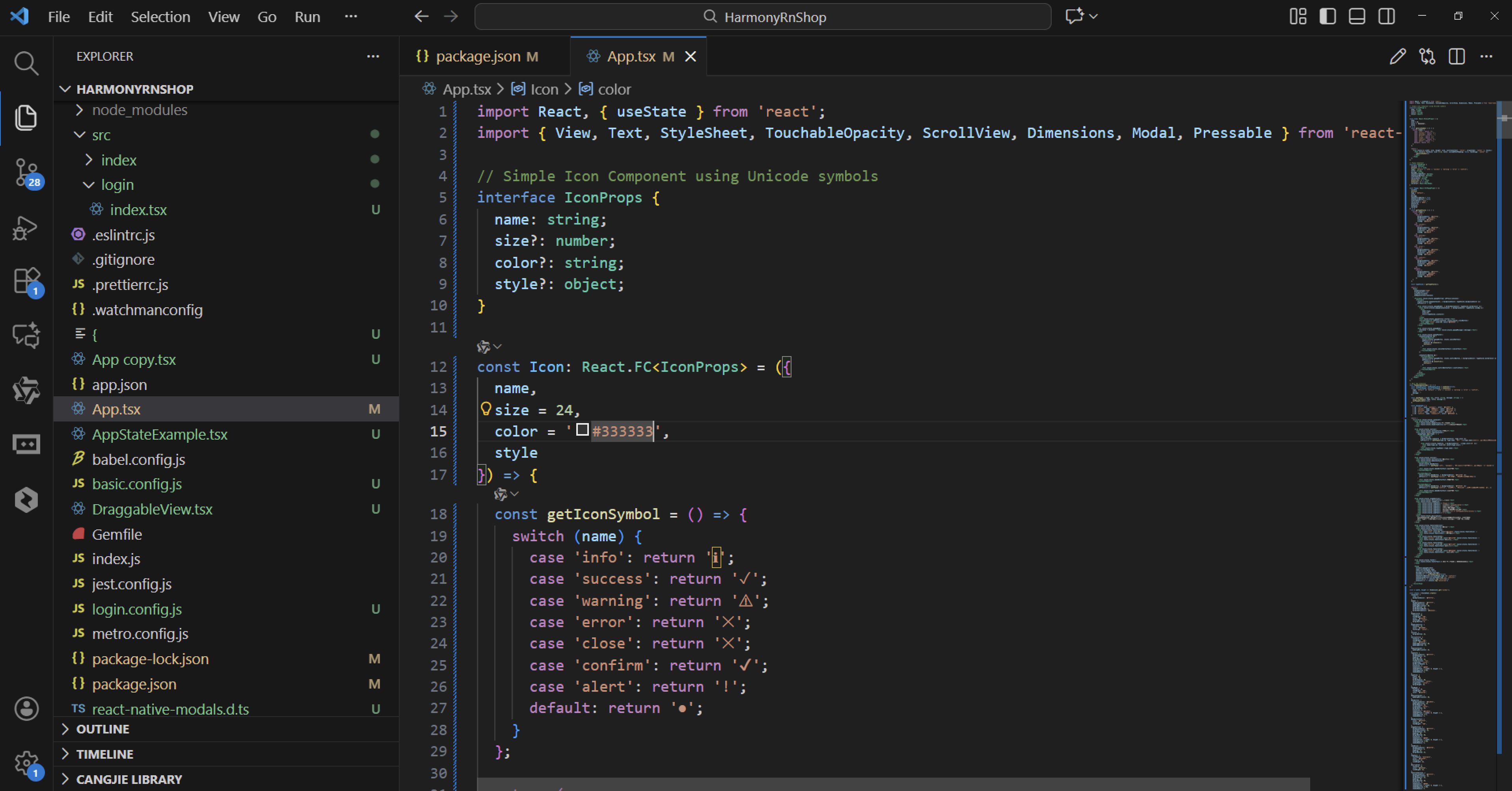
组件样式代码演示:
import React, { useState } from 'react';
import { View, Text, StyleSheet, TouchableOpacity, ScrollView, Dimensions, Modal, Pressable } from 'react-native';

// Simple Icon Component using Unicode symbols
interface IconProps {
  name: string;
  size?: number;
  color?: string;
  style?: object;
}

const Icon: React.FC<IconProps> = ({
  name,
  size = 24,
  color = '#333333',
  style
}) => {
  const getIconSymbol = () => {
    switch (name) {
      case 'info': return 'ℹ';
      case 'success': return '✓';
      case 'warning': return '⚠';
      case 'error': return '✕';
      case 'close': return '✕';
      case 'confirm': return '✔';
      case 'alert': return '!';
      default: return '●';
    }
  };

  return (
    <View style={[{ width: size, height: size, justifyContent: 'center', alignItems: 'center' }, style]}>
      <Text style={{ fontSize: size * 0.8, color, includeFontPadding: false, textAlign: 'center' }}>
        {getIconSymbol()}
      </Text>
    </View>
  );
};

// Popup Component
interface PopupProps {
  visible: boolean;
  onClose: () => void;
  type?: 'default' | 'info' | 'success' | 'warning' | 'error' | 'confirm';
  title: string;
  message: string;
  showConfirmButton?: boolean;
  showCancelButton?: boolean;
  confirmText?: string;
  cancelText?: string;
  onConfirm?: () => void;
  onCancel?: () => void;
  children?: React.ReactNode;
}

const Popup: React.FC<PopupProps> = ({
  visible,
  onClose,
  type = 'default',
  title,
  message,
  showConfirmButton = true,
  showCancelButton = false,
  confirmText = '确定',
  cancelText = '取消',
  onConfirm,
  onCancel,
  children
}) => {
  const getTypeStyles = () => {
    switch (type) {
      case 'info':
        return {
          backgroundColor: '#e3f2fd',
          borderColor: '#2196f3',
          iconColor: '#2196f3',
          iconBg: '#bbdefb'
        };
      case 'success':
        return {
          backgroundColor: '#e8f5e9',
          borderColor: '#4caf50',
          iconColor: '#4caf50',
          iconBg: '#c8e6c9'
        };
      case 'warning':
        return {
          backgroundColor: '#fff8e1',
          borderColor: '#ffc107',
          iconColor: '#ffc107',
          iconBg: '#ffecb3'
        };
      case 'error':
        return {
          backgroundColor: '#ffebee',
          borderColor: '#f44336',
          iconColor: '#f44336',
          iconBg: '#ffcdd2'
        };
      case 'confirm':
        return {
          backgroundColor: '#f1f8ff',
          borderColor: '#0366d6',
          iconColor: '#0366d6',
          iconBg: '#cce5ff'
        };
      default:
        return {
          backgroundColor: '#ffffff',
          borderColor: '#e0e0e0',
          iconColor: '#666666',
          iconBg: '#eeeeee'
        };
    }
  };

  const typeStyles = getTypeStyles();

  return (
    <Modal
      animationType="fade"
      transparent={true}
      visible={visible}
      onRequestClose={onClose}
    >
      <Pressable style={styles.popupOverlay} onPress={onClose}>
        <Pressable
          style={[styles.popupContainer, { backgroundColor: typeStyles.backgroundColor }]}
          onPress={() => {}}
        >
          <View style={[styles.popupHeader, { borderBottomColor: typeStyles.borderColor }]}>
            <View style={[styles.popupIconContainer, { backgroundColor: typeStyles.iconBg }]}>
              <Icon
                name={type}
                size={24}
                color={typeStyles.iconColor}
              />
            </View>
            <Text style={styles.popupTitle}>{title}</Text>
            <TouchableOpacity onPress={onClose} style={styles.closeButton}>
              <Icon name="close" size={20} color="#999999" />
            </TouchableOpacity>
          </View>

          <View style={styles.popupBody}>
            {children ? children : <Text style={styles.popupMessage}>{message}</Text>}
          </View>

          <View style={styles.popupFooter}>
            {showCancelButton && (
              <TouchableOpacity
                style={[styles.popupButton, styles.cancelButton]}
                onPress={() => {
                  onCancel && onCancel();
                  onClose();
                }}
              >
                <Text style={styles.cancelButtonText}>{cancelText}</Text>
              </TouchableOpacity>
            )}

            {showConfirmButton && (
              <TouchableOpacity
                style={[styles.popupButton, styles.confirmButton, { backgroundColor: typeStyles.borderColor }]}
                onPress={() => {
                  onConfirm && onConfirm();
                  onClose();
                }}
              >
                <Text style={styles.confirmButtonText}>{confirmText}</Text>
              </TouchableOpacity>
            )}
          </View>
        </Pressable>
      </Pressable>
    </Modal>
  );
};

// Main App Component
const PopupComponentApp = () => {
  const [popupVisible, setPopupVisible] = useState(false);
  const [currentPopup, setCurrentPopup] = useState({
    type: 'default' as 'default' | 'info' | 'success' | 'warning' | 'error' | 'confirm',
    title: '',
    message: ''
  });

  const openPopup = (type: any, title: string, message: string) => {
    setCurrentPopup({ type, title, message });
    setPopupVisible(true);
  };

  const popupTypes = [
    { id: 'info', name: '信息提示', color: '#2196f3' },
    { id: 'success', name: '成功提示', color: '#4caf50' },
    { id: 'warning', name: '警告提示', color: '#ffc107' },
    { id: 'error', name: '错误提示', color: '#f44336' },
    { id: 'confirm', name: '确认对话框', color: '#0366d6' },
  ];

  return (
    <ScrollView style={styles.container}>
      <View style={styles.header}>
        <Text style={styles.headerTitle}>弹出框组件</Text>
        <Text style={styles.headerSubtitle}>美观实用的模态弹窗组件</Text>
      </View>

      <View style={styles.section}>
        <Text style={styles.sectionTitle}>弹窗类型</Text>
        <View style={styles.typesContainer}>
          {popupTypes.map((type) => (
            <TouchableOpacity
              key={type.id}
              style={[styles.typeCard, { borderLeftColor: type.color }]}
              onPress={() => openPopup(type.id, type.name, `这是一个${type.name}示例,用于向用户展示重要信息。`)}
            >
              <View style={[styles.typeIcon, { backgroundColor: `${type.color}20` }]}>
                <Icon name={type.id} size={24} color={type.color} />
              </View>
              <Text style={styles.typeName}>{type.name}</Text>
            </TouchableOpacity>
          ))}
        </View>
      </View>

      <View style={styles.section}>
        <Text style={styles.sectionTitle}>功能演示</Text>
        <View style={styles.demosContainer}>
          <TouchableOpacity
            style={styles.demoButton}
            onPress={() => openPopup('info', '信息提示', '这是信息类型的弹窗,用于向用户提供一般性信息。')}
          >
            <Text style={styles.demoButtonText}>信息弹窗</Text>
          </TouchableOpacity>

          <TouchableOpacity
            style={[styles.demoButton, { backgroundColor: '#4caf50' }]}
            onPress={() => openPopup('success', '操作成功', '您的操作已成功完成!')}
          >
            <Text style={styles.demoButtonText}>成功弹窗</Text>
          </TouchableOpacity>

          <TouchableOpacity
            style={[styles.demoButton, { backgroundColor: '#f44336' }]}
            onPress={() => openPopup('confirm', '确认操作', '您确定要执行此操作吗?此操作不可撤销。', )}
          >
            <Text style={styles.demoButtonText}>确认弹窗</Text>
          </TouchableOpacity>
        </View>
      </View>

      <View style={styles.usageSection}>
        <Text style={styles.sectionTitle}>使用方法</Text>
        <View style={styles.codeBlock}>
          <Text style={styles.codeText}>{'<Popup'}</Text>
          <Text style={styles.codeText}>  visible={'{popupVisible}'}</Text>
          <Text style={styles.codeText}>  type="success"</Text>
          <Text style={styles.codeText}>  title="操作成功"</Text>
          <Text style={styles.codeText}>  message="您的操作已完成"</Text>
          <Text style={styles.codeText}>  onClose={'{() => setPopupVisible(false)}'}</Text>
          <Text style={styles.codeText}>{'/>'}</Text>
        </View>
        <Text style={styles.description}>
          Popup组件提供了多种弹窗类型,包括信息、成功、警告、错误和确认弹窗。
          可通过type属性设置弹窗类型,通过title和message属性设置标题和内容。
        </Text>
      </View>

      <View style={styles.featuresSection}>
        <Text style={styles.sectionTitle}>功能特性</Text>
        <View style={styles.featuresList}>
          <View style={styles.featureItem}>
            <Icon name="info" size={20} color="#2196f3" style={styles.featureIcon} />
            <Text style={styles.featureText}>多种弹窗类型</Text>
          </View>
          <View style={styles.featureItem}>
            <Icon name="success" size={20} color="#4caf50" style={styles.featureIcon} />
            <Text style={styles.featureText}>可定制按钮</Text>
          </View>
          <View style={styles.featureItem}>
            <Icon name="warning" size={20} color="#ffc107" style={styles.featureIcon} />
            <Text style={styles.featureText}>响应式设计</Text>
          </View>
          <View style={styles.featureItem}>
            <Icon name="confirm" size={20} color="#0366d6" style={styles.featureIcon} />
            <Text style={styles.featureText}>简单易用API</Text>
          </View>
        </View>
      </View>

      <View style={styles.footer}>
        <Text style={styles.footerText}>© 2023 弹出框组件 | 现代化UI组件库</Text>
      </View>

      <Popup
        visible={popupVisible}
        type={currentPopup.type}
        title={currentPopup.title}
        message={currentPopup.message}
        onClose={() => setPopupVisible(false)}
        showConfirmButton={currentPopup.type !== 'confirm'}
        showCancelButton={currentPopup.type === 'confirm'}
        onConfirm={() => console.log('Confirmed')}
        onCancel={() => console.log('Cancelled')}
      />
    </ScrollView>
  );
};

const { width, height } = Dimensions.get('window');

const styles = StyleSheet.create({
  container: {
    flex: 1,
    backgroundColor: '#f5f7fa',
  },
  header: {
    backgroundColor: '#ffffff',
    paddingVertical: 30,
    paddingHorizontal: 20,
    marginBottom: 10,
    borderBottomWidth: 1,
    borderBottomColor: '#eaeaea',
  },
  headerTitle: {
    fontSize: 28,
    fontWeight: '700',
    color: '#2d3748',
    textAlign: 'center',
    marginBottom: 5,
  },
  headerSubtitle: {
    fontSize: 16,
    color: '#718096',
    textAlign: 'center',
  },
  section: {
    marginBottom: 25,
  },
  sectionTitle: {
    fontSize: 20,
    fontWeight: '700',
    color: '#2d3748',
    paddingHorizontal: 20,
    paddingBottom: 15,
  },
  typesContainer: {
    paddingHorizontal: 15,
  },
  typeCard: {
    backgroundColor: '#ffffff',
    borderRadius: 12,
    padding: 20,
    marginBottom: 15,
    flexDirection: 'row',
    alignItems: 'center',
    borderLeftWidth: 4,
    elevation: 2,
    shadowColor: '#000',
    shadowOffset: { width: 0, height: 2 },
    shadowOpacity: 0.05,
    shadowRadius: 4,
  },
  typeIcon: {
    width: 40,
    height: 40,
    borderRadius: 20,
    justifyContent: 'center',
    alignItems: 'center',
    marginRight: 15,
  },
  typeName: {
    fontSize: 16,
    fontWeight: '600',
    color: '#2d3748',
  },
  demosContainer: {
    paddingHorizontal: 20,
  },
  demoButton: {
    backgroundColor: '#2196f3',
    paddingVertical: 15,
    borderRadius: 10,
    alignItems: 'center',
    marginBottom: 15,
    elevation: 3,
    shadowColor: '#2196f3',
    shadowOffset: { width: 0, height: 2 },
    shadowOpacity: 0.2,
    shadowRadius: 4,
  },
  demoButtonText: {
    color: '#ffffff',
    fontSize: 16,
    fontWeight: '600',
  },
  usageSection: {
    backgroundColor: '#ffffff',
    marginHorizontal: 15,
    borderRadius: 15,
    padding: 20,
    marginBottom: 20,
    elevation: 3,
    shadowColor: '#000',
    shadowOffset: { width: 0, height: 2 },
    shadowOpacity: 0.08,
    shadowRadius: 4,
  },
  codeBlock: {
    backgroundColor: '#2d3748',
    borderRadius: 8,
    padding: 15,
    marginBottom: 15,
  },
  codeText: {
    fontFamily: 'monospace',
    color: '#e2e8f0',
    fontSize: 14,
    lineHeight: 22,
  },
  description: {
    fontSize: 15,
    color: '#4a5568',
    lineHeight: 22,
  },
  featuresSection: {
    backgroundColor: '#ffffff',
    marginHorizontal: 15,
    borderRadius: 15,
    padding: 20,
    marginBottom: 20,
    elevation: 3,
    shadowColor: '#000',
    shadowOffset: { width: 0, height: 2 },
    shadowOpacity: 0.08,
    shadowRadius: 4,
  },
  featuresList: {
    paddingLeft: 10,
  },
  featureItem: {
    flexDirection: 'row',
    alignItems: 'center',
    marginBottom: 15,
  },
  featureIcon: {
    marginRight: 15,
  },
  featureText: {
    fontSize: 16,
    color: '#2d3748',
  },
  footer: {
    paddingVertical: 20,
    alignItems: 'center',
  },
  footerText: {
    color: '#a0aec0',
    fontSize: 14,
  },
  // Popup Styles
  popupOverlay: {
    flex: 1,
    backgroundColor: 'rgba(0, 0, 0, 0.5)',
    justifyContent: 'center',
    alignItems: 'center',
    padding: 20,
  },
  popupContainer: {
    width: '100%',
    maxWidth: 400,
    borderRadius: 15,
    overflow: 'hidden',
    elevation: 10,
    shadowColor: '#000',
    shadowOffset: { width: 0, height: 5 },
    shadowOpacity: 0.3,
    shadowRadius: 10,
  },
  popupHeader: {
    flexDirection: 'row',
    alignItems: 'center',
    padding: 20,
    borderBottomWidth: 1,
  },
  popupIconContainer: {
    width: 40,
    height: 40,
    borderRadius: 20,
    justifyContent: 'center',
    alignItems: 'center',
    marginRight: 15,
  },
  popupTitle: {
    flex: 1,
    fontSize: 18,
    fontWeight: '700',
    color: '#2d3748',
  },
  closeButton: {
    padding: 5,
  },
  popupBody: {
    padding: 20,
  },
  popupMessage: {
    fontSize: 16,
    color: '#4a5568',
    lineHeight: 24,
  },
  popupFooter: {
    flexDirection: 'row',
    padding: 15,
    backgroundColor: '#f7fafc',
    justifyContent: 'flex-end',
  },
  popupButton: {
    paddingHorizontal: 20,
    paddingVertical: 10,
    borderRadius: 8,
    minWidth: 80,
    alignItems: 'center',
    marginLeft: 10,
  },
  cancelButton: {
    backgroundColor: '#edf2f7',
  },
  cancelButtonText: {
    color: '#4a5568',
    fontWeight: '600',
  },
  confirmButton: {
    backgroundColor: '#2196f3',
  },
  confirmButtonText: {
    color: '#ffffff',
    fontWeight: '600',
  },
});

export default PopupComponentApp;
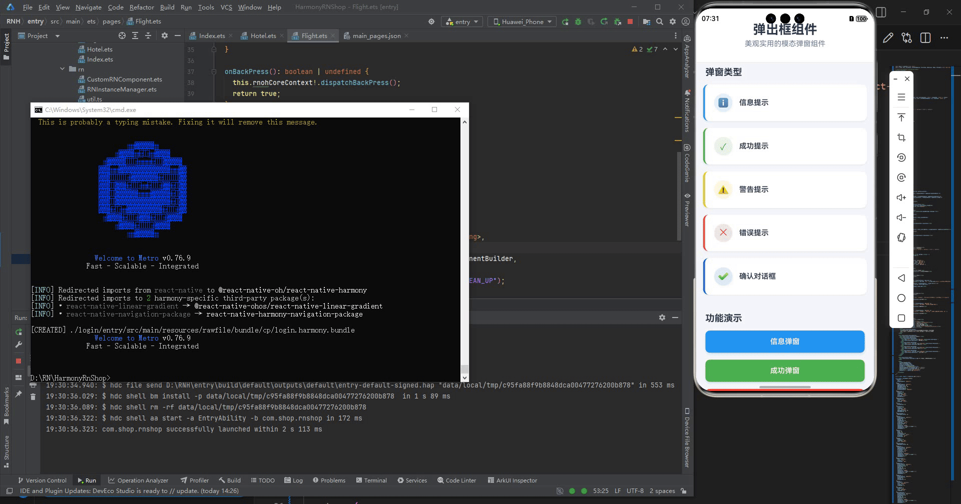
打包
接下来通过打包命令npn run harmony将reactNative的代码打包成为bundle,这样可以进行在开源鸿蒙OpenHarmony中进行使用。

打包之后再将打包后的鸿蒙OpenHarmony文件拷贝到鸿蒙的DevEco-Studio工程目录去:

最后运行效果图如下显示:

腾讯云面向开发者汇聚海量精品云计算使用和开发经验,营造开放的云计算技术生态圈。
更多推荐

 0
0 0
0- 0


 已为社区贡献1条内容

所有评论(0)