python colorbar函数_Python Matplotlib.pyplot.colorbar()用法及代码示例
颜色条是从标量值到颜色的映射的可视化。在Matplotlib中,它们被绘制到专用轴中。注意:通常通过Figure.colorbar或其pyplot包装器pyplot.colorbar创建颜色条,该内部使用make_axes和Colorbar。作为end-user,您很可能不必调用该方法或显式实例化此模块中的类。python中的matplotlib.pyplot.colorbar()matplotl
颜色条是从标量值到颜色的映射的可视化。在Matplotlib中,它们被绘制到专用轴中。
注意:通常通过Figure.colorbar或其pyplot包装器pyplot.colorbar创建颜色条,该内部使用make_axes和Colorbar。作为end-user,您很可能不必调用该方法或显式实例化此模块中的类。
python中的matplotlib.pyplot.colorbar()
matplotlib的pyplot模块中的colorbar()函数将色条添加到指示色标的图。
用法:matplotlib.pyplot.colorbar(mappable=None, cax=None, ax=None, **kwarg)
参数:
ax:此参数是可选参数,它包含轴或轴列表。
** kwarg(关键字参数):此参数是可选参数,有两种:
colorbar properties:
extend:{‘neither’, ‘both’,‘min’, ‘max’}的尖头超出范围
值。
label:彩条的长轴上的标签。
刻度:没有或没有刻度或定位器列表。
返回值:colorbar是“ matplotlib.colorbar.Colorbar”类的实例。
以下示例说明了matplotlib.pyplot中的matplotlib.pyplot.colorbar()函数:
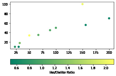
范例1:向散点图添加水平色条。
Python3
# Python Program illustrating
# pyplot.colorbar() method
import numpy as np
import matplotlib.pyplot as plt
# Dataset
# List of total number of items purchased
# from each products
purchaseCount = [100, 200, 150, 23, 30, 50,
156, 32, 67, 89]
# List of total likes of 10 products
likes = [50, 70, 100, 10, 10, 34, 56, 18, 35, 45]
# List of Like/Dislike ratio of 10 products
ratio = [1, 0.53, 2, 0.76, 0.5, 2.125, 0.56,
1.28, 1.09, 1.02]
# scatterplot
plt.scatter(x=purchaseCount, y=likes, c=ratio, cmap="summer")
plt.colorbar(label="Like/Dislike Ratio", orientation="horizontal")
plt.show()
输出:
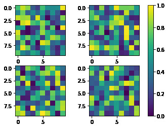
范例2:向多个子图添加单个颜色条。
Python3
# Python Program illustrating
# pyplot.colorbar() method
import matplotlib.pyplot as plt
# creates four Axes
fig, axes = plt.subplots(nrows=2, ncols=2)
for ax in axes.flat:
im = ax.imshow(np.random.random((10, 10)), vmin=0, vmax=1)
plt.colorbar(im, ax=axes.ravel().tolist())
plt.show()
输出:
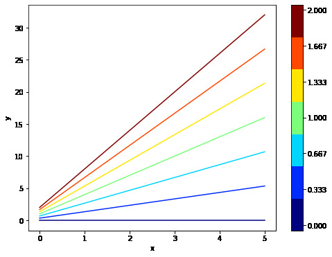
范例3:向非映射对象添加颜色条。
Python3
# Python Program illustrating
# pyplot.colorbar() method
import numpy as np
import matplotlib as mpl
import matplotlib.pyplot as plt
x = np.linspace(0, 5, 100)
N = 7
# colormap
cmap = plt.get_cmap('jet', N)
fig, ax1 = plt.subplots(1, 1, figsize=(8, 6))
for i, n in enumerate(np.linspace(0, 2, N)):
y = x*i+n
ax1.plot(x, y, c=cmap(i))
plt.xlabel('x-axis')
plt.ylabel('y-axis')
# Normalizer
norm = mpl.colors.Normalize(vmin=0, vmax=2)
# creating ScalarMappable
sm = plt.cm.ScalarMappable(cmap=cmap, norm=norm)
sm.set_array([])
plt.colorbar(sm, ticks=np.linspace(0, 2, N))
plt.show()
输出:

腾讯云面向开发者汇聚海量精品云计算使用和开发经验,营造开放的云计算技术生态圈。
更多推荐


 1
1 0
0- 0


 已为社区贡献3条内容

所有评论(0)