python的matplotlib库绘图没有轴线箭头
python的matplotlib库绘图添加轴线箭头
·
使用plt.arrow命令绘制轴线和箭头,并覆盖原轴线
示例代码:
import matplotlib.pyplot as plt
import numpy as np

plt.rcParams['font.sans-serif'] = ['Songti SC']  # 用来正常显示中文标签

# 定义x的取值范围为从-3到3,共计100个点
x_values = np.linspace(-3, 3, 100)

# 根据二次函数公式计算y值
y_values = x_values**2

# 创建绘图窗口,并设置大小
plt.figure(figsize=(8, 6))

# 绘制x和y值,设置线条颜色为黑色
plt.plot(x_values, y_values, color='black')

# 设置y轴的显示范围,适应二次函数的输出
plt.ylim(0, 9)

# 设置坐标轴名称及其字体大小
plt.xlabel("输入值", fontsize=12)
plt.ylabel("输出值", fontsize=12)

# 添加x轴和y轴的箭头
plt.arrow(-3, 0, 5.9, 0, head_width=0.2, head_length=0.1, fc='k', ec='k', length_includes_head=True, clip_on=False)
plt.arrow(0, 0, 0, 8.9, head_width=0.1, head_length=0.2, fc='k', ec='k', length_includes_head=True, clip_on=False)

# 不显示上边和右边的轴线
plt.gca().spines['top'].set_visible(False)
plt.gca().spines['right'].set_visible(False)
plt.gca().spines['bottom'].set_visible(False)
plt.gca().spines['left'].set_visible(False)

# 关闭所有轴的刻度和标签显示
plt.tick_params(axis='both', which='both', bottom=False, top=False, left=False, right=False, labelbottom=False, labelleft=False)

# 显示图表
plt.show()
运行结果: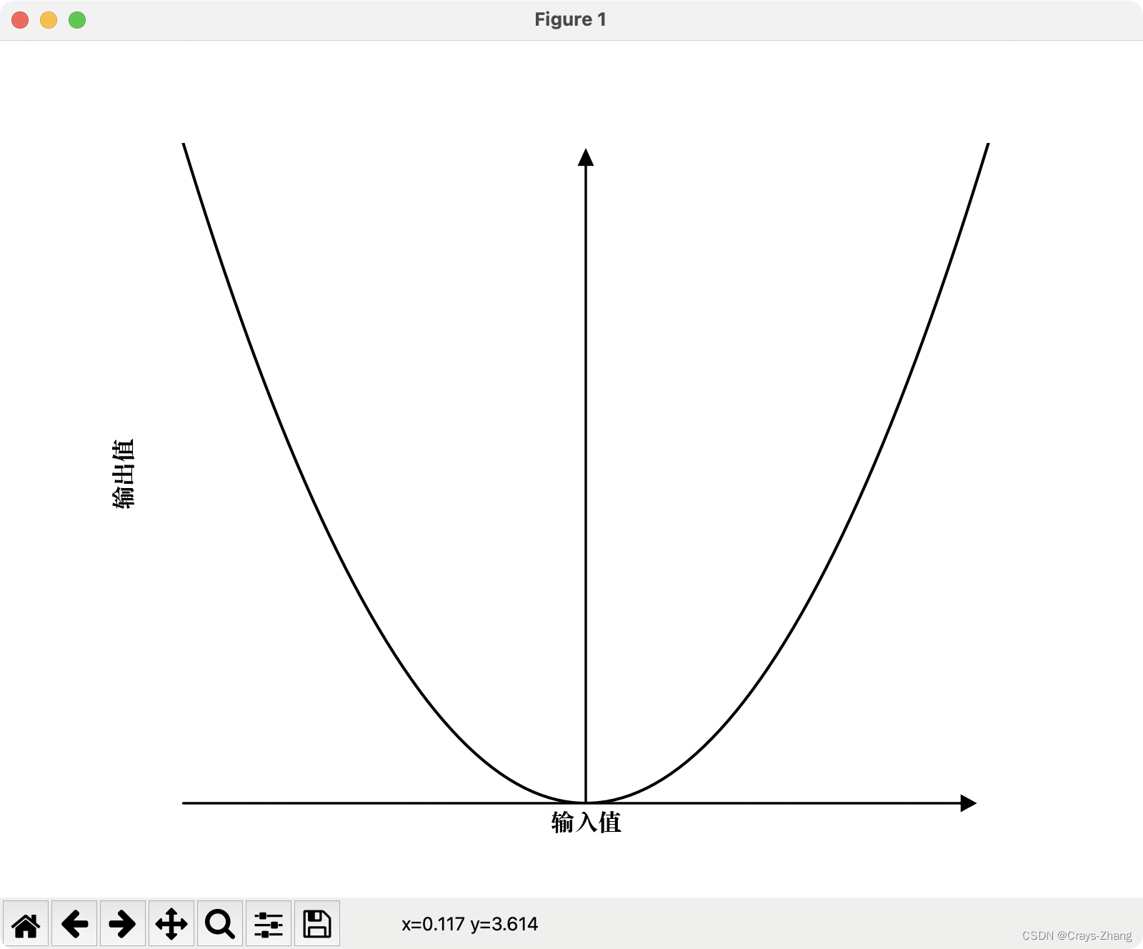

腾讯云面向开发者汇聚海量精品云计算使用和开发经验,营造开放的云计算技术生态圈。
更多推荐


 3
3 0
0- 0


 已为社区贡献1条内容

所有评论(0)