ECharts数据可视化项目-大屏数据可视化展示
·
可视化面板介绍
应对现在数据可视化的趋势,越来越多企业需要在很多场景(营销数据,生产数据,用户数据)下使用,可视化图表来展示体现数据,让数据更加直观,数据特点更加突出。
01-使用技术
完成该项目需要具备以下知识:
- div + css 布局
- flex 布局
- Less
- 原生js + jquery 使用
- rem适配
- “echarts基础”
02- 案例适配方案
- 设计稿是1920px
1. flexible.js 把屏幕分为 24 等份
2. cssrem 插件的基准值是 80px
插件-配置按钮---配置扩展设置--Root Font Size 里面 设置。
03-基础设置
- body 设置背景图 ,缩放为 100% , 行高1.15
- css初始化
04-header 布局
- 高度为100px
- 背景图,在容器内显示
- 缩放比例为 100%
- h1 标题部分 白色 38像素 居中显示 行高为 80像素
- 时间模块 showTime 定位右侧 right 为 30px 行高为 75px 文字颜色为:rgba(255, 255, 255, 0.7) 而文字大小为 20像素
javascript
// 格式: 当前时间:2025年7月25-10时54分14秒

<script>

            var t = null;

            t = setTimeout(time, 1000);//開始运行

            function time() {

                clearTimeout(t);//清除定时器

                dt = new Date();

                var y = dt.getFullYear();

                var mt = dt.getMonth() + 1;

                var day = dt.getDate();

                var h = dt.getHours();//获取时

                var m = dt.getMinutes();//获取分

                var s = dt.getSeconds();//获取秒

                document.querySelector(".showTime").innerHTML = '当前时间:' + y + "年" + mt + "月" + day + "-" + h + "时" + m + "分" + s + "秒";

                t = setTimeout(time, 1000); //设定定时器,循环运行

            }

 </script>
- header部分css样式
header {

  position: relative;

  height: 1.25rem;

  background: url(../images/head_bg.png) no-repeat top center;

  background-size: 100% 100%;

  h1 {

    font-size: 0.475rem;

    color: #fff;

    text-align: center;

    line-height: 1rem;

  }

  .showTime {

    position: absolute;

    top: 0;

    right: 0.375rem;

    line-height: 0.9375rem;

    font-size: 0.25rem;

    color: rgba(255, 255, 255, 0.7);

  }

}


// 05-mainbox  主体模块

  //需要一个上左右的10px 的内边距


//column 列容器,分三列,占比 3:5:3


//css样式:


.mainbox {

  padding: 0.125rem 0.125rem 0;

  display: flex;

  .column {

    flex: 3;

  }

  &:nth-child(2) {

    flex: 5;

  }

}
06-公共面板模块 panel
- 高度为 310px
- 1像素的 1px solid rgba(25, 186, 139, 0.17) 边框
- 有line.jpg 背景图片
- padding为 上为 0 左右 15px 下为 40px
- 下外边距是 15px
- 利用panel 盒子 before 和after 制作上面两个角 大小为 10px 线条为 2px solid #02a6b5
- 新加一个盒子before 和after 制作下侧两个角 宽度高度为 10px
.panel {

  position: relative;

  height: 3.875rem;

  border: 1px solid rgba(25, 186, 139, 0.17);

  background: url(../images/line\(1\).png);

  padding: 0 0.1875rem 0.5rem;

  margin-bottom: 0.1875rem;

  &::before {

    position: absolute;

    top: 0;

    left: 0;

    content: "";

    width: 10px;

    height: 10px;

    border-top: 2px solid #02a6b5;

    border-left: 2px solid #02a6b5;

  }

  &::after {

    position: absolute;

    top: 0;

    right: 0;

    content: "";

    width: 10px;

    height: 10px;

    border-top: 2px solid #02a6b5;

    border-right: 2px solid #02a6b5;

  }

  .panel-footer {

    position: absolute;

    left: 0;

    bottom: 0;

    width: 100%;

    &::before {

      position: absolute;

      bottom: 0;

      left: 0;

      content: "";

      width: 10px;

      height: 10px;

      border-bottom: 2px solid #02a6b5;

      border-left: 2px solid #02a6b5;

    }

    &::after {

      position: absolute;

      bottom: 0;

      right: 0;

      content: "";

      width: 10px;

      height: 10px;

      border-bottom: 2px solid #02a6b5;

      border-right: 2px solid #02a6b5;

    }

  }

}
07-柱形图 bar 模块(布局)
- 标题模块 h2 高度为 48px 文字颜色为白色 文字大小为 20px
- 图标内容模块 chart 高度 240px
- 以上可以作为panel公共样式部分
.panel {

  position: relative;

  height: 3.875rem;

  border: 1px solid rgba(25, 186, 139, 0.17);

  background: url(../images/line\(1\).png);

  padding: 0 0.1875rem 0.5rem;

  margin-bottom: 0.1875rem;

  &::before {

    position: absolute;

    top: 0;

    left: 0;

    content: "";

    width: 10px;

    height: 10px;

    border-top: 2px solid #02a6b5;

    border-left: 2px solid #02a6b5;

  }

  &::after {

    position: absolute;

    top: 0;

    right: 0;

    content: "";

    width: 10px;

    height: 10px;

    border-top: 2px solid #02a6b5;

    border-right: 2px solid #02a6b5;

  }

  .panel-footer {

    position: absolute;

    left: 0;

    bottom: 0;

    width: 100%;

    &::before {

      position: absolute;

      bottom: 0;

      left: 0;

      content: "";

      width: 10px;

      height: 10px;

      border-bottom: 2px solid #02a6b5;

      border-left: 2px solid #02a6b5;

    }

    &::after {

      position: absolute;

      bottom: 0;

      right: 0;

      content: "";

      width: 10px;

      height: 10px;

      border-bottom: 2px solid #02a6b5;

      border-right: 2px solid #02a6b5;

    }

  }

}
08-中间布局
- 上面是no 数字模块
- 下面是map 地图模块
1. 数字模块 no 有个背景颜色 rgba(101, 132, 226, 0.1); 有个15像素的内边距
2. 注意中间列 column 有个 左右 10px 下 15px 的外边距
3. no 模块里面上下划分 上面是数字(no-hd) 下面 是 相关文字说明(no-bd)
4. no-hd 数字模块 有一个边框 1px solid rgba(25, 186, 139, 0.17)
5. no-hd 数字模块 里面分为两个小li 每个小li高度为 80px 文字大小为 70px 颜色为 #ffeb7b 字体是图标字体 electronicFont
6. no-hd 利用 after 和 before制作2个小角, 边框 2px solid #02a6b5 宽度为 30px 高度为 10px
7. 小竖线 给 第一个小li after 就可以 1px宽 背景颜色为 rgba(255, 255, 255, 0.2); 高度 50% top 25% 即可
8. no-bd 里面也有两个小li 高度为 40px 文字颜色为 rgba(255, 255, 255, 0.7) 文字大小为 18px 上内边距为 10px
/* 声明字体*/

@font-face {

  font-family: electronicFont;

  src: url(../font/DS-DIGIT.TTF);

}
地图模块制作:
1. 地图模块高度为 810px 里面包含4个盒子 chart 放图表模块 球体盒子 旋转1 旋转2
2. 球体图片模块 map1 大小为 518px 要加背景图片 因为要缩放100% 定位到最中央 透明度 .3
3. 旋转1 map 2 大小为 643px 要加背景图片 因为要缩放100% 定位到中央 透明度 .6 做旋转动画 利用z-index压住球体
4. 旋转2 map3 大小为 566px 要加背景图片 因为要缩放100% 定位到中央 旋转动画 注意是逆时针
```html
 <div class="no">

                <div class="no-hd">

                    <ul>

                        <li>125811</li>

                        <li>104563</li>

                    </ul>

                </div>

                <div class="no-bd">

                    <ul>

                        <li>前端需求人数</li>

                        <li>市场供应人数</li>

                    </ul>

                </div>

            </div>

            <div class="map">

                <div class="chart"></div>

                <div class="map1"></div>

                <div class="map2"></div>

                <div class="map3"></div>

            </div>

```
中间样式
/* 声明字体*/

@font-face {

  font-family: electronicFont;

  src: url(../font/DS-DIGIT.TTF);

}

.no {

  background: rgba(101, 132, 226, 0.1);

  padding: 0.1875rem;

  .no-hd {

    position: relative;

    border: 1px solid rgba(25, 186, 139, 0.17);

    &::before {

      content: "";

      position: absolute;

      width: 30px;

      height: 10px;

      border-top: 2px solid #02a6b5;

      border-left: 2px solid #02a6b5;

      top: 0;

      left: 0;

    }

    &::after {

      content: "";

      position: absolute;

      width: 30px;

      height: 10px;

      border-bottom: 2px solid #02a6b5;

      border-right: 2px solid #02a6b5;

      right: 0;

      bottom: 0;

    }

    ul {

      display: flex;

      li {

        position: relative;

        flex: 1;

        text-align: center;

        height: 1rem;

        line-height: 1rem;

        font-size: 0.875rem;

        color: #ffeb7b;

        padding: 0.05rem 0;

        font-family: electronicFont;

        font-weight: bold;

        &:first-child::after {

          content: "";

          position: absolute;

          height: 50%;

          width: 1px;

          background: rgba(255, 255, 255, 0.2);

          right: 0;

          top: 25%;

        }

      }

    }

  }

  .no-bd ul {

    display: flex;

    li {

      flex: 1;

      height: 0.5rem;

      line-height: 0.5rem;

      text-align: center;

      font-size: 0.225rem;

      color: rgba(255, 255, 255, 0.7);

      padding-top: 0.125rem;

    }

  }

}

.map {

  position: relative;

  height: 10.125rem;

  .chart {

    position: absolute;

    top: 0;

    left: 0;

    z-index: 5;

    height: 10.125rem;

    width: 100%;

  }

  .map1,

  .map2,

  .map3 {

    position: absolute;

    top: 50%;

    left: 50%;

    transform: translate(-50%, -50%);

    width: 6.475rem;

    height: 6.475rem;

    background: url(../images/map.png) no-repeat;

    background-size: 100% 100%;

    opacity: 0.3;

  }

  .map2 {

    width: 8.0375rem;

    height: 8.0375rem;

    background-image: url(../images/lbx.png);

    opacity: 0.6;

    animation: rotate 15s linear infinite;

    z-index: 2;

  }

  .map3 {

    width: 7.075rem;

    height: 7.075rem;

    background-image: url(../images/jt.png);

    animation: rotate1 10s linear infinite;

  }


  @keyframes rotate {

    from {

      transform: translate(-50%, -50%) rotate(0deg);

    }

    to {

      transform: translate(-50%, -50%) rotate(360deg);

    }

  }

  @keyframes rotate1 {

    from {

      transform: translate(-50%, -50%) rotate(0deg);

    }

    to {

      transform: translate(-50%, -50%) rotate(-360deg);

    }

  }

}
09-Echarts-介绍
常见的数据可视化库:
- D3.js 目前 Web 端评价最高的 Javascript 可视化工具库(入手难)
- ECharts.js 百度出品的一个开源 Javascript 数据可视化库
- Highcharts.js 国外的前端数据可视化库,非商用免费,被许多国外大公司所使用
- AntV 蚂蚁金服全新一代数据可视化解决方案 等等
- Highcharts 和 Echarts 就像是 Office 和 WPS 的关系
> ECharts,一个使用 JavaScript 实现的开源可视化库,可以流畅的运行在 PC 和移动设备上,兼容当前绝大部分浏览器(IE8/9/10/11,Chrome,Firefox,Safari等),底层依赖矢量图形库 [ZRender](https://github.com/ecomfe/zrender),提供直观,交互丰富
10-Echarts-体验
下载echarts https://github.com/apache/incubator-echarts/tree/4.5.0
使用步骤:
1. 引入echarts 插件文件到html页面中
2. 准备一个具备大小的DOM容器
3. 初始化echarts实例对象
4. 指定配置项和数据(option)
5. 将配置项设置给echarts实例对象
11-Echarts-基础配置
需要了解的主要配置:`series` `xAxis` `yAxis` `grid` `tooltip` `title` `legend` `color`
- series
- 系列列表。每个系列通过 `type` 决定自己的图表类型
- xAxis:直角坐标系 grid 中的 x 轴
- boundaryGap: 坐标轴两边留白策略 true,这时候刻度只是作为分隔线,标签和数据点都会在两个刻度之间的带(band)中间。
- yAxis:直角坐标系 grid 中的 y 轴
- grid:直角坐标系内绘图网格。
- title:标题组件
- tooltip:提示框组件
- legend:图例组件
- color:调色盘颜色列表
数据堆叠,同个类目轴上系列配置相同的`stack`值后 后一个系列的值会在前一个系列的值上相加。
以下是完成该案例的完整代码;
HTML
<!DOCTYPE html>
<html lang="en">

<head>
    <meta charset="UTF-8">
    <meta name="viewport" content="width=device-width, initial-scale=1.0">
    <title>数据可视化</title>
    <link rel="stylesheet" href="css/index.css">
</head>

<body>
    <!-- 头部 -->
    <header>
        <h1>数据可视化-ECharts</h1>
        <div class="showTime">当前时间:2020年3月17-0时54分14秒</div>
        <script>
            var t = null;
            t = setTimeout(time, 1000); //開始运行
            function time() {
                clearTimeout(t); //清除定时器
                dt = new Date();
                var y = dt.getFullYear();
                var mt = dt.getMonth() + 1;
                var day = dt.getDate();
                var h = dt.getHours(); //获取时
                var m = dt.getMinutes(); //获取分
                var s = dt.getSeconds(); //获取秒
                document.querySelector(".showTime").innerHTML =
                    "当前时间:" +
                    y +
                    "年" +
                    mt +
                    "月" +
                    day +
                    "-" +
                    h +
                    "时" +
                    m +
                    "分" +
                    s +
                    "秒";
                t = setTimeout(time, 1000); //设定定时器,循环运行
            }
        </script>
    </header>
    <!-- 页面主体部分 -->
    <section class="mainbox">
        <div class="column">
            <div class="panel bar">
                <h2>柱形图-就业行业</h2>
                <div class="chart"></div>
                <div class="panel-footer"></div>
            </div>
            <div class="panel line">
                <h2>折线图-人员变化 <a href="javascript:;">2024</a>
                    <a href="javascript:;">2025</a>
                </h2>
                <div class="chart"></div>
                <div class="panel-footer"></div>
            </div>
            <div class="panel pie">
                <h2>饼状图-年龄分布</h2>
                <div class="chart"></div>
                <div class="panel-footer"></div>
            </div>

        </div>
        <div class="column">
            <!-- no模块制作 -->
            <div class="no">
                <div class="no-hd">
                    <ul>
                        <li>125811</li>
                        <li>100000</li>
                    </ul>
                </div>
                <div class="no-bd">
                    <ul>
                        <li>前端需求人数</li>
                        <li>市场供应人数</li>
                    </ul>
                </div>
            </div>
            <!-- 地图模块 -->
            <div class="map">
                <div class="map1"></div>
                <div class="map2"></div>
                <div class="map3"></div>
                <div class="chart"></div>
            </div>
        </div>
        <div class="column">
            <div class="panel bar2">
                <h2>柱形图-技能掌握</h2>
                <div class="chart"></div>
                <div class="panel-footer"></div>
            </div>
            <div class="panel line2">
                <h2>折线图-播放量</h2>
                <div class="chart">图表</div>
                <div class="panel-footer"></div>
            </div>
            <div class="panel pie1">
                <h2>饼状图-地区分布</h2>
                <div class="chart">图表</div>
                <div class="panel-footer"></div>
            </div>
        </div>
    </section>

    <script src="js/echarts.min.js"></script>
    <script src="js/jquery.js"></script>
    <script src="js/flexible.js"></script>


    <script src="js/china.js"></script>
    <script src="js/mymap.js"></script>
    <script src="js/index.js"></script>
</body>

</html>
CSS
* {
  margin: 0;
  padding: 0;
  box-sizing: border-box;
}
li {
  list-style: none;
}
@font-face {
  font-family: electronicFont;
  src: url(../font/DS-DIGIT.TTF);
}
body {
  font-family: Arial, Helvetica, sans-serif;
  margin: 0;
  padding: 0;
  /*  背景图定位 / 背景图尺寸  cover 完全铺满容器  contain 完整显示在容器内 */
  background: url(../images/bg.jpg) no-repeat #000;
  background-size: cover;
  /* 行高是字体1.15倍 */
  line-height: 1.15;
}
header {
  position: relative;
  height: 1.25rem;
  background: url(../images/head_bg.png) no-repeat top center;
  background-size: 100% 100%;
}
header h1 {
  font-size: 0.475rem;
  color: #fff;
  text-align: center;
  line-height: 1rem;
}
header .showTime {
  position: absolute;
  top: 0;
  right: 0.375rem;
  line-height: 0.9375rem;
  font-size: 0.25rem;
  color: rgba(255, 255, 255, 0.7);
}
.mainbox {
  min-width: 1024px;
  max-width: 1920px;
  padding: 0.125rem 0.125rem 0;
  display: flex;
}
.mainbox .column {
  flex: 3;
}
.mainbox .column:nth-child(2) {
  flex: 5;
  margin: 0 0.125rem 0.1875rem;
  overflow: hidden;
}
.panel {
  position: relative;
  height: 3.875rem;
  border: 1px solid rgba(25, 186, 139, 0.17);
  background: rgba(255, 255, 255, 0.04) url(../images/line\(1\).png);
  padding: 0 0.1875rem 0.5rem;
  margin-bottom: 0.1875rem;
}
.panel::before {
  position: absolute;
  top: 0;
  left: 0;
  content: "";
  width: 10px;
  height: 10px;
  border-top: 2px solid #02a6b5;
  border-left: 2px solid #02a6b5;
}
.panel::after {
  position: absolute;
  top: 0;
  right: 0;
  content: "";
  width: 10px;
  height: 10px;
  border-top: 2px solid #02a6b5;
  border-right: 2px solid #02a6b5;
}
.panel .panel-footer {
  position: absolute;
  left: 0;
  bottom: 0;
  width: 100%;
}
.panel .panel-footer::before {
  position: absolute;
  bottom: 0;
  left: 0;
  content: "";
  width: 10px;
  height: 10px;
  border-bottom: 2px solid #02a6b5;
  border-left: 2px solid #02a6b5;
}
.panel .panel-footer::after {
  position: absolute;
  bottom: 0;
  right: 0;
  content: "";
  width: 10px;
  height: 10px;
  border-bottom: 2px solid #02a6b5;
  border-right: 2px solid #02a6b5;
}
.panel h2 {
  height: 0.6rem;
  line-height: 0.6rem;
  text-align: center;
  color: #fff;
  font-size: 0.25rem;
  font-weight: 400;
}
.panel h2 a {
  margin: 0 0.1875rem;
  color: #fff;
  text-decoration: underline;
}
.panel .chart {
  height: 3rem;
}
.no {
  background: rgba(101, 132, 226, 0.1);
  padding: 0.1875rem;
}
.no .no-hd {
  position: relative;
  border: 1px solid rgba(25, 186, 139, 0.17);
}
.no .no-hd::before {
  content: "";
  position: absolute;
  width: 30px;
  height: 10px;
  border-top: 2px solid #02a6b5;
  border-left: 2px solid #02a6b5;
  top: 0;
  left: 0;
}
.no .no-hd::after {
  content: "";
  position: absolute;
  width: 30px;
  height: 10px;
  border-bottom: 2px solid #02a6b5;
  border-right: 2px solid #02a6b5;
  right: 0;
  bottom: 0;
}
.no .no-hd ul {
  display: flex;
}
.no .no-hd ul li {
  position: relative;
  flex: 1;
  text-align: center;
  height: 1rem;
  line-height: 1rem;
  font-size: 0.875rem;
  color: #ffeb7b;
  padding: 0.05rem 0;
  font-family: electronicFont;
  font-weight: bold;
}
.no .no-hd ul li:first-child::after {
  content: "";
  position: absolute;
  height: 50%;
  width: 1px;
  background: rgba(255, 255, 255, 0.2);
  right: 0;
  top: 25%;
}
.no .no-bd ul {
  display: flex;
}
.no .no-bd ul li {
  flex: 1;
  text-align: center;
  color: rgba(255, 255, 255, 0.7);
  font-size: 0.225rem;
  height: 0.5rem;
  line-height: 0.5rem;
  padding-top: 0.125rem;
}
.map {
  height: 10.125rem;
  position: relative;
}
.map .map1,
.map .map2,
.map .map3 {
  position: absolute;
  top: 50%;
  left: 50%;
  transform: translate(-50%, -50%);
  width: 6.475rem;
  height: 6.475rem;
  background: url(../images/map.png) no-repeat;
  background-size: 100% 100%;
  opacity: 0.3;
}
.map .map2 {
  width: 8.0375rem;
  height: 8.0375rem;
  background-image: url(../images/lbx.png);
  opacity: 0.6;
  animation: rotate2 15s linear infinite;
  z-index: 2;
}
.map .map3 {
  width: 7.075rem;
  height: 7.075rem;
  background-image: url(../images/jt.png);
  animation: rotate1 10s linear infinite;
}
.map .chart {
  position: absolute;
  top: 0;
  left: 0;
  z-index: 5;
  width: 100%;
  height: 10.125rem;
}
@keyframes rotate1 {
  from {
    transform: translate(-50%, -50%) rotate 0deg;
  }
  to {
    transform: translate(-50%, -50%) rotate(360deg);
  }
}
@keyframes rotate2 {
  from {
    transform: translate(-50%, -50%) rotate 0deg;
  }
  to {
    transform: translate(-50%, -50%) rotate(-360deg);
  }
}
JAVASCRIPT
// 柱状图
(function () {
var myChart = echarts.init(document.querySelector(".bar .chart"));
var option = {
tooltip: {
trigger: 'axis',
axisPointer: {
type: 'shadow'
}
},
grid: {
left: '0%',
top: '10%',
right: '0%',
bottom: '4%',
containLabel: true
},
xAxis: [
{
type: 'category',
data: [
"旅游行业",
"教育培训",
"游戏行业",
"医疗行业",
"电商行业",
"社交行业",
"金融行业"
],
axisTick: {
alignWithLabel: true
},
axisLabel: {
color: "rgba(255,255,255,.6)",
fontSize: "6",
axisLine: {
show: false
}
}
}
],
yAxis: [
{
type: 'value',
axisLabel: {
color: "rgba(255,255,255,.6)",
fontSize: "12",
axisLine: {
show: true,
splitLine: {
lineStyle: {
color: "rgba(255,255,255,.1)",
width: 2
}
}
}
}
}
],
series: [
{
name: 'Direct',
type: 'bar',
barWidth: '35%',
data: [200, 300, 300, 900, 1500, 1200, 600],
itemStyle: {
barBorderRadius: 5
}
}
]
};
myChart.setOption(option);
window.addEventListener('resize', function () {
myChart.resize();
})
})();
// 柱状图2
(function () {
var myColor = ["#1089E7", "#F57474", "#56D0E3", "#F8B448", "#8B78F6"];
var myChart = echarts.init(document.querySelector(".bar2 .chart"));
option = {
grid: {
top: '10%',
left: '22%',
bottom: '10%',
},
xAxis: {
show: false
},
yAxis: [{
type: 'category',
inverse: true,
data: ['HTMLS', 'CSS3', 'Javascript', 'VUE', 'NODE',],
axisLine: {
show: false
},
axisTick: {
show: false
},
axisLabel: {
color: "#fff"
}
},
{
data: [70, 34, 60, 78, 69],
inverse: true,
axisLine: {
show: false
},
axisTick: {
show: false
},
axisLabel: {
color: "#fff"
}
}
],
series: [
{
name: '条',
type: 'bar',
data: [70, 34, 60, 78, 69],
yAxisIndex: 0,
itemStyle: {
barBorderRadius: 20,
color: function (params) {
return myColor[params.dataIndex];
}
},
barCategoryGap: 50,
barWidth: 10,
label: {
show: true,
position: "inside",
formatter: "{c}%"
}
},
{
name: '框',
type: 'bar',
barCategoryGap: 50,
barWidth: 15,
data: [100, 100, 100, 100, 100],
yAxisIndex: 1,
itemStyle: {
color: "none",
borderColor: "#00c1de",
borderWidth: 3,
barBorderRadius: 15
},
}
]
};
myChart.setOption(option);
window.addEventListener('resize', function () {
myChart.resize();
})
})();
// 折线图
(function () {
var myChart = echarts.init(document.querySelector(".line .chart"));
var yearData = [
{
year: '2020', // 年份
data: [ // 两个数组是因为有两条线
[24, 40, 101, 134, 90, 230, 210, 230, 120, 230, 210, 120],
[40, 64, 191, 324, 290, 330, 310, 213, 180, 200, 180, 79]
]
},
{
year: '2021', // 年份
data: [ // 两个数组是因为有两条线
[123, 175, 112, 197, 121, 67, 98, 21, 43, 64, 76, 38],
[143, 131, 165, 123, 178, 21, 82, 64, 43, 60, 19, 34]
]
}
];
var option = {
color: ["#00f2f1", "#ed3f35"],
tooltip: {
trigger: 'axis'
},
legend: {
// data: ['Email', 'Union Ads', 'Video Ads', 'Direct', 'Search Engine'],
textStyle: {
color: "#4c9bfb"
},
right: "10%"
},
grid: {
top: '20%',
left: '3%',
right: '4%',
bottom: '3%',
containLabel: true,
show: true,
borderColor: "#012f4a"
},
xAxis: {
type: 'category',
boundaryGap: false,
data: ["一月", "二月", "三月", "四月", "五月", "六月", "七月", "八月", "九月", "十月", "十一月", "十二月"],
axisTick: {
show: false
},
axisLabel: {
color: "#4c9bfd"
},
axisLine: {
show: false
}
},
yAxis: {
type: 'value',
axisTick: {
show: false
},
axisLabel: {
color: "#4c9bfd"
},
axisLine: {
show: false
},
splitLine: {
lineStyle: {
color: "#012f4a"
}
}
},
series: [
{
smooth: true,
name: '新增粉丝',
type: 'line',
stack: 'Total',
data: yearData[0].data[0]
},
{
smooth: true,
name: '新增游客',
type: 'line',
stack: 'Total',
data: yearData[1].data[1]
}
]
};
myChart.setOption(option);
window.addEventListener('resize', function () {
myChart.resize();
});
$(".line h2").on("click", "a", function () {
al1(1);
var Object = yearData[$(this).index()];
option.series[0].data = Object.data[0];
option.series[1].data = Object.data[1];
myChart.setOption(option);
})
})();
(function () {
var myChart = echarts.init(document.querySelector(".line2 .chart"));
var option = {
tooltip: {
trigger: 'axis',
},
legend: {
top: "0%",
// data: ['Email', 'Union Ads', 'Video Ads', 'Direct', 'Search Engine'],
textStyle: {
color: "rgba(255,255,255,.5)",
fontSize: "12"
}
},
grid: {
left: '10%',
top: '30%',
right: '10%',
bottom: '10%',
containLabel: true
},
xAxis: [
{
type: 'category',
boundaryGap: false,
data: ["01",
"02",
"03",
"04",
"05",
"06",
"07",
"08",
"09",
"11",
"12",
"13",
"14",
"15",
"16",
"17",
"18",
"19",
"20",
"21",
"22",
"23",
"24",
"25",
"26",
"27",
"28",
"29",
"30"],
axisLabel: {
textStyle: {
color: "rgba(255,255,255,.6)",
fontSize: 12
}
},
axisLine: {
lineStyle: {
color: "rgba(255,255,255,.2)"
}
}
}
],
yAxis: [
{
type: 'value',
axisTick: { show: false },
axisLabel: {
textStyle: {
color: "rgba(255,255,255,.6)",
fontSize: 12
}
},
axisLine: {
lineStyle: {
color: "rgba(255,255,255,.1)"
}
},
splitLine: {
lineStyle: {
color: "rgba(255,255,266,.1)"
}
}
}
],
series: [
{
name: '播放量',
type: 'line',
smooth: true,
lineStyle: {
color: "#0184d5",
width: "2"
},
areaStyle: {
normal: {
color: new echarts.graphic.LinearGradient(
0,
0,
0,
1,
[
{
offset: 0,
color: "rgba(1, 132, 213, 0.9)"
},
{
offset: 0.8,
color: "rgba(1, 132, 213, 0.9)"
}
],
false
),
}
},
Symbol: "circle",
symbolSize: 8,
showSymbol: false,
itemStyle: {
normal: {
color: "#0184d5",
borderColor: "rgba(221, 220, 107, .1)",
borderWidth: 12
}
},
emphasis: {
focus: 'series'
},
data: [30,
40,
30,
40,
30,
40,
30,
60,
20,
40,
20,
40,
30,
40,
30,
40,
30,
40,
30,
60,
20,
40,
20,
40,
30,
60,
20,
40,
20,
40]
},
{
name: '转发量',
type: 'line',
smooth: true,
emphasis: {
focus: 'series'
},
data: [50,
30,
50,
60,
10,
50,
30,
50,
60,
40,
60,
40,
80,
30,
50,
60,
10,
50,
30,
70,
20,
50,
10,
40,
50,
30,
70,
20,
50,
10,
40],
lineStyle: {
color: "#00d887",
width: "2"
},
areaStyle: {
normal: {
color: new echarts.graphic.LinearGradient(
0,
0,
0,
1,
[
{
offset: 0,
color: "rgba(1, 132, 213, 0.9)"
},
{
offset: 0.8,
color: "rgba(1, 132, 213, 0.9)"
}
],
false
),
}
},
Symbol: "circle",
symbolSize: 8,
showSymbol: false,
itemStyle: {
normal: {
color: "#00d887",
borderColor: "rgba(221, 220, 107, .1)",
borderWidth: 12
}
},
emphasis: {
focus: 'series'
},
},
]
};
myChart.setOption(option);
window.addEventListener('resize', function () {
myChart.resize();
})
})();
(function () {
var myChart = echarts.init(document.querySelector(".pie .chart"));
var option = {
color: [
"#065aab",
"#066eab",
"#0682ab",
"#0696ab",
"#06a0ab",
"#06b4ab",
"#06c8ab",
"#06dcab",
"#06f0ab"
],
tooltip: {
trigger: 'item'
},
legend: {
bottom: '0%',
itemWidth: 10,
itemHeight: 10,
textStyle: {
color: "rgba(255,255,255,.5)",
fontSize: "12"
}
},
series: [
{
name: "年龄分布",
type: 'pie',
center: ["50%", "42%"],
radius: ['40%', '70%'],
avoidLabelOverlap: false,
label: {
show: false,
position: 'center'
},
radius: ['40%', '60%'],
labelLine: {
show: false
},
data: [
{ value: 1, name: "0岁以下" },
{ value: 4, name: "20-29岁" },
{ value: 2, name: "30-39岁" },
{ value: 2, name: "40-49岁" },
{ value: 1, name: "50岁以上" }
]
}
]
};
myChart.setOption(option);
window.addEventListener("resize", function () {
myChart.resize();
});
})();
(function () {
var myChart = echarts.init(document.querySelector(".pie1 .chart"));
var option = {
color: [
"#006cff",
"#60cda0",
"#ed8884",
"#ff9f7f",
"#0096ff",
"#9fe6b8",
"#32c5e9",
"#1d9dff"
],
tooltip: {
trigger: 'item',
formatter: '{a} <br/>{b} : {c} ({d}%)'
},
legend: {
top: "90%",
itemWidth: 10,
itemHeight: 10,
textStyle: {
color: "rgba(255,255,255,.5)",
fontSize: "12"
}
},
series: [
{
name: '地区分布',
type: 'pie',
label: {
fontSize: 10
},
labelLine: {
length: 10,
// 连接到文字的线长度
length2: 10
},
radius: [10, 70],
center: ['50%', '50%'],
roseType: 'radius',
itemStyle: {
borderRadius: 5
},
data: [
{ value: 20, name: "云南" },
{ value: 26, name: "北京" },
{ value: 24, name: "山东" },
{ value: 25, name: "河北" },
{ value: 20, name: "江苏" },
{ value: 25, name: "浙江" },
{ value: 30, name: "深圳" },
{ value: 42, name: "广东" }
]
}
]
};
myChart.setOption(option);
window.addEventListener("resize", function () {
myChart.resize();
});
})();
// 地图模块
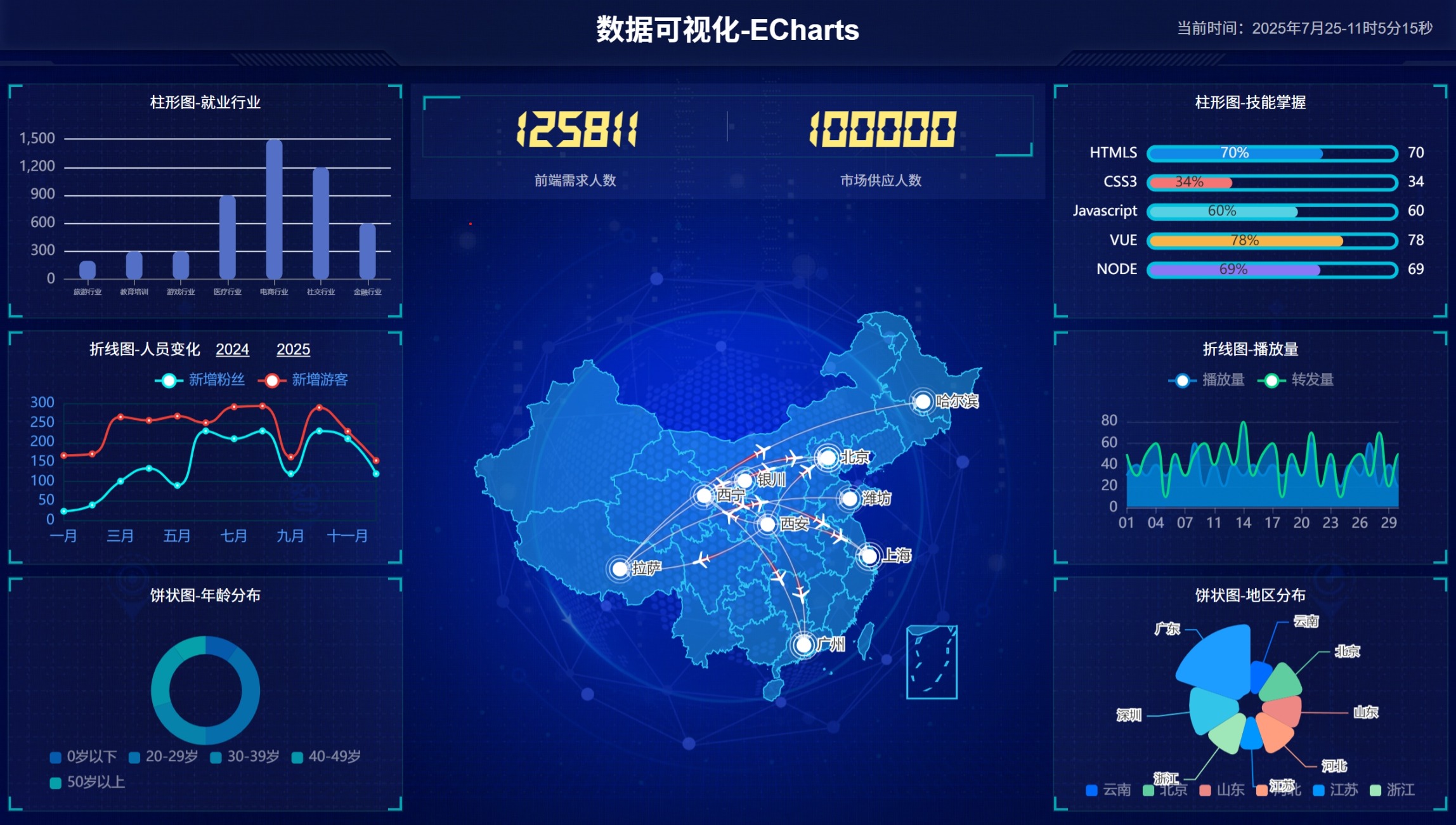
以下是结果展示
如何进行实时定位
在ECharts中实现小范围精确实时定位,通常用于在图表中高亮显示特定点或区域(如坐标点),并支持动态数据更新。以下是逐步解决方案,基于ECharts的配置和API实现。整个过程包括坐标系设置、数据绑定和实时更新机制。
步骤1: 理解核心概念
- 小范围定位:指在有限区域内(如某个$x$和$y$的小区间)精确定位点。例如,在笛卡尔坐标系中,点坐标为$(x, y)$。
- 实时:数据需动态变化,通过ECharts的
setOption方法更新。 - 精确性:通过调整坐标轴范围和缩放级别实现高精度显示。
步骤2: 基本配置(静态定位)
首先,创建一个基础散点图(scatter)来定位点。使用option对象定义坐标系和数据系列。
- 坐标轴设置:限制范围以确保小范围显示。
- 数据系列:使用
type: 'scatter'绘制点。
// 初始化ECharts实例
var chartDom = document.getElementById('chart-container');
var myChart = echarts.init(chartDom);

// 定义option对象
var option = {
    xAxis: {
        type: 'value',
        min: 0,  // 设置小范围起始值
        max: 10  // 设置小范围结束值
    },
    yAxis: {
        type: 'value',
        min: 0,
        max: 10
    },
    series: [{
        type: 'scatter',
        data: [[5, 5]],  // 初始点坐标,例如点$(5,5)$
        symbolSize: 10,  // 点大小,提高可见性
        label: {
            show: true,
            formatter: '位置: ({c})'  // 显示坐标标签
        }
    }]
};

// 应用配置
myChart.setOption(option);
步骤3: 实现实时更新
为支持实时定位,需动态更新数据源。使用setInterval或事件监听器(如WebSocket)来修改数据。
- 关键API:
myChart.setOption更新数据数组。 - 性能优化:避免频繁重绘,使用
notMerge: false只更新变化部分。
// 模拟实时数据源(例如每秒更新一次)
setInterval(function() {
    // 生成新坐标(示例:随机小范围内点)
    var newX = Math.random() * 10;  // 范围0-10
    var newY = Math.random() * 10;
    var newData = [[newX, newY]];  // 新点坐标$(x,y)$

    // 更新图表
    myChart.setOption({
        series: [{
            data: newData
        }]
    });
}, 1000);  // 更新间隔1秒
步骤4: 提高精度和范围控制
在小范围内实现高精度:
- 缩放功能:添加
dataZoom组件,允许用户手动缩放。 - 坐标轴精度:设置
axisLabel.formatter自定义标签格式,例如显示更多小数位。 - 响应式设计:监听
resize事件确保图表适应容器。
// 在option中添加dataZoom和精度设置
option.dataZoom = [{
    type: 'inside',  // 内置缩放
    xAxisIndex: 0,
    start: 0,
    end: 100
}];
option.xAxis.axisLabel = {
    formatter: function(value) {
        return value.toFixed(2);  // 显示两位小数,提高精度
    }
};
option.yAxis.axisLabel = {
    formatter: function(value) {
        return value.toFixed(2);
    }
};

// 应用更新
myChart.setOption(option);

// 添加窗口resize监听
window.addEventListener('resize', function() {
    myChart.resize();
});
示例完整代码
<!DOCTYPE html>
<html>
<head>
    <meta charset="utf-8">
    <title>ECharts实时定位示例</title>
    <script src="https://cdn.jsdelivr.net/npm/echarts@5.4.3/dist/echarts.min.js"></script>
</head>
<body>
    <div id="chart-container" style="width: 600px; height: 400px;"></div>
    <script>
        var chartDom = document.getElementById('chart-container');
        var myChart = echarts.init(chartDom);

        // 初始配置
        var option = {
            xAxis: { type: 'value', min: 0, max: 10 },
            yAxis: { type: 'value', min: 0, max: 10 },
            series: [{
                type: 'scatter',
                data: [[5, 5]],
                symbolSize: 10,
                label: { show: true, formatter: '位置: ({c})' }
            }],
            dataZoom: [{ type: 'inside', xAxisIndex: 0 }]
        };
        myChart.setOption(option);

        // 实时更新
        setInterval(() => {
            var newX = (Math.random() * 10).toFixed(2);
            var newY = (Math.random() * 10).toFixed(2);
            myChart.setOption({
                series: [{ data: [[parseFloat(newX), parseFloat(newY)]] }]
            });
        }, 1000);
    </script>
</body>
</html>
注意事项
- 性能问题:高频率更新可能导致卡顿。优化方法:减少数据点数量或使用Web Worker。
- 坐标系统:如果使用地理坐标系(如地图),需改用
geo组件,方法类似。 - 误差处理:确保数据源精度(如传感器数据),避免累积误差。
- 测试建议:在真实环境中测试,使用开发工具监控FPS(帧率)。

腾讯云面向开发者汇聚海量精品云计算使用和开发经验,营造开放的云计算技术生态圈。
更多推荐
 26
26 0
0- 0


 已为社区贡献1条内容

所有评论(0)