数据可视化---共享子图2
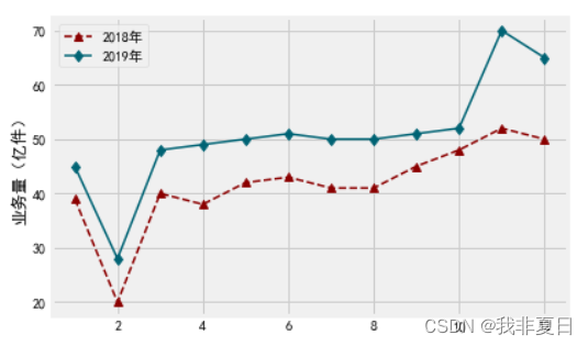
题目一:绘制反映2018年、2019年快递业务量趋势的折线图
编写程序。已知2018年、2019年物流行业的快递业务量情况如下表所示。
表 2018、2019年物流行业的快递业务量
|
月份 |
2018年业务量(亿件) |
2019年业务量(亿件) |
|
1月 |
39 |
45 |
|
2月 |
20 |
28 |
|
3月 |
40 |
48 |
|
4月 |
38 |
49 |
|
5月 |
42 |
50 |
|
6月 |
43 |
51 |
|
7月 |
41 |
50 |
|
8月 |
41 |
50 |
|
9月 |
45 |
51 |
|
10月 |
48 |
52 |
|
11月 |
52 |
70 |
|
12月 |
50 |
65 |
根据表的数据绘制图表,具体要求如下:
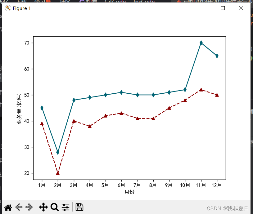
(1)绘制反映2018年、2019年快递业务量趋势的折线图;
(2)折线图的x轴为月份;y轴为业务量,y轴的标签为“业务量(亿件)”;
(3)代表2018年的折线样式:颜色为“#8B0000”、标记为正三角形、线型为长虚线,线宽为1.5;
(4)代表2019年的折线样式:颜色为“#006374”、标记为长菱形、线型为实线,线宽为1.5;
(5)折线图的主题风格切换为“fivethirtyeight”。
最终效果图:
运行代码:
#绘制反映2018年、2019年快递业务量趋势的折线图
import numpy as np
import matplotlib.pyplot as plt
import matplotlib.style as ms

plt.rcParams["font.sans-serif"] = ["SimHei"]
plt.rcParams["axes.unicode_minus"] = False
sale_a = [39, 20, 40, 38, 42, 43, 41, 41, 45, 48, 52, 50]
sale_b = [45, 28, 48, 49, 50, 51, 50, 50, 51, 52, 70, 65]

fig = plt.figure()
ax = fig.add_subplot(111)
#绘制具有不同线条样式的折线图
ax.plot(sale_a, '--', marker='^', color='#8B0000', linewidth=1.5)
ax.plot(sale_b, '-', marker='d', color='#006374', linewidth=1.5)
ax.set_ylabel('业务量(亿件)')
ax.set_xlabel('月份')
ax.set_xticks(np.arange(0, len(sale_a)))
stringA = [str(i) + '月' for i in range(1, 13)]
ax.set_xticklabels(stringA)
ms.use('fivethirtyeight')
plt.show()
运行结果
题目二:绘制一个包含正弦曲线和余弦曲线的图表
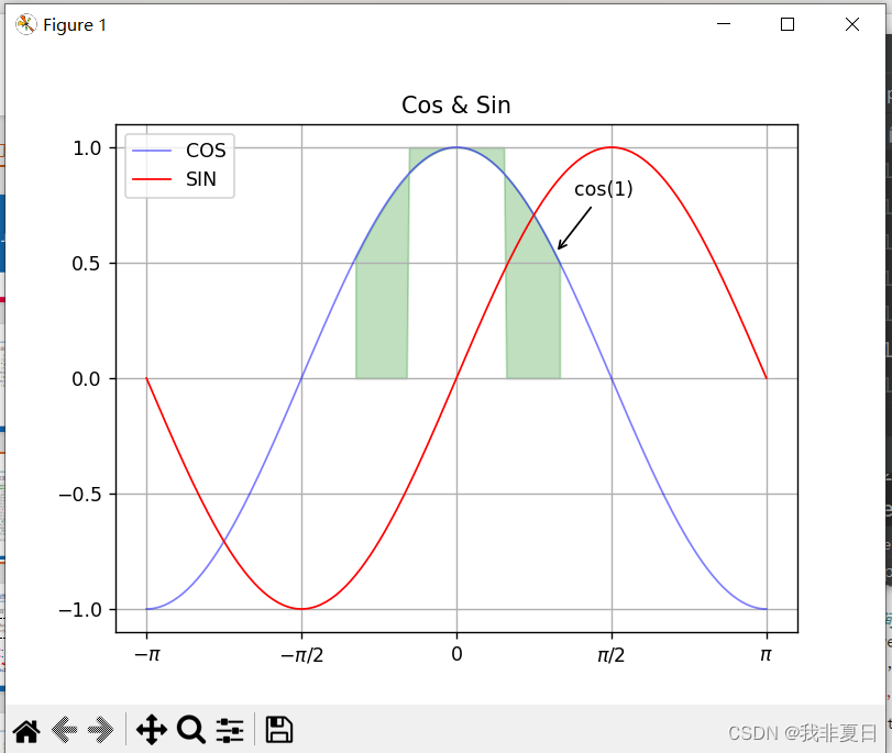
编写程序。绘制一个包含正弦曲线和余弦曲线的图表,具体要求如下:
(1)正弦曲线的样式:红色、线宽为1.0;
(2)余弦曲线的样式:蓝色、线宽为1.0,透明度为0.5;
(3)x轴的刻度标签为“-π”、 “-π/2”、 “0”、 “π/2”、 “-π”;
(4)在x=1、y=np.cos(1)的位置添加指向型注释文本;
(5)填充|x|<0.5或余弦值大于0.5的区域为绿色,透明度为0.25。
最终的效果如图4-13所示。
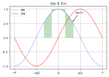
正弦和余弦曲线
运行代码:
#绘制一个包含正弦曲线和余弦曲线的图标
import numpy as np
import matplotlib.pyplot as plt

x = np.linspace(-np.pi, np.pi, 256, endpoint=True)
y_cos, y_sin = np.cos(x), np.sin(x)
plt.plot(x, y_cos, color='blue', linewidth=1.0, label='COS', alpha=0.5)
plt.plot(x, y_sin, color='red', linewidth=1.0, label='SIN')
plt.title('Cos & Sin')
plt.xticks([-np.pi, -np.pi/2, 0, np.pi/2, np.pi],
           [r'$-\pi$', r'$-\pi/2$', r'$0$', r'$\pi/2$', r'$\pi$'])#在字符串前加r,意味着该字符串将被视为原始字符串,所有转义字符都被忽略
plt.yticks(np.linspace(-1, 1, 5, endpoint=True))
plt.legend(loc='upper left')
plt.grid()
plt.fill_between(x, np.abs(x) < 0.5, y_cos, y_cos > 0.5, color='green', alpha=0.25)
plt.annotate('cos(1)', xy=(1, np.cos(1)), xycoords='data', xytext=(10, 30), textcoords='offset points', arrowprops=dict(arrowstyle='->'))
plt.show()
运行结果:
题目三:绘制图表
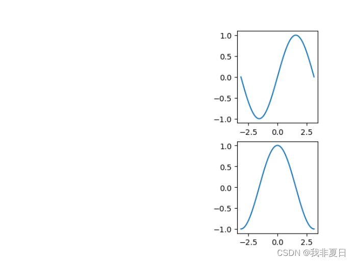
编写程序。按照如下要求绘制图表:
(1)画布被规划为2*3的矩阵区域;
(2)在编号为3的区域中绘制包含一条正弦曲线的子图;
(3)在编号为6的区域中绘制包含一条余弦曲线的子图;
(4)共享两个子图的x轴。
最终效果图
运行代码:
import numpy as np
import matplotlib.pyplot as plt
x = np.linspace(-np.pi, np.pi, 256, endpoint=True)
sin, cos = np.sin(x), np.cos(x)
ax_one = plt.subplot(233)
ax_one.plot(x, sin)
ax_two = plt.subplot(236, sharex=ax_one)
ax_two.plot(x, cos)
plt.show()
运行结果:

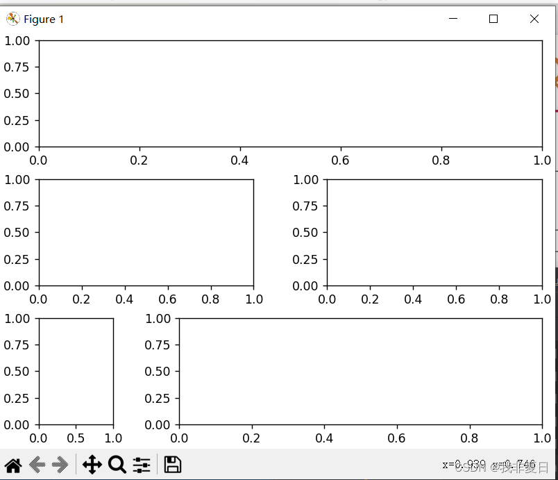
题目四:按照自定义的布局结构绘制子图
编写程序。按照自定义的布局结构绘制子图,具体下图

自定义的布局结构
运行代码:
#按照自定义的布局结构绘制子图
import matplotlib.pyplot as plt

fig = plt.figure(constrained_layout = True)
gs = fig.add_gridspec(3, 4)
fig.add_subplot(gs[0, :])
fig.add_subplot(gs[1, :2])
fig.add_subplot(gs[1, 2:])
fig.add_subplot(gs[2, 0])
fig.add_subplot(gs[2, 1:])

plt.show()
运行结果:
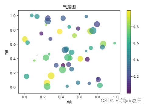
题目五:编写如下图的气泡图
编写程序。编写如下图的气泡图。
运行代码:
#气泡图
import numpy as np
import matplotlib.pyplot as plt
plt.rcParams["font.sans-serif"] = ["SimHei"]
plt.rcParams["axes.unicode_minus"] = False

x = np.random.rand(50)
y = np.random.rand(50)
size = np.random.rand(50)*300
colors = np.random.rand(50)

plt.scatter(x, y, s=size, c=colors, alpha=0.7, cmap='viridis')

plt.title('气泡图')
plt.xlabel('X轴')
plt.ylabel('Y轴')
plt.colorbar()#显示颜色条
plt.show()
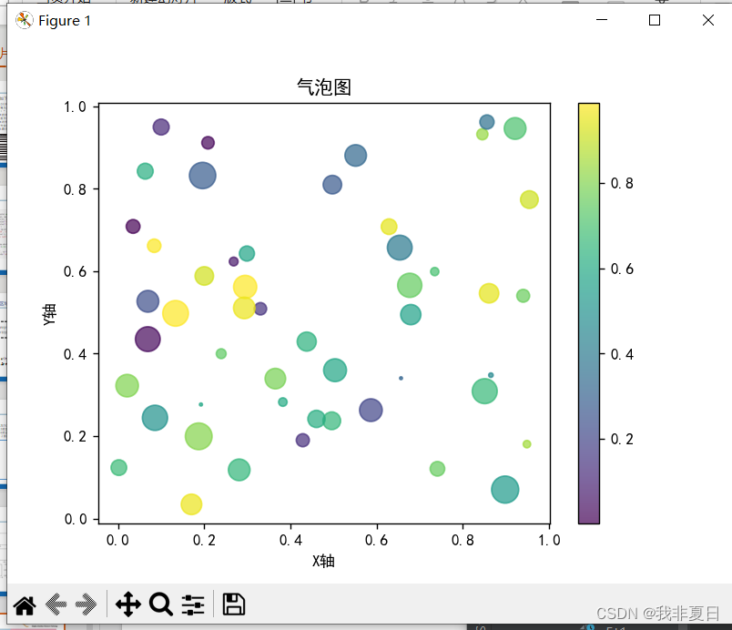
运行结果:

腾讯云面向开发者汇聚海量精品云计算使用和开发经验,营造开放的云计算技术生态圈。
更多推荐
 25
25 0
0- 0


 已为社区贡献5条内容

所有评论(0)