从入门小白到精通,玩转React Native鸿蒙跨平台开发:KeyboardAvoidingView解决手机上弹出的键盘常常会挡住当前的视图
React Native的KeyboardAvoidingView组件解决了移动端键盘遮挡输入框的问题,通过自动调整布局确保内容可见。该组件支持三种行为模式(height/position/padding),需根据平台差异设置不同属性。典型应用场景包括表单页面,需配合ScrollView使用时需注意高度设置和键盘持久化配置。代码示例展示了跨平台适配方案,iOS推荐使用padding模式,Andro
KeyboardAvoidingView
本组件用于解决一个常见的尴尬问题:手机上弹出的键盘常常会挡住当前的视图。本组件可以自动根据键盘的高度,调整自身的 height 或底部的 padding,以避免被遮挡。
KeyboardAvoidingView是React Native中用于解决键盘弹出遮挡输入框问题的容器组件,通过自动调整布局避免内容被遮挡。
核心功能
- 自动调整布局:键盘弹出时,组件会根据behavior属性动态调整自身高度、位置或下边距 。
- 支持多平台:需根据Android和iOS的差异设置behavior值(如iOS用’position’,Android用’height’) 。
核心属性
- behavior(必填):
- ‘height’:调整组件高度 。
- ‘position’:调整组件位置(需配合contentContainerStyle) 。
- ‘padding’:调整下边距 。
- keyboardVerticalOffset:补偿顶部距离(如状态栏高度) 。
- contentContainerStyle:仅当behavior为’position’时生效,用于设置内部容器样式 。
使用示例
<KeyboardAvoidingView
  behavior={Platform.OS === 'ios' ? 'position' : 'height'}
  keyboardVerticalOffset={20}
>
  {/* 子组件(如TextInput) */}
</KeyboardAvoidingView>
注意事项
- 需在render内使用,且需设置固定高度 。
- 与ScrollView搭配时,需设置keyboardShouldPersistTaps为’always’ 。
1、使用组件KeyboardAvoidingView
 <KeyboardAvoidingView style={{height: height}} behavior="padding"
     keyboardVerticalOffset={80}>
</KeyboardAvoidingView>
使用注意:
在render内使用,需要设置高度
keyboardVerticalOffset:
有时候应用离屏幕顶部还有一些距离(比如状态栏等等),利用此属性来补偿修正这段距离。
2.与ScrollView使用
ScrollView标签不要设置高度
render() {
        return (
            <KeyboardAvoidingView style={{height: height}} behavior="padding" keyboardVerticalOffset={80}>
                ...
                <ScrollView
                    // style={{height: height - 180}}
                            keyboardShouldPersistTaps="always"
                            showsVerticalScrollIndicator={false}
                            ref="scrollView">
                    <FlatList
                        data={this.state.renderList}
                        keyExtractor={(item, index) => this._extraUniqueKey(item, index)}
                        renderItem={this._renderDname}
                        numColumns={1}
                        extraData={this.props}
                        ItemSeparatorComponent={() => (<Text style={{height: 8}}/>)}
                    />
                </ScrollView>
                ...
            </KeyboardAvoidingView>
        );
    }
实际案例演示:
KeyboardAvoidingView组件是整个解决方案的核心,它通过动态调整布局来避免虚拟键盘遮挡输入框。其工作原理是监听键盘的显示和隐藏事件,当键盘弹出时,根据设置的behavior属性来调整界面布局。在iOS平台上使用"padding"模式,通过增加底部内边距来为键盘腾出空间;在Android平台上使用"height"模式,直接调整容器高度。这种差异化处理源于两个平台键盘行为的本质区别:iOS键盘是覆盖在应用之上的,而Android键盘会改变应用窗口的可用高度。
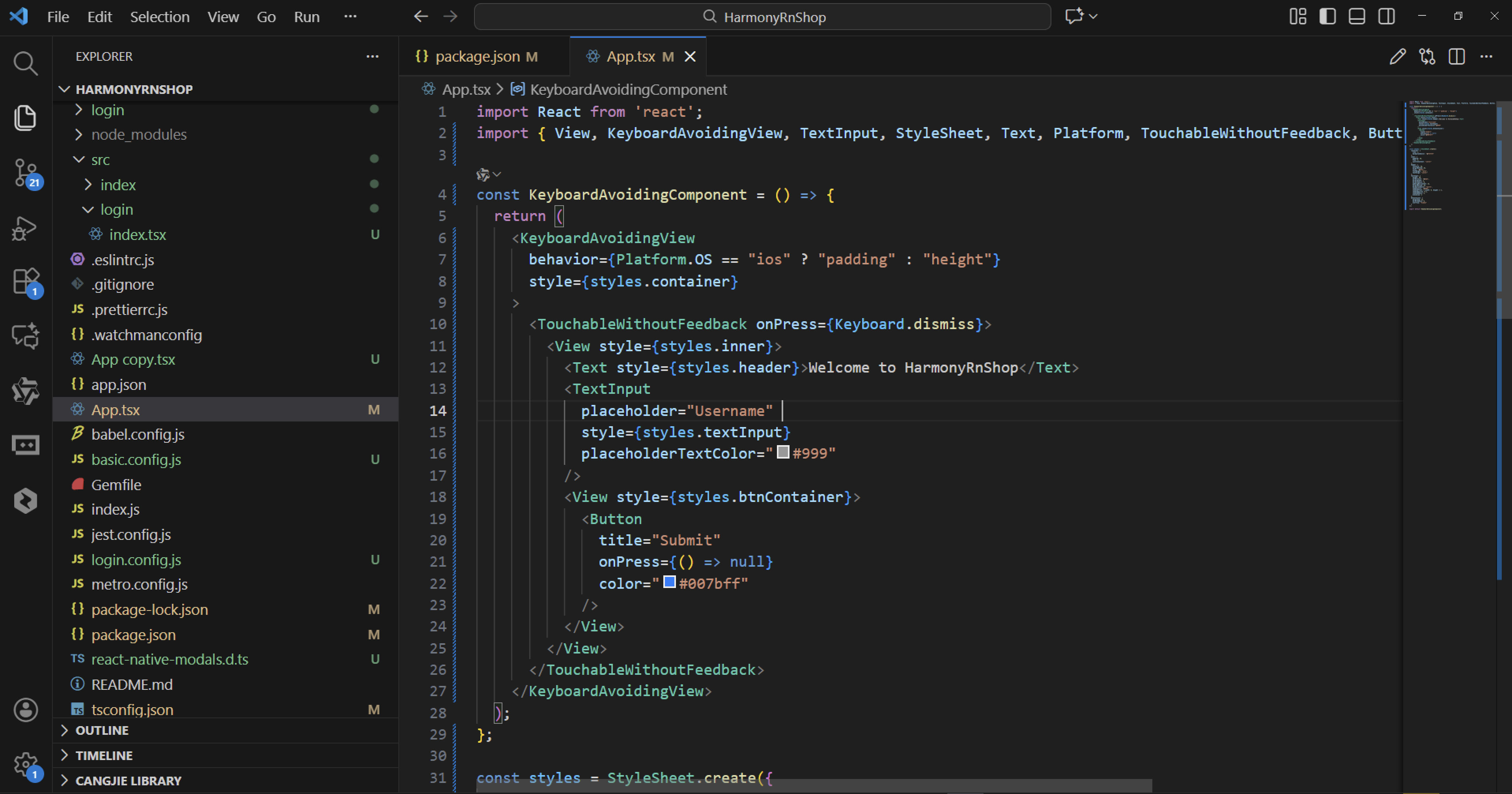
import React from 'react';
import { View, KeyboardAvoidingView, TextInput, StyleSheet, Text, Platform, TouchableWithoutFeedback, Button, Keyboard  } from 'react-native';

const KeyboardAvoidingComponent = () => {
  return (
    <KeyboardAvoidingView
      behavior={Platform.OS == "ios" ? "padding" : "height"}
      style={styles.container}
    >
      <TouchableWithoutFeedback onPress={Keyboard.dismiss}>
        <View style={styles.inner}>
          <Text style={styles.header}>Welcome to HarmonyRnShop</Text>
          <TextInput
            placeholder="Username"
            style={styles.textInput}
            placeholderTextColor="#999"
          />
          <View style={styles.btnContainer}>
            <Button
              title="Submit"
              onPress={() => null}
              color="#007bff"
            />
          </View>
        </View>
      </TouchableWithoutFeedback>
    </KeyboardAvoidingView>
  );
};

const styles = StyleSheet.create({
  container: {
    flex: 1,
    backgroundColor: "#f5f5f5"
  },
  inner: {
    padding: 24,
    flex: 1,
    justifyContent: "center"
  },
  header: {
    fontSize: 28,
    marginBottom: 24,
    color: "#333",
    fontWeight: "bold",
    textAlign: "center"
  },
  textInput: {
    height: 50,
    borderColor: "#ddd",
    borderWidth: 1,
    borderRadius: 8,
    paddingHorizontal: 12,
    marginBottom: 24,
    backgroundColor: "white",
    shadowColor: "#000",
    shadowOffset: { width: 0, height: 2 },
    shadowOpacity: 0.1,
    shadowRadius: 4,
    elevation: 2
  },
  btnContainer: {
    marginTop: 12,
    borderRadius: 8,
    overflow: "hidden"
  }
});

export default KeyboardAvoidingComponent;
TouchableWithoutFeedback组件与Keyboard.dismiss的组合实现了一个重要的交互细节:当用户点击非输入区域时,通过调用Keyboard.dismiss方法主动收起键盘,这符合移动端用户的操作习惯。其背后的原理是利用了React Native的事件系统,将触摸事件与键盘控制进行关联。
TextInput组件的样式设计体现了现代UI设计理念,包括圆角边框、阴影效果和精心设计的间距。placeholderTextColor属性的使用确保了占位符文本在不同背景下的可读性。按钮容器通过overflow: "hidden"属性确保按钮的圆角效果不会被子元素破坏。
整个布局系统基于flexbox模型,container使用flex: 1占满全屏,inner容器通过justifyContent: "center"实现内容的垂直居中。这种布局方式能够适应不同尺寸的移动设备屏幕。
样式系统的实现通过StyleSheet.create方法,这不仅提供了类型安全检查,还能优化渲染性能。React Native的样式系统在底层会将这些样式属性转换为对应平台的原生样式,iOS转换为NSLayoutConstraint和UIView属性,Android转换为ConstraintLayout和View属性。
这段React Native代码展示了一个处理键盘遮挡问题的典型解决方案。代码通过KeyboardAvoidingView组件来确保当虚拟键盘弹出时,输入框不会被遮挡,这在移动应用开发中是一个常见的用户体验优化点。
KeyboardAvoidingView的behavior属性根据平台进行差异化设置,iOS使用padding模式而Android使用height模式,体现了React Native的跨平台适配能力。TouchableWithoutFeedback配合Keyboard.dismiss实现了点击空白区域收起键盘的交互逻辑。
样式设计方面,采用了现代化的UI元素,包括圆角边框、阴影效果和精心设计的间距。输入框具有清晰的视觉反馈,按钮容器通过overflow: "hidden"确保按钮样式不会超出圆角边界。
代码结构清晰,将样式定义与组件逻辑分离,遵循了React Native的最佳实践。这种键盘避免模式在实际应用中非常实用,能够显著提升表单填写体验。
打包
接下来通过打包命令npn run harmony将reactNative的代码打包成为bundle,这样可以进行在开源鸿蒙OpenHarmony中进行使用。
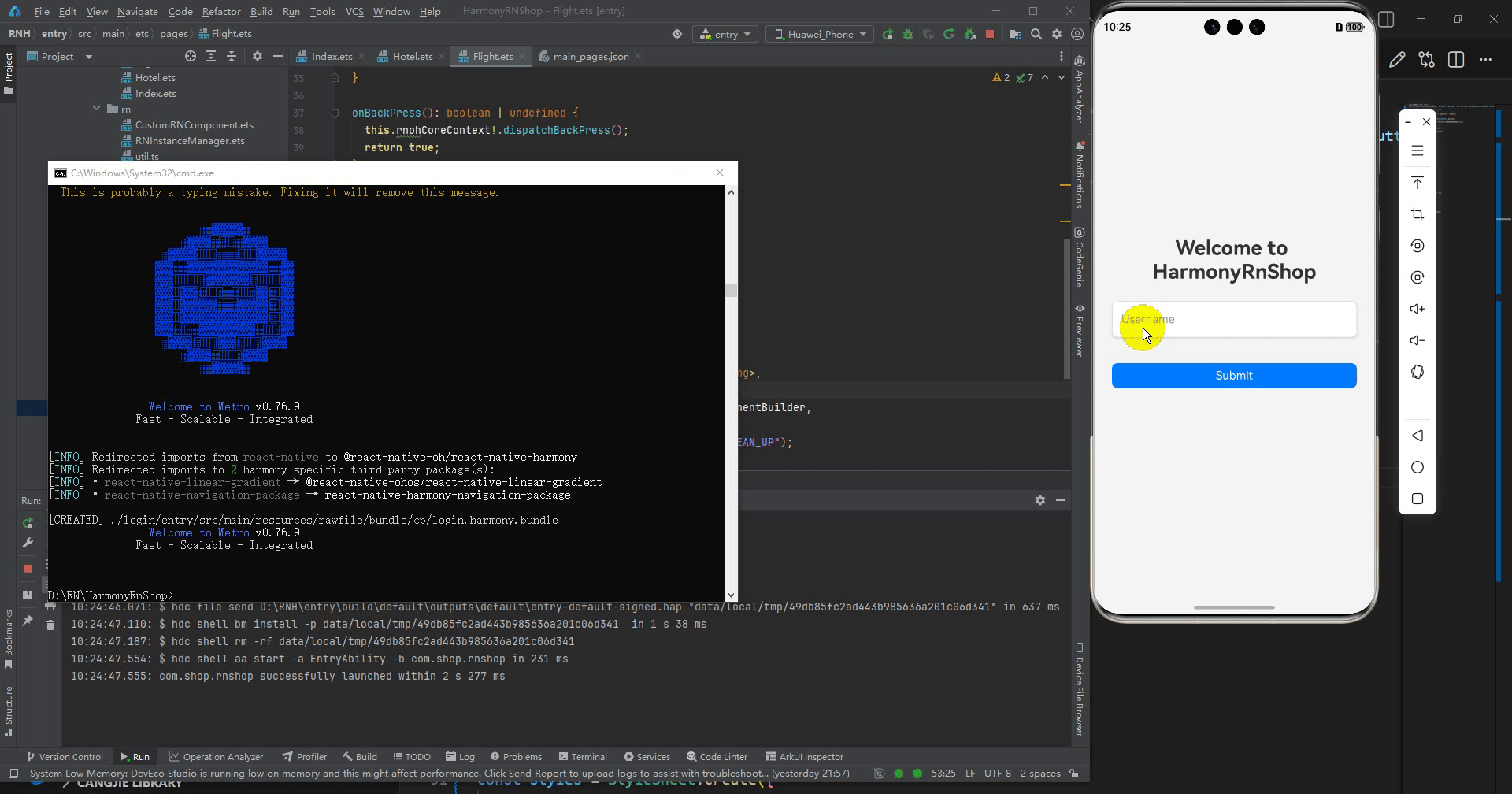
最后运行效果图如下显示:
欢迎大家加入开源鸿蒙跨平台开发者社区,一起共建开源鸿蒙跨平台生态。

腾讯云面向开发者汇聚海量精品云计算使用和开发经验,营造开放的云计算技术生态圈。
更多推荐
 3
3 0
0- 0


 已为社区贡献3条内容

所有评论(0)