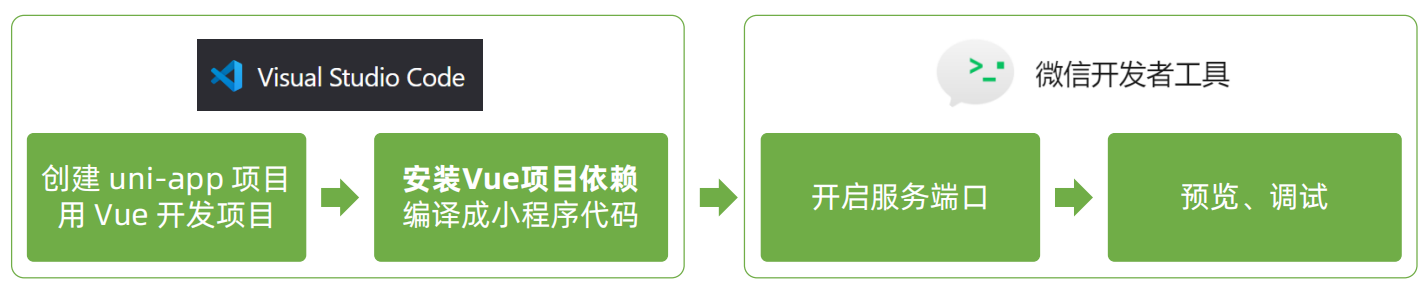
微信小程序六 使用vscode开发uniapp
vscode开发uni-app项目、uni-ui组件库
一 VS Code 开发 uni-app 项目准备
1.1 为什么选择 VS Code ?
- HbuilderX 对 TS (TypeScript)类型支持暂不完善
- VS Code 对 TS 类型支持友好,熟悉的编辑器
tips:TypeScript 是 JavaScript 的超集,它在 JavaScript 的基础上添加了强类型、接口、类、泛型等特性,并提供了静态类型检查等工具,让开发者能够在编写代码时更加安全、高效、可靠。与 JavaScript 相比,TypeScript 具有更强的类型系统、更严格的类型检查、更好的代码可读性和维护性等优点。此外,TypeScript 的社区活跃度也非常高,它被越来越多的开发者和公司所采用。
1.2 安装VS Code插件
安装三个uni-app相关插件
uni-app插件作用:
- 快速创建页面或组件
- 代码提示
- 鼠标悬停查文档
使用vscode打开我们上一章节创建好的项目
uni-create-view插件
先安装第一个插件uni-create-view,该插件可以快速创建 uniapp 视图与组件!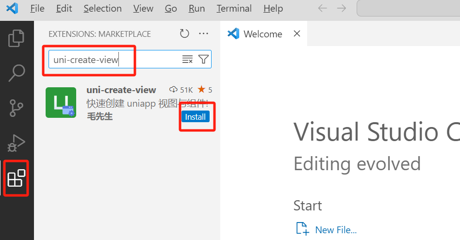
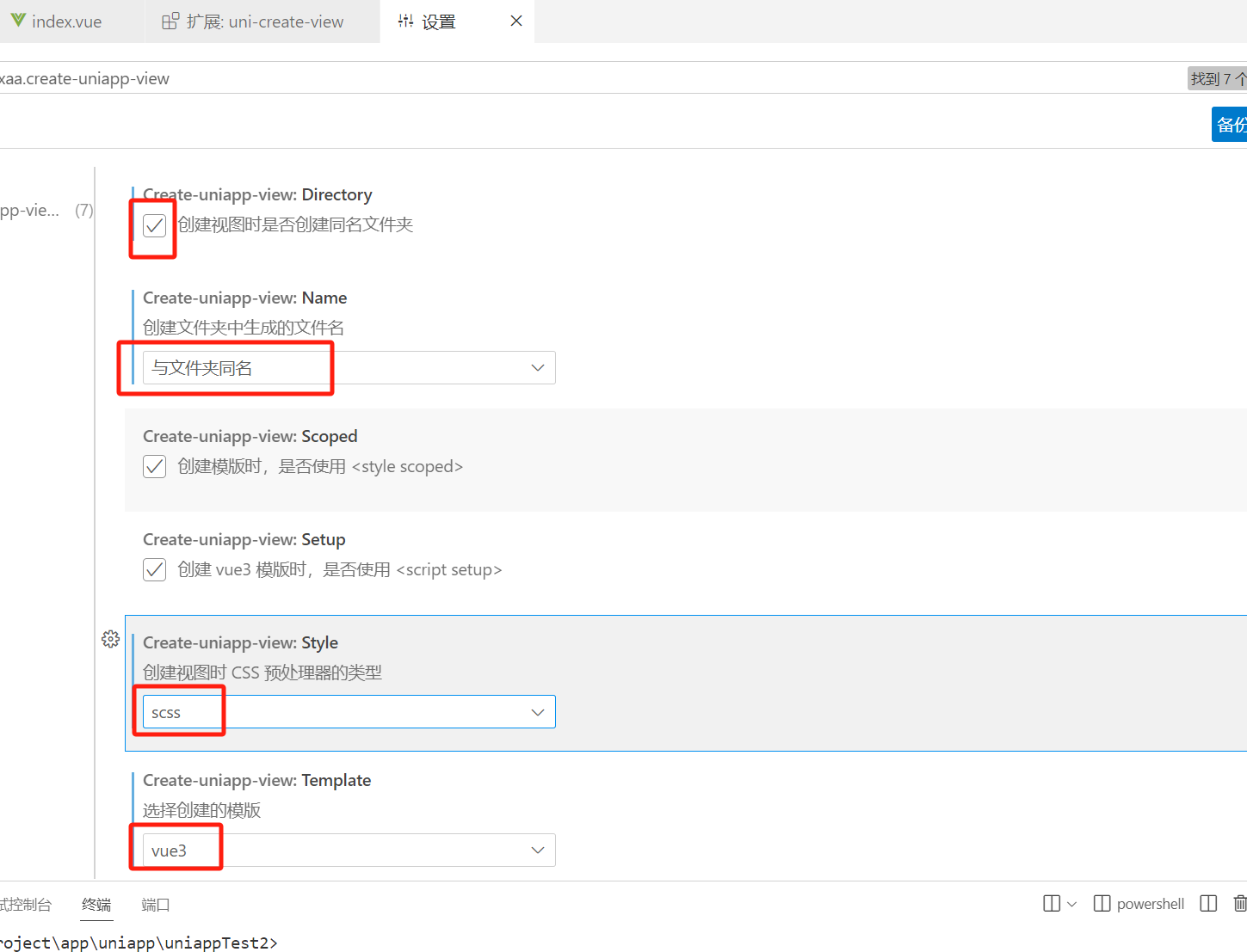
安装后需要进行设置
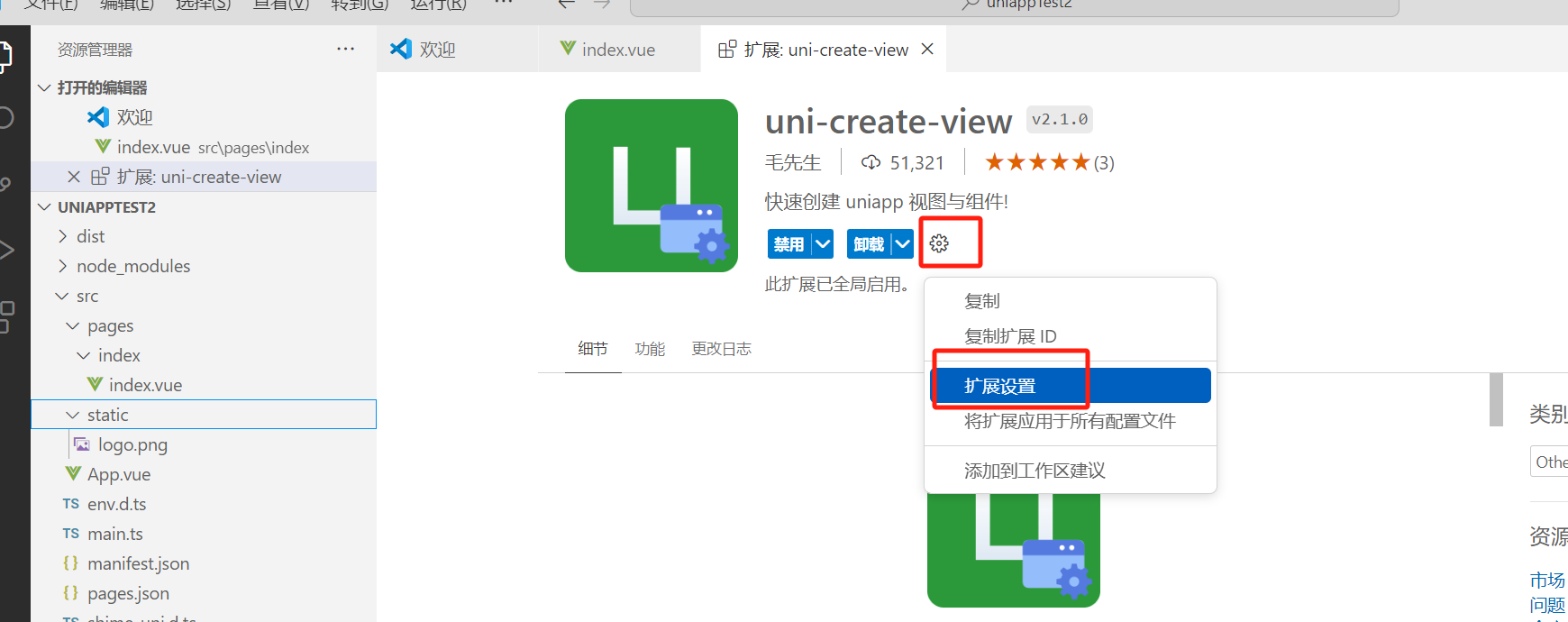
按照下边的进行选择
可以看到,多出来很多功能
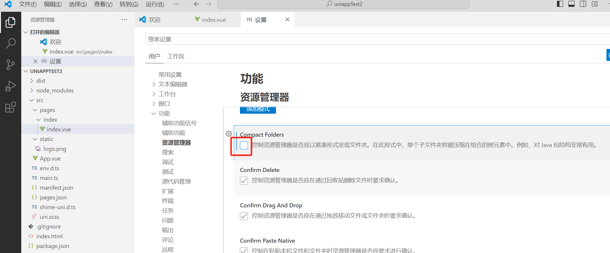
先对vscode进行一下设置
取消勾选
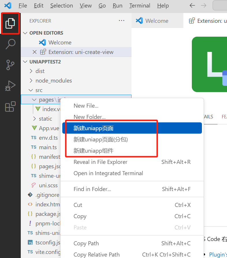
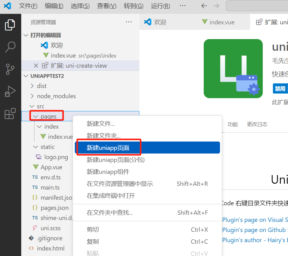
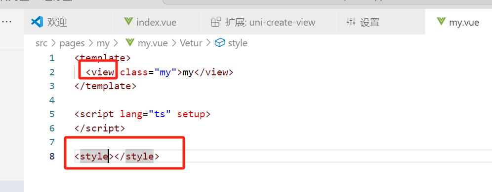
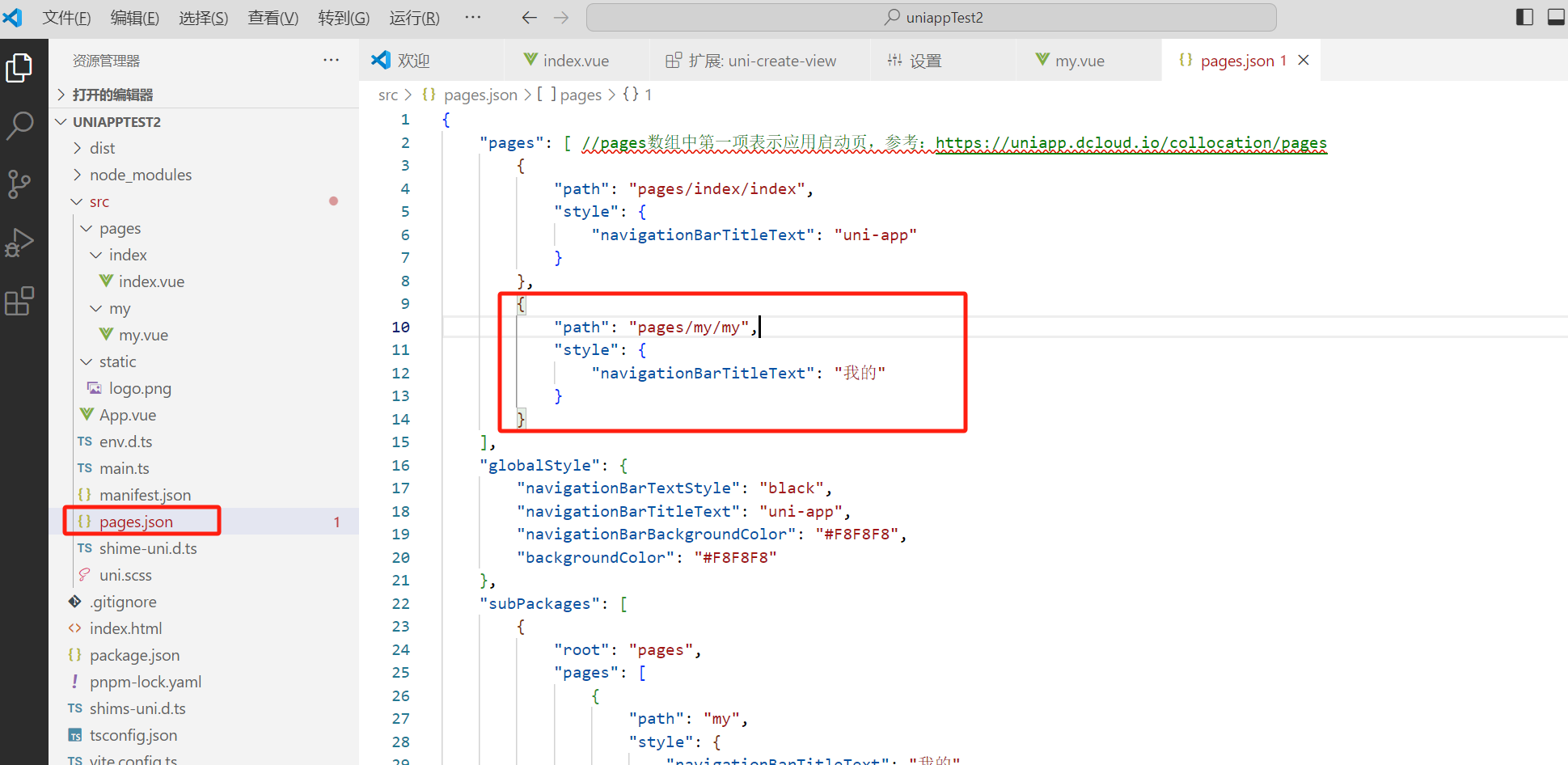
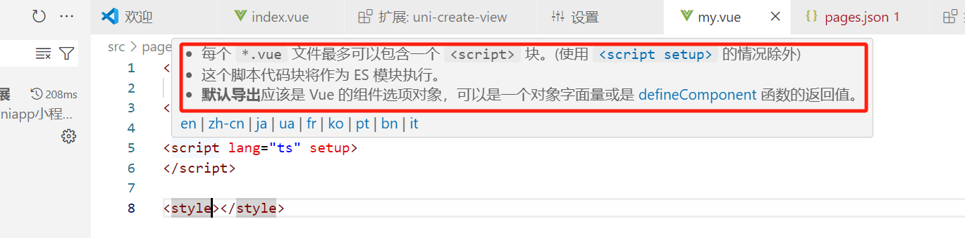
此时,在page文件夹上右键,选择新建uniapp页面
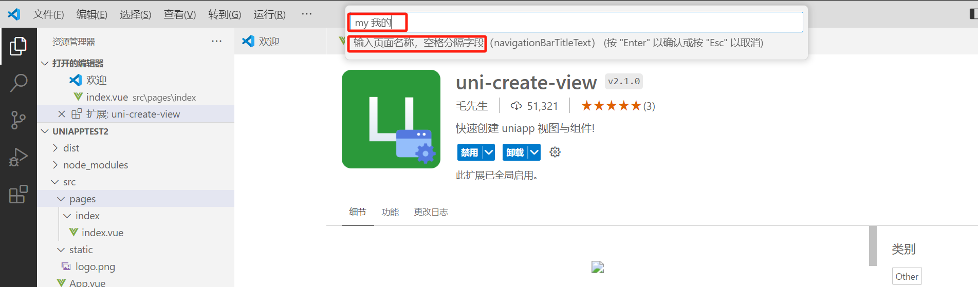
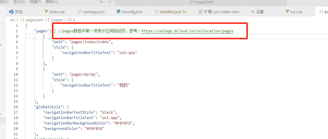
输入框里,前边是页面名称,后边空格,空格后是导航标题。我们输入my 我的,回车
看效果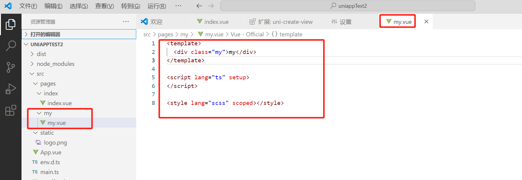
因为我们开发的是小程序,所以我们把div改为view
可以看到,已经自动注册了页面的路由
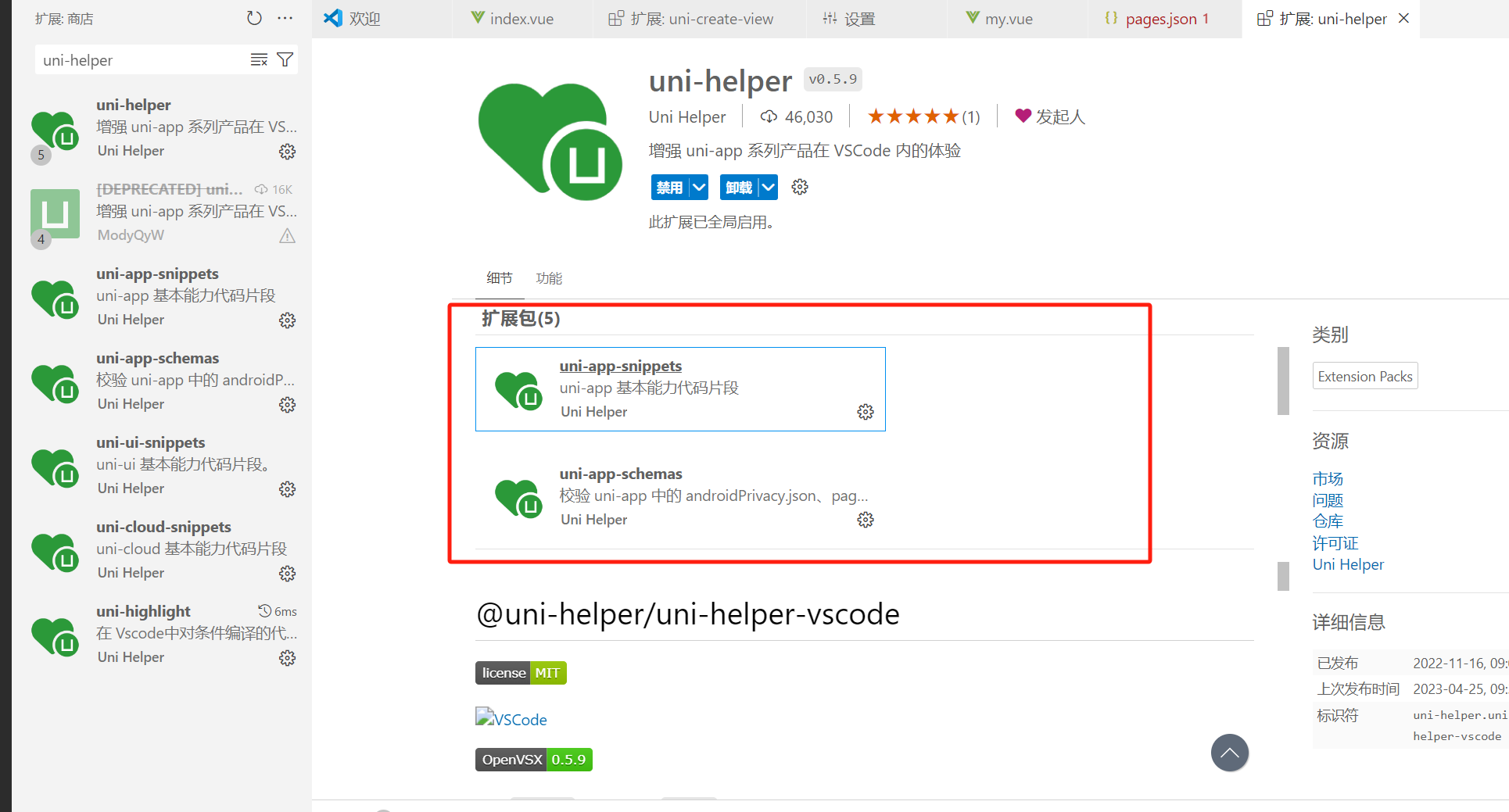
uni-helper插件
主要用来代码提示、代码校验等
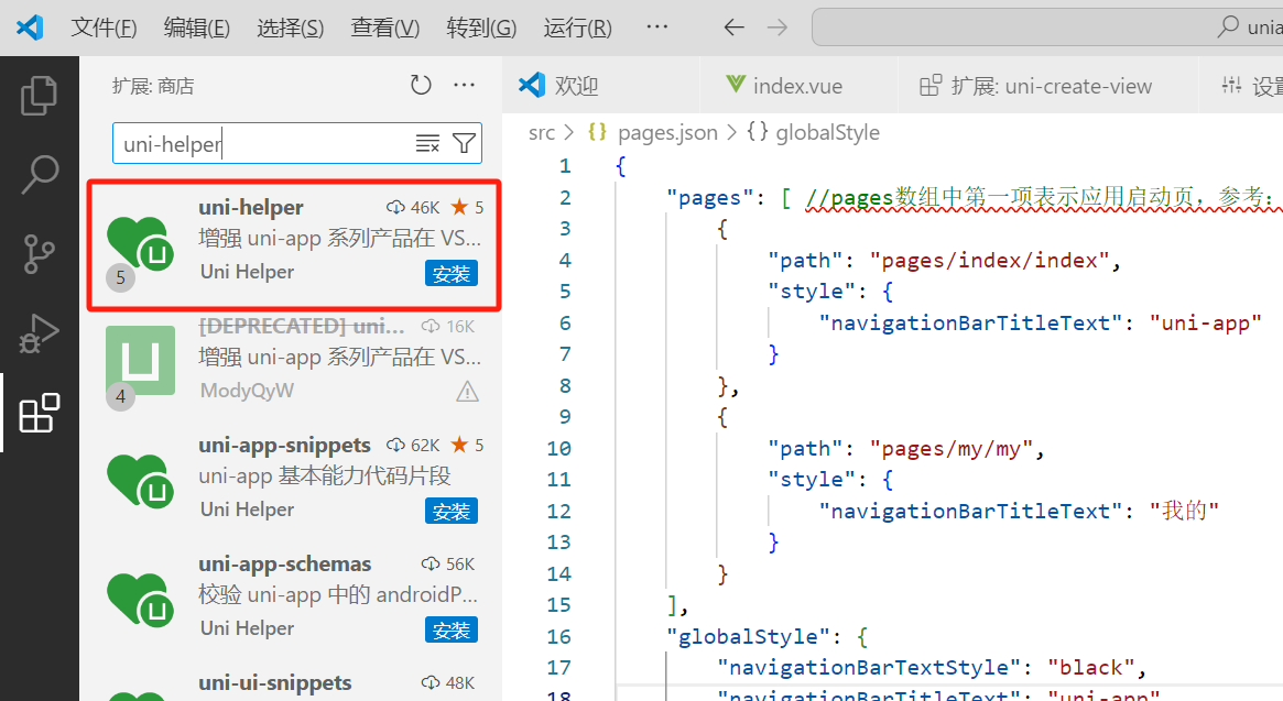
安装后,发现,其实是相当于安装了五个扩展包,各有各的作用
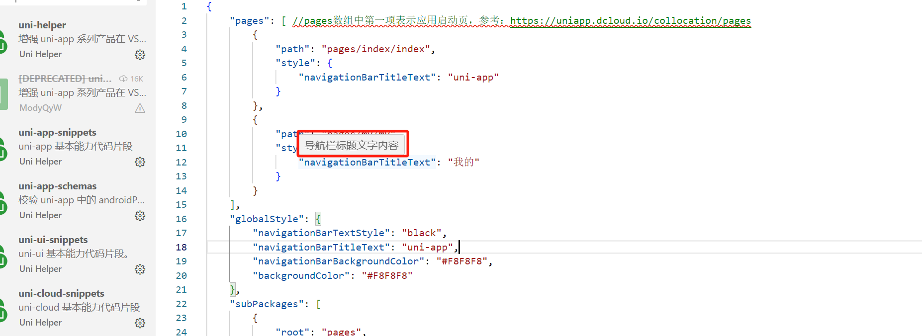
安装后,鼠标悬停在代码上时是有提示的
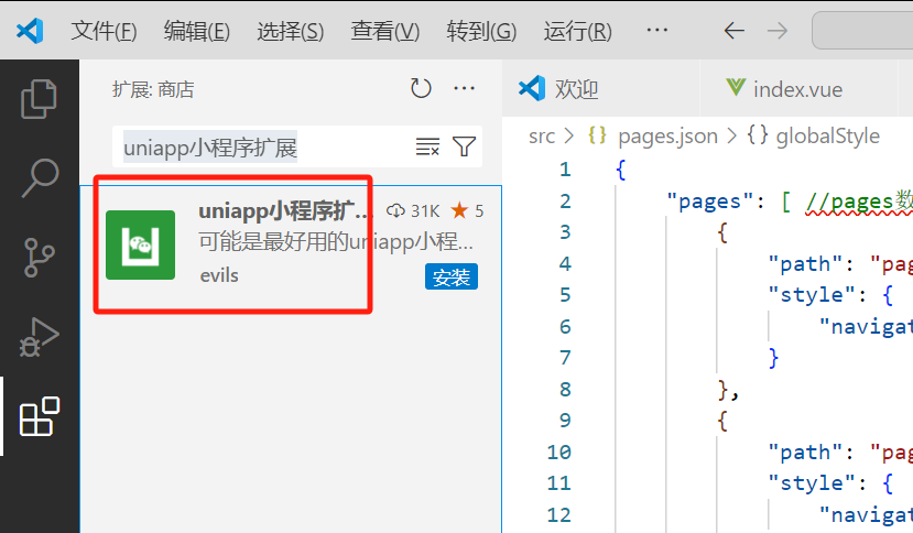
uniapp小程序扩展插件
用来完善文档提示功能
安装后,鼠标悬停在代码块上后,会有文档提示
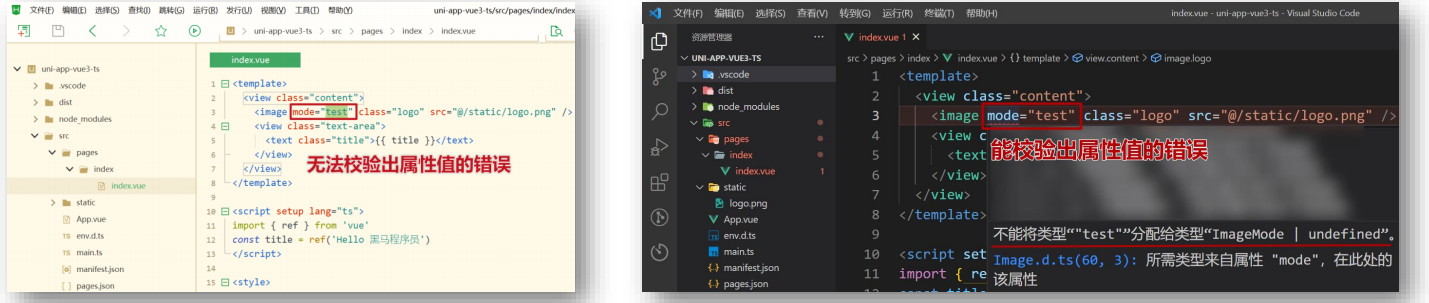
1.3 ts类型校验
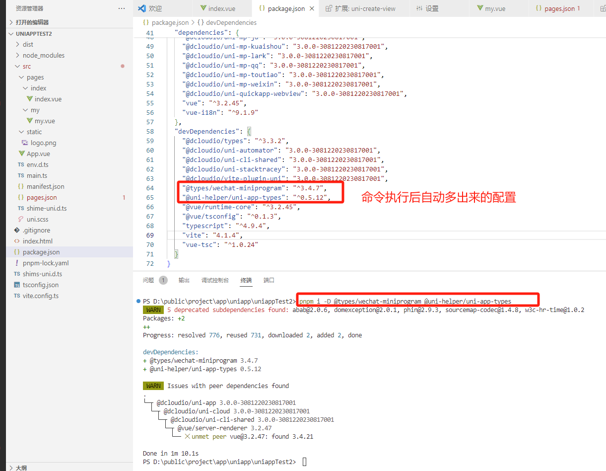
安装类型声明文件
pnpm i -D @types/wechat-miniprogram @uni-helper/uni-app-types
配置tsconfig.json
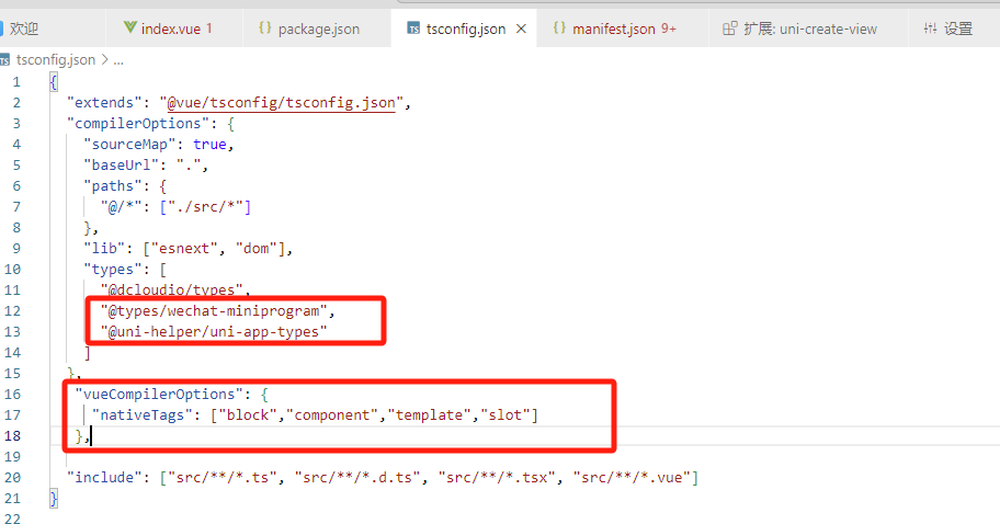
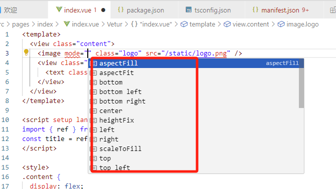
此时,代码里类型不对的话就会有提示了
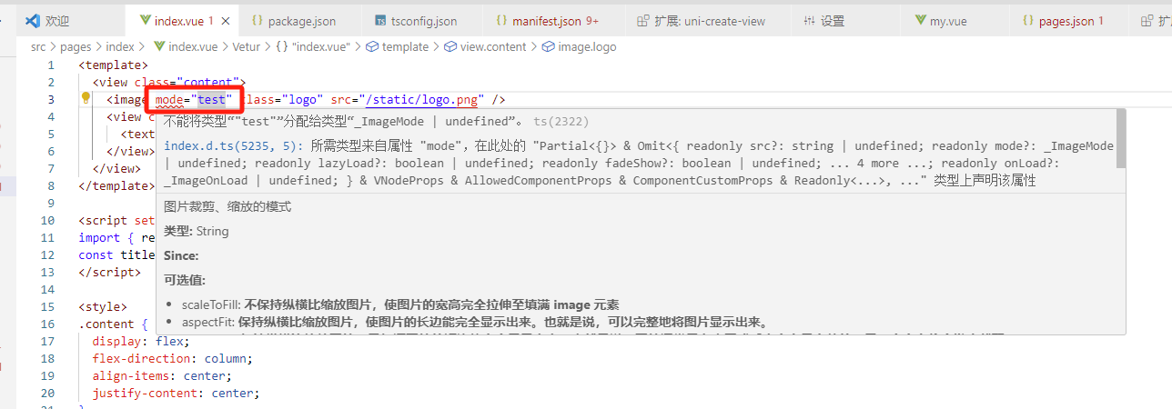
cscode里使用代码提示快捷键ctrl+i,查看这里有哪些值可以写
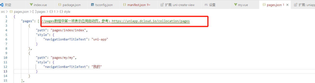
1.4 json注释问题
我们看到package.json里的注释一直报错,因为vscode是严格检查json格式的,只要不是json格式就报错
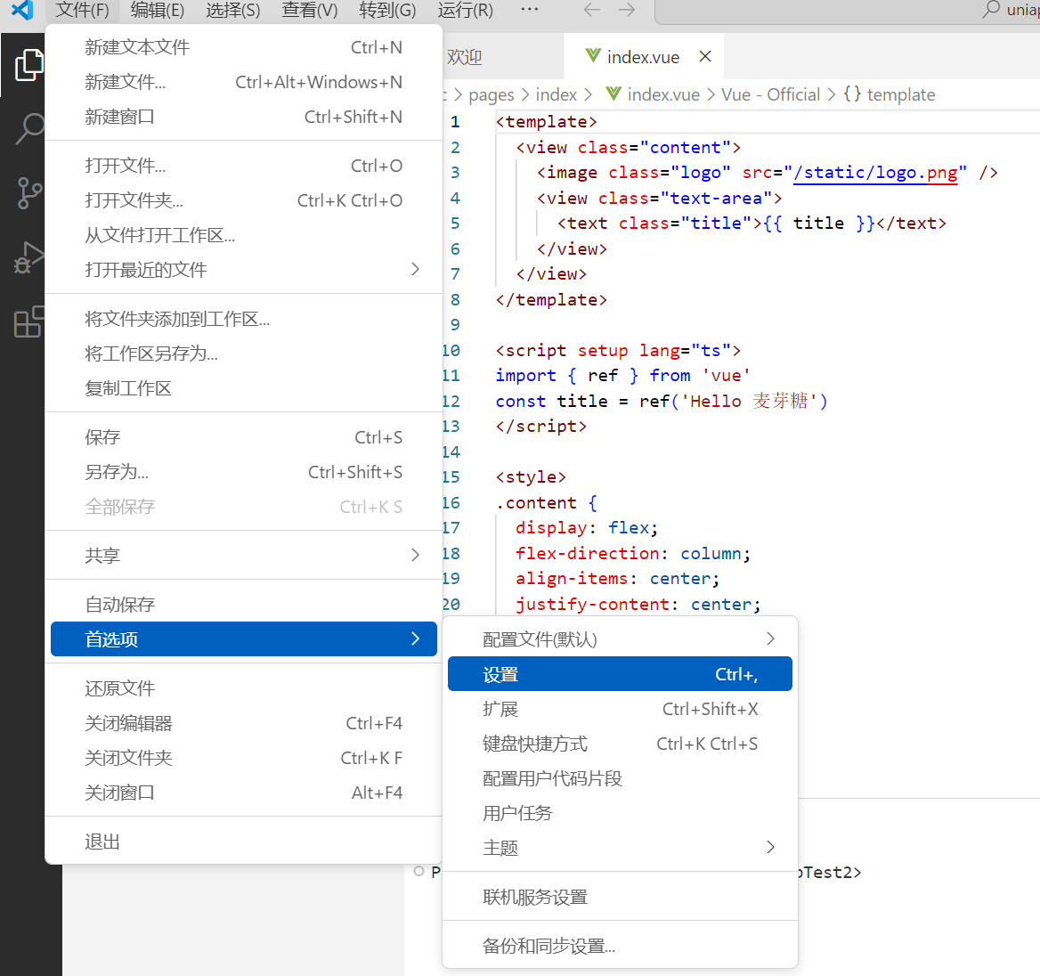
解决:打开设置
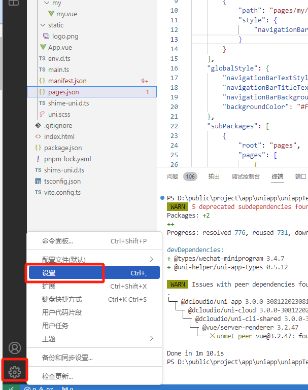
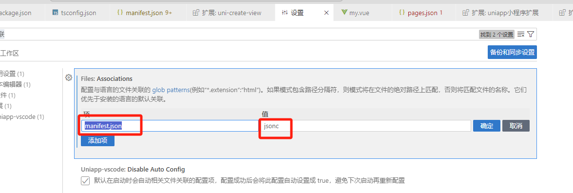
搜索“文件关联”,点击“添加项”
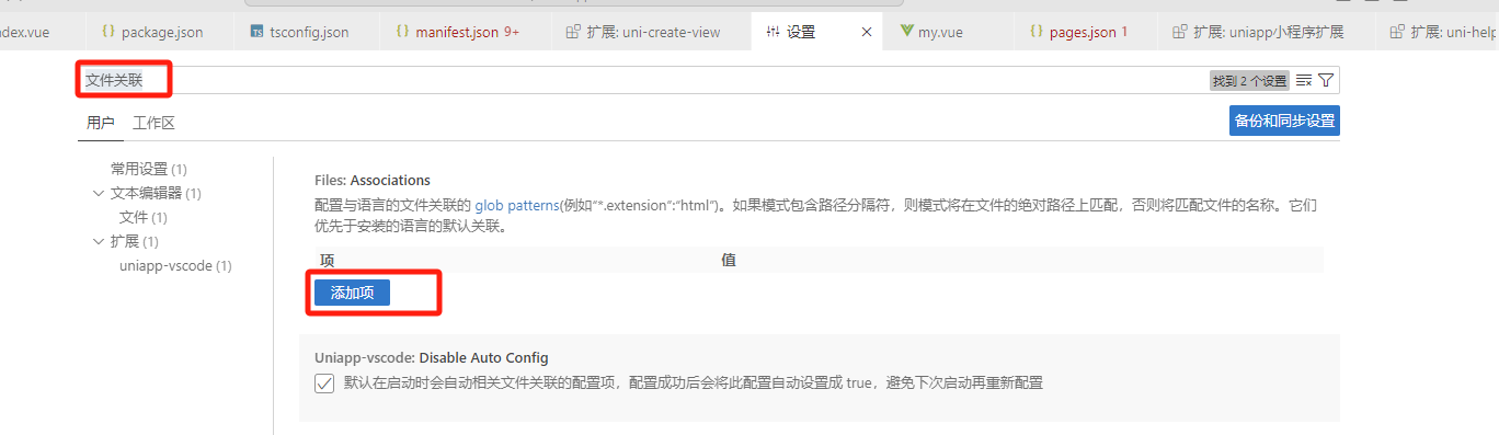
前边写文件名,后边写jsonc(jsonc代表json文件可以加注释)
然后,继续点击“添加项”
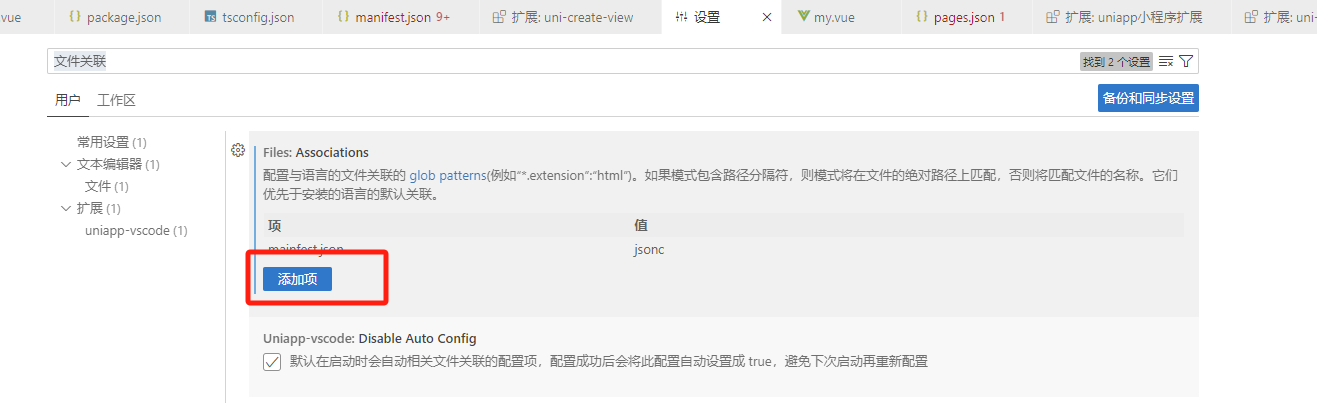
同样,把pages.json也设置为jsonc即可
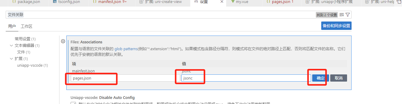
发现,注释已经不报错了
注意:uniapp里,只有manifest.json和pages.json这俩文件可以写注释,其他json文件不可以写注释。
二 开发uniapp项目
2.1 配置项目基础信息
下载项目基础模板代码:
链接:https://pan.baidu.com/s/1mEejGXG5yBQ4CSvfNVf9Vw
提取码:jmf8
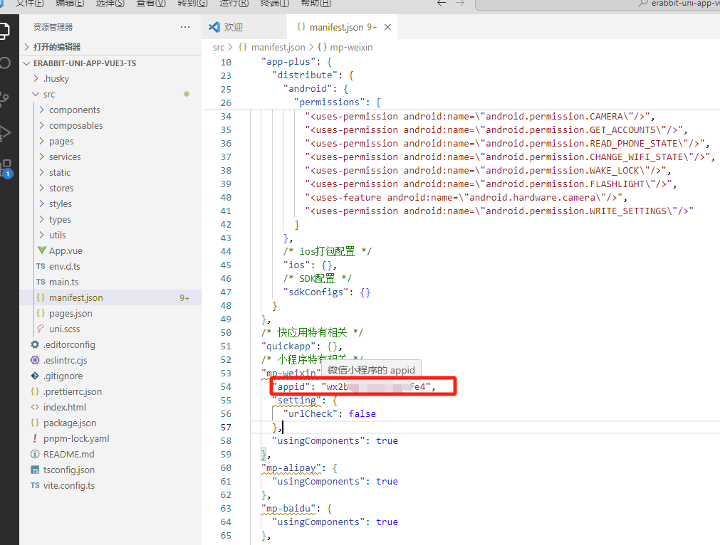
注意:
- 在 manifest.json 中添加微信小程序的 appid
- 执行先关命令安装依赖、编译为小程序项目
pnpm install 与 pnpm dev:mp-weixin - 导入微信开发者工具里
添加appid
在manifest.json添加微信小程序appid时要注意,文件里最上边有一个appid,不是这个
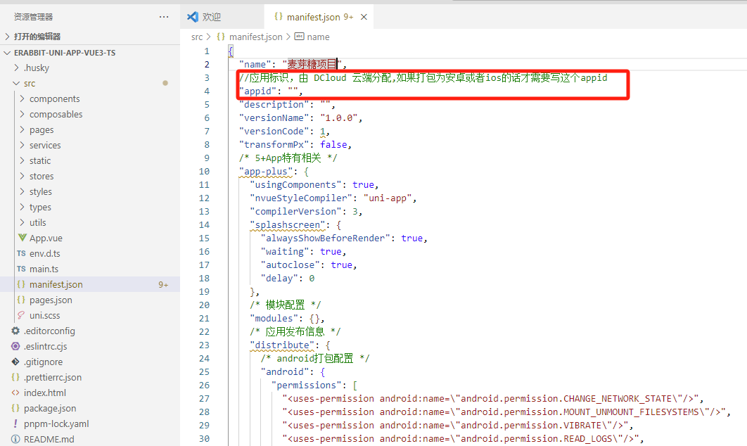
而是下边这里,是我们要写的自己的微信小程序appid
安装依赖
执行pnpm install
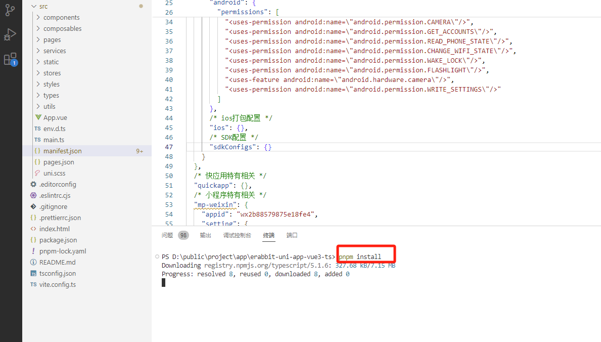
编译为微信小程序pnpm dev:mp-weixin,编译后,在项目目录里看到编译后的dist文件夹
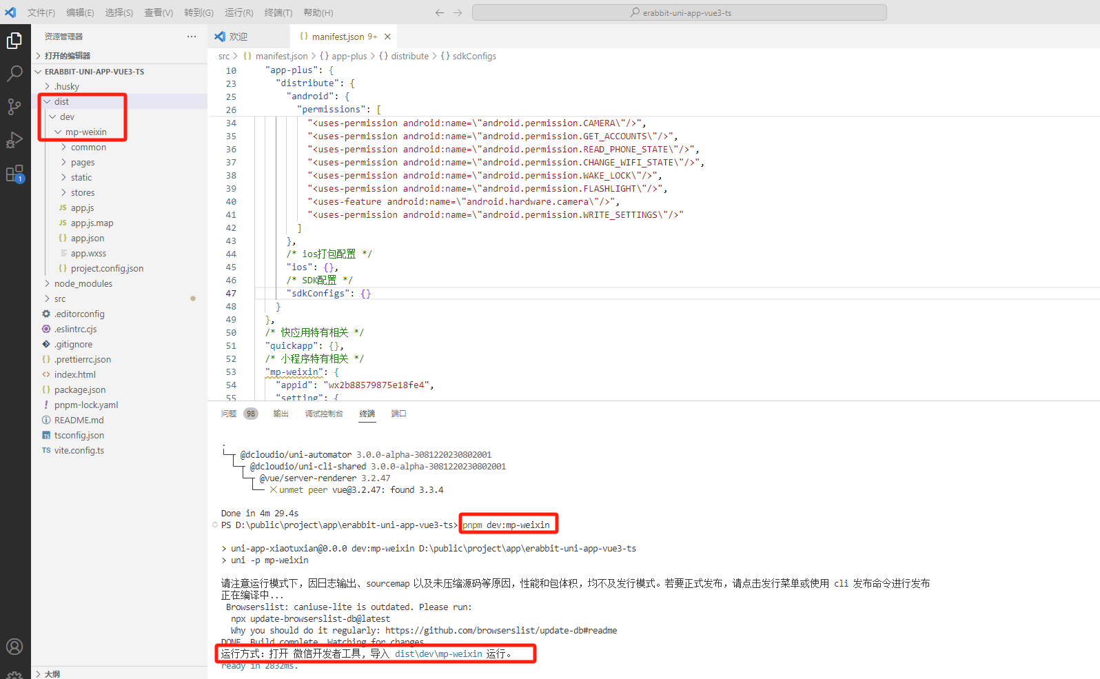
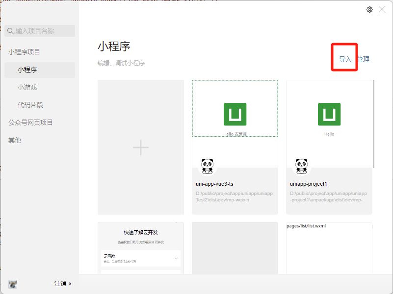
导入微信开发者工具看实时效果
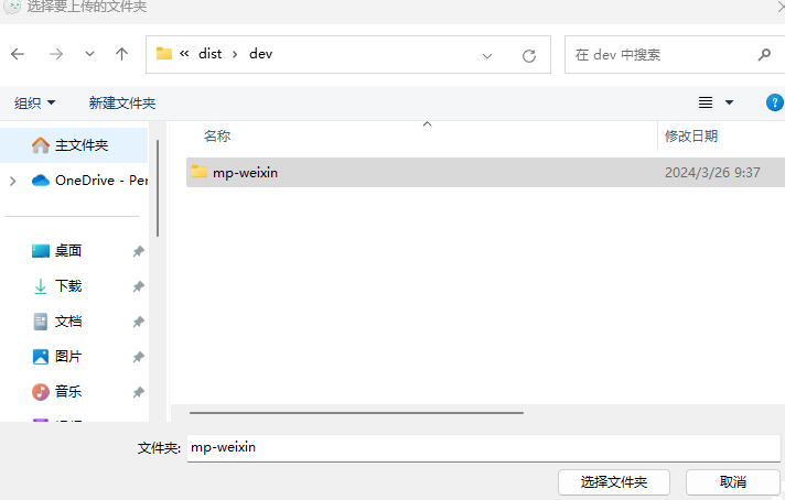
选择dist/dev/mp-weixin文件夹
修改项目名,选择不使用云开发
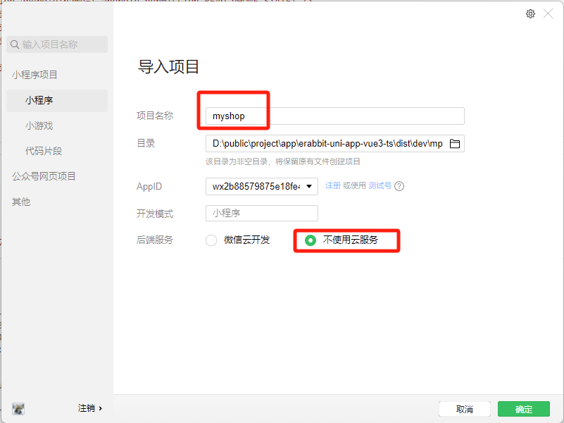
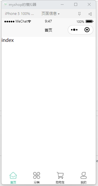
效果如下
项目总共有三大块,分别是构建界面、状态管理、数据交互
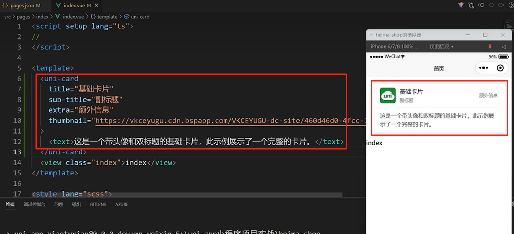
2.2 使用 uni-ui 组件库
2.2.1 构建界面
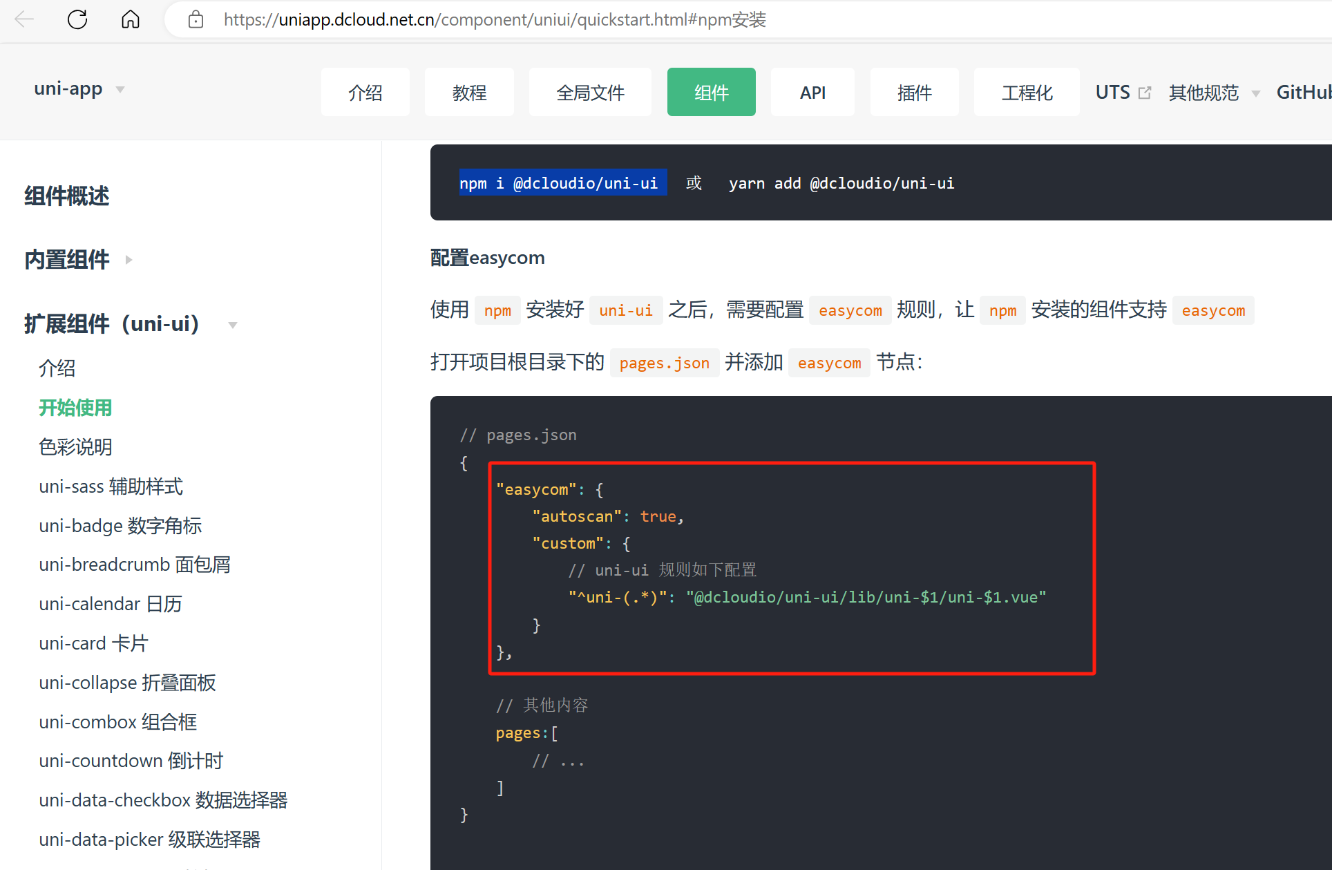
安装uni-ui
官网:https://uniapp.dcloud.net.cn/component/uniui/quickstart.html#npm%E5%AE%89%E8%A3%85
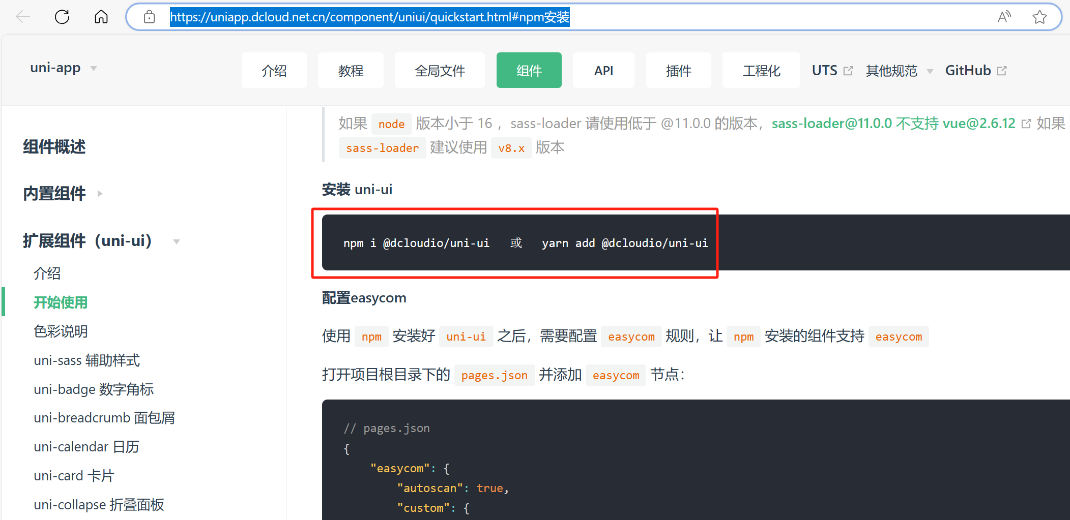
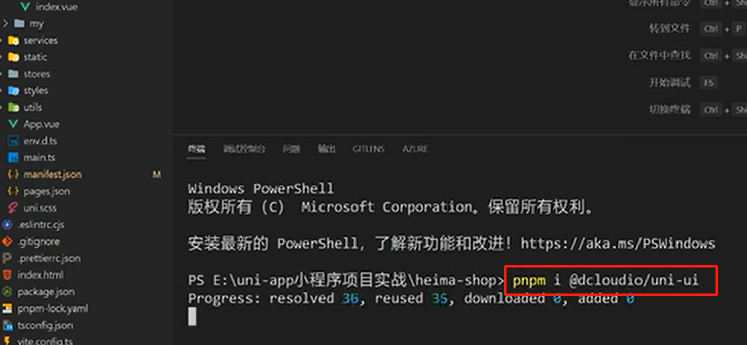
由于项目里使用pnpm,所以把上边命令的npm改为pnpm
pnpm i @dcloudio/uni-ui
组件自动引入
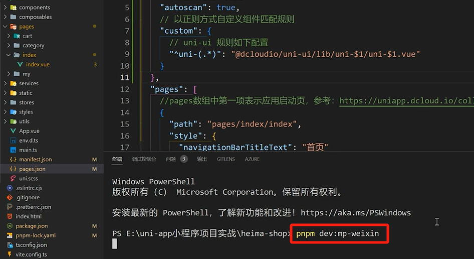
在pages.json里配置如下内容
如下
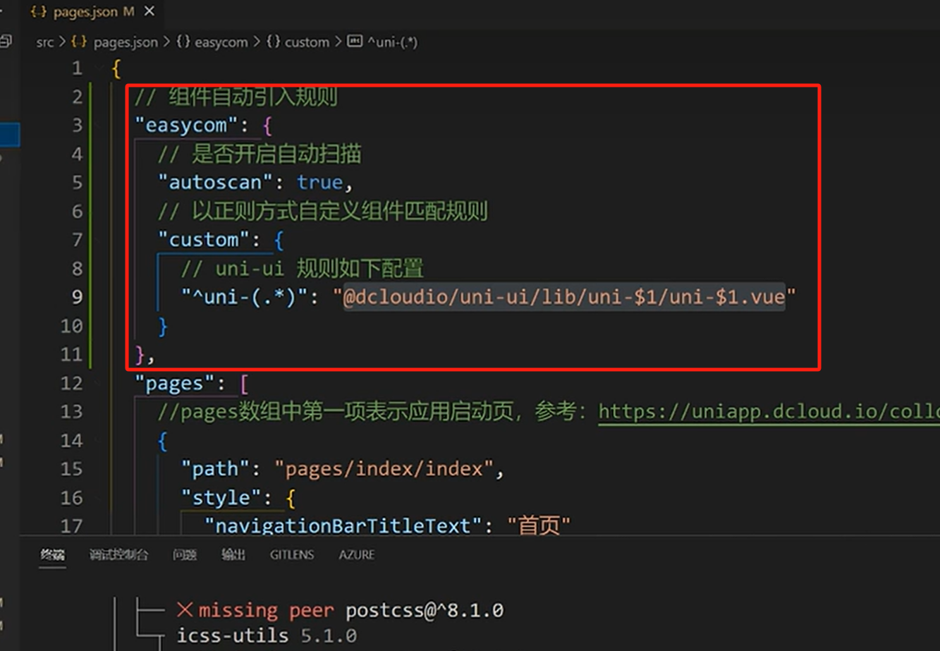
配置好后,需要重启服务
我们在官网选一个组件,看看能否自动导入
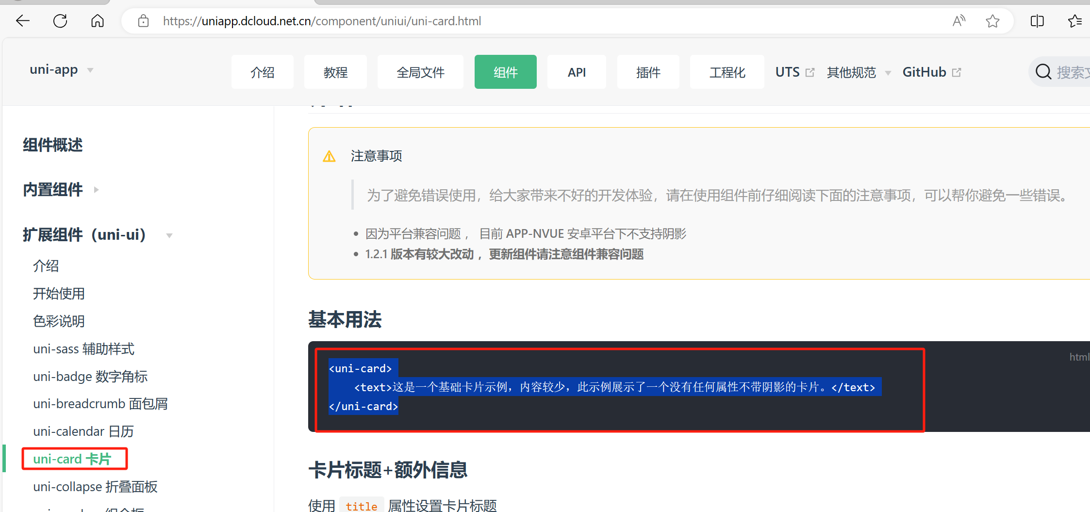
在项目里粘贴进来,可以看到已经自动导入了相关依赖可以使用该组件了
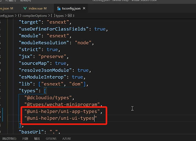
配置ts类型
安装依赖
pnpm i -D @uni-helper/uni-ui-types
在 tsconfig.json里进行如下配置
{
	"compilerOptions": {
		"types": [
			"@dcloudio/types",
			"@types/wechat-miniprogram",
			"@uni-helper/uni-app-types",
			 "@uni-helper/uni-ui-types"
		]
	},
}
2.2.2 状态管理
小程序端 Pinia 持久化
官网:https://prazdevs.github.io/pinia-plugin-persistedstate/guide/config.html#storage
之前网页端持久化,我们使用的api是
- localStorage.setItem()
- localStorage.getItem()
兼容多端的api
- uni.setStorageSync()
- uni.getStorageSync()
使用方式
src/store/index.ts
import { createPinia } from 'pinia'
import persist from 'pinia-plugin-persistedstate'

// 创建 pinia 实例
const pinia = createPinia()
// 使用持久化存储插件
pinia.use(persist)

// 默认导出,给 main.ts 使用
export default pinia

// 模块统一导出
export * from './modules/member'
src/main.ts
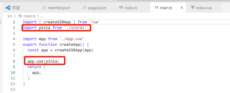
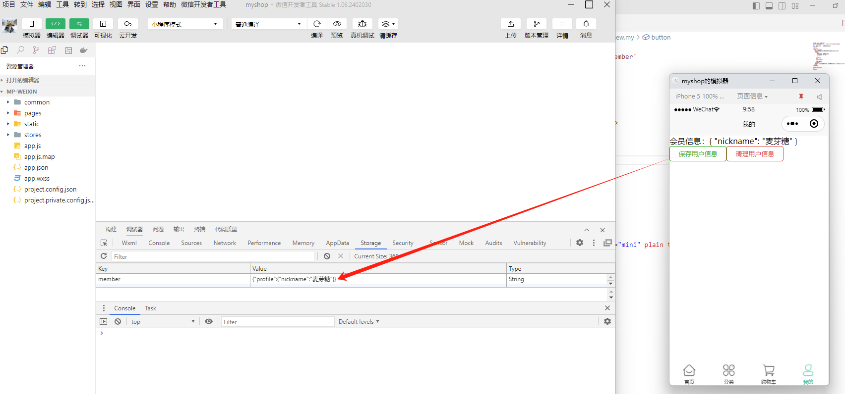
在src/store/modules/member.ts(会员信息)里使用pania对数据进行持久化
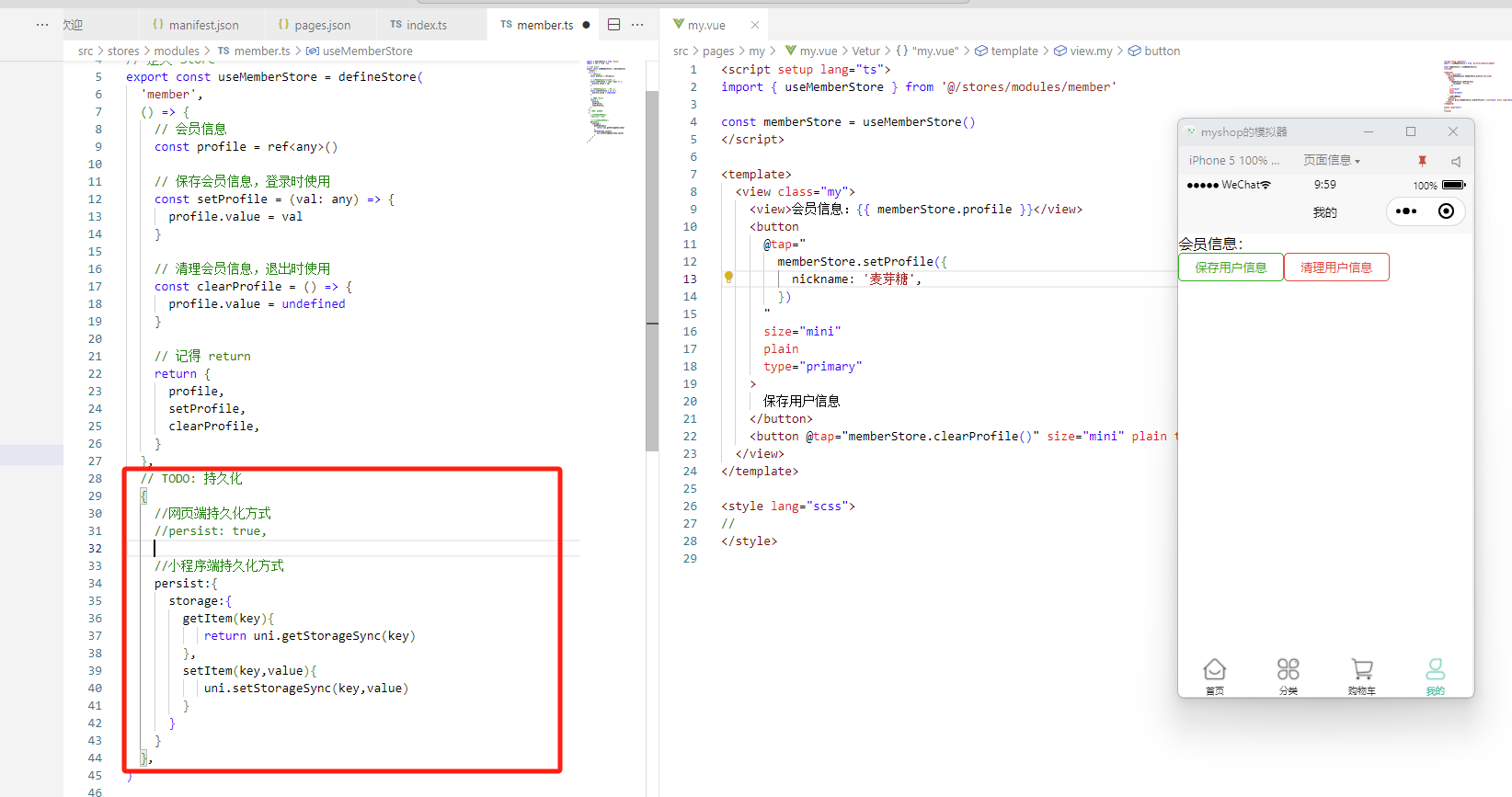
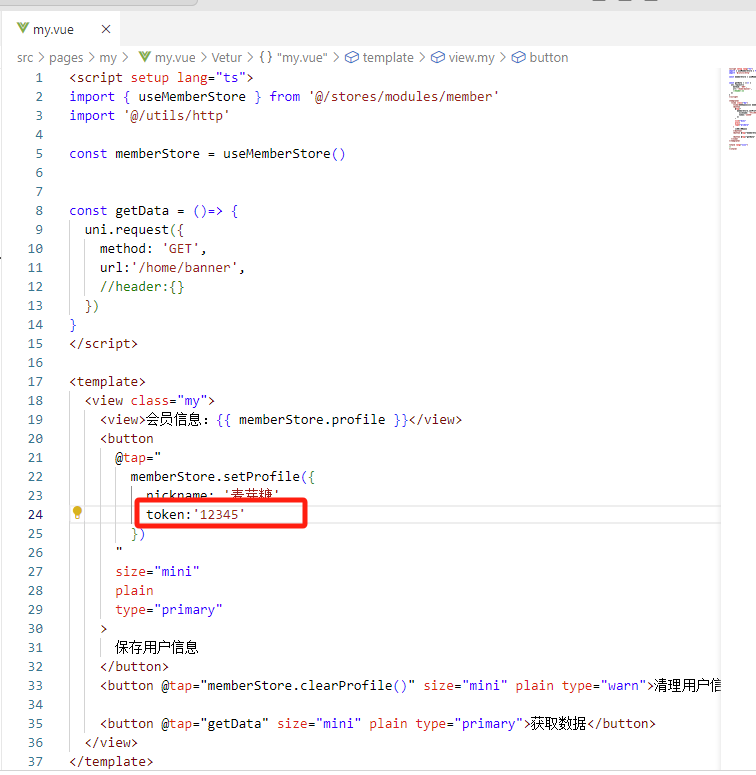
点击“保存用户信息”,可以看到storage里存进了用户信息
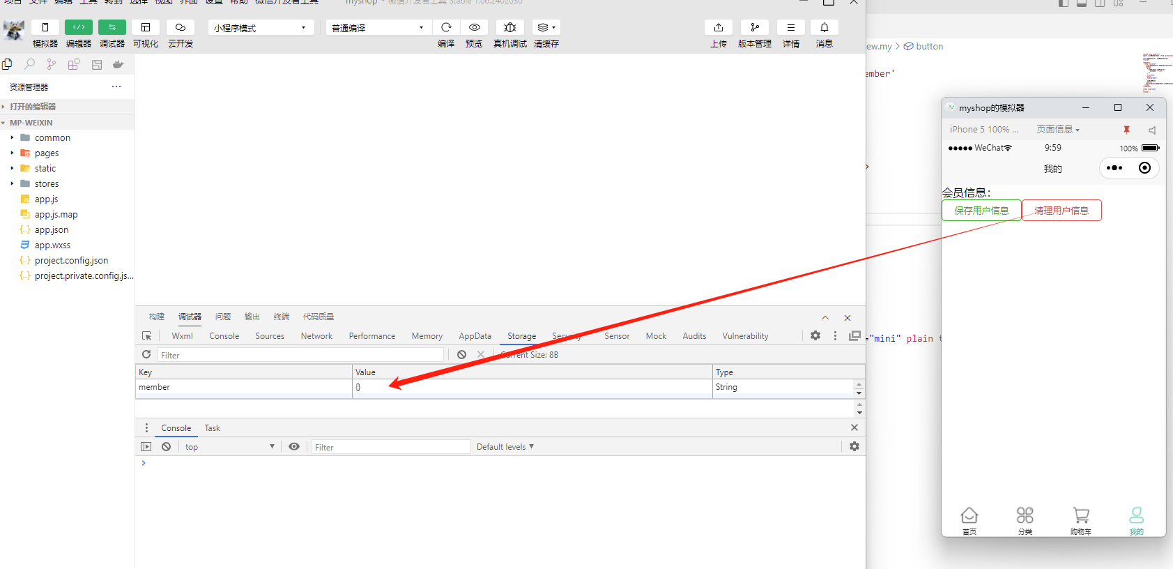
点击“清理用户信息”
2.2.3 数据交互
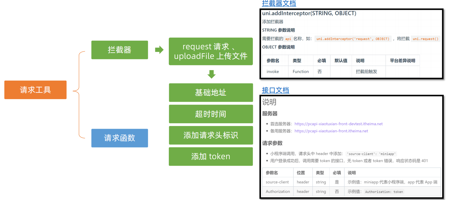
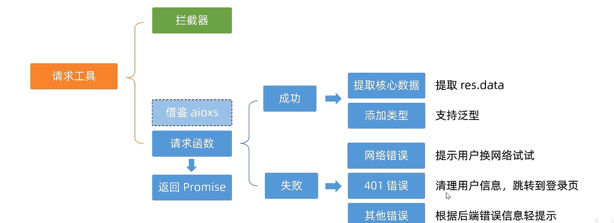
这里讲解请求工具的封装,分为拦截器封装和请求函数的封装
拦截器封装
其中
- 拦截器文档:https://uniapp.dcloud.net.cn/api/interceptor.html#addinterceptor
- 接口文档:https://apifox.com/apidoc/shared-0e6ee326-d646-41bd-9214-29dbf47648fa/doc-1521513
我们在项目里添加拦截器,打开src/utils/http.ts文件
// 添加拦截器:
//     拦截 request 请求
//     拦截 uploadFile 文件上传


//TODO:
//1.非 http 开头需拼接地址
//2.请求超时
//3.添加小程序端请求头标识
//4.添加 token 请求头标识

const baseURL = 'https://pcapi-xiaotuxian-front-devtest.itheima.net'

// 添加拦截器
const httpInterceptor = {
  // 拦截前触发
  invoke(options: UniApp.RequestOptions) {
    // 1. 非 http 开头需拼接地址
    if (!options.url.startsWith('http')) {
      options.url = baseURL + options.url

    }
    // 2. 请求超时, 默认 60s
    options.timeout = 10000
    console.log(options)

  },
}
uni.addInterceptor('request', httpInterceptor)
uni.addInterceptor('uploadFile', httpInterceptor)
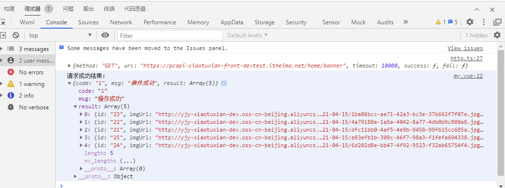
在页面添加按钮以及函数
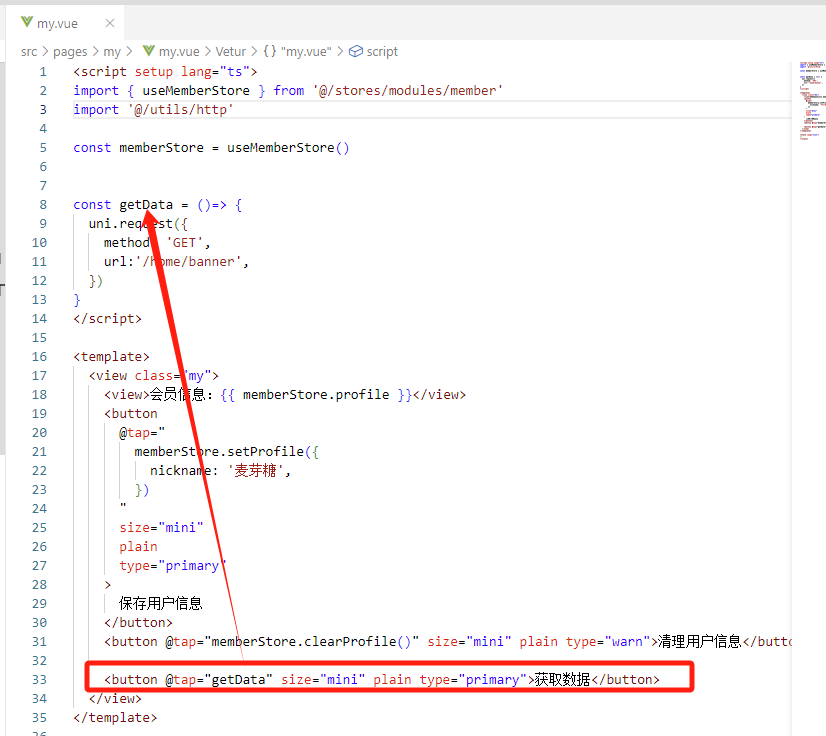
点击按钮测试,查看控制台
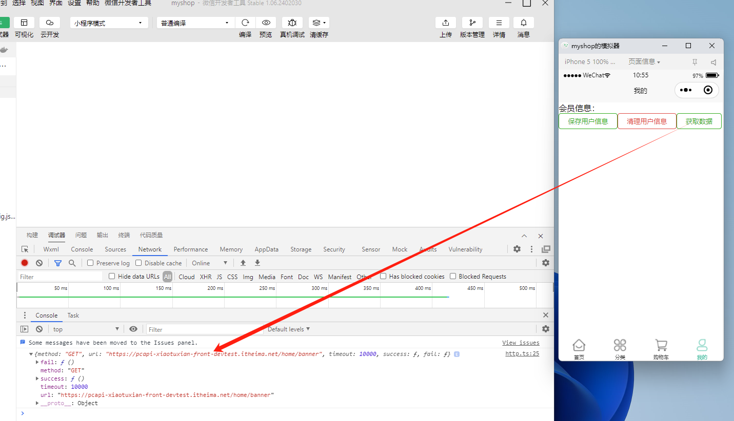
注意,此时不生效的话,可能需要重新编译启动项目pnpm dev:mp-weixin
也可以看到后端返回了数据
我们继续在src/utils/http.ts里完成第三步和第四步
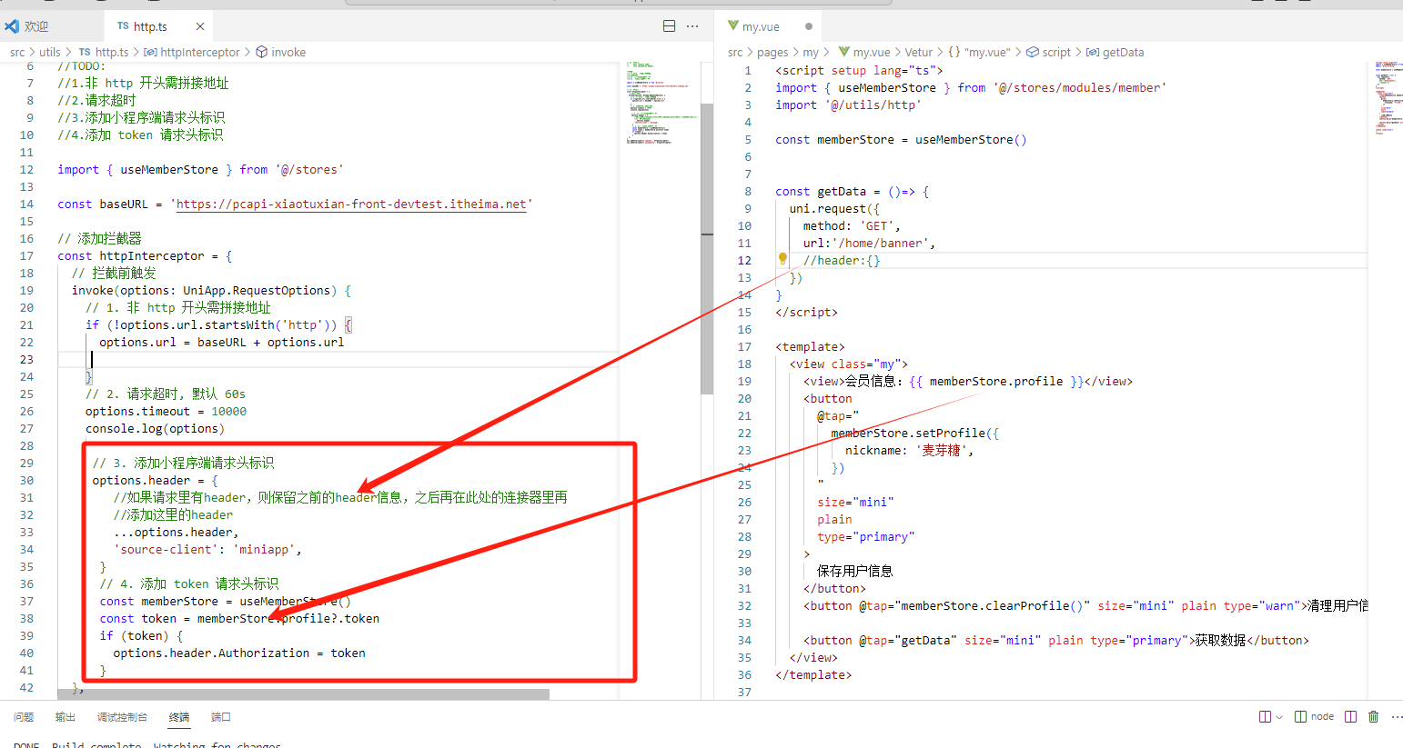
我们在页面里写死一个token
上边的拦截器只是对请求前做了拦截,并没有对响应做拦截,下面通过请求函数的封装,可以实现对响应的拦截
请求函数封装
src\utils\http.ts
/**
* 请求函数
* @param UniApp.RequestOptions
* @returns Promise
* 1. 返回 Promise 对象
* 2. 获取数据成功
* 2.1 提取核心数据 res.data
* 2.2 添加类型,支持泛型
* 3. 获取数据失败
* 3.1 401错误 -> 清理用户信息,跳转到登录页
* 3.2 其他错误 -> 根据后端错误信息轻提示
* 3.3 网络错误 -> 提示用户换网络
*/
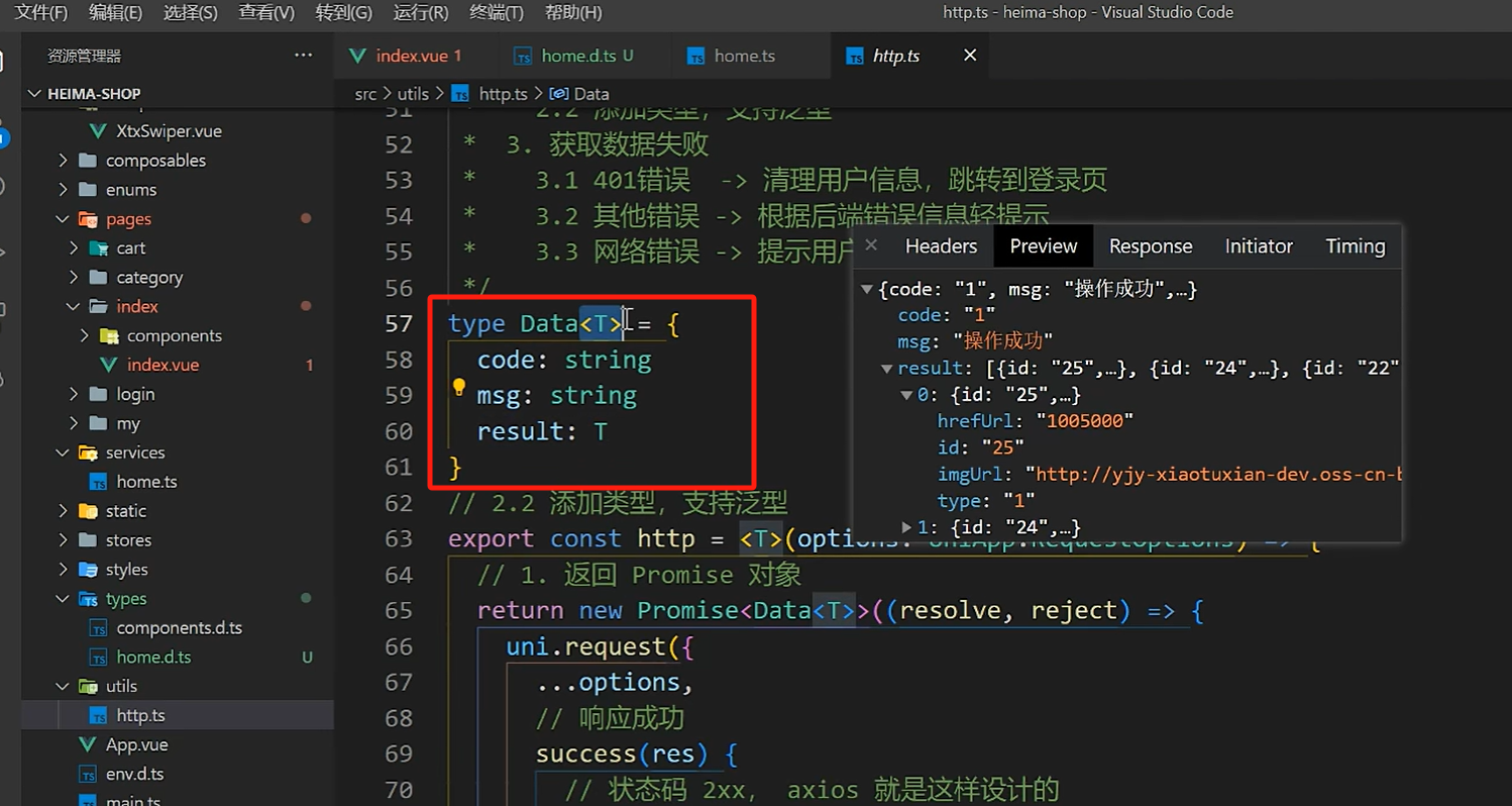
type Data<T> = {
code: string
msg: string
result: T
}
// 2.2 添加类型,支持泛型
export const http = <T>(options: UniApp.RequestOptions) => {
// 1. 返回 Promise 对象(resolve成功,reject失败)
return new Promise ((resolve, reject) => {
uni.request({
...options,
// 响应成功
success(res) {
//提取核心数据 res.data
resolve(res.data)
}
})
})
}
页面里,替换之前的request请求方式
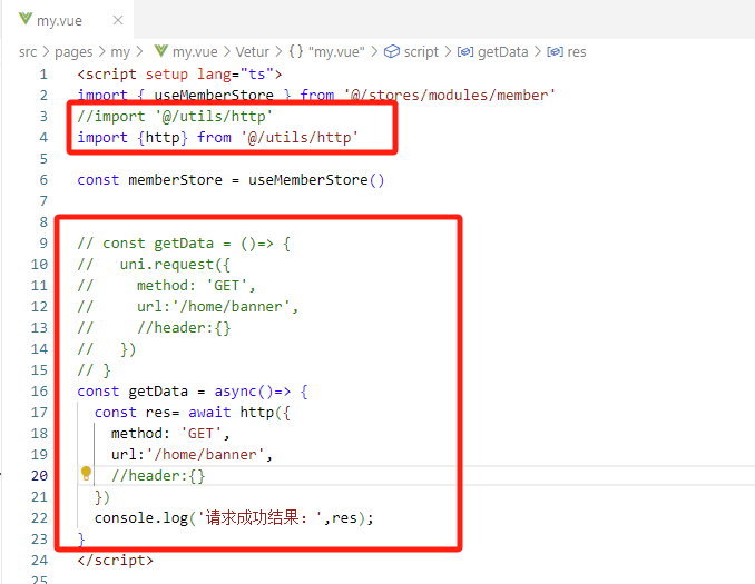
查看日志
完善http.ts文件,处理请求失败的情况
type Data<T> = {
    code: string
    msg: string
    result: T
  }
  // 2.2 添加类型,支持泛型
  export const http = <T>(options: UniApp.RequestOptions) => {
    // 1. 返回 Promise 对象(resolve成功,reject失败)
    return new Promise<Data<T>>((resolve, reject) => {
      uni.request({
        ...options,
        // 响应成功
        success(res) {
          // 状态码 2xx, axios 就是这样设计的
          if (res.statusCode >= 200 && res.statusCode < 300) {
            // 2.1 提取核心数据 res.data
            resolve(res.data as Data<T>)
          } else if (res.statusCode === 401) {
            // 401错误  -> 清理用户信息,跳转到登录页
            const memberStore = useMemberStore()
            memberStore.clearProfile()
            //跳转到登录页
            uni.navigateTo({ url: '/pages/login/login' })
            reject(res)
          } else {
            // 其他错误 -> 根据后端错误信息轻提示
            uni.showToast({
              icon: 'none',
              title: (res.data as Data<T>).msg || '请求错误',
            })
            reject(res)
          }
        },
        // 响应失败
        fail(err) {
          uni.showToast({
            icon: 'none',
            title: '网络错误,换个网络试试',
          })
          reject(err)
        },
      })
    })
  }
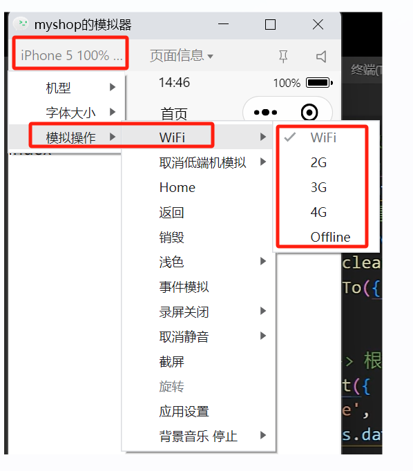
小程需开发工具模拟切换网络
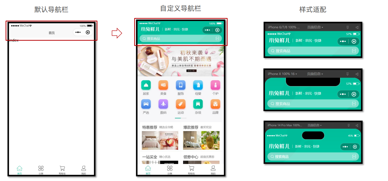
2.3 首页 – 自定义导航栏
步骤
- 准备组件
- 隐藏默认导航栏,修改文字颜色
- 样式适配 -> 安全区域(针对不同手机上边的刘海,做对应的样式适配)
静态结构
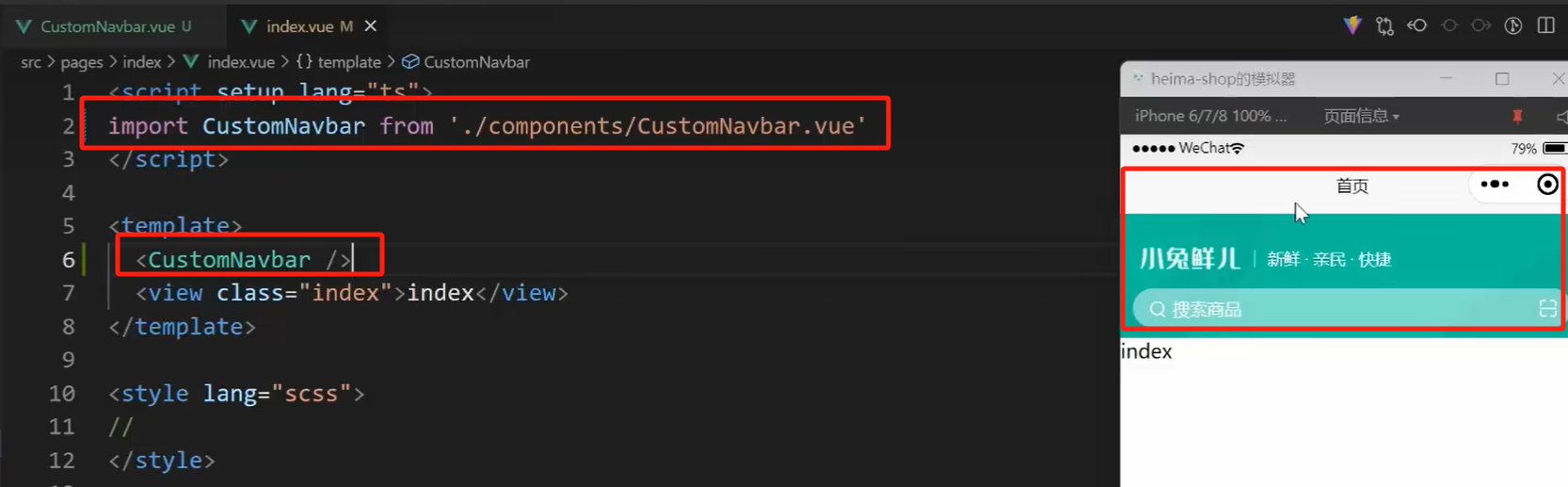
新建业务组件:src/pages/index/componets/CustomNavbar.vue
<script setup lang="ts">
//
</script>

<template>
  <view class="navbar">
    <!-- logo文字 -->
    <view class="logo">
      <image class="logo-image" src="@/static/images/logo.png"></image>
      <text class="logo-text">新鲜 · 亲民 · 快捷</text>
    </view>
    <!-- 搜索条 -->
    <view class="search">
      <text class="icon-search">搜索商品</text>
      <text class="icon-scan"></text>
    </view>
  </view>
</template>

<style lang="scss">
/* 自定义导航条 */
.navbar {
  background-image: url(@/static/images/navigator_bg.png);
  background-size: cover;
  position: relative;
  display: flex;
  flex-direction: column;
  padding-top: 20px;
  .logo {
    display: flex;
    align-items: center;
    height: 64rpx;
    padding-left: 30rpx;
    padding-top: 20rpx;
    .logo-image {
      width: 166rpx;
      height: 39rpx;
    }
    .logo-text {
      flex: 1;
      line-height: 28rpx;
      color: #fff;
      margin: 2rpx 0 0 20rpx;
      padding-left: 20rpx;
      border-left: 1rpx solid #fff;
      font-size: 26rpx;
    }
  }
  .search {
    display: flex;
    align-items: center;
    justify-content: space-between;
    padding: 0 10rpx 0 26rpx;
    height: 64rpx;
    margin: 16rpx 20rpx;
    color: #fff;
    font-size: 28rpx;
    border-radius: 32rpx;
    background-color: rgba(255, 255, 255, 0.5);
  }
  .icon-search {
    &::before {
      margin-right: 10rpx;
    }
  }
  .icon-scan {
    font-size: 30rpx;
    padding: 15rpx;
  }
}
</style>
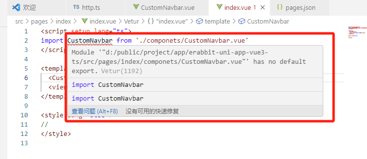
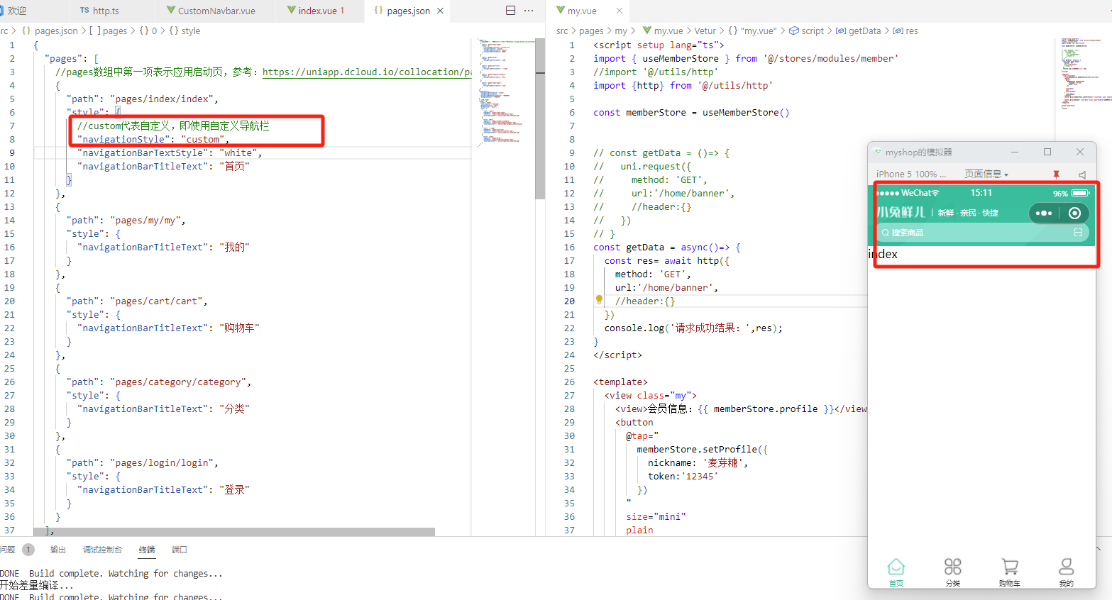
在首页src\pages\index\index.vue里引用上边组件
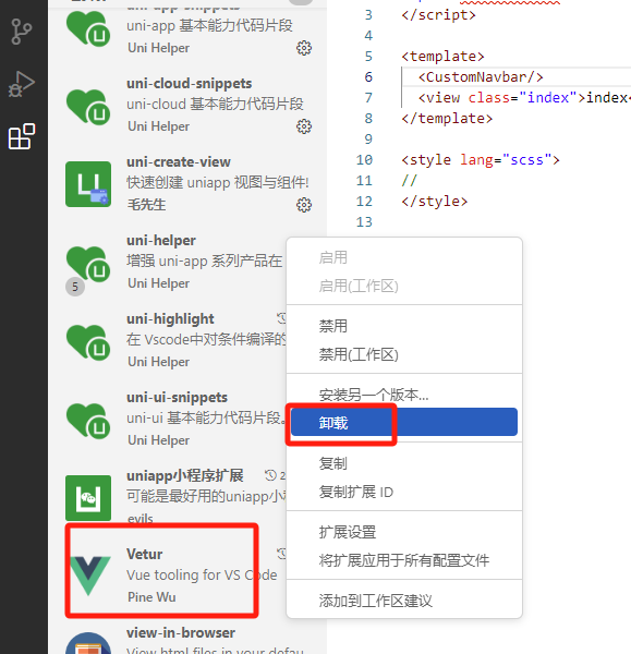
tips:这里有报错提示,但是不影响运行,是因为Vetur 暂不支持ts语法,我们卸载vscode的Vetur插件,安装Volar 即可
可以看到,我们自定义导航栏和默认导航栏重复了,需要去掉默认导航栏,在pages.json里进行如下配置
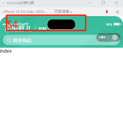
此时,我们切换模拟器机型,选择iphone15pro max
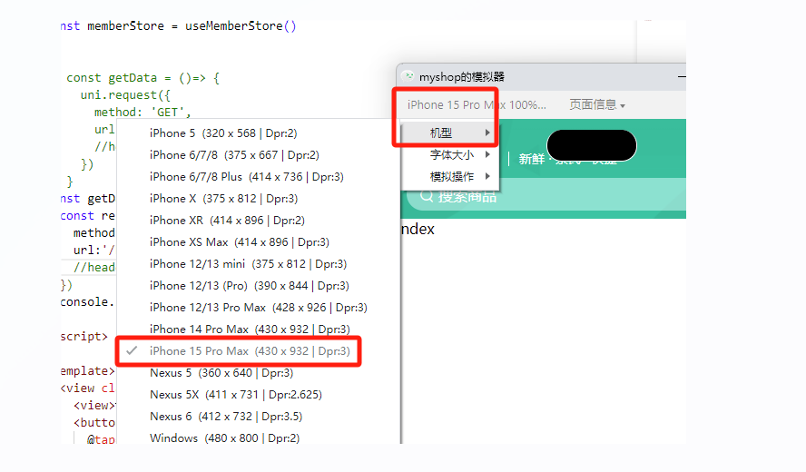
查看效果
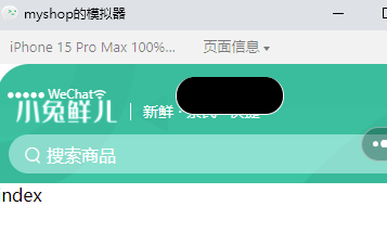
发现,有的字体被手机刘海挡住了
安全区域
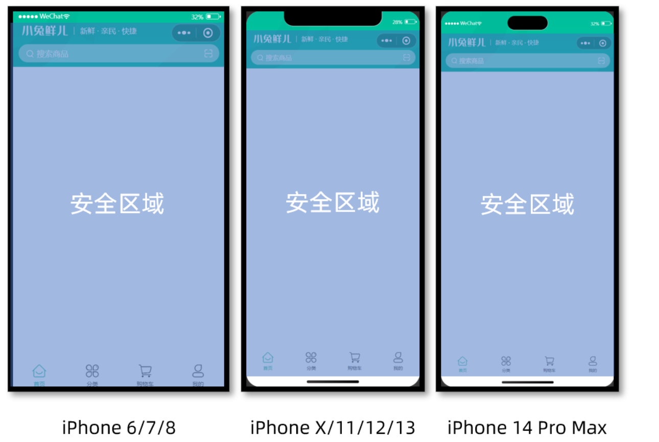
不同手机的安全区域不同,适配安全区域能防止页面重要内容被遮挡。
可通过 uni.getSystemInfoSync() 获取屏幕边界(上下左右)到安全区的距离。在导航栏代码里打印屏幕到边界距离
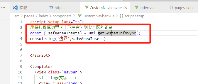
//获取屏幕边界(上下左右)到安全区的距离
const { safeAreaInsets} = uni.getSystemInfoSync()
console.log('边界',safeAreaInsets)
查看控制台
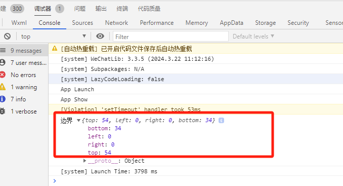
我们关注的是top这个值(底部的话,微信已经帮我们处理好了,不需要关心),这里top是54,代表屏幕最上边到安全区域距离就是54
此时,就需要我们动态调整样式来适应不同屏幕top距离
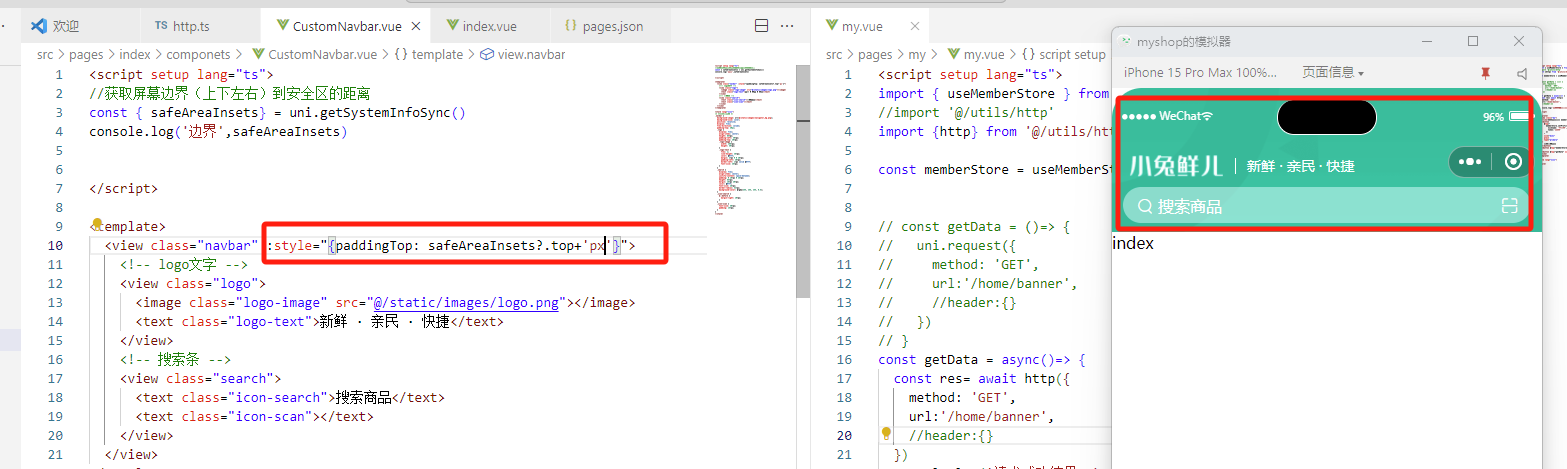
:style="{paddingTop: safeAreaInsets?.top+'px'}"
此时,切换模拟器的任何机型,都可以完美适配
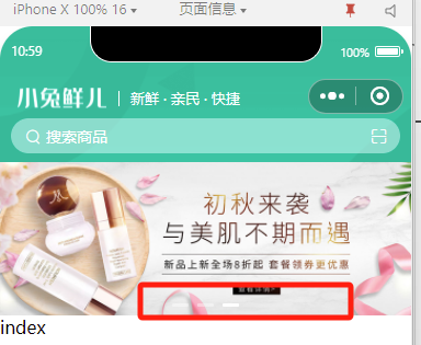
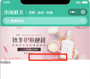
2.4 通用轮播组件
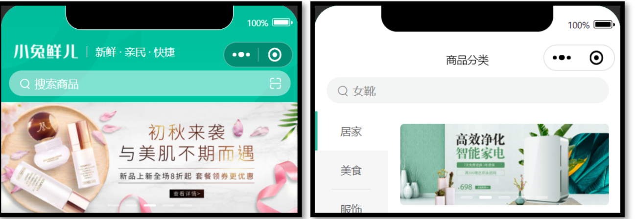
项目中总共有两处广告位,分别位于【首页】和【商品分类页】。
轮播图组件需要在首页和分类页使用,需要封装成通用组件。
静态结构
首页广告布局为独立的组件 XtxSwiper ,我们写在 src/components 目录中。
该组件定义了 list 属性接收外部传入的数据,内部通过小程序内置组件 swiper 展示首页广告的数据。
轮播图组件
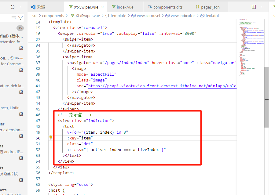
静态结构:src/components/XtxSwiper.vue
<script setup lang="ts">
import { ref } from 'vue'

const activeIndex = ref(0)
</script>

<template>
  <view class="carousel">
    <swiper :circular="true" :autoplay="false" :interval="3000">
      <swiper-item>
        <navigator url="/pages/index/index" hover-class="none" class="navigator">
          <image
            mode="aspectFill"
            class="image"
            src="https://pcapi-xiaotuxian-front-devtest.itheima.net/miniapp/uploads/slider_1.jpg"
          ></image>
        </navigator>
      </swiper-item>
      <swiper-item>
        <navigator url="/pages/index/index" hover-class="none" class="navigator">
          <image
            mode="aspectFill"
            class="image"
            src="https://pcapi-xiaotuxian-front-devtest.itheima.net/miniapp/uploads/slider_2.jpg"
          ></image>
        </navigator>
      </swiper-item>
      <swiper-item>
        <navigator url="/pages/index/index" hover-class="none" class="navigator">
          <image
            mode="aspectFill"
            class="image"
            src="https://pcapi-xiaotuxian-front-devtest.itheima.net/miniapp/uploads/slider_3.jpg"
          ></image>
        </navigator>
      </swiper-item>
    </swiper>
    <!-- 指示点 -->
    <view class="indicator">
      <text
        v-for="(item, index) in 3"
        :key="item"
        class="dot"
        :class="{ active: index === activeIndex }"
      ></text>
    </view>
  </view>
</template>

<style lang="scss">
:host {
  display: block;
  height: 280rpx;
}
/* 轮播图 */
.carousel {
  height: 100%;
  position: relative;
  overflow: hidden;
  transform: translateY(0);
  background-color: #efefef;
  .indicator {
    position: absolute;
    left: 0;
    right: 0;
    bottom: 16rpx;
    display: flex;
    justify-content: center;
    .dot {
      width: 30rpx;
      height: 6rpx;
      margin: 0 8rpx;
      border-radius: 6rpx;
      background-color: rgba(255, 255, 255, 0.4);
    }
    .active {
      background-color: #fff;
    }
  }
  .navigator,
  .image {
    width: 100%;
    height: 100%;
  }
}
</style>
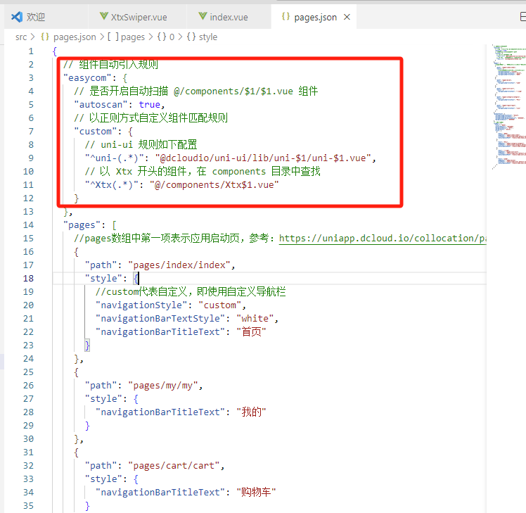
自动导入全局组件
配置后,在首页和分类页直接引用上边的组件即可
参考配置pages.json
{
  // 组件自动引入规则
  "easycom": {
    // 是否开启自动扫描 @/components/$1/$1.vue 组件
    "autoscan": true,
    // 以正则方式自定义组件匹配规则
    "custom": {
      // uni-ui 规则如下配置
      "^uni-(.*)": "@dcloudio/uni-ui/lib/uni-$1/uni-$1.vue",
      // 以 Xtx 开头的组件,在 components 目录中查找(需要重启服务才能生效)
      "^Xtx(.*)": "@/components/Xtx$1.vue"
    }
  }
}
在src/index/index.vue首页里引入轮播图公共组件
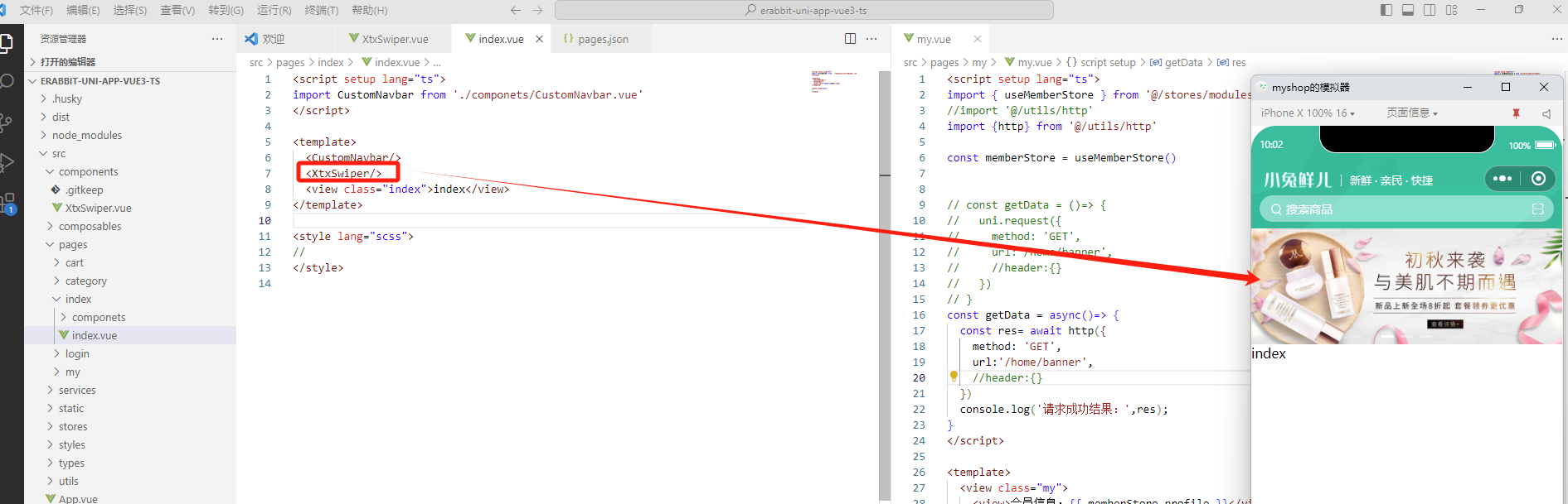
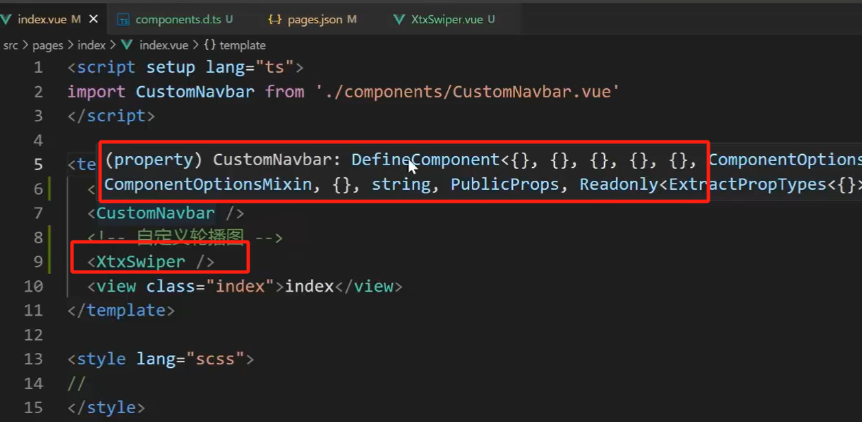
注意,此时,鼠标放在我们自定义组件上后,显示的是unknow
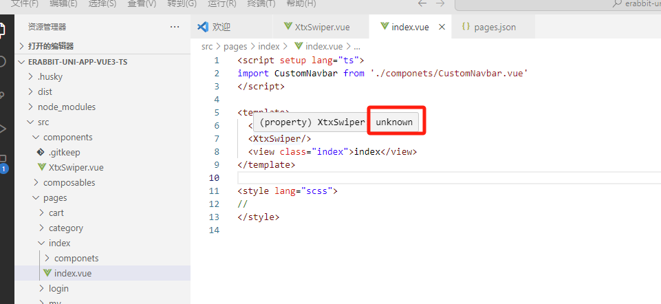
全局组件类型声明
为全局组件提供类型声明,解决上边unknow的问题
Volar 插件说明:https://github.com/vuejs/language-tools
// src/types/components.d.ts
import XtxSwiper from './XtxSwiper.vue'
declare module 'vue' {
  export interface GlobalComponents {
    XtxSwiper: typeof XtxSwiper
  }
}
danger 版本升级:新版 Volar 把 declare module '@vue/runtime-core' 调整为 declare module 'vue'
此时,unknow问题解决
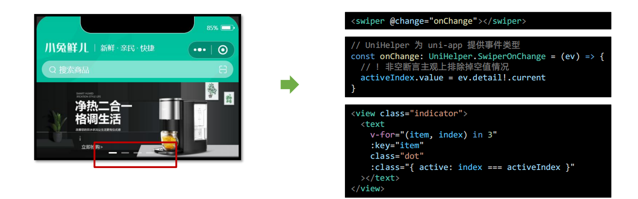
首页 – 轮播图指示点
此时,滑动轮播图的时候,下边的指示点是不变的
鼠标放swiper上,打开官网
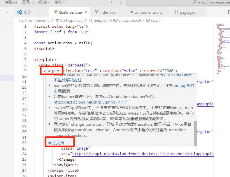
官网: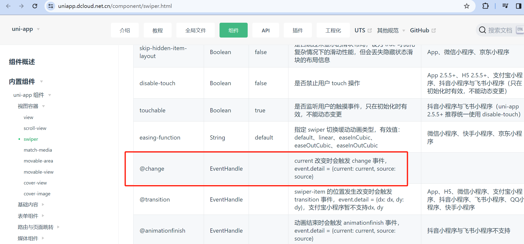
知识点:
- UniHelper 提供事件类型,文档说明
- ?(可选链) 允许前面表达式为空值
- !(非空断言) 主观上排除掉空值情况
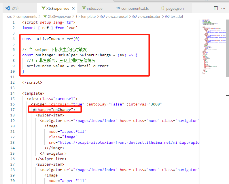
此时,轮播图下的指示点就会跟着变化了
首页 – 获取轮播图后台数据
- 封装获取轮播图数据API
- 页面初始化调用API
接口调用
该业务功能对于前端来说比较简单,只需调用后端提供的接口将获得的数据展现,结合运营人员的营销策略跳转到对应的链接地址即可。
接口地址:/home/banner
请求方式:GET
请求参数:
Query:
| 字段名 | 必须 | 默认值 | 备注 |
|---|---|---|---|
| distributionSite | 否 | 1 | 活动 banner 位置,1 代表首页,2 代表商品分类页,默认为 1 |
// 存放路径: src/services/home.ts
import type { BannerItem } from '@/types/home'
import { http } from '@/utils/http'
/**
 * 首页-广告区域-小程序
 * @param distributionSite 广告区域展示位置(投放位置 投放位置,1为首页,2为分类商品页) 默认是1
 */
export const getHomeBannerAPI = (distributionSite = 1) => {
  return http<BannerItem[]>({
    method: 'GET',
    url: '/home/banner',
    data: {
      distributionSite,
    },
  })
}
首页src\pages\index\index.vue
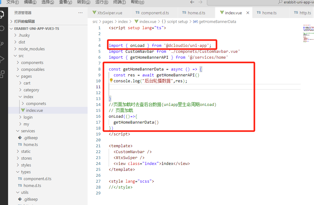
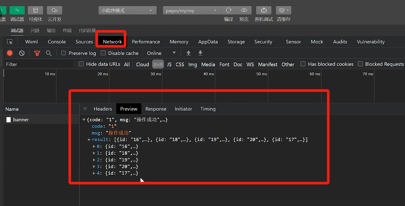
控制台可以看到,后台数据已经有了
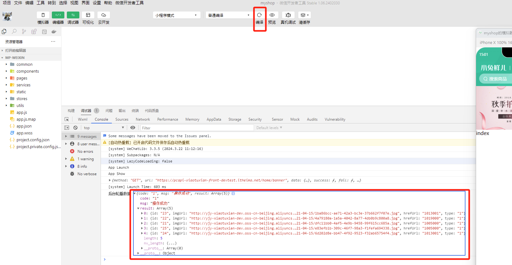
接下来就需要把数据渲染到页面里展示出来了
步骤
- 定义轮播图数据类型
- 指定类型并传值给子组件
- 渲染轮播图数据
数据类型声明
存放路径:src/types/home.d.ts,表示首页的接口对应的数据类型声明文件
/** 首页-广告区域数据类型,对应后台接口返回的数据类型 */
export type BannerItem = {
  /** 跳转链接 */
  hrefUrl: string
  /** id */
  id: string
  /** 图片链接 */
  imgUrl: string
  /** 跳转类型 */
  type: number
}
至于后台返回的code、msg、result等通用参数,之前在通用拦截器http.ts里已经定义好了
最后,将获得的数据结合模板语法渲染到页面中
home.ts
import type { BannerItem } from '@/types/home'
import { http } from '@/utils/http'

/**
 * 首页-广告区域-小程序
 * @param distributionSite 广告区域展示位置(投放位置 投放位置,1为首页,2为分类商品页) 默认是1
 */
export const getHomeBannerAPI = (distributionSite = 1) => {
  return http<BannerItem[]>({
    method: 'GET',
    url: '/home/banner',
    data: {
      distributionSite,
    },
  })
}
页面获取数据src\pages\index\index.vue
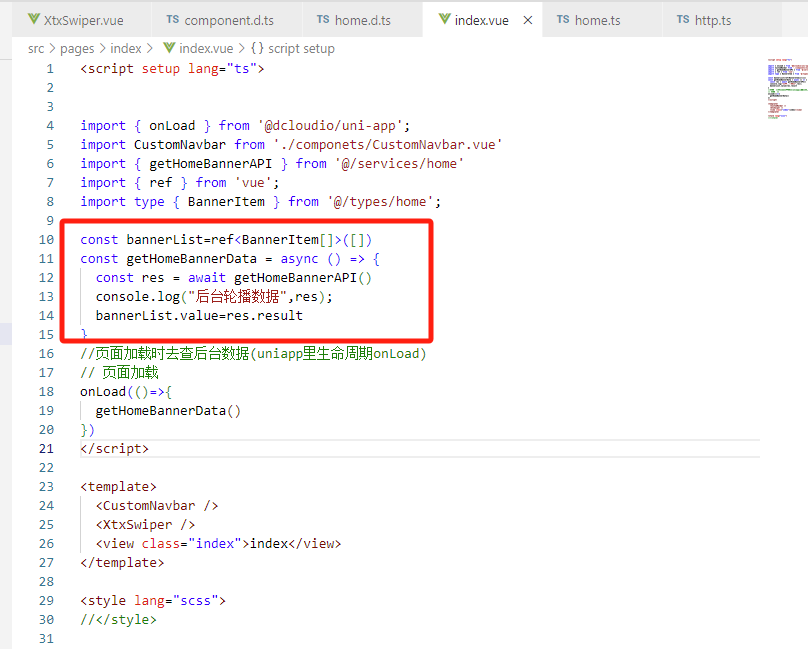
通过自定义属性,把数据传递给子组件<XtxSwiper />
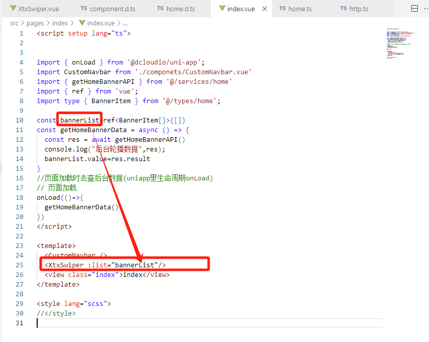
子组件<XtxSwiper />通过props接收父组件数据
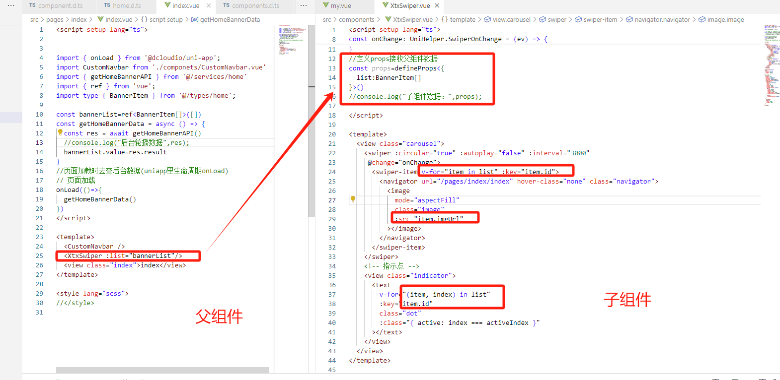
效果
轮播图组件代码:src\components\XtxSwiper.vue
<script setup lang="ts">
import type { BannerItem } from '@/types/home';
import { ref } from 'vue'

const activeIndex = ref(0)

// 当 swiper 下标发生变化时触发
const onChange: UniHelper.SwiperOnChange = (ev) => {
  //!:非空断言,主观上排除空值情况
  activeIndex.value = ev.detail.current
}
//定义props接收父组件数据
const props=defineProps<{
  list:BannerItem[]
}>()
//console.log("子组件数据:",props);

</script>

<template>
  <view class="carousel">
    <swiper :circular="true" :autoplay="false" :interval="3000"
     @change="onChange">
      <swiper-item v-for="item in list" :key="item.id">
        <navigator url="/pages/index/index" hover-class="none" class="navigator">
          <image
            mode="aspectFill"
            class="image"
            :src="item.imgUrl"
          ></image>
        </navigator>
      </swiper-item>
    </swiper>
    <!-- 指示点 -->
    <view class="indicator">
      <text
        v-for="(item, index) in list"
        :key="item.id"
        class="dot"
        :class="{ active: index === activeIndex }"
      ></text>
    </view>
  </view>
</template>

<style lang="scss">
:host {
  display: block;
  height: 280rpx;
}
/* 轮播图 */
.carousel {
  height: 100%;
  position: relative;
  overflow: hidden;
  transform: translateY(0);
  background-color: #efefef;
  .indicator {
    position: absolute;
    left: 0;
    right: 0;
    bottom: 16rpx;
    display: flex;
    justify-content: center;
    .dot {
      width: 30rpx;
      height: 6rpx;
      margin: 0 8rpx;
      border-radius: 6rpx;
      background-color: rgba(255, 255, 255, 0.4);
    }
    .active {
      background-color: #fff;
    }
  }
  .navigator,
  .image {
    width: 100%;
    height: 100%;
  }
}
</style>

腾讯云面向开发者汇聚海量精品云计算使用和开发经验,营造开放的云计算技术生态圈。
更多推荐
 20
20 0
0- 0


 已为社区贡献9条内容

所有评论(0)