vue.js待办事件案例
单元十 待办事件案例
学习目标
主要通过上面学习的内容结合实现的一个小案例,主要功能就是通过输入框输入待办事件,回车添加在列表里面,勾选事件有样式效果,以及全部,未完成,已完成三个筛选功能。并且使用 Vue.js 框架构建,数据存储在本地浏览器的 localStorage 中,以便在页面刷新或重新打开时保留待办事项数据。
任务一 模版部分
1.1 任务描述
实现页面布局,显示出来基本的页面信息
1.2 任务实施
创建文件vue,在App.vue里面写入,在终端使用npm run dev 或者npm run serve 运行,如下图所示
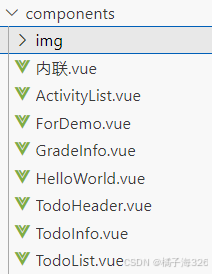
App.vue里面
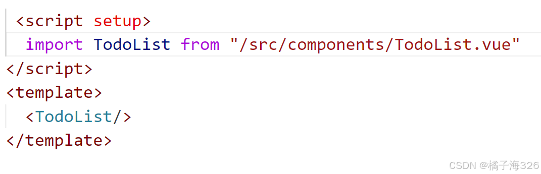
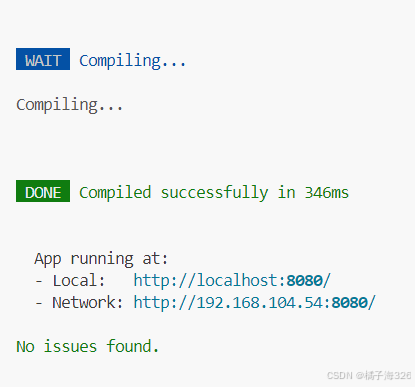
终端里面运行效果 (如图片效果就是运行成功)
(1)在<template>模块里面嵌套div盒子,id名为app,里面进行书写页面内容给到一个标题<h2>,类名,显示‘待办事件列表’。
<template>

<div id=“app”>

           <h2 class="app-title">待办事项列表</h2>

<div/>

<template/>
(2)给到输入容器div以及类名,给到输入框input以及提示文本信息和添加按钮button,给到点击事件类型。
<div class="input-container">

      <input v-model="newTodo" placeholder="添加新的待办事项" />

      <button @click="addTodo">添加事项</button>

 </div>
(3)下面给到一个无序列表,用来展示待办事件每个列表项都有一个复选框input[type="checkbox"],用来标记完成状态,显示事件文本span,删除按钮button。
<ul class="todo-list">

      <li>

        <input type="checkbox" class="todo-checkbox"/>

      <span  class="todo-text">{{ todo.text }}</span>

             <button class="todo-delete-btn">删除</button>

      </li>

 </ul>
(4)得给这个列表使用v-for指令来配合后面的相关属性,实现渲染列表,展示相应的样式效果。
 <li

        v-for="(todo, index) in filteredTodos"

        :key="index"

        :class="{ completed: todo.completed }"

      >

        <input

          type="checkbox"

          v-model="todo.completed"

          @change="toggleTodo(todo)"

          class="todo-checkbox"

        />

        <span :class="{ 'text-muted': todo.completed }" class="todo-text">{{ todo.text }}</span>

        <button @click="removeTodo(index)" class="todo-delete-btn">删除</button>

      </li>
(5)最后设置一个按钮组,包括三个筛选事项的元素span,同时为他们绑定事件类型,并通过动态类名绑定来体现当前处于激活状态的筛选按钮可以方便地筛选待办事项列表,查看不同状态下的事项。
 <div class="btn-group">

      <span @click="filterTodos('all')" :class="{ active: filter === 'all' }">全部</span>

      <span @click="filterTodos('active')" :class="{ active: filter === 'active' }">待完成</span>

      <span @click="filterTodos('completed')" :class="{ active: filter === 'completed' }">已完成</span>

    </div>
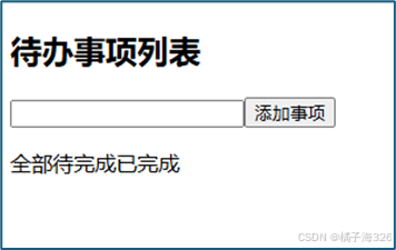
到这里基本的页面已将设置完成了
任务二 脚本部分
2.1 任务描述
在<script>里面,通过定义数据、生命周期钩子、计算属性和各种操作方法,完整地实现了待办事项的添加、删除、筛选以及数据持久化等核心功能,使得整个待办事项列表应用能够正常、高效地运行。
2.2 任务实施
2.2.1 data函数
data函数用于定义响应式数据,返回一个包含初始数据的对象。
export default {

     data() {

        return {

          newTodo: "",

          todos: [],

          filter: "all",

    };

  }
newTodo:是一个空字符串类型的变量,通过 v-model 指令与模板中的输入框进行双向数据绑定。
todos:定义为一个空数组,用于存放所有的待办事项对象。
filter:初始值设置为 "all",用于记录当前待办事项列表的筛选状态。
2.2.2 created 钩子
用于从本地存储(localStorage)中读取之前保存的待办事项数据。
 created() {

    const storedTodos = localStorage.getItem("todos");

    if (storedTodos) {

      this.todos = JSON.parse(storedTodos);

    }

  }
通过 localStorage.getItem 获取名为 "todos" 的数据项。如果获取到的数据不为 null也就是之前有保存过待办事项,则使用 JSON.parse(storedTodos) 将获取到的 JSON 格式字符串数据解析为 待办事项数组,并赋值给 this.todos恢复上次关闭时的待办事项列表状态,实现数据的持久化恢复。
2.2.3 watch 侦听器
watch 用于监听数据的变化,当 todos 数组发生改变,会执行相应的回调操作。
 watch: {

    todos(newTodos) {

      localStorage.setItem("todos", JSON.stringify(newTodos));

    },

  }
只要 todos 数组的引用,就会触发 watch 中的回调函数,接收新的 todos 值作为参数( newTodos)。通过 localStorage.setItem将更新后的 todos 数组转换为 JSON 格式字符串,并保存到本地存储 localStorage 中,覆盖原来存储的数据,确保实时保存,方便下次继续使用当前的数据状态。
2.2.4 computed计算属性
computed 计算属性会基于其依赖的数据自动重新计算结果,这里的 filteredTodos 计算属性主要用于根据当前的筛选状态(由 filter 属性决定)返回经过筛选后的待办事项数组。
computed: {

    filteredTodos() {

      if (this.filter === "active") {

        return this.todos.filter((todo) =>!todo.completed);

      } else if (this.filter === "completed") {

        return this.todos.filter((todo) => todo.completed);

      }

      return this.todos;

    },

  }
使用if语句进行判断
当 this.filter === "active" 时,筛选状态为“待完成” ,会调用数组的 filter 方法对 this.todos 数组进行筛选,返回一个新的数组,新数组中只包含未完成的待办事项对象。
当 this.filter === "completed" 时筛选状态为显“已完成” 事项,同样使用 filter 方法筛选 this.todos 数组,返回的新数组中已完成的待办事项对象。
若 this.filter 的值既不是 "active" 也不是 "completed",那默认就是 "all" 状态,此时直接返回整个 this.todos 数组,意味着显示所有的待办事项,无论其是否已完成。
2.2.5 methods 方法集合
定义了多个方法,用于处理与待办事项相关的各种操作。
methods: {

    addTodo() {

      if (this.newTodo.trim()!== "") {

        this.todos.push({

          text: this.newTodo,

          completed: false,

        });

        this.newTodo = "";

      }

    },

    removeTodo(index) {

      this.todos.splice(index, 1);

    },

    filterTodos(status) {

      this.filter = status;

    },

    toggleTodo(todo) {

        this.$nextTick(() => {

        localStorage.setItem("todos", JSON.stringify(this.todos));

      });

    },

  },

};
(1)addTodo :添加新的待办事项到 todos 数组中。
this.newTodo.trim()!== "",判断输入框中输入不为空字符串,创建一个新的待办事项,对象包含 text 属性(值为当前 的内容)和 completed 属性(初始化为 false,新添加的事项是未完成状态),通过 this.todos.push 方法添加到 todos 数组中,再将 this.newTodo 重置为空字符串,以便继续输入待办事项。
(2)removeTodo
接收一个参数index也就是待办事项在 todos 数组中的索引。通过 this.todos.splice(index, 1) 语句,从 todos 数组中删除指定索引位置的元素,实现了待办事项列表中移除功能。
(3)filterTodos
接收参数status,是三个筛选状态,将更新的this.filter值传入参数,改变状态,触发计算属性,使列表根据新的状态展示列表。
(4)toggleTodo
接收参数todo,代表需要切换完成的待办事件对象,点击复选框改变状态触发这个方法,通过 this.$nextTick 在下一个 Vue 实例更新周期中执行回调函数。会使用 localStorage.setItem 将更新后的 todos 数组保存到本地存储中,确保持久化保存,避免数据丢失。
整体的功能在这里实现了下面来看一下实现的整体效果
功能
任务三 样式部分
2.1 任务描述
对这个整体的页面进行样式美化以及布局
2.2 任务实施
(1)整体body样式
display: flex和flex-direction: column将页面内容以垂直方向的弹性布局排列,方便对页面元素进行整体的居中对齐等操作。align-items: center使得页面内的元素在交叉轴(垂直方向,因为是列布局)上居中对齐,整体看起来更加规整。min-height: 100vh保证页面至少占据整个视口(浏览器可视区域)的高度,避免内容较少时页面显示不协调。margin: 0去除页面默认的外边距,让页面能从浏览器边缘开始布局;padding: 20px则给页面内容区域添加了一定的内边距,使内容不会紧贴边缘;box-sizing: border-box规定元素的盒模型计算方式,使得设置的内边距和边框不会撑大元素原本设定的宽度,更便于布局控制。
body {
  background-color: #e6f7ff;
  font-family: Arial, sans-serif;
  display: flex;
  flex-direction: column;
  align-items: center;
  min-height: 100vh;
  margin: 0;
  padding: 20px;
  box-sizing: border-box;
}
(2)标题样式
margin-bottom: 20px 给标题下方添加了 20px 的外边距,使标题与下方元素保持一定间隔,避免显得过于拥挤。
.app-title {
  color: #003366;
  margin-bottom: 20px;
}
(3)输入容器的样式
同样采用 display: flex 弹性布局,方便内部的输入框和按钮按照一定规则排列
width: 100%让其宽度默认占满父元素宽度,同时设置max-width: 400px限制其最大宽度为400px,防止在大屏幕上过度拉伸而影响美观。- 底部添加
margin-bottom: 20px的外边距,与下方元素保持间隔。
.input-container {
  display: flex;
  width: 100%;
  max-width: 400px;
  margin-bottom: 20px;
}
(4)输入框样式
- 弹性占比:
flex: 1表示在弹性布局的父容器(.input-container)中,该输入框会占据剩余的全部可用空间,这样可以自适应不同屏幕宽度,确保按钮能紧跟其后。 - 内边距:通过
padding: 10px 15px给输入框内部添加了一定的内边距,使输入的文字与边框有合适的距离,看起来更舒适。 - 边框样式:设置
border: 1px solid #ccc给输入框添加了1px宽的灰色(#ccc)边框,并且通过border-radius: 5px 0 0 5px只给左上角和左下角设置了5px的圆角,形成一种独特的外观效果。 - 字体大小:指定字体大小为
16px,保证文字显示清晰且大小合适。
input[type="text"] {
  flex: 1;
  padding: 10px 15px;
  border: 1px solid #ccc;
  border-radius: 5px 0 0 5px;
  font-size: 16px;
}
(5)按钮样式
鼠标悬停效果:当鼠标悬停在按钮上时(:hover 伪类),通过 transition: background-color 0.3s ease 实现背景颜色平滑过渡
同时设置了 border-radius: 0 5px 5px 0,给右上角和右下角设置 5px 的圆角,与输入框的圆角相呼应,打造出连贯的外观。
button {
  padding: 10px 20px;
  background-color: #d9edf7;
  border: 1px solid #ccc;
  border-left: none;
  border-radius: 0 5px 5px 0;
  cursor: pointer;
  transition: background-color 0.3s ease;
  font-size: 16px;
}

button:hover {
  background-color: #b3e5fc;
}
按钮组:采用 display: flex 弹性布局,方便内部的筛选按钮(span 元素)在水平方向上排列整齐,形成按钮组的布局效果。
.btn-group {
  display: flex;
  margin-top: 20px;
}
删除按钮:当鼠标悬停在删除按钮上时,通过 transition: color 0.3s ease 实现颜色平滑过渡,将颜色变为红色(#f00),给用户明显的视觉提示,表明点击该按钮会执行删除操作。
.todo-delete-btn {
  background-color: transparent;
  border: none;
  color: #999;
  cursor: pointer;
  font-size: 14px;
  transition: color 0.3s ease;
}

.todo-delete-btn:hover {
  color: #f00;
}
(6) 列表样式
list-style: none去除默认的列表项符号(如圆点等),使列表外观更简洁;padding: 0清除列表默认的内边距,方便后续对列表项进行更精准的布局。
.todo-list {
  width: 100%;
  max-width: 400px;
  list-style: none;
  padding: 0;
}- 采用
display: flex弹性布局,并通过align-items: center让列表项内部的元素在垂直方向上居中对齐,justify-content: space-between则使内部元素在水平方向上两端对齐,中间间隔均匀,实现了复选框、待办事项文本和删除按钮的合理布局。 - 初始设置
box-shadow: 0 2px 4px rgba(0, 0, 0, 0.1)给列表项添加了一个淡淡的阴影,增强立体感,使其看起来有一定的悬浮效果。 - 当鼠标悬停在列表项上时(
:hover伪类),通过transition: box-shadow 0.3s ease实现阴影平滑过渡,将阴影强度增大为0 4px 8px rgba(0, 0, 0, 0.2),给用户视觉反馈,提示可操作。
li {
  display: flex;
  align-items: center;
  justify-content: space-between;
  background-color: #fff;
  padding: 10px 15px;
  border-radius: 5px;
  margin-bottom: 10px;
  box-shadow: 0 2px 4px rgba(0, 0, 0, 0.1);
  transition: box-shadow 0.3s ease;
}

li:hover {
  box-shadow: 0 4px 8px rgba(0, 0, 0, 0.2);
}
(7)文本样式
flex: 1使其在弹性布局的列表项中占据剩余的全部可用空间,确保文本能自适应列表项宽度,充分展示内容- 对于已完成的待办事项文本(通过
.completed.todo-text选择器匹配,也就是当列表项有.completed类时对应的文本),添加了text-decoration: line-through样式,给文字添加删除线,表示该事项已完成;同时改变文字颜色为灰色(#ccc)并设置透明度为0.7,使其呈现出一种弱化、提示已完成的视觉效果。
.todo-text {
  flex: 1;
  font-size: 16px;
}

.completed.todo-text {
  text-decoration: line-through;
  color: #ccc;
  opacity: 0.7;
}
(8) span元素样式
- 当
span元素有.active类时(通过动态绑定类名实现,用于表示当前选中的筛选按钮),背景颜色变为蓝色(#007bff),文字颜色变为白色(#fff),并且字体加粗(font-weight: bold),突出显示当前处于激活状态的筛选按钮,方便用户直观地看到当前选择的筛选条件。 - 当鼠标悬停在
span元素上时,背景颜色变为灰色(#ccc),给用户视觉反馈,提示按钮可点击,同时也能体现出按钮的交互性。
.btn-group span {
  margin-right: 15px;
  padding: 5px 10px;
  border-radius: 5px;
  cursor: pointer;
  transition: background-color 0.3s ease, color 0.3s ease;
}

.btn-group span.active {
  background-color: #007bff;
  color: #fff;
  font-weight: bold;
}

.btn-group span:hover {
  background-color: #ccc;
}
当 span 元素处于某个有 .completed 类的父元素下时(虽然在给出的 HTML 结构中未体现具体应用场景,但样式已定义),会给 span 元素添加删除线,并将颜色变为灰色(#ccc),与已完成的待办事项文本样式保持一致,可能用于表示某种特定的完成状态相关的视觉效果。
.completed span {
  text-decoration: line-through;
  color: #ccc;
}
到这里所有的样式就设置完了,让我们来看一下整体实现的效果
待办
全部代码
<template>
  <div id="app">
    <h2 class="app-title">待办事项列表</h2>
    <div class="input-container">
      <input v-model="newTodo" placehol der="添加新的待办事项" />
      <button @click="addTodo">添加事项</button>
    </div>
    <ul class="todo-list">
      <li
        v-for="(todo, index) in filteredTodos"
        :key="index"
        :class="{ completed: todo.completed }"
      >
        <input
          type="checkbox"
          v-model="todo.completed"
          @change="toggleTodo(todo)"
          class="todo-checkbox"
        />
        <span :class="{ 'text-muted': todo.completed }" class="todo-text">{{ todo.text }}</span>
        <button @click="removeTodo(index)" class="todo-delete-btn">删除</button>
      </li>
    </ul>
    <div class="btn-group">
      <span @click="filterTodos('all')" :class="{ active: filter === 'all' }">全部</span>
      <span @click="filterTodos('active')" :class="{ active: filter === 'active' }">待完成</span>
      <span @click="filterTodos('completed')" :class="{ active: filter === 'completed' }">已完成</span>
    </div>
  </div>
</template>

<script>
export default {
  data() {
    return {
      newTodo: "",
      todos: [],
      filter: "all",
    };
  },
  created() {
    const storedTodos = localStorage.getItem("todos");
    if (storedTodos) {
      this.todos = JSON.parse(storedTodos);
    }
  },
  watch: {
    todos(newTodos) {
      localStorage.setItem("todos", JSON.stringify(newTodos));
    },
  },
  computed: {
    filteredTodos() {
      if (this.filter === "active") {
        return this.todos.filter((todo) =>!todo.completed);
      } else if (this.filter === "completed") {
        return this.todos.filter((todo) => todo.completed);
      }
      return this.todos;
    },
  },
  methods: {
    addTodo() {
      if (this.newTodo.trim()!== "") {
        this.todos.push({
          text: this.newTodo,
          completed: false,
        });
        this.newTodo = "";
      }
    },
    removeTodo(index) {
      this.todos.splice(index, 1);
    },
    filterTodos(status) {
      this.filter = status;
    },
    toggleTodo(todo) {
        this.$nextTick(() => {
        localStorage.setItem("todos", JSON.stringify(this.todos));
      });
    },
  },
};
</script>
<style scoped>
body {
  background-color: #e6f7ff;
  font-family: Arial, sans-serif;
  display: flex;
  flex-direction: column;
  align-items: center;
  min-height: 100vh;
  margin: 0;
  padding: 20px;
  box-sizing: border-box;}
.app-title {
  color: #003366;
  margin-bottom: 20px;
}
.input-container {
  display: flex;
  width: 100%;
  max-width: 400px;
  margin-bottom: 20px;
}

input[type="text"] {
  flex: 1;
  padding: 10px 15px;
  border: 1px solid #ccc;
  border-radius: 5px 0 0 5px;
  font-size: 16px;
}
button {
  padding: 10px 20px;
  background-color: #d9edf7;
  border: 1px solid #ccc;
  border-left: none;
  border-radius: 0 5px 5px 0;
  cursor: pointer;
  transition: background-color 0.3s ease;
  font-size: 16px;
}

button:hover {
  background-color: #b3e5fc;
}
.todo-list {
  width: 100%;
  max-width: 400px;
  list-style: none;
  padding: 0;
}
li {
  display: flex;
  align-items: center;
  justify-content: space-between;
  background-color: #fff;
  padding: 10px 15px;
  border-radius: 5px;
  margin-bottom: 10px;
  box-shadow: 0 2px 4px rgba(0, 0, 0, 0.1);
  transition: box-shadow 0.3s ease;
}

li:hover {
  box-shadow: 0 4px 8px rgba(0, 0, 0, 0.2);
}
.todo-checkbox {
  margin-right: 10px;
}
.todo-text {
  flex: 1;
  font-size: 16px;}

.completed.todo-text {
  text-decoration: line-through;
  color: #ccc;
  opacity: 0.7;
}
.todo-delete-btn {
  background-color: transparent;
  border: none;
  color: #999;
  cursor: pointer;
  font-size: 14px;
  transition: color 0.3s ease;
}

.todo-delete-btn:hover {
  color: #f00;
}

.btn-group {
  display: flex;
  margin-top: 20px;
}

.btn-group span {
  margin-right: 15px;
  padding: 5px 10px;
  border-radius: 5px;
  cursor: pointer;
  transition: background-color 0.3s ease, color 0.3s ease;
}

.btn-group span.active {
  background-color: #007bff;
  color: #fff;
  font-weight: bold;
}

.btn-group span:hover {
  background-color: #ccc;
}
.completed span {
  text-decoration: line-through;
  color: #ccc;
}
</style>

腾讯云面向开发者汇聚海量精品云计算使用和开发经验,营造开放的云计算技术生态圈。
更多推荐
 60
60 0
0- 0


 已为社区贡献2条内容

所有评论(0)