运用python进行数据可视化——散点图和气泡图
通过这五个实验,我们可以看到散点图和气泡图在展示多维数据和变量关系方面的强大功能。这些图表不仅提供了数据的直观视图,还通过颜色、形状、大小和透明度等视觉元素增加了信息的维度。在数据分析中,合理选择和使用这些图表可以更有效地传达数据背后的信息。
散点图和气泡图在数据分析中的应用
散点图和气泡图是数据可视化中常用的图表类型,它们能够展示变量之间的关系,并提供额外的维度信息。本文将通过五个Python代码示例,展示如何使用Matplotlib库绘制散点图和气泡图,并分析其在数据分析中的应用。
实验一:体积和百分比变化
实验代码:
import matplotlib.pyplot as plt
import numpy as np

import matplotlib.cbook as cbook

# Load a numpy record array from yahoo csv data with fields date, open, high,
# low, close, volume, adj_close from the mpl-data/sample_data directory. The
# record array stores the date as an np.datetime64 with a day unit ('D') in
# the date column.
price_data = cbook.get_sample_data('goog.npz')['price_data']
price_data = price_data[-250:]  # get the most recent 250 trading days

delta1 = np.diff(price_data["adj_close"]) / price_data["adj_close"][:-1]

# Marker size in units of points^2
volume = (15 * price_data["volume"][:-2] / price_data["volume"][0])**2
close = 0.003 * price_data["close"][:-2] / 0.003 * price_data["open"][:-2]

fig, ax = plt.subplots()
ax.scatter(delta1[:-1], delta1[1:], c=close, s=volume, alpha=0.5)

ax.set_xlabel(r'$\Delta_i$', fontsize=15)
ax.set_ylabel(r'$\Delta_{i+1}$', fontsize=15)
ax.set_title('Volume and percent change')

ax.grid(True)
fig.tight_layout()

plt.show()
实验结果:
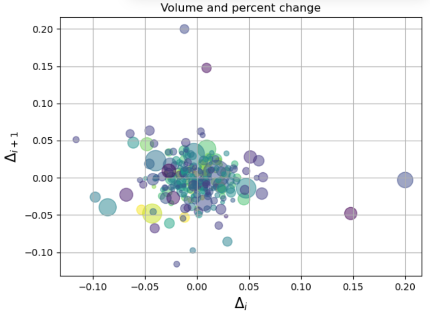
第一张图展示了两个连续时间点上的变化量(Δi 和 Δi+1)之间的关系。气泡的大小表示交易量,颜色表示开盘价与收盘价的比值。从图中可以看出,大多数数据点集中在原点附近,表明大多数交易日的价格变化不大。气泡的大小和颜色为我们提供了关于交易活跃度和价格波动的额外信息。
实验二:散点图与直方图的结合
实验代码:
import matplotlib.pyplot as plt
import numpy as np

# Fixing random state for reproducibility
np.random.seed(19680801)

# some random data
x = np.random.randn(1000)
y = np.random.randn(1000)


def scatter_hist(x, y, ax, ax_histx, ax_histy):
    # no labels
    ax_histx.tick_params(axis="x", labelbottom=False)
    ax_histy.tick_params(axis="y", labelleft=False)

    # the scatter plot:
    ax.scatter(x, y)

    # now determine nice limits by hand:
    binwidth = 0.25
    xymax = max(np.max(np.abs(x)), np.max(np.abs(y)))
    lim = (int(xymax/binwidth) + 1) * binwidth

    bins = np.arange(-lim, lim + binwidth, binwidth)
    ax_histx.hist(x, bins=bins)
    ax_histy.hist(y, bins=bins, orientation='horizontal')

fig, axs = plt.subplot_mosaic([['histx', '.'],
                               ['scatter', 'histy']],
                              figsize=(6, 6),
                              width_ratios=(4, 1), height_ratios=(1, 4),
                              layout='constrained')
scatter_hist(x, y, axs['scatter'], axs['histx'], axs['histy'])
实验结果:
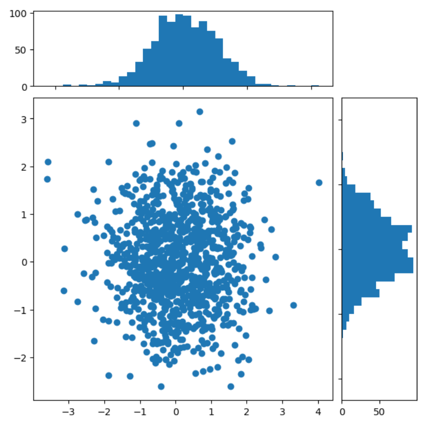
第二张图结合了散点图和直方图,展示了两个随机变量x和y的分布情况。散点图显示了x和y之间的关系,而直方图则展示了x和y的单独分布。这种组合可以帮助我们同时观察变量之间的关系和各自的分布特征。
实验三:不同形状和大小的气泡图
实验代码:
import matplotlib.pyplot as plt
import numpy as np

# Fixing random state for reproducibility
np.random.seed(19680801)


N = 100
r0 = 0.6
x = 0.9 * np.random.rand(N)
y = 0.9 * np.random.rand(N)
area = (20 * np.random.rand(N))**2  # 0 to 10 point radii
c = np.sqrt(area)
r = np.sqrt(x ** 2 + y ** 2)
area1 = np.ma.masked_where(r < r0, area)
area2 = np.ma.masked_where(r >= r0, area)
plt.scatter(x, y, s=area1, marker='^', c=c)
plt.scatter(x, y, s=area2, marker='o', c=c)
# Show the boundary between the regions:
theta = np.arange(0, np.pi / 2, 0.01)
plt.plot(r0 * np.cos(theta), r0 * np.sin(theta))

plt.show()
实验结果:
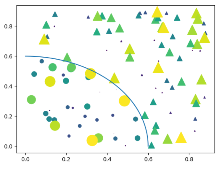
第三张图展示了不同形状(圆形和三角形)和大小的气泡图。气泡的大小表示面积,颜色表示不同的数据集。图中还绘制了一个圆形边界,将气泡图分为两个区域。这种可视化有助于展示不同类别数据的分布和密度。
实验四:颜色和透明度的气泡图
实验代码:
import matplotlib.pyplot as plt
import numpy as np

np.random.seed(19680801)


fig, ax = plt.subplots()
for color in ['tab:blue', 'tab:orange', 'tab:green']:
    n = 750
    x, y = np.random.rand(2, n)
    scale = 200.0 * np.random.rand(n)
    ax.scatter(x, y, c=color, s=scale, label=color,
               alpha=0.3, edgecolors='none')

ax.legend()
ax.grid(True)

plt.show()
实验结果:
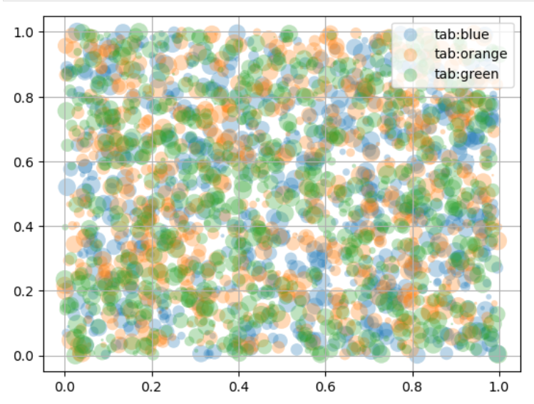
第四张图展示了一个气泡图,其中气泡的颜色和透明度表示不同的数据集。每个气泡的大小相同,但颜色和透明度的变化使得我们可以区分不同的数据集。这种可视化有助于在二维空间中展示多维数据。
实验五:带有图例的气泡图
实验代码:
N = 45
x, y = np.random.rand(2, N)
c = np.random.randint(1, 5, size=N)
s = np.random.randint(10, 220, size=N)

fig, ax = plt.subplots()

scatter = ax.scatter(x, y, c=c, s=s)

# produce a legend with the unique colors from the scatter
legend1 = ax.legend(*scatter.legend_elements(),
                    loc="lower left", title="Classes")
ax.add_artist(legend1)

# produce a legend with a cross-section of sizes from the scatter
handles, labels = scatter.legend_elements(prop="sizes", alpha=0.6)
legend2 = ax.legend(handles, labels, loc="upper right", title="Sizes")

plt.show()
实验结果:
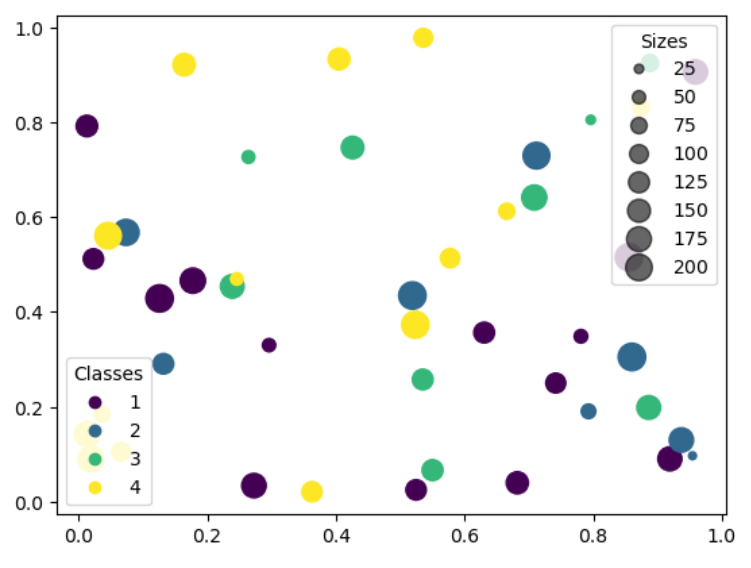
第五张图展示了一个带有图例的气泡图,其中气泡的颜色表示类别,大小表示数值大小。图例清晰地展示了不同颜色和大小气泡的含义。这种可视化有助于快速识别不同类别的数据点,并理解它们在数据集中的分布。
总结
通过这五个实验,我们可以看到散点图和气泡图在展示多维数据和变量关系方面的强大功能。这些图表不仅提供了数据的直观视图,还通过颜色、形状、大小和透明度等视觉元素增加了信息的维度。在数据分析中,合理选择和使用这些图表可以更有效地传达数据背后的信息。

腾讯云面向开发者汇聚海量精品云计算使用和开发经验,营造开放的云计算技术生态圈。
更多推荐
 4
4 0
0- 0


 已为社区贡献2条内容

所有评论(0)