MATLAB数据分析与可视化:从入门到精通
·
在当今这个数据爆炸的时代,海量数据背后隐藏着怎样的价值?如何让枯燥的数字变成直观的洞见?今天,就让我们一同探索MATLAB这个强大的数据分析与可视化利器,解锁数据科学的无限可能!
一、数据分析:从基础到进阶
1.1 数据预处理:打好分析基础
% 生成包含异常值和缺失值的示例数据
rng(42); % 设置随机种子保证可重复性
data = randn(1000, 1) * 10 + 50; % 正态分布数据
data(randi(1000, 20)) = NaN; % 添加缺失值
data(randi(1000, 10)) = data(randi(1000, 10)) + 100; % 添加异常值

% 数据清洗
clean_data = data;
clean_data(isnan(clean_data)) = []; % 删除缺失值

% 异常值检测与处理
Q1 = quantile(clean_data, 0.25);
Q3 = quantile(clean_data, 0.75);
IQR = Q3 - Q1;
lower_bound = Q1 - 1.5 * IQR;
upper_bound = Q3 + 1.5 * IQR;

outliers = clean_data < lower_bound | clean_data > upper_bound;
clean_data(outliers) = []; % 删除异常值

fprintf('原始数据量: %d\n', length(data));
fprintf('清洗后数据量: %d\n', length(clean_data));
fprintf('异常值数量: %d\n', sum(outliers));
1.2 统计分析:深入理解数据
% 描述性统计分析
data_stats = struct();
data_stats.mean = mean(clean_data);
data_stats.median = median(clean_data);
data_stats.std = std(clean_data);
data_stats.skewness = skewness(clean_data);
data_stats.kurtosis = kurtosis(clean_data);

fprintf('\n=== 描述性统计分析 ===\n');
fprintf('均值: %.2f\n', data_stats.mean);
fprintf('中位数: %.2f\n', data_stats.median);
fprintf('标准差: %.2f\n', data_stats.std);
fprintf('偏度: %.2f\n', data_stats.skewness);
fprintf('峰度: %.2f\n', data_stats.kurtosis);

% 假设检验:正态性检验
[h, p] = lillietest(clean_data);
fprintf('\n正态性检验 p值: %.4f\n', p);
if h == 0
    fprintf('数据服从正态分布\n');
else
    fprintf('数据不服从正态分布\n');
end
二、高级可视化技巧大全
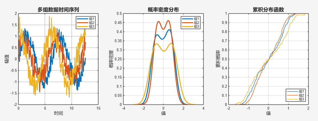
2.1 多维度数据对比分析
% 创建综合对比图表
figure('Position', [100, 100, 1400, 1000])

% 生成多组数据
x = linspace(0, 4*pi, 200);
group1 = sin(x) + 0.2*randn(1, 200);
group2 = 0.8*sin(x + pi/4) + 0.3*randn(1, 200);
group3 = 1.2*cos(x) + 0.25*randn(1, 200);

% 子图1:时间序列对比
subplot(2,3,1)
h1 = plot(x, group1, 'Color', [0, 0.4470, 0.7410], 'LineWidth', 2.5);
hold on
h2 = plot(x, group2, 'Color', [0.8500, 0.3250, 0.0980], 'LineWidth', 2.5);
h3 = plot(x, group3, 'Color', [0.9290, 0.6940, 0.1250], 'LineWidth', 2.5);
title('多组数据时间序列', 'FontSize', 14, 'FontWeight', 'bold')
xlabel('时间', 'FontSize', 12)
ylabel('幅值', 'FontSize', 12)
legend([h1, h2, h3], {'组1', '组2', '组3'}, 'Location', 'northeast')
grid on
set(gca, 'GridAlpha', 0.3)

% 子图2:概率密度分布
subplot(2,3,2)
[pdf1, xi1] = ksdensity(group1);
[pdf2, xi2] = ksdensity(group2);
[pdf3, xi3] = ksdensity(group3);

plot(xi1, pdf1, 'Color', [0, 0.4470, 0.7410], 'LineWidth', 2.5)
hold on
plot(xi2, pdf2, 'Color', [0.8500, 0.3250, 0.0980], 'LineWidth', 2.5)
plot(xi3, pdf3, 'Color', [0.9290, 0.6940, 0.1250], 'LineWidth', 2.5)
title('概率密度分布', 'FontSize', 14, 'FontWeight', 'bold')
xlabel('值', 'FontSize', 12)
ylabel('概率密度', 'FontSize', 12)
legend({'组1', '组2', '组3'})
grid on

% 子图3:累积分布函数
subplot(2,3,3)
ecdf(group1)
hold on
ecdf(group2)
ecdf(group3)
title('累积分布函数', 'FontSize', 14, 'FontWeight', 'bold')
xlabel('值', 'FontSize', 12)
ylabel('累积概率', 'FontSize', 12)
legend({'组1', '组2', '组3'}, 'Location', 'southeast')
grid on
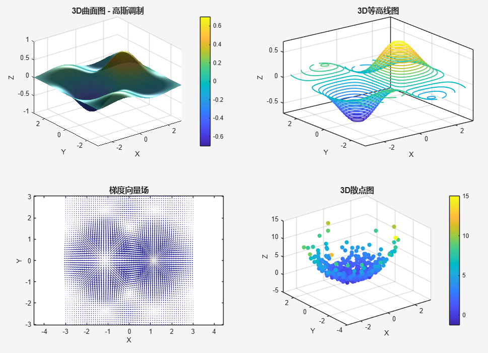
2.2 交互式3D可视化
% 创建交互式3D图形
figure('Position', [200, 200, 1200, 800])

% 生成3D数据
[X, Y] = meshgrid(-3:0.1:3, -3:0.1:3);
Z1 = sin(X).*cos(Y).*exp(-0.2*(X.^2 + Y.^2));
Z2 = 0.5*cos(2*X).*sin(2*Y);

% 3D曲面图
subplot(2,2,1)
surf(X, Y, Z1, 'EdgeColor', 'none', 'FaceAlpha', 0.9)
title('3D曲面图 - 高斯调制', 'FontSize', 12, 'FontWeight', 'bold')
xlabel('X')
ylabel('Y')
zlabel('Z')
colormap(parula)
colorbar
lighting gouraud
light('Position', [1, 1, 1])

% 3D等高线图
subplot(2,2,2)
contour3(X, Y, Z1, 30, 'LineWidth', 1.5)
title('3D等高线图', 'FontSize', 12, 'FontWeight', 'bold')
xlabel('X')
ylabel('Y')
zlabel('Z')
grid on

% 向量场可视化
subplot(2,2,3)
[U, V] = gradient(Z1);
quiver(X, Y, U, V, 2, 'Color', [0.2, 0.2, 0.6])
title('梯度向量场', 'FontSize', 12, 'FontWeight', 'bold')
xlabel('X')
ylabel('Y')
axis equal

% 3D散点图
subplot(2,2,4)
n_points = 500;
x_scatter = randn(n_points, 1);
y_scatter = randn(n_points, 1);
z_scatter = x_scatter.^2 + y_scatter.^2 + randn(n_points, 1)*0.5;
scatter3(x_scatter, y_scatter, z_scatter, 40, z_scatter, 'filled')
title('3D散点图', 'FontSize', 12, 'FontWeight', 'bold')
xlabel('X')
ylabel('Y')
zlabel('Z')
colorbar
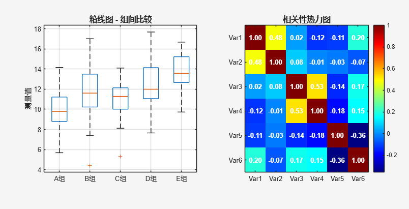
2.3 高级统计图表
% 创建高级统计图表
figure('Position', [100, 100, 1500, 900])

% 生成分类数据
categories = {'A组', 'B组', 'C组', 'D组', 'E组'};
data_matrix = [randn(50,1)*2 + 10; randn(50,1)*3 + 12;
               randn(50,1)*1.5 + 11; randn(50,1)*2.5 + 13;
               randn(50,1)*2 + 14];
groups = repelem(1:5, 50)';

% 小提琴图(箱线图+密度图)
subplot(2,3,1)
boxplot(data_matrix, groups, 'Labels', categories)
title('箱线图 - 组间比较', 'FontSize', 12, 'FontWeight', 'bold')
ylabel('测量值')
grid on

% 热力图增强版
subplot(2,3,2)
corr_data = randn(100, 6);
corr_data(:,2) = corr_data(:,1) * 0.7 + randn(100,1);
corr_data(:,4) = corr_data(:,3) * 0.6 + randn(100,1);
corr_data(:,6) = -corr_data(:,5) * 0.5 + randn(100,1);

corr_matrix = corr(corr_data);
imagesc(corr_matrix)
colorbar
colormap(jet)
title('相关性热力图', 'FontSize', 12, 'FontWeight', 'bold')
xticks(1:6)
yticks(1:6)
xticklabels({'Var1', 'Var2', 'Var3', 'Var4', 'Var5', 'Var6'})
yticklabels({'Var1', 'Var2', 'Var3', 'Var4', 'Var5', 'Var6'})

% 添加相关系数值
for i = 1:6
    for j = 1:6
        text(i, j, sprintf('%.2f', corr_matrix(i,j)), ...
             'HorizontalAlignment', 'center', ...
             'Color', 'white', 'FontWeight', 'bold', 'FontSize', 10)
    end
end
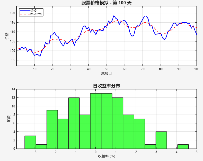
2.4 动态数据故事讲述
% 创建动态数据演示
figure('Position', [150, 150, 1000, 700])

% 模拟股票价格随机游走
n_days = 100;
price = 100; % 初始价格
prices = zeros(1, n_days);

for day = 1:n_days
    % 随机波动
    change = randn() * 2;
    price = max(price + change, 0); % 价格不能为负
    prices(day) = price;

    % 实时绘图
    subplot(2,1,1)
    plot(1:day, prices(1:day), 'b-', 'LineWidth', 2)
    hold on
    if day > 1
        % 添加移动平均线
        window = min(10, day);
        moving_avg = movmean(prices(1:day), window);
        plot(1:day, moving_avg, 'r--', 'LineWidth', 1.5)
    end
    hold off

    title(['股票价格模拟 - 第 ' num2str(day) ' 天'], ...
          'FontSize', 14, 'FontWeight', 'bold')
    xlabel('交易日')
    ylabel('价格')
    legend('价格', '移动平均', 'Location', 'northwest')
    grid on
    xlim([0, n_days])
    ylim([max(0, min(prices)-5), max(prices)+5])

    % 实时收益分布
    subplot(2,1,2)
    if day > 10
        returns = diff(prices(1:day)) ./ prices(1:day-1) * 100;
        histogram(returns, 15, 'FaceColor', 'green', 'FaceAlpha', 0.7)
        title('日收益率分布', 'FontSize', 14, 'FontWeight', 'bold')
        xlabel('收益率 (%)')
        ylabel('频数')
        grid on
    end

    drawnow
    pause(0.1) % 控制动画速度
end
三、实用技巧与最佳实践
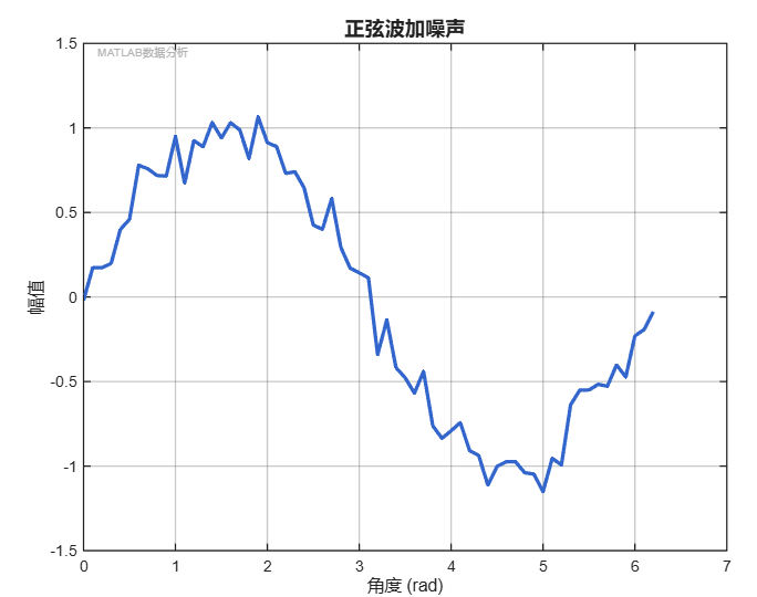
3.1 图表美化专业函数
function professionalFigure(x, y, options)
    % 专业图表设置函数
    % 输入参数检查
    arguments
        x (1,:) double
        y (1,:) double
        options.title (1,:) char = '专业图表'
        options.xlabel (1,:) char = 'X轴'
        options.ylabel (1,:) char = 'Y轴'
        options.color (1,3) double = [0.2, 0.4, 0.8]
        options.linewidth (1,1) double = 2.5
    end

    % 创建图形
    figure('Color', 'white', 'Position', [100, 100, 800, 600])

    % 绘制数据
    plot(x, y, 'LineWidth', options.linewidth, ...
         'Color', options.color)

    % 美化设置
    grid on
    set(gca, 'GridAlpha', 0.3, 'GridColor', [0.3, 0.3, 0.3], ...
             'FontSize', 11, 'FontName', 'Arial')

    title(options.title, 'FontSize', 14, 'FontWeight', 'bold')
    xlabel(options.xlabel, 'FontSize', 12)
    ylabel(options.ylabel, 'FontSize', 12)

    % 设置坐标轴
    set(gca, 'Box', 'on', 'LineWidth', 1)

    % 添加水印(可选)
    text(0.02, 0.98, 'MATLAB数据分析', ...
         'Units', 'normalized', 'FontSize', 8, ...
         'Color', [0.7, 0.7, 0.7], 'HorizontalAlignment', 'left')
end

% 使用示例
x = 0:0.1:2*pi;
y = sin(x) + 0.1*randn(size(x));
professionalFigure(x, y, 'title', '正弦波加噪声', ...
                   'xlabel', '角度 (rad)', 'ylabel', '幅值')
3.2 批量处理与自动化
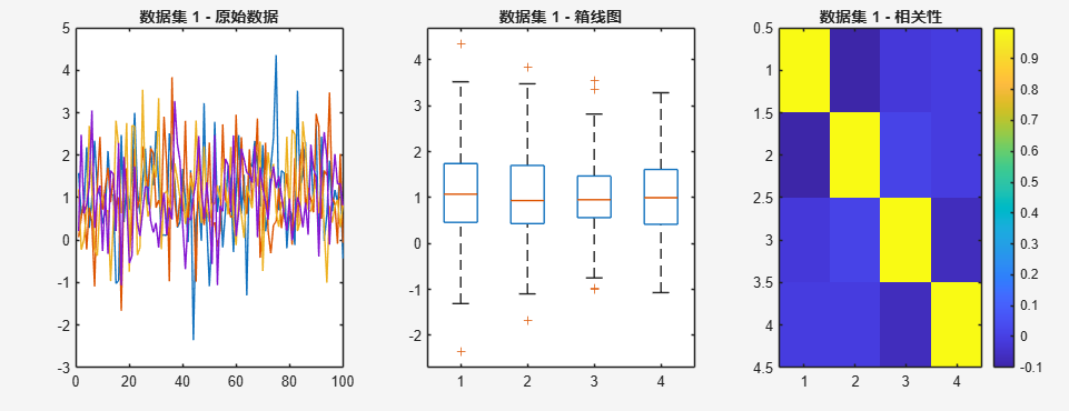
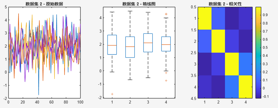
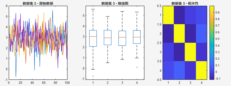
% 批量数据分析和可视化
data_files = {'dataset1.csv', 'dataset2.csv', 'dataset3.csv'}; % 示例文件列表
results = cell(length(data_files), 1);

for i = 1:length(data_files)
    % 模拟数据读取和分析
    data = randn(100, 4) + i; % 模拟不同数据集

    % 分析每个数据集
    results{i}.mean = mean(data);
    results{i}.std = std(data);
    results{i}.corr = corr(data);

    % 自动生成图表
    figure('Position', [100, 100, 1200, 400])

    subplot(1,3,1)
    plot(data)
    title(['数据集 ' num2str(i) ' - 原始数据'])

    subplot(1,3,2)
    boxplot(data)
    title(['数据集 ' num2str(i) ' - 箱线图'])

    subplot(1,3,3)
    imagesc(results{i}.corr)
    colorbar
    title(['数据集 ' num2str(i) ' - 相关性'])

    % 保存图表
    saveas(gcf, sprintf('analysis_dataset_%d.png', i))
end

腾讯云面向开发者汇聚海量精品云计算使用和开发经验,营造开放的云计算技术生态圈。
更多推荐
 6
6 0
0- 0


 已为社区贡献1条内容

所有评论(0)