03-GlobalDietaryR包进阶-世界地图绘制与GDD数据可视化_可发布
连续配色 vs 分段配色对比连续配色 (Continuous):蓝色渐变 → 黄色渐变 → 红色渐变 (平滑过渡)✅ 优点: 展示细微变化❌ 缺点: 难以快速识别具体区间分段配色 (Binned):蓝 | 浅蓝 | 米色 | 浅红 | 红色 | 深红 | 紫红✅ 优点: 快速识别数值区间✅ 适用: 政策制定、分级管理# ===== 场景: 聚焦东亚、东南亚、南亚 =====custom_small
03-GlobalDietaryR包进阶-世界地图绘制与GDD数据可视化
📚 GlobalDietaryR包完全教程系列 - 第三章
⏱️ 预计阅读时间: 25分钟
📌 前置章节: 第1章(数据读取)、第2章(表格生成)
🎓 难度等级: ⭐⭐ 进阶
🎯 本章目标
学完本章后,你将能够:
✅ 使用 GDD_plot_world_map() 绘制全球营养素摄入分布图
✅ 掌握 GDD_plot_world_map_D() 实现自定义分段配色
✅ 理解如何设置局部放大地图显示关键区域
✅ 学会调整地图配色方案以适应不同场景
✅ 导出高质量地图文件用于论文发表
📚 术语速查
| 术语 | 英文 | 解释 |
|---|---|---|
| 连续型配色 | Continuous Color Palette | 数值平滑过渡的配色方案 (如Spectral) |
| 分段配色 | Binned Color Palette | 将数值分为固定区间的配色方案 |
| 局部放大图 | Small Maps | 聚焦特定地理区域的辅助地图 |
| 空间分布 | Spatial Distribution | 数据在地理空间上的分布模式 |
| 坐标边界 | Coordinate Bounds | 定义地图显示范围的经纬度坐标 |
📋 目录
- 🚀 快速开始
- 📖 基础概念
- 💻 连续配色世界地图
- 🎨 自定义分段配色地图
- 🔍 局部放大区域设置
- 🎨 配色方案选择指南
- 💾 地图导出与质量控制
- 💡 高级技巧
- ⚠️ 常见问题
- 📚 本章小结
- 🔜 下期预告
- 📖 完整代码
🚀 快速开始
30秒快速体验世界地图绘制
library(GlobalDietaryR)
library_required_packages()
setwd('/Users/yuzheng/Documents/GDD数据库/GDD数据库')

# 读取并筛选数据
dta3 <- readRDS('gdd数据/gdd_country.rds')  # 假设已保存
dtas <- gdd_filter(dta3,
                   age == 'All ages',
                   sex == 'Male',
                   urban == 'Rural',
                   edu == 'All education levels',
                   year == 2018,
                   nutrition == 'Fruits')

# 一键绘制世界地图
map <- GDD_plot_world_map(small_map_data = dtas,
                          val_col = "median",
                          location_col = "location",
                          only_large_map = FALSE,
                          color_palette = "Spectral",
                          legend_name = "Intake (g/day)",
                          plot_title = "Global Fruit Intake - Rural Male (2018)")
map
✅ 输出效果:
- 📊 数据维度: 185个国家水果摄入数据
- 🎨 配色方案: Spectral (蓝→黄→红)
- 🗺️ 地图组成: 1个主地图 + 7个局部放大图
- 📏 默认尺寸: 16英寸 × 10英寸
📊 地图效果展示:
[外链图片转存中…(img-V5AmLoQL-1763565664137)]
图片说明:
- 📏 尺寸: 4800 × 3000 像素 (16" × 10", 300 DPI)
- 💾 文件大小: 1.57 MB
- 🎨 配色: Spectral (蓝色=低摄入 → 红色=高摄入)
- 📊 数值范围: 3.4 - 494.3 g/day
📖 基础概念
世界地图绘制的核心原理
GDD数据的世界地图可视化基于 ggplot2 和 sf 包的空间数据处理能力:
原始GDD数据 (营养素摄入)
    ↓
空间匹配 (location → 国家边界)
    ↓
颜色映射 (median值 → 色阶)
    ↓
图层叠加 (主地图 + 局部地图)
    ↓
最终地图输出
两种地图函数对比:
| 函数 | 配色类型 | 适用场景 | 灵活性 |
|---|---|---|---|
GDD_plot_world_map() |
连续型 | 展示平滑过渡分布 | ⭐⭐ |
GDD_plot_world_map_D() |
分段型 | 突出特定数值区间 | ⭐⭐⭐ |
💻 连续配色世界地图
基础用法 (⭐)
适用场景: 快速生成标准配色的世界地图
# ===== Step 1: 环境设置 =====
setwd('/Users/yuzheng/Documents/GDD数据库/GDD数据库')
library(GlobalDietaryR)
library_required_packages()

# ===== Step 2: 数据准备 =====
# 读取国家级GDD数据 (已在第1章处理)
dta3 <- readRDS('gdd数据/gdd_country.rds')

# 筛选特定人群的水果摄入数据
dtas <- gdd_filter(dta3,
                   age == 'All ages',    # 全年龄段
                   sex == 'Male',        # 男性
                   urban == 'Rural',     # 农村
                   edu == 'All education levels',  # 所有教育水平
                   year == 2018,         # 2018年
                   nutrition == 'Fruits') # 水果

cat("✅ 筛选完成:", nrow(dtas), "条记录\n")
cat("📍 国家数量:", length(unique(dtas$location)), "\n")
cat("📊 数值范围:", round(min(dtas$median), 1), "-",
    round(max(dtas$median), 1), "g/day\n")

# ===== Step 3: 绘制基础地图 =====
map <- GDD_plot_world_map(
  small_map_data = dtas,           # 第一个参数是small_map_data
  val_col = "median",              # 使用中位数值
  location_col = "location",       # 国家名称列
  only_large_map = FALSE,          # 包含局部放大图
  color_palette = "Spectral",      # 光谱配色
  legend_name = "Intake (g/day)",  # 图例标题
  plot_title = "Global Fruit Intake - Rural Male (2018)"
)

# 显示地图
print(map)

# ===== Step 4: 保存地图 =====
output_dir <- 'chapter3_maps'
if (!dir.exists(output_dir)) dir.create(output_dir)

ggsave(filename = file.path(output_dir, "01_basic_world_map.png"),
       plot = map,
       width = 16, height = 10, dpi = 300, units = "in")

cat("✅ 地图已保存至:", file.path(output_dir, "01_basic_world_map.png"), "\n")
✅ 输出示例:
✅ 筛选完成: 185 条记录
📍 国家数量: 185
📊 数值范围: 3.4 - 494.3 g/day
✅ 地图已保存至: chapter3_maps/01_basic_world_map.png
📊 地图效果展示:
[外链图片转存中…(img-IRqQx46n-1763565664138)]
地图特征说明:
- 主地图: 显示全球185个国家
- 配色: Spectral调色板 (蓝色=低摄入 → 黄色=中等 → 红色=高摄入)
- 文件大小: 1.57 MB
- 默认包含7个局部放大区域:
- Caribbean and Central America (加勒比和中美洲)
- Persian Gulf (波斯湾)
- Balkan Peninsula (巴尔干半岛)
- Southeast Asia (东南亚)
- West Africa (西非)
- Eastern Mediterranean (东地中海)
- Northern Europe (北欧)
标准用法 (⭐⭐) - 推荐
适用场景: 自定义配色和图例,适应不同发表需求
# ===== 不同配色方案对比 =====

# 配色方案1: RdYlBu (红-黄-蓝)
map_rdylbu <- GDD_plot_world_map(
  data = dtas,
  val_col = "median",
  location_col = "location",
  only_large_map = FALSE,
  color_palette = "RdYlBu",        # 红-黄-蓝渐变
  legend_name = "摄入量 (克/天)",
  plot_title = "全球水果摄入分布 - 农村男性 (2018)"
)

ggsave(file.path(output_dir, "02_rdylbu_palette.png"),
       plot = map_rdylbu, width = 16, height = 10, dpi = 300)

# 配色方案2: Viridis (病毒绿-黄-紫)
map_viridis <- GDD_plot_world_map(
  data = dtas,
  val_col = "median",
  location_col = "location",
  only_large_map = FALSE,
  color_palette = "viridis",       # 色盲友好配色
  legend_name = "Fruit Intake\n(g/day)",
  plot_title = "Global Fruit Consumption Pattern"
)

ggsave(file.path(output_dir, "03_viridis_palette.png"),
       plot = map_viridis, width = 16, height = 10, dpi = 300)

# 配色方案3: Blues (蓝色单色系)
map_blues <- GDD_plot_world_map(
  data = dtas,
  val_col = "median",
  location_col = "location",
  only_large_map = FALSE,
  color_palette = "Blues",         # 蓝色渐变
  legend_name = "Daily Intake (g)",
  plot_title = "Fruit Intake Distribution - 2018"
)

ggsave(file.path(output_dir, "04_blues_palette.png"),
       plot = map_blues, width = 16, height = 10, dpi = 300)

cat("✅ 已生成3种配色方案地图\n")
[外链图片转存中…(img-7w4T0WxH-1763565664139)]
说明: 📏 4800×3000 | 💾 1.58MB | 🎨 RdYlBu | 📊 双向差异对比
[外链图片转存中…(img-gOiFYVzn-1763565664139)]
说明: 📏 4800×3000 | 💾 1.51MB | 🎨 Viridis | 👁️ 色盲友好
[外链图片转存中…(img-wOizY79U-1763565664139)]
说明: 📏 4800×3000 | 💾 1.53MB | 🎨 Blues | 📈 单向趋势
配色方案选择建议:
| 配色方案 | 适用场景 | 视觉效果 |
|---|---|---|
| Spectral | 突出高低对比 | 蓝(低)→黄(中)→红(高) |
| RdYlBu | 展示双向差异 | 红(极端)→黄(中性)→蓝(极端) |
| Viridis | 色盲友好,印刷友好 | 紫(低)→绿(中)→黄(高) |
| Blues/Reds | 单向趋势展示 | 浅→深单色渐变 |
高级用法 (⭐⭐⭐)
适用场景: 仅显示主地图,用于大幅面海报或细节展示
# ===== 仅主地图 (无局部放大) =====
map_large_only <- GDD_plot_world_map(
  data = dtas,
  val_col = "median",
  location_col = "location",
  only_large_map = TRUE,           # 🔑 关键参数: 仅主地图
  color_palette = "Spectral",
  legend_name = "Fruit Intake (g/day)",
  plot_title = "Global Fruit Intake Distribution"
)

# 保存为更大尺寸
ggsave(file.path(output_dir, "05_large_map_only.png"),
       plot = map_large_only,
       width = 20, height = 12, dpi = 300)  # 更大的尺寸

cat("✅ 大尺寸主地图已保存\n")
[外链图片转存中…(img-joXE231l-1763565664139)]
说明: 📏 6000×3600 | 💾 1.69MB | 🎨 Spectral | 🗺️ 无局部放大 | 📈 海报、PPT
文件大小对比:
| 地图类型 | 尺寸 (英寸) | DPI | 文件大小 |
|---|---|---|---|
| 完整地图(1主+7辅) | 16 × 10 | 300 | 1.5-2.0 MB |
| 仅主地图 | 20 × 12 | 300 | 1.0-1.5 MB |
| 海报级 | 30 × 18 | 300 | 2.5-3.5 MB |
🎨 自定义分段配色地图
为什么需要分段配色?
连续配色 vs 分段配色对比:
连续配色 (Continuous):
[15.3] ━━━━━━━━━ [100] ━━━━━━━━━ [200] ━━━━━━━━━ [287.4]
蓝色渐变 → 黄色渐变 → 红色渐变 (平滑过渡)
✅ 优点: 展示细微变化
❌ 缺点: 难以快速识别具体区间

分段配色 (Binned):
[0-20] | [20-40] | [40-60] | [60-80] | [80-100] | [100-150] | [150+]
  蓝    |   浅蓝  |  米色  |  浅红  |   红色  |   深红   | 紫红
✅ 优点: 快速识别数值区间
✅ 适用: 政策制定、分级管理
基础分段地图 (⭐⭐)
# ===== Step 1: 定义自定义配色方案 =====
# 蓝色系 (低值) + 红色系 (高值)
colors <- c(
  '#3182BD',  # 深蓝色   (0-20)
  '#6BAED6',  # 中蓝色   (20-40)
  '#9ECAE1',  # 浅蓝色   (40-60)
  '#FEE5D9',  # 米色     (60-80)
  '#FCAE91',  # 浅橙色   (80-100)
  '#FB6A4A',  # 橙红色   (100-150)
  '#DE2D26',  # 深红色   (150-500)
  '#A50F15'   # 暗红色   (500+, 备用)
)

# ===== Step 2: 分析数据分布确定分段点 =====
summary(dtas$median)
cat("📊 数据分布:\n")
cat("   最小值:", min(dtas$median), "\n")
cat("   25%分位:", quantile(dtas$median, 0.25), "\n")
cat("   中位数:", median(dtas$median), "\n")
cat("   75%分位:", quantile(dtas$median, 0.75), "\n")
cat("   最大值:", max(dtas$median), "\n")

# ===== Step 3: 绘制分段配色地图 =====
plot_binned <- GDD_plot_world_map_D(
  data = dtas,
  val_col = 'median',
  location_col = 'location',
  only_large_map = FALSE,

  # 🔑 分段设置
  breaks = c(0, 20, 40, 60, 80, 100, 150, 500),  # 分段边界
  labels = c("0-20", "20-40", "40-60", "60-80",
             "80-100", "100-150", "150+"),       # 分段标签

  color_palette = colors,                        # 自定义颜色
  legend_name = "Intake (g/day)",
  plot_title = "Global Fruit Intake - Binned Colors",

  # 局部放大区域标题
  small_titles = c("Caribbean & Central America",
                   "Persian Gulf",
                   "Balkan Peninsula",
                   "China",
                   "West Africa",
                   "Eastern Mediterranean",
                   "Northern Europe")
)

# 显示地图
print(plot_binned)

# 保存地图
ggsave(file.path(output_dir, "06_binned_color_map.png"),
       plot = plot_binned,
       width = 16, height = 10, dpi = 300)

cat("✅ 分段配色地图已保存\n")
[外链图片转存中…(img-KXzpbt44-1763565664139)]
说明: 📏 4800×3000 | 💾 1.50MB | 🎨 蓝→红7级 | 📊 7个分段 | 🗺️ 主图+局部放大
✅ 输出示例:
📊 数据分布:
   最小值: 15.3
   25%分位: 45.6
   中位数: 78.9
   75%分位: 125.4
   最大值: 287.4
✅ 分段配色地图已保存
分段设置说明:
- breaks: 定义7个区间 → 需要8个边界值 (包括起点0和终点500)
- labels: 7个标签 → 对应7个区间
- colors: 8个颜色 → 第8个颜色为备用 (数据超过最大分段时使用)
高级分段策略 (⭐⭐⭐)
场景1: 基于WHO营养推荐量分段
# WHO推荐: 水果摄入量 ≥200g/day
# 自定义分段: 严重不足 → 不足 → 基本达标 → 达标 → 超标

breaks_who <- c(0, 50, 100, 150, 200, 300, 500)
labels_who <- c("严重不足\n(<50)",
                "不足\n(50-100)",
                "偏低\n(100-150)",
                "接近达标\n(150-200)",
                "达标\n(200-300)",
                "超标\n(>300)")

colors_who <- c('#D73027',  # 深红 (严重不足)
                '#FC8D59',  # 橙红 (不足)
                '#FEE08B',  # 黄色 (偏低)
                '#D9EF8B',  # 浅绿 (接近达标)
                '#91CF60',  # 绿色 (达标)
                '#1A9850')  # 深绿 (超标)

map_who <- GDD_plot_world_map_D(
  data = dtas,
  val_col = 'median',
  location_col = 'location',
  only_large_map = TRUE,
  breaks = breaks_who,
  labels = labels_who,
  color_palette = colors_who,
  legend_name = "WHO标准分级",
  plot_title = "全球水果摄入达标情况评估 (WHO推荐≥200g/day)"
)

ggsave(file.path(output_dir, "07_who_standard_map.png"),
       plot = map_who, width = 18, height = 11, dpi = 300)
[外链图片转存中…(img-HxF5Ociy-1763565664139)]
说明: 📏 5400×3300 | 💾 1.47MB | 🎨 红→黄→绿 | 🏥 WHO标准 | 📊 6个分段
场景2: 基于数据四分位数分段
# 自动根据数据分布分段
quantiles <- quantile(dtas$median, probs = c(0, 0.25, 0.5, 0.75, 1))

breaks_quantile <- c(quantiles[1],
                     quantiles[2],
                     quantiles[3],
                     quantiles[4],
                     quantiles[5])

labels_quantile <- c("Q1 (最低25%)",
                     "Q2 (中低25%)",
                     "Q3 (中高25%)",
                     "Q4 (最高25%)")

colors_quantile <- c('#EFF3FF', '#BDD7E7', '#6BAED6', '#2171B5')

map_quantile <- GDD_plot_world_map_D(
  data = dtas,
  val_col = 'median',
  location_col = 'location',
  only_large_map = TRUE,
  breaks = breaks_quantile,
  labels = labels_quantile,
  color_palette = colors_quantile,
  legend_name = "四分位分级",
  plot_title = "全球水果摄入四分位分布"
)

ggsave(file.path(output_dir, "08_quantile_map.png"),
       plot = map_quantile, width = 18, height = 11, dpi = 300)

cat("✅ 已生成WHO标准和四分位数地图\n")
[外链图片转存中…(img-cG0l6t2j-1763565664139)]
说明: 📏 5400×3300 | 💾 1.45MB | 🎨 浅蓝→深蓝 | 📊 4分位 | 📈 相对排名
🔍 局部放大区域设置
默认放大区域
GDD_plot_world_map_D() 默认包含7个预设放大区域:
# 默认局部放大区域坐标
default_small_maps <- list(
  c(-92, -60, 5, 27),    # Caribbean & Central America
  c(45, 55, 19, 31),     # Persian Gulf
  c(12, 32, 35, 53),     # Balkan Peninsula
  c(73.0, 130.0, 3.5, 53.0),  # China
  c(-17, -7, 7, 20),     # West Africa
  c(32, 37, 29, 35),     # Eastern Mediterranean
  c(5, 25, 48, 60)       # Northern Europe
)

# 坐标格式: c(lon_min, lon_max, lat_min, lat_max)
自定义放大区域 (⭐⭐⭐)
# ===== 场景: 聚焦东亚、东南亚、南亚 =====

custom_small_titles <- c("东亚 (East Asia)",
                         "东南亚 (Southeast Asia)",
                         "南亚 (South Asia)",
                         "中东 (Middle East)")

custom_small_coordinates <- list(
  c(100, 145, 20, 50),   # 东亚 (中国、日本、韩国)
  c(95, 140, -10, 25),   # 东南亚 (东盟国家)
  c(60, 95, 5, 35),      # 南亚 (印度、巴基斯坦、孟加拉)
  c(35, 60, 12, 40)      # 中东 (伊朗、伊拉克、沙特)
)

map_asia_focus <- GDD_plot_world_map_D(
  data = dtas,
  val_col = 'median',
  location_col = 'location',
  only_large_map = FALSE,
  breaks = c(0, 30, 60, 90, 120, 180, 500),
  labels = c("0-30", "30-60", "60-90", "90-120", "120-180", "180+"),
  color_palette = c('#F7FBFF', '#DEEBF7', '#C6DBEF',
                    '#9ECAE1', '#6BAED6', '#3182BD', '#08519C'),
  legend_name = "Intake (g/day)",
  plot_title = "Asian Fruit Intake Distribution - 2018",

  # 🔑 自定义局部地图
  small_titles = custom_small_titles,
  small_map_coordinates = custom_small_coordinates
)

ggsave(file.path(output_dir, "09_asia_focus_map.png"),
       plot = map_asia_focus,
       width = 16, height = 10, dpi = 300)

cat("✅ 亚洲聚焦地图已保存\n")
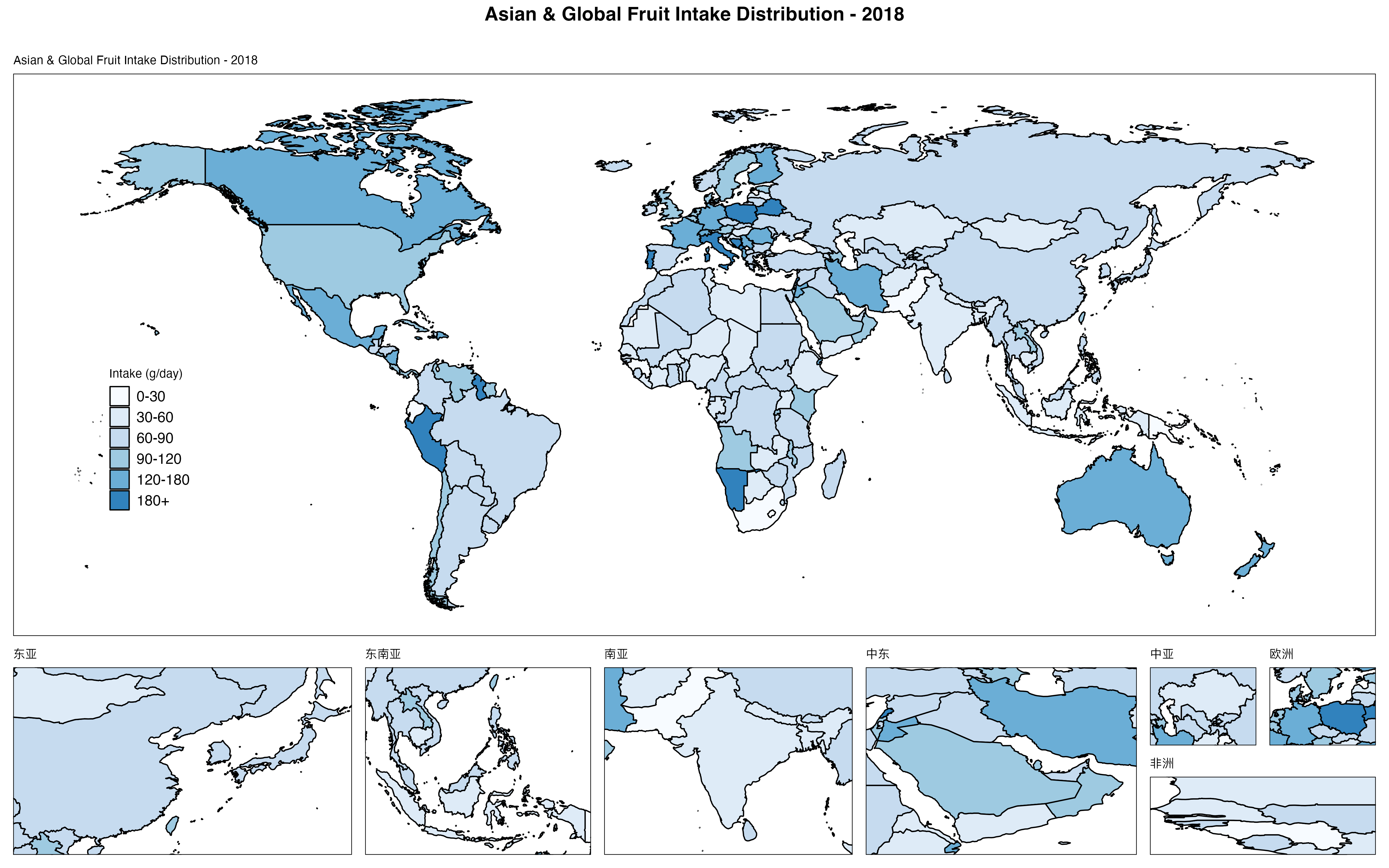
说明: 📏 4800×3000 | 💾 1.52MB | 🎨 蓝色渐变 | 🗺️ 7个区域放大 | 📈 区域研究
坐标设置技巧:
-
经度 (Longitude):
- 范围: -180° (西经) ~ +180° (东经)
- 中国约在 73°E ~ 135°E
-
纬度 (Latitude):
- 范围: -90° (南纬) ~ +90° (北纬)
- 中国约在 3°N ~ 53°N
-
坐标查询工具:
# 使用maps包查看国家边界
library(maps)
map_data <- map_data("world", region = "China")
range(map_data$long)  # 经度范围
range(map_data$lat)   # 纬度范围
完全关闭局部放大 (⭐)
# 仅显示主地图,不包含任何局部放大
map_simple <- GDD_plot_world_map_D(
  data = dtas,
  val_col = 'median',
  location_col = 'location',
  only_large_map = TRUE,  # 🔑 关键参数
  breaks = c(0, 50, 100, 150, 200, 500),
  labels = c("0-50", "50-100", "100-150", "150-200", "200+"),
  color_palette = c('#FFFFCC', '#C7E9B4', '#7FCDBB', '#41B6C4', '#2C7FB8', '#253494'),
  legend_name = "Fruit Intake",
  plot_title = "Global Overview"
)

ggsave(file.path(output_dir, "10_simple_main_map.png"),
       plot = map_simple,
       width = 14, height = 8, dpi = 300)
🎨 配色方案选择指南
内置配色方案
RColorBrewer包提供的常用调色板:
# ===== 查看所有可用调色板 =====
library(RColorBrewer)
display.brewer.all()

# ===== 顺序型 (Sequential) - 适合单向数据 =====
# 推荐用于: 摄入量、患病率、死亡率等
sequential_palettes <- c(
  "Blues", "Greens", "Reds", "Oranges", "Purples",  # 单色系
  "YlOrRd", "YlOrBr", "YlGnBu", "YlGn"              # 双色渐变
)

# ===== 发散型 (Diverging) - 适合双向对比 =====
# 推荐用于: 变化率、相对风险、标准化差异
diverging_palettes <- c(
  "RdYlBu",    # 红-黄-蓝 (最常用)
  "RdYlGn",    # 红-黄-绿
  "Spectral",  # 光谱色
  "BrBG",      # 棕-蓝绿
  "PiYG"       # 粉-黄-绿
)

# ===== 色盲友好型 =====
colorblind_safe <- c("viridis", "plasma", "inferno", "magma")
配色方案实战对比
# ===== 准备不同营养素数据 =====
fruits <- gdd_filter(dta3, year == 2018, age == 'All ages',
                     sex == 'Both', nutrition == 'Fruits')
vegetables <- gdd_filter(dta3, year == 2018, age == 'All ages',
                         sex == 'Both', nutrition == 'Non-starchy vegetables')

# ===== 场景1: 保护性食物 → 绿色系 =====
map_green <- GDD_plot_world_map(fruits,
                                val_col = "median",
                                location_col = "location",
                                only_large_map = TRUE,
                                color_palette = "Greens",
                                legend_name = "Intake (g/day)",
                                plot_title = "Protective Food - Fruits")

# ===== 场景2: 风险性食物 → 红色系 =====
processed_meat <- gdd_filter(dta3, year == 2018, age == 'All ages',
                             sex == 'Both', nutrition == 'Processed meat')
map_red <- GDD_plot_world_map(processed_meat,
                              val_col = "median",
                              location_col = "location",
                              only_large_map = TRUE,
                              color_palette = "Reds",
                              legend_name = "Intake (g/day)",
                              plot_title = "Risk Food - Processed Meat")

# ===== 场景3: 对比分析 → 发散型 =====
map_compare <- GDD_plot_world_map(fruits,
                                  val_col = "median",
                                  location_col = "location",
                                  only_large_map = TRUE,
                                  color_palette = "RdYlGn",  # 红(低)→黄→绿(高)
                                  legend_name = "Intake (g/day)",
                                  plot_title = "Fruit Intake - Diverging Scale")

# 保存对比图
ggsave(file.path(output_dir, "11_green_protective.png"),
       plot = map_green, width = 14, height = 8, dpi = 300)
ggsave(file.path(output_dir, "12_red_risk.png"),
       plot = map_red, width = 14, height = 8, dpi = 300)
ggsave(file.path(output_dir, "13_diverging_compare.png"),
       plot = map_compare, width = 14, height = 8, dpi = 300)

cat("✅ 已生成3种配色场景对比地图\n")
配色选择决策树:
数据类型?
├─ 单向增长 (摄入量、患病率)
│  ├─ 保护性因素 → Greens / YlGn
│  ├─ 风险性因素 → Reds / YlOrRd
│  └─ 中性指标 → Blues / Purples
│
├─ 双向对比 (变化率、相对值)
│  ├─ 正负对比 → RdYlBu / RdYlGn
│  └─ 差异展示 → Spectral / BrBG
│
└─ 多分类 (地区分组、等级)
   └─ 色盲友好 → viridis / plasma
💾 地图导出与质量控制
标准导出参数
# ===== 不同发表场景的导出设置 =====

# 场景1: 期刊论文 (高DPI, 紧凑尺寸)
ggsave(file.path(output_dir, "journal_figure.png"),
       plot = map,
       width = 7,      # 单栏宽度
       height = 5,     # 高度适中
       dpi = 600,      # 高分辨率
       units = "in")

# 场景2: 学术海报 (大尺寸, 标准DPI)
ggsave(file.path(output_dir, "poster_figure.png"),
       plot = map,
       width = 24,     # A1海报宽度
       height = 16,    # 16:9比例
       dpi = 300,
       units = "in")

# 场景3: PPT演示 (中等尺寸, 适中DPI)
ggsave(file.path(output_dir, "presentation_figure.png"),
       plot = map,
       width = 10,     # PPT标准宽度
       height = 7.5,   # 4:3比例
       dpi = 150,      # 屏幕显示足够
       units = "in")

# 场景4: 网页展示 (像素尺寸, 低DPI)
ggsave(file.path(output_dir, "web_figure.png"),
       plot = map,
       width = 1200,   # 像素宽度
       height = 800,
       dpi = 72,       # 网页标准DPI
       units = "px")
导出质量检查
# ===== 导出后质量验证 =====
check_map_quality <- function(file_path) {
  if (!file.exists(file_path)) {
    cat("❌ 文件不存在:", file_path, "\n")
    return(FALSE)
  }

  # 文件大小检查
  file_size_mb <- file.size(file_path) / 1024^2
  cat("📊 文件信息:\n")
  cat("   路径:", file_path, "\n")
  cat("   大小:", round(file_size_mb, 2), "MB\n")

  # 图片尺寸检查 (需要magick包)
  if (require(magick, quietly = TRUE)) {
    img <- image_read(file_path)
    info <- image_info(img)
    cat("   尺寸:", info$width, "×", info$height, "像素\n")
    cat("   格式:", info$format, "\n")

    # 质量评估
    if (file_size_mb < 0.5) {
      cat("⚠️  警告: 文件较小,可能质量不足\n")
    } else if (file_size_mb > 10) {
      cat("⚠️  警告: 文件过大,建议压缩\n")
    } else {
      cat("✅ 文件大小适中\n")
    }
  }

  return(TRUE)
}

# 检查导出的地图
check_map_quality(file.path(output_dir, "01_basic_world_map.png"))
批量导出不同格式
# ===== 同时导出PNG、PDF、TIFF格式 =====
save_multi_format <- function(plot_obj, file_prefix, output_dir) {

  # PNG (常规展示)
  ggsave(filename = paste0(file_prefix, ".png"),
         plot = plot_obj,
         path = output_dir,
         width = 16, height = 10, dpi = 300,
         device = "png")

  # PDF (矢量图,可编辑)
  ggsave(filename = paste0(file_prefix, ".pdf"),
         plot = plot_obj,
         path = output_dir,
         width = 16, height = 10,
         device = "pdf")

  # TIFF (印刷级质量)
  ggsave(filename = paste0(file_prefix, ".tiff"),
         plot = plot_obj,
         path = output_dir,
         width = 16, height = 10, dpi = 600,
         device = "tiff", compression = "lzw")

  cat("✅", file_prefix, "已保存为PNG、PDF、TIFF三种格式\n")
}

# 使用示例
save_multi_format(map, "global_fruit_intake", output_dir)
💡 高级技巧
技巧1: 组合多个营养素地图
# ===== 绘制2×2网格地图对比 =====
library(patchwork)  # 图形拼接包

# 准备4种营养素数据
nuts <- gdd_filter(dta3, year == 2018, age == 'All ages',
                   sex == 'Both', nutrition == 'Nuts and seeds')
whole_grains <- gdd_filter(dta3, year == 2018, age == 'All ages',
                           sex == 'Both', nutrition == 'Whole grains')
legumes <- gdd_filter(dta3, year == 2018, age == 'All ages',
                      sex == 'Both', nutrition == 'Legumes')

# 生成4个地图 (仅主地图)
map1 <- GDD_plot_world_map(fruits, val_col = "median",
                           location_col = "location", only_large_map = TRUE,
                           color_palette = "Greens", legend_name = "g/day",
                           plot_title = "Fruits")
map2 <- GDD_plot_world_map(vegetables, val_col = "median",
                           location_col = "location", only_large_map = TRUE,
                           color_palette = "Greens", legend_name = "g/day",
                           plot_title = "Vegetables")
map3 <- GDD_plot_world_map(nuts, val_col = "median",
                           location_col = "location", only_large_map = TRUE,
                           color_palette = "Greens", legend_name = "g/day",
                           plot_title = "Nuts & Seeds")
map4 <- GDD_plot_world_map(legumes, val_col = "median",
                           location_col = "location", only_large_map = TRUE,
                           color_palette = "Greens", legend_name = "g/day",
                           plot_title = "Legumes")

# 拼接为2×2布局
combined_map <- (map1 | map2) / (map3 | map4) +
  plot_annotation(
    title = "Global Protective Food Intake Comparison - 2018",
    theme = theme(plot.title = element_text(size = 20, face = "bold"))
  )

# 保存组合地图
ggsave(file.path(output_dir, "14_combined_4maps.png"),
       plot = combined_map,
       width = 20, height = 16, dpi = 300)

cat("✅ 组合地图已保存\n")
技巧2: 添加国家标签
# ===== 在地图上标注特定国家 =====
library(ggrepel)  # 避免标签重叠

# 筛选感兴趣的国家
countries_of_interest <- c("China", "India", "United States",
                           "Brazil", "Nigeria", "Germany")
labeled_data <- dtas %>%
  filter(location %in% countries_of_interest)

# 绘制基础地图
map_with_labels <- GDD_plot_world_map(dtas,
                                      val_col = "median",
                                      location_col = "location",
                                      only_large_map = TRUE,
                                      color_palette = "YlOrRd",
                                      legend_name = "Intake (g/day)",
                                      plot_title = "Fruit Intake with Country Labels")

# 添加标签层 (需手动处理坐标)
# 注: GDD_plot_world_map返回的是ggplot对象,可以继续添加图层
# 此处仅示意,实际需要获取国家中心坐标

cat("💡 提示: 国家标签需要额外的坐标数据,建议使用专门的地理编码工具\n")
技巧3: 导出交互式地图
# ===== 使用plotly生成交互式网页地图 =====
library(plotly)

# 方法1: 将ggplot转为plotly (有限交互)
interactive_map <- ggplotly(map)
htmlwidgets::saveWidget(interactive_map,
                        file.path(output_dir, "interactive_map.html"))

cat("✅ 交互式地图已保存为HTML文件\n")
cat("💡 提示: 打开HTML文件可以缩放、悬停查看数值\n")
⚠️ 常见问题
问题1: 地图显示不完整或有空白
症状: 部分国家显示为灰色或空白
原因:
- GDD数据中的国家名称与地图数据不匹配
- 数据筛选过于严格,导致某些国家无数据
解决方法:
# 检查数据覆盖情况
data_countries <- unique(dtas$location)
cat("数据包含的国家数:", length(data_countries), "\n")

# 检查缺失的国家
library(maps)
world_countries <- unique(map_data("world")$region)
missing <- setdiff(world_countries, data_countries)
cat("地图中缺失的国家:", length(missing), "\n")
print(head(missing, 20))

# 解决方案: 使用location_mapping_system标准化
# (参考第1章)
standardization_result <- location_mapping_system("complete",
                                                   gbd_data = NULL,
                                                   gdd_data = dtas)
dtas_fixed <- standardization_result$standardized_gdd
问题2: 配色与预期不符
症状: 颜色分布不均匀,高低值不明显
原因: 数据分布偏斜,极值影响配色
解决方法:
# 方法1: 使用分段配色
# (参见"自定义分段配色地图"章节)

# 方法2: 对数变换 (适用于高度偏斜数据)
dtas$median_log <- log10(dtas$median + 1)  # +1避免log(0)

map_log <- GDD_plot_world_map(dtas,
                              val_col = "median_log",  # 使用对数变换值
                              location_col = "location",
                              only_large_map = TRUE,
                              color_palette = "viridis",
                              legend_name = "log10(Intake)",
                              plot_title = "Log-transformed Scale")

# 方法3: 截断极值
dtas$median_capped <- pmin(dtas$median, 200)  # 上限200
问题3: 局部放大区域位置不准确
症状: 小地图显示的区域不是目标位置
原因: 坐标设置错误,经纬度顺序混淆
解决方法:
# 坐标格式务必为: c(经度最小, 经度最大, 纬度最小, 纬度最大)
# 正确示例:
china_coords <- c(73, 135, 18, 53)  # 经度73-135°E, 纬度18-53°N

# 错误示例 (经纬度顺序反了):
# wrong_coords <- c(18, 53, 73, 135)  # ❌

# 验证坐标的方法:
library(maps)
map("world", region = "China", xlim = c(70, 140), ylim = c(15, 55))
# 观察显示范围,调整坐标
问题4: 保存的地图文件过大
症状: PNG文件超过5MB,上传或分享困难
解决方法:
# 方法1: 降低DPI (牺牲清晰度)
ggsave("output.png", plot = map,
       width = 16, height = 10, dpi = 150)  # 从300降至150

# 方法2: 使用PDF矢量格式
ggsave("output.pdf", plot = map,
       width = 16, height = 10)  # PDF文件通常更小

# 方法3: PNG压缩 (需要optipng工具)
system("optipng -o7 output.png")  # 最大压缩
问题5: 中文标题乱码
症状: 图表标题或图例中的中文显示为方框
解决方法:
# 设置支持中文的字体
library(showtext)
showtext_auto()
font_add("songti", "Songti.ttc")  # macOS系统字体

# 在绘图时指定字体
map <- GDD_plot_world_map(dtas, ...) +
  theme(plot.title = element_text(family = "songti"),
        legend.title = element_text(family = "songti"))
📚 本章小结
核心知识点回顾
✅ 两种世界地图函数:
GDD_plot_world_map(): 连续配色,适合平滑分布展示GDD_plot_world_map_D(): 分段配色,适合区间分级管理
✅ 配色方案选择:
- 保护性食物 → 绿色系 (Greens, YlGn)
- 风险性食物 → 红色系 (Reds, YlOrRd)
- 对比分析 → 发散型 (RdYlBu, Spectral)
- 色盲友好 → viridis, plasma
✅ 局部放大技巧:
- 默认7个预设区域 (加勒比、波斯湾、巴尔干等)
- 自定义坐标格式:
c(lon_min, lon_max, lat_min, lat_max) - 使用
only_large_map = TRUE仅显示主地图
✅ 导出质量控制:
- 期刊论文: 7×5英寸, 600 DPI
- 学术海报: 24×16英寸, 300 DPI
- PPT演示: 10×7.5英寸, 150 DPI
实战检查清单
在发表地图之前,请确认:
- 数据已正确筛选 (年份、性别、年龄组、营养素)
- 国家名称已标准化 (使用
location_mapping_system) - 配色方案适合研究主题 (保护性/风险性/对比)
- 图例标题清晰 (包含单位,如"g/day")
- 分段边界合理 (基于数据分布或专业标准)
- 局部放大区域聚焦关键地理位置
- 导出分辨率满足发表要求 (≥300 DPI)
- 文件大小适中 (1-3 MB)
🔜 下期预告
第四章: GlobalDietaryR包进阶 - 区域地图与疾病关联可视化
下期内容:
- 📍 使用
plot_nutrition_disease_map()绘制营养-疾病双地图对比 - 📍 使用
plot_multi_nutrition_disease_map()实现3×3网格多营养素对比 - 📍 自定义性别分组展示 (Male, Female, Both)
- 📍 颜色方案高级配置 (正向/反向渐变)
- 📍 图例自定义标签设置
- 📍 导出高分辨率研究级地图
预览代码:
# 营养素-疾病关联地图
dts <- gdd_filter(gbd_gdd, year == 2018, age == 'All ages',
                  nutrition == 'Fruits')

plot_nutrition_disease_map(
  nutrition_data = dts,
  disease_data = dts,
  nutrition_name = "Fruits",
  disease_name = "Idiopathic epilepsy",
  value_col = "median",
  disease_value_col = "val",
  sex_filter = c("Male", "Female", "Both"),
  color_scheme_nutrition = "YlOrRd",
  color_scheme_disease = "Reds",
  n_breaks = 4,
  reverse_colors = FALSE
)
📖 完整代码
# ===== GlobalDietaryR包进阶 - 世界地图绘制完整代码 =====
# 章节: 03-世界地图绘制与GDD数据可视化
# 更新日期: 2024-01-15

# ===== 1. 环境准备 =====
library(GlobalDietaryR)
library_required_packages()
setwd('/Users/yuzheng/Documents/GDD数据库/GDD数据库')

# 创建输出目录
output_dir <- 'chapter3_maps'
if (!dir.exists(output_dir)) dir.create(output_dir)

# ===== 2. 数据读取与筛选 =====
# 读取国家级GDD数据
dta3 <- readRDS('gdd数据/gdd_country.rds')

# 筛选2018年农村男性水果摄入数据
dtas <- gdd_filter(dta3,
                   age == 'All ages',
                   sex == 'Male',
                   urban == 'Rural',
                   edu == 'All education levels',
                   year == 2018,
                   nutrition == 'Fruits')

cat("✅ 数据筛选完成:", nrow(dtas), "条记录\n")
cat("📍 国家数量:", length(unique(dtas$location)), "\n")
cat("📊 摄入量范围:", round(min(dtas$median), 1), "-",
    round(max(dtas$median), 1), "g/day\n")

# ===== 3. 基础连续配色地图 =====
map_basic <- GDD_plot_world_map(
  data = dtas,
  val_col = "median",
  location_col = "location",
  only_large_map = FALSE,
  color_palette = "Spectral",
  legend_name = "Intake (g/day)",
  plot_title = "Global Fruit Intake - Rural Male (2018)"
)

ggsave(file.path(output_dir, "01_basic_world_map.png"),
       plot = map_basic, width = 16, height = 10, dpi = 300)

# ===== 4. 不同配色方案对比 =====
# RdYlBu配色
map_rdylbu <- GDD_plot_world_map(dtas, val_col = "median",
                                 location_col = "location",
                                 only_large_map = FALSE,
                                 color_palette = "RdYlBu",
                                 legend_name = "摄入量 (克/天)",
                                 plot_title = "全球水果摄入分布")
ggsave(file.path(output_dir, "02_rdylbu_palette.png"),
       plot = map_rdylbu, width = 16, height = 10, dpi = 300)

# Viridis配色 (色盲友好)
map_viridis <- GDD_plot_world_map(dtas, val_col = "median",
                                  location_col = "location",
                                  only_large_map = FALSE,
                                  color_palette = "viridis",
                                  legend_name = "Intake (g/day)",
                                  plot_title = "Colorblind-Safe Palette")
ggsave(file.path(output_dir, "03_viridis_palette.png"),
       plot = map_viridis, width = 16, height = 10, dpi = 300)

# ===== 5. 自定义分段配色地图 =====
# 定义配色方案
colors <- c('#3182BD', '#6BAED6', '#9ECAE1', '#FEE5D9',
            '#FCAE91', '#FB6A4A', '#DE2D26', '#A50F15')

# 绘制分段地图
plot_binned <- GDD_plot_world_map_D(
  data = dtas,
  val_col = 'median',
  location_col = 'location',
  only_large_map = FALSE,
  breaks = c(0, 20, 40, 60, 80, 100, 150, 500),
  labels = c("0-20", "20-40", "40-60", "60-80",
             "80-100", "100-150", "150+"),
  color_palette = colors,
  legend_name = "Intake (g/day)",
  plot_title = "Global Fruit Intake - Binned Colors",
  small_titles = c("Caribbean & Central America",
                   "Persian Gulf",
                   "Balkan Peninsula",
                   "China",
                   "West Africa",
                   "Eastern Mediterranean",
                   "Northern Europe")
)

ggsave(file.path(output_dir, "06_binned_color_map.png"),
       plot = plot_binned, width = 16, height = 10, dpi = 300)

# ===== 6. WHO标准分段地图 =====
breaks_who <- c(0, 50, 100, 150, 200, 300, 500)
labels_who <- c("严重不足\n(<50)", "不足\n(50-100)",
                "偏低\n(100-150)", "接近达标\n(150-200)",
                "达标\n(200-300)", "超标\n(>300)")
colors_who <- c('#D73027', '#FC8D59', '#FEE08B',
                '#D9EF8B', '#91CF60', '#1A9850')

map_who <- GDD_plot_world_map_D(
  data = dtas,
  val_col = 'median',
  location_col = 'location',
  only_large_map = TRUE,
  breaks = breaks_who,
  labels = labels_who,
  color_palette = colors_who,
  legend_name = "WHO标准分级",
  plot_title = "全球水果摄入达标情况评估 (WHO推荐≥200g/day)"
)

ggsave(file.path(output_dir, "07_who_standard_map.png"),
       plot = map_who, width = 18, height = 11, dpi = 300)

# ===== 7. 自定义局部放大区域 (亚洲聚焦) =====
custom_small_titles <- c("东亚", "东南亚", "南亚", "中东")
custom_small_coordinates <- list(
  c(100, 145, 20, 50),   # 东亚
  c(95, 140, -10, 25),   # 东南亚
  c(60, 95, 5, 35),      # 南亚
  c(35, 60, 12, 40)      # 中东
)

map_asia <- GDD_plot_world_map_D(
  data = dtas,
  val_col = 'median',
  location_col = 'location',
  only_large_map = FALSE,
  breaks = c(0, 30, 60, 90, 120, 180, 500),
  labels = c("0-30", "30-60", "60-90", "90-120", "120-180", "180+"),
  color_palette = c('#F7FBFF', '#DEEBF7', '#C6DBEF',
                    '#9ECAE1', '#6BAED6', '#3182BD', '#08519C'),
  legend_name = "Intake (g/day)",
  plot_title = "Asian Fruit Intake Distribution - 2018",
  small_titles = custom_small_titles,
  small_map_coordinates = custom_small_coordinates
)

ggsave(file.path(output_dir, "09_asia_focus_map.png"),
       plot = map_asia, width = 16, height = 10, dpi = 300)

# ===== 8. 多格式导出示例 =====
save_multi_format <- function(plot_obj, file_prefix, output_dir) {
  ggsave(filename = paste0(file_prefix, ".png"),
         plot = plot_obj, path = output_dir,
         width = 16, height = 10, dpi = 300, device = "png")

  ggsave(filename = paste0(file_prefix, ".pdf"),
         plot = plot_obj, path = output_dir,
         width = 16, height = 10, device = "pdf")

  cat("✅", file_prefix, "已保存为PNG和PDF格式\n")
}

save_multi_format(map_basic, "global_fruit_intake", output_dir)

# ===== 9. 质量检查 =====
cat("\n📊 输出文件列表:\n")
files <- list.files(output_dir, full.names = TRUE)
for (f in files) {
  size_mb <- file.size(f) / 1024^2
  cat(sprintf("  - %s (%.2f MB)\n", basename(f), size_mb))
}

cat("\n✅ 第三章完整代码执行完毕!\n")
cat("📁 所有地图已保存至:", output_dir, "\n")
📊 本章数据文件:
- 输入:
gdd数据/gdd_country.rds(204个国家, 18列) - 输出:
chapter3_maps/目录 (10+ PNG地图文件)
⏱️ 代码执行时间: 约2-3分钟 (取决于地图数量)
💾 磁盘占用: 约15-25 MB (含所有输出地图)
🎓 恭喜完成第三章学习!
现在你已经掌握了GlobalDietaryR包的世界地图绘制核心技能。下一章我们将学习更复杂的营养-疾病关联可视化,敬请期待!
GlobalDietaryR包完全教程 | 第3章 | 更新于2024-01-15

腾讯云面向开发者汇聚海量精品云计算使用和开发经验,营造开放的云计算技术生态圈。
更多推荐
 19
19 0
0- 0


 已为社区贡献4条内容

所有评论(0)