申万家用电器行业与沪深300指数数据分析实验平台开发实践
一、项目概述
1.1 项目背景
随着金融数据分析在投资研究和学术教育中的重要性不断提升,需要一个集数据处理、分析计算、可视化展示于一体的实验平台。本项目基于实际的金融数据分析实验需求,开发了一个针对申万家用电器行业股票和沪深300指数的分析实验平台,将10个完整的金融数据分析实验流程数字化、可视化。
1.2 技术架构
前端框架: Streamlit(Python Web应用框架)
数据处理: Pandas, NumPy
可视化库: Matplotlib, Seaborn
开发语言: Python 3.8+
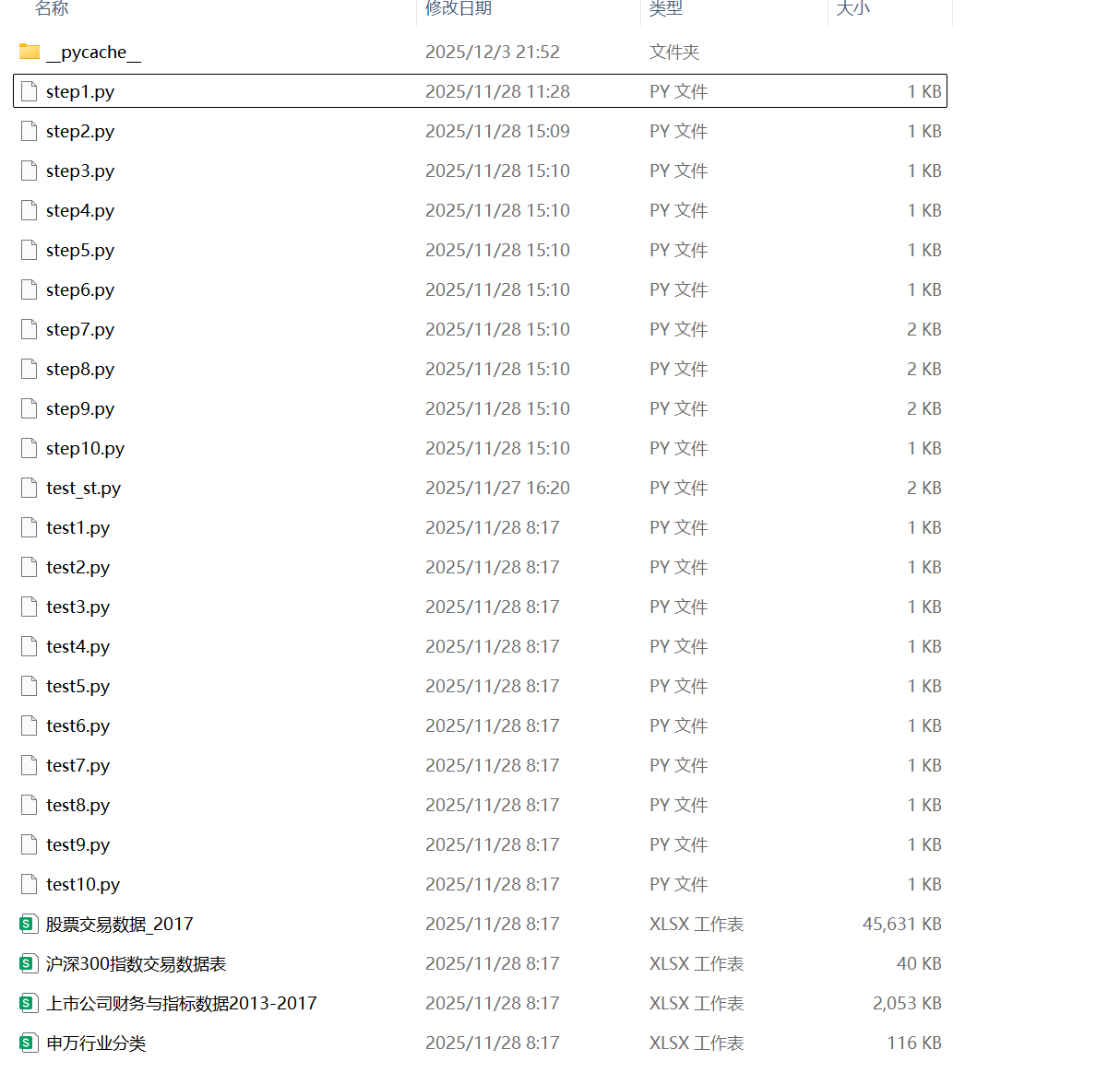
数据文件: Excel格式(申万行业分类、财务数据、交易数据)
1.3 实验内容
-
申万家用电器行业股票代码获取
-
申万家用电器行业股票财务指标数据获取
-
申万家用电器行业股票财务指标数据处理
-
申万家用电器行业股票财务指标数据主成分分析
-
申万家用电器行业股票日交易数据获取
-
申万家用电器行业股票交易指数的构造
-
计算沪深300指数2014-2017年的年涨跌幅指标
-
计算获得沪深300指数2016年收盘指数的关键转折
-
计算沪深300指数2016年移动平均值
-
计算沪深300指数2016年现价指标
1.4数据准备
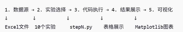
二、平台架构设计
2.1 系统模块架构
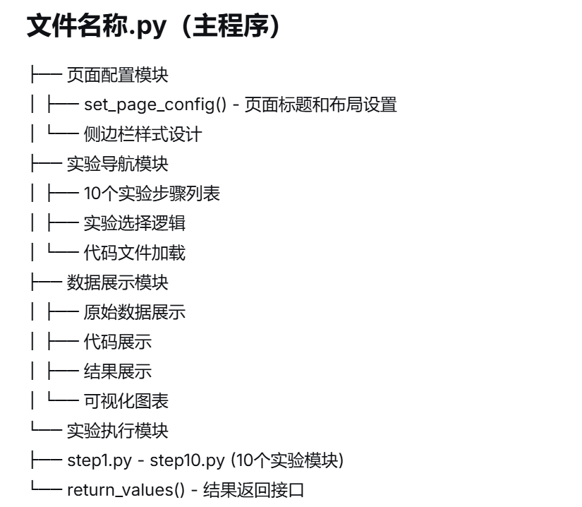
2.2 数据处理流程
三、核心功能实现
3.1 实验流程管理系统
3.1.1 主程序控制逻辑
# 文件名称.py - 主程序核心逻辑
class MainController:
    """主程序控制器"""

    def __init__(self):
        # 页面基础配置
        self.setup_page_config()
        # 实验步骤定义
        self.define_experiment_steps()
        # 侧边栏构建
        self.build_sidebar()

    def setup_page_config(self):
        """设置页面配置"""
        st.set_page_config(
            page_title="31_梁微",
            layout='wide'
        )

    def define_experiment_steps(self):
        """定义10个实验步骤"""
        self.experiment_list = [
            '1.申万家用电器行业股票代码获取',
            '2.申万家用电器行业股票财务指标数据获取',
            '3.申万家用电器行业股票财务指标数据处理',
            '4.申万家用电器行业股票财务指标数据主成分分析',
            '5.申万家用电器行业股票日交易数据获取',
            '6.申万家用电器行业股票交易指数的构造',
            '7.计算沪深300指数2014-2017年的年涨跌幅指标',
            '8.计算获得沪深300指数2016年收盘指数的关键转折',
            '9.计算沪深300指数2016年10、20、30、60日收盘指数移动平均值',
            '10.计算沪深300指数2016年现价指标'
        ]

    def build_sidebar(self):
        """构建侧边栏导航"""
        with st.sidebar:
            st.subheader('请选择实验')
            selected_experiment = st.selectbox(" ", self.experiment_list)
            return selected_experiment
3.1.2 实验代码加载系统
class CodeLoader:
    """代码文件加载器"""

    @staticmethod
    def load_experiment_code(step_number):
        """加载指定步骤的代码文件"""
        file_path = f"step{step_number}.py"
        try:
            with open(file_path, 'r', encoding='utf-8') as file:
                code_content = file.read()
            return code_content
        except FileNotFoundError:
            st.error(f"代码文件 {file_path} 不存在")
            return None
3.2 数据展示系统
3.2.1 实验结果显示模块
class ExperimentDisplay:
    """实验结果显示模块"""

    def display_experiment_result(self, experiment_num, result):
        """显示实验完整结果"""
        # 1. 显示原始数据
        self.display_original_data(experiment_num)

        # 2. 显示代码
        self.display_experiment_code(experiment_num)

        # 3. 显示结果
        self.display_result_data(result)

        # 4. 可视化展示
        if self.need_visualization(experiment_num):
            self.create_visualization(experiment_num, result)

    def display_original_data(self, exp_num):
        """显示原始数据"""
        data_files = {
            1: '申万行业分类.xlsx',
            2: '上市公司财务与指标数据2013-2017.xlsx',
            5: '股票交易数据_2017.xlsx',
            7: '沪深300指数交易数据表.xlsx',
            8: '沪深300指数交易数据表.xlsx',
            9: '沪深300指数交易数据表.xlsx',
            10: '沪深300指数交易数据表.xlsx'
        }

        if exp_num in data_files:
            data = pd.read_excel(data_files[exp_num])
            st.subheader('原始数据')
            st.dataframe(data, use_container_width=True)
四、实验功能详解
4.1 实验1:申万家用电器行业股票代码获取
4.1.1 实现逻辑
# step1.py 核心实现
def get_home_appliance_stocks():
    """获取申万家用电器行业股票代码"""
    # 1. 加载申万行业分类数据
    industry_data = pd.read_excel('申万行业分类.xlsx')

    # 2. 筛选家用电器行业
    appliance_stocks = industry_data[
        industry_data['行业名称'] == '家用电器'
    ]

    # 3. 提取股票代码和简称
    stock_series = pd.Series(
        appliance_stocks['股票简称'].values,
        index=appliance_stocks['股票代码']
    )

    return stock_series
4.1.2 结果显示优化
def display_stock_codes(self, stock_series):
    """显示股票代码结果"""
    # 转换为DataFrame展示
    result_df = pd.DataFrame({
        '股票代码': list(stock_series.index),
        '股票简称': stock_series.values
    })

    # 添加统计信息
    stock_count = len(result_df)

    # 分两列显示
    col1, col2 = st.columns([2, 1])

    with col1:
        st.dataframe(result_df, use_container_width=True)

    with col2:
        st.metric("股票数量", stock_count)
        st.metric("行业", "家用电器")
4.2 实验5:申万家用电器行业股票日交易数据获取
4.2.1 数据获取与处理
# step5.py 核心实现
def get_stock_trading_data_2017():
    """获取2017年股票交易数据"""
    # 1. 加载所有股票交易数据
    all_trading_data = pd.read_excel('股票交易数据_2017.xlsx')

    # 2. 获取家用电器行业股票代码
    appliance_codes = get_home_appliance_stocks().index.tolist()

    # 3. 筛选家用电器行业股票数据
    appliance_trading_data = all_trading_data[
        all_trading_data['Stkcd'].isin(appliance_codes)
    ]

    # 4. 数据格式化
    appliance_trading_data['Trddt'] = pd.to_datetime(
        appliance_trading_data['Trddt']
    )

    return appliance_trading_data
4.2.2 交易数据可视化
def visualize_trading_data(trading_data):
    """可视化交易数据"""
    # 确保日期列格式正确
    trading_data['Trddt'] = pd.to_datetime(trading_data['Trddt'])

    # 按日期排序
    trading_data = trading_data.sort_values('Trddt')

    # 创建两个子图
    fig, (ax1, ax2) = plt.subplots(2, 1, figsize=(12, 8))

    # 收盘价走势图
    ax1.plot(trading_data['Trddt'], trading_data['Clsprc'],
             color='blue', linewidth=0.8)
    ax1.set_title('2017年收盘价走势', fontsize=14)
    ax1.set_xlabel('交易日期')
    ax1.set_ylabel('收盘价(元)')
    ax1.grid(True, alpha=0.3)

    # 设置日期格式
    ax1.xaxis.set_major_locator(plt.matplotlib.dates.MonthLocator())
    ax1.xaxis.set_major_formatter(plt.matplotlib.dates.DateFormatter('%Y-%m'))
    plt.setp(ax1.xaxis.get_majorticklabels(), rotation=45)

    # 成交量走势图
    ax2.plot(trading_data['Trddt'], trading_data['Dnshrtrd'],
             color='red', linewidth=0.8)
    ax2.set_title('2017年成交量走势', fontsize=14)
    ax2.set_xlabel('交易日期')
    ax2.set_ylabel('成交量(股)')
    ax2.grid(True, alpha=0.3)

    plt.tight_layout()
    return fig
4.3 实验7-10:沪深300指数分析
4.3.1 年涨跌幅计算
# step7.py 核心实现
def calculate_yearly_returns():
    """计算2014-2017年年涨跌幅"""
    hs300_data = pd.read_excel('沪深300指数交易数据表.xlsx')
    hs300_data['Idxtrd01'] = pd.to_datetime(hs300_data['Idxtrd01'])

    yearly_returns = []

    for year in range(2014, 2018):
        year_data = hs300_data[hs300_data['Idxtrd01'].dt.year == year]
        if len(year_data) > 0:
            start_price = year_data.iloc[0]['Idxcls01']
            end_price = year_data.iloc[-1]['Idxcls01']
            yearly_return = (end_price - start_price) / start_price
            yearly_returns.append(yearly_return)

    return yearly_returns
4.3.2 移动平均计算
# step9.py 核心实现
def calculate_moving_averages():
    """计算2016年移动平均线"""
    hs300_data = pd.read_excel('沪深300指数交易数据表.xlsx')
    hs300_data['Idxtrd01'] = pd.to_datetime(hs300_data['Idxtrd01'])

    # 筛选2016年数据
    data_2016 = hs300_data[
        (hs300_data['Idxtrd01'] >= '2016-01-01') &
        (hs300_data['Idxtrd01'] <= '2016-12-31')
    ]

    # 计算不同周期的移动平均
    ma_10 = data_2016['Idxcls01'].rolling(window=10).mean()
    ma_20 = data_2016['Idxcls01'].rolling(window=20).mean()
    ma_30 = data_2016['Idxcls01'].rolling(window=30).mean()
    ma_60 = data_2016['Idxcls01'].rolling(window=60).mean()

    return ma_10.values, ma_20.values, ma_30.values, ma_60.values
五、界面设计与用户体验
5.1 实验选择界面
class ExperimentSelector:
    """实验选择界面"""

    def create_sidebar(self):
        """创建侧边栏选择界面"""
        with st.sidebar:
            # 标题区域
            st.markdown("""
            <div style="
                background: linear-gradient(135deg, #667eea 0%, #764ba2 100%);
                padding: 15px;
                border-radius: 10px;
                color: white;
                margin-bottom: 20px;
            ">
                <h3 style="margin: 0; text-align: center;">📊 数据分析实验</h3>
                <p style="margin: 5px 0 0 0; text-align: center; font-size: 12px;">
                    申万家电行业 & 沪深300指数
                </p>
            </div>
            """, unsafe_allow_html=True)

            # 实验选择
            selected = st.selectbox(
                "选择实验步骤",
                [
                    '1.申万家用电器行业股票代码获取',
                    '2.申万家用电器行业股票财务指标数据获取',
                    '3.申万家用电器行业股票财务指标数据处理',
                    '4.申万家用电器行业股票财务指标数据主成分分析',
                    '5.申万家用电器行业股票日交易数据获取',
                    '6.申万家用电器行业股票交易指数的构造',
                    '7.计算沪深300指数2014-2017年的年涨跌幅指标',
                    '8.计算获得沪深300指数2016年收盘指数的关键转折',
                    '9.计算沪深300指数2016年10、20、30、60日收盘指数移动平均值',
                    '10.计算沪深300指数2016年现价指标'
                ]
            )

            # 进度显示
            experiment_number = int(selected.split('.')[0])
            st.markdown("---")
            st.write(f"**进度**: {experiment_number}/10")

            return selected
5.2 结果展示界面
class ResultDisplayInterface:
    """结果展示界面"""

    def display_experiment_section(self, section_title, content, content_type='dataframe'):
        """显示实验的一个部分"""
        icons = {
            'dataframe': '📊',
            'code': '💻',
            'result': '📈',
            'chart': '📊'
        }

        icon = icons.get(content_type, '📋')

        st.markdown(f"""
        <div style="
            background: #f8f9fa;
            padding: 15px 20px;
            border-left: 4px solid #3498db;
            border-radius: 5px;
            margin: 15px 0;
        ">
            <h3 style="margin: 0; color: #2c3e50;">
                {icon} {section_title}
            </h3>
        </div>
        """, unsafe_allow_html=True)

        # 根据内容类型显示
        if content_type == 'dataframe':
            st.dataframe(content, use_container_width=True)
        elif content_type == 'code':
            st.code(content, language='python')
        elif content_type == 'result':
            st.write(content)
六、数据可视化系统
6.1 图表生成系统
class ChartGenerator:
    """图表生成器"""

    def __init__(self):
        # 设置中文字体
        plt.rcParams['font.sans-serif'] = ['SimHei']
        plt.rcParams['axes.unicode_minus'] = False

    def create_timeseries_chart(self, dates, values, title, ylabel, color='blue'):
        """创建时间序列图表"""
        fig, ax = plt.subplots(figsize=(12, 4))

        # 绘制数据
        ax.plot(dates, values, color=color, linewidth=1)

        # 设置标题和标签
        ax.set_title(title, fontsize=14)
        ax.set_xlabel('交易日期', fontsize=12)
        ax.set_ylabel(ylabel, fontsize=12)

        # 设置日期格式
        ax.xaxis.set_major_locator(plt.matplotlib.dates.MonthLocator())
        ax.xaxis.set_major_formatter(plt.matplotlib.dates.DateFormatter('%Y-%m'))
        plt.setp(ax.xaxis.get_majorticklabels(), rotation=45)

        # 添加网格
        ax.grid(True, alpha=0.3)

        return fig

    def create_multiple_line_chart(self, dates, data_dict, title):
        """创建多条线图表"""
        fig, ax = plt.subplots(figsize=(12, 4))

        colors = ['blue', 'red', 'green', 'orange']
        line_styles = ['-', '--', '-.', ':']

        for idx, (label, values) in enumerate(data_dict.items()):
            color = colors[idx % len(colors)]
            style = line_styles[idx % len(line_styles)]
            ax.plot(dates, values, label=label, color=color,
                    linestyle=style, linewidth=1)

        ax.set_title(title, fontsize=14)
        ax.set_xlabel('交易日期', fontsize=12)
        ax.set_ylabel('指数值', fontsize=12)

        # 设置日期格式
        ax.xaxis.set_major_locator(plt.matplotlib.dates.MonthLocator())
        ax.xaxis.set_major_formatter(plt.matplotlib.dates.DateFormatter('%Y-%m'))
        plt.setp(ax.xaxis.get_majorticklabels(), rotation=45)

        # 添加图例和网格
        ax.legend()
        ax.grid(True, alpha=0.3)

        return fig
七、实验平台特色
7.1 技术特色
-
模块化设计: 10个实验步骤独立实现
-
代码透明: 每个实验的完整Python代码可见
-
数据完整: 从原始数据到结果的全过程展示
-
交互性强: 用户可自由切换实验步骤
7.2 实验内容特色
-
行业聚焦: 专注于申万家用电器行业分析
-
指数分析: 沪深300指数多维度分析
-
技术指标: 包含多种技术指标计算
-
时间序列: 2014-2017年数据全面分析
7.3 教育价值
-
实践教学: 适合金融数据分析课程实验
-
代码学习: 展示数据处理和分析的实际代码
-
结果验证: 可验证分析结果的正确性
-
流程完整: 展示数据分析的完整流程
八、使用说明
8.1 环境要求
# 必需库
pip install streamlit pandas numpy matplotlib seaborn
8.2 运行方式
streamlit run 文件名称.py8.3 界面展示
申万家用电器行业与沪深300指数数据分析实验平台展示
九、总结
本金融数据分析实验平台成功实现了:
9.1 技术实现
-
完整的实验流程: 10个相互关联的实验步骤
-
清晰的数据展示: 原始数据、代码、结果三层展示
-
丰富的可视化: 多种金融数据图表
-
友好的用户界面: 简洁的实验导航和结果展示
9.2 教育意义
-
实践性强: 真实金融数据分析案例
-
代码可见: 学习实际的数据处理代码
-
结果可验证: 每个实验都有明确的结果输出
-
流程完整: 展示数据分析的完整流程
9.3 应用价值
-
教学工具: 适合金融数据分析课程
-
学习平台: 学生可以实践数据分析技能
-
演示系统: 展示金融数据分析的方法
-
实验平台: 提供标准化的实验环境
本平台为金融数据分析教学和实践提供了一个完整的解决方案,通过10个精心设计的实验步骤,让我们能够系统地学习和掌握金融数据分析的核心技能。

腾讯云面向开发者汇聚海量精品云计算使用和开发经验,营造开放的云计算技术生态圈。
更多推荐
 10
10 0
0- 0


 已为社区贡献2条内容

所有评论(0)