【Python与机器学习 3】 数据可视化-Matplotlib基本图表的绘制及应用场景
·
基本图表的绘制及应用场景
Matplotlib
目的是为Python构建一个Matlab式的绘图接口
Matplotlib如何显示中文
pyplot
pyplot模块包含了常用的matplotlib API函数
import matplotlib.pyplot as plt
plt.plot() 绘制单个点
plt.figure()
plt.plot(1.5, 1.5, 'o')
plt.plot(2, 2, '*')
plt.plot(2.5, 2.5, '*')
散点图 plt.scatter()
适用场景:适用于二维或三维数据集(如点代表国家), 但其中只有两维需要比较。
气泡图为特殊的散点图,气泡的大小为一个维度
参数
c颜色,b:blue;g:green; r:red;c:cyan 蓝绿色;y: yellow; k: black; w:white
s点的大小
marker标记 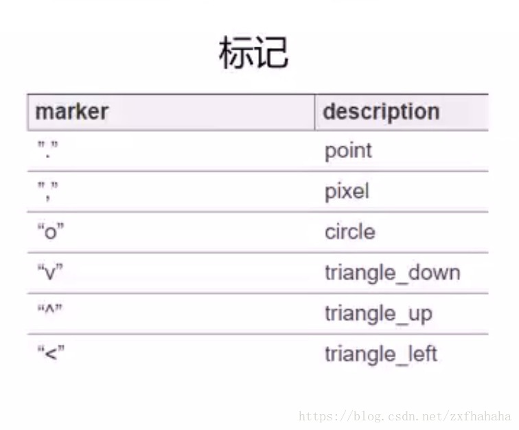
linestyle 线型 
import numpy as np
x = np.array([1, 2, 3, 4, 5, 6, 7, 8])
y = x
colors = ['red'] * (len(x) - 1) #改变颜色大小
colors.append('green')

plt.figure()
plt.scatter(x, y, s=100, c=colors)
添加图例 legend
plt.figure()
#先写标签label为图例的名称,但是此时只是只定了label图上并不会显示legend
plt.scatter(x[:2], y[:2], c='red', label='samples 1')
plt.scatter(x[2:], y[2:], c='blue', label='samples2')
#添加图例legend loc代表图例的位置,1234分别为上下左右,也可以指定为'best'
plt.legend(loc=4, frameon=True, title='Legend')
添加坐标标签,标题
# 添加坐标标签,标题
plt.xlabel('x label')
plt.ylabel('y label')
plt.title('Scatter Plot Example')
线图(折线图) plt.plot
适用场景:适用于二维数据集, 适合进行趋势的比较
不需要指定x方向的坐标,默认用索引号作为X轴方向的值
linear_data = np.arange(1, 9)
quadratic_data = linear_data ** 2
plt.figure()
# 生成三条线
plt.plot(linear_data, '-o', quadratic_data, '-o')
plt.plot([22, 44, 66], '--r')  ## --为虚线r为红色
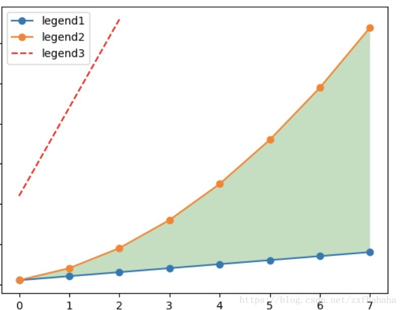
填充线间的区域 fill_between
plt.gca().fill_between(range(len(linear_data)),linear_data, quadratic_data,facecolor='green',alpha=0.25) #range(len(linear_data))为横坐标。alpha为透明度把横坐标的索引号替换成时间
绘制图像的坐标轴为时间数据时,可以借助pandas的to_datetime()完成
plt.figure()
observation_dates = np.arange('2017-10-11', '2017-10-19', dtype='datetime64[D]') #np.array()生成时间数据
observation_dates = list(map(pd.to_datetime, observation_dates))#用pandas的to_datetime()把用numpy生成的时间数据进行转换,因为pandas对时间序列格式化操作好一点
plt.plot(observation_dates, linear_data, '-o',
        observation_dates, quadratic_data, '-o')
x = plt.gca().xaxis # 获取x轴的每个刻度
for item in x.get_ticklabels():
    item.set_rotation(45) # 因为时间太长,可能会重叠,所以把它都旋转45°
plt.subplots_adjust(bottom=0.25) #调整边界距离
# 对于学术制图,可在标题中包含latex语法
ax = plt.gca()
ax.set_title('Quadratic ($x^2$) vs. Linear ($x$)')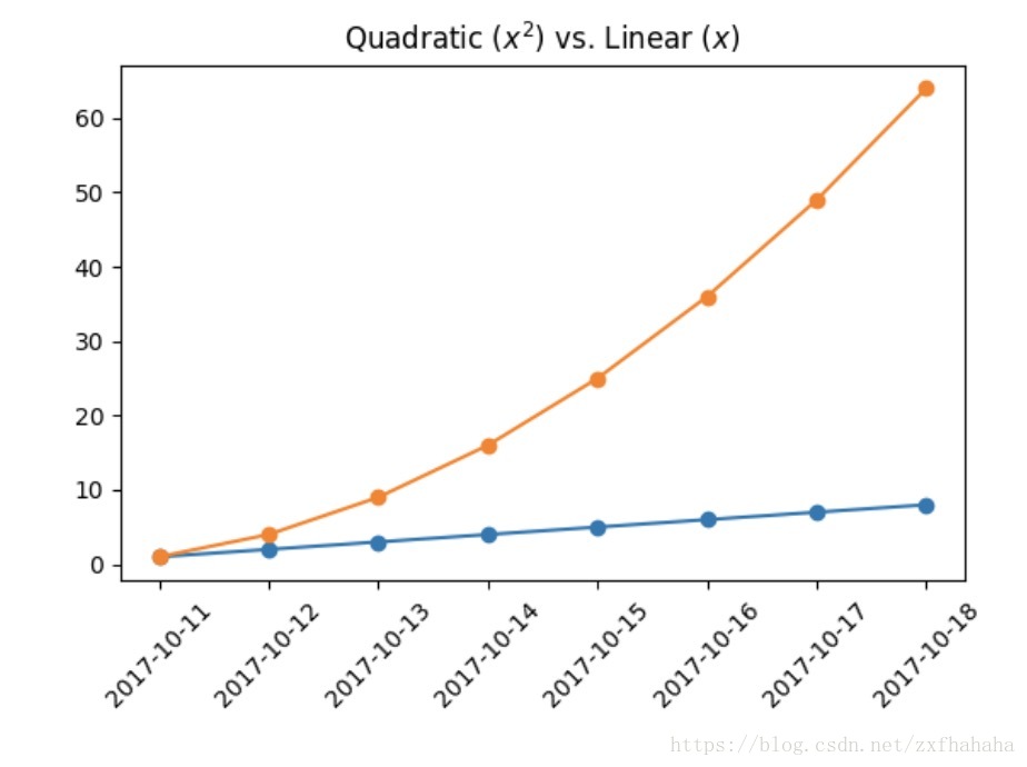
柱状图 plt.bar()
适用场景:适用于二维数据集,但只有一个维度需要比较。利用柱子的高度反映数据的差异。
plt.figure()
x_vals = list(range(len(linear_data)))
plt.bar(x_vals, linear_data, width=0.3) #width为柱子的宽度
分组柱状图 group bar chart
同一副图中包含多个柱状图时,注意要对x轴的数据做相应的移动,避免柱状图重叠
在上面代码的基础上
x_vals2 = [item + 0.3 for item in x_vals] #x向右偏移0.3,为了不和上面的柱状图重叠
plt.bar(x_vals2, quadratic_data, width=0.3)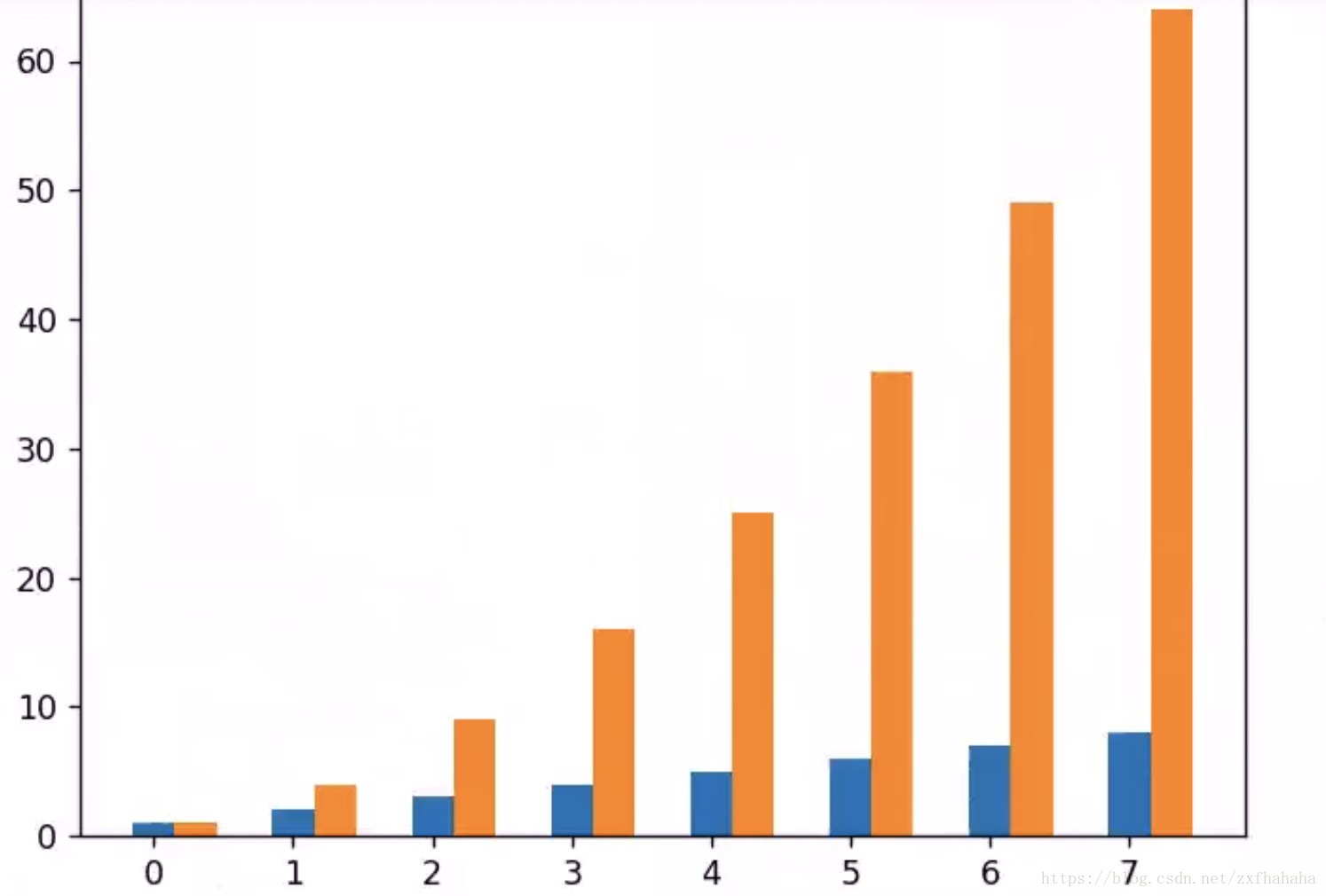
堆叠柱状图 stack bar chart
使用bottom参数,第二个柱状图踩到第一个数据上面
plt.figure()
x_vals = list(range(len(linear_data)))
plt.bar(x_vals, linear_data, width=0.3)
plt.bar(x_vals, quadratic_data, width=0.3, bottom=linear_data)
横向柱状图 plt.barh
相应的参数width变为参数height;bottom变为left
plt.figure()
x_vals = list(range(len(linear_data)))
plt.barh(x_vals, linear_data, height=0.3)
plt.barh(x_vals, quadratic_data, height=0.3, left=linear_data)

腾讯云面向开发者汇聚海量精品云计算使用和开发经验,营造开放的云计算技术生态圈。
更多推荐
 1
1 0
0- 0


 已为社区贡献4条内容

所有评论(0)