Flutter下拉框实现方式全面解析
在Flutter开发中,下拉选择组件是承接“用户输入-选项筛选”交互的核心元素,广泛应用于表单填写、数据筛选、配置选择等场景。根据需求差异(如单选/多选、是否需要搜索、是否集成表单校验、数据来源等),下拉框的实现方式也有所不同。
本文将系统拆解Flutter中5种主流下拉框实现方案,涵盖原生组件基础用法、表单集成、样式定制、高级自定义(搜索/多选)及第三方库选型,每个方案均包含完整实现代码、关键属性解析、适用场景说明,帮助开发者快速匹配项目需求,提升开发效率与用户体验。
前置说明:下文所有示例基于Flutter 3.x版本,核心依赖为flutter官方SDK。示例中通用变量定义如下(需在State类中声明,确保状态管理正常):
// 下拉选项数据源(实际项目可替换为接口返回数据)
final List<String> options = [
  "北京", "上海", "广州", "深圳", "杭州", "成都", "武汉", "西安"
];
// 单选选中值
String? selectedValue;
// 多选选中值(下文多选方案使用)
List<String> selectedValues = [];
// 表单key(表单校验方案使用)
final GlobalKey<FormState> _formKey = GlobalKey<FormState>();
// 搜索控制器(带搜索功能的方案使用)
final TextEditingController _searchController = TextEditingController();
// 第三方库下拉框key(第三方库方案使用)
final GlobalKey<DropdownSearchState> dropDownKey = GlobalKey<DropdownSearchState>();
1. 基础单选:原生体验(DropdownButton)
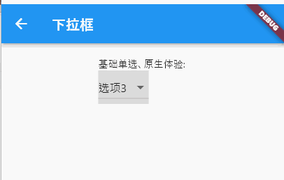
Flutter原生DropdownButton组件是实现基础单选下拉框的首选,无需额外依赖,提供与平台一致的原生交互体验(如iOS的悬浮下拉菜单、Android的底部弹出菜单),适合选项数量少(3-5个)、无需复杂样式的简单场景。
完整实现代码:
/// 原生基础单选下拉框
Widget _buildBasicSingleSelectDropdown(BuildContext context) {
  return DropdownButton<String>(
    // 当前选中值(需与items中DropdownMenuItem的value类型一致)
    value: selectedValue,
    // 未选中时的提示文本(仅value为null时显示)
    hint: const Text('请选择城市'),
    // 是否占满父容器宽度(false时自适应文本宽度,true时撑满)
    isExpanded: false,
    // 下拉箭头图标(可替换为自定义图标)
    icon: const Icon(Icons.arrow_drop_down, color: Colors.grey),
    // 下拉菜单阴影层级(值越大阴影越明显,默认8)
    elevation: 8,
    // 下拉菜单背景色(默认白色)
    dropdownColor: Colors.white,
    // 选项文本样式(统一控制所有选项的字体、颜色)
    style: const TextStyle(color: Colors.black87, fontSize: 16),
    // 选中项的下划线样式(默认有下划线,可设为SizedBox.shrink()隐藏)
    underline: Container(height: 1, color: Colors.grey[200]),
    // 值变化回调(选中新选项时触发,value为选中项的值)
    onChanged: (String? value) {
      if (value != null) {
        setState(() {
          selectedValue = value;
        });
        // 可选:选中后触发其他业务逻辑(如接口请求、页面跳转)
        debugPrint("选中城市:$value");
      }
    },
    // 下拉选项列表(通过map转换数据源为DropdownMenuItem)
    items: options.map((String option) {
      return DropdownMenuItem<String>(
        value: option, // 选项对应的值(与DropdownButton的泛型一致)
        child: Text(option), // 选项显示的文本
      );
    }).toList(),
  );
}
关键属性深度解析:
-
value:核心绑定属性,指定当前选中的选项值。注意:值必须是
items列表中某个DropdownMenuItem的value,否则会导致下拉框异常;未选中时设为null,此时显示hint文本。 -
hint:占位提示,仅当
value为null时生效,区别于disabledHint(禁用状态下的提示)。 -
isExpanded:控制下拉框宽度是否撑满父容器。建议在表单、卡片等布局中设为
true,保证UI对齐;简单弹窗中可设为false自适应。 -
onChanged:状态变更核心回调,参数为选中项的
value(可能为null,需判空)。必须通过setState更新selectedValue,否则UI不会刷新。 -
items:下拉选项集合,必须是
DropdownMenuItem类型列表。通过map方法将原始数据源(如List<String>)转换为目标类型,注意泛型一致性。
适用场景:
简单设置项选择(如“排序方式”“性别选择”)、选项数量少(≤5个)、无需自定义样式,追求原生平台交互体验的场景。
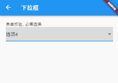
2. 表单校验:必填选择(DropdownButtonFormField)
在表单场景(如注册、提交信息)中,下拉框通常需要支持“必填校验”“统一提交验证”。Flutter原生DropdownButtonFormField组件继承自FormField,可直接集成到Form组件中,无需额外封装校验逻辑,完美适配表单生态。
完整实现代码:
/// 表单集成式下拉框(支持必填校验)
Widget _buildFormValidatedDropdown(BuildContext context) {
  return Form(
    key: _formKey, // 表单唯一标识,用于触发整体校验
    child: Column(
      mainAxisSize: MainAxisSize.min,
      children: [
        DropdownButtonFormField<String>(
          value: selectedValue,
          hint: const Text('请选择省份'),
          isExpanded: true, // 表单中建议撑满宽度,保证UI统一
          // 表单校验逻辑(提交时触发,返回null表示校验通过,非null为错误提示)
          validator: (String? value) {
            if (value == null || value.isEmpty) {
              return '请选择省份(必填)';
            }
            // 可选:添加自定义校验规则(如禁止选择特定选项)
            if (value == "其他") {
              return '请选择具体省份,如需添加请联系管理员';
            }
            return null;
          },
          // 值变化回调(与DropdownButton一致)
          onChanged: (String? value) {
            setState(() {
              selectedValue = value;
            });
          },
          // 下拉选项列表
          items: options.map((String option) {
            return DropdownMenuItem<String>(
              value: option,
              child: Text(option),
            );
          }).toList(),
          // 可选:提交按钮触发校验
          onSaved: (String? value) {
            // 校验通过后保存数据(如存入模型、提交接口)
            debugPrint("最终选中省份:$value");
          },
        ),
        const SizedBox(height: 20),
        ElevatedButton(
          onPressed: () {
            // 触发表单整体校验
            if (_formKey.currentState!.validate()) {
              // 校验通过:执行提交逻辑
              _formKey.currentState!.save(); // 触发所有FormField的onSaved
              ScaffoldMessenger.of(context).showSnackBar(
                const SnackBar(content: Text('表单提交成功')),
              );
            }
          },
          child: const Text('提交表单'),
        ),
      ],
    ),
  );
}
核心功能亮点:
-
原生表单集成:无需手动关联校验逻辑,通过
Form的key即可触发整体校验,与TextFormField、CheckboxFormField等组件无缝兼容。 -
灵活校验规则:
validator属性支持多维度校验(必填、选项过滤、格式验证等),错误提示直接显示在下拉框下方,符合Material Design规范。 -
提交生命周期:通过
onSaved回调统一收集表单数据,避免在onChanged中重复处理提交逻辑,代码更整洁。 -
样式自适应:默认继承表单组件的视觉风格,与其他表单字段保持一致,减少样式适配成本。
适用场景:
注册/登录表单、信息提交页面、需要统一校验的多字段表单场景(如下单地址选择、个人信息完善)。
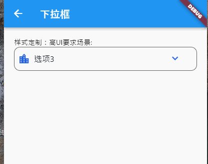
3. 样式定制:高UI要求场景(DropdownButtonFormField + InputDecoration)
原生下拉框默认样式较简单,当项目有统一UI规范(如圆角边框、聚焦状态高亮、背景色定制)时,可通过DropdownButtonFormField的decoration属性(继承自InputDecoration)实现全维度样式定制,适配设计稿要求。
完整实现代码:
/// 全样式定制下拉框
Widget _buildFullyCustomizedDropdown(BuildContext context) {
  return DropdownButtonFormField<String>(
    value: selectedValue,
    hint: const Text('请选择城市', style: TextStyle(color: Colors.grey[600])),
    isExpanded: true,
    // 核心:样式定制(InputDecoration支持丰富的UI配置)
    decoration: InputDecoration(
      // 基础边框(未聚焦状态)
      border: OutlineInputBorder(
        borderRadius: BorderRadius.circular(12), // 圆角
        borderSide: const BorderSide(color: Color(0xFFE5E7EB), width: 1.5),
      ),
      // 聚焦状态边框(获取焦点时高亮)
      focusedBorder: OutlineInputBorder(
        borderRadius: BorderRadius.circular(12),
        borderSide: const BorderSide(color: Color(0xFF2563EB), width: 2),
      ),
      // 错误状态边框(校验失败时)
      errorBorder: OutlineInputBorder(
        borderRadius: BorderRadius.circular(12),
        borderSide: const BorderSide(color: Color(0xFFEF4444), width: 1.5),
      ),
      // 聚焦错误状态边框
      focusedErrorBorder: OutlineInputBorder(
        borderRadius: BorderRadius.circular(12),
        borderSide: const BorderSide(color: Color(0xFFEF4444), width: 2),
      ),
      // 背景色(需设置filled: true才生效)
      fillColor: Colors.grey[50],
      filled: true,
      // 内边距(控制下拉框内容与边框的距离)
      contentPadding: const EdgeInsets.symmetric(horizontal: 16, vertical: 14),
      // 可选:前缀图标(如位置图标)
      prefixIcon: const Icon(Icons.location_city, color: Color(0xFF2563EB)),
      // 可选:后缀图标偏移(调整下拉箭头位置)
      suffixIconConstraints: const BoxConstraints(minWidth: 40, minHeight: 40),
    ),
    // 下拉菜单样式定制
    dropdownColor: Colors.white,
    // 自定义下拉箭头图标
    icon: const Icon(Icons.keyboard_arrow_down, color: Color(0xFF2563EB), size: 24),
    // 选项文本样式
    style: const TextStyle(color: Color(0xFF111827), fontSize: 16, fontWeight: FontWeight.w400),
    // 校验逻辑(配合错误边框)
    validator: (String? value) {
      return value == null ? '请选择城市' : null;
    },
    onChanged: (String? value) {
      setState(() {
        selectedValue = value;
      });
    },
    items: options.map((String option) {
      return DropdownMenuItem<String>(
        value: option,
        // 可选:自定义单个选项样式(如高亮特定选项)
        child: Text(
          option,
          style: option == "北京" ? const TextStyle(color: Color(0xFF2563EB), fontWeight: FontWeight.w500) : null,
        ),
      );
    }).toList(),
  );
}
样式定制核心要点:
-
边框体系:通过
border(默认)、focusedBorder(聚焦)、errorBorder(错误)、focusedErrorBorder(聚焦错误)四个属性,覆盖所有状态下的边框样式,建议统一使用OutlineInputBorder保证风格一致。 -
背景与内边距:
filled: true+fillColor控制背景色;contentPadding调整上下左右内边距,避免文本贴边。 -
图标定制:
prefixIcon(前缀图标,如功能标识)、icon(下拉箭头)可替换为自定义图标,通过suffixIconConstraints调整图标尺寸和位置。 -
文本样式分层:
style控制所有选项文本样式,单个DropdownMenuItem可单独设置child样式(如高亮热门选项)。
适用场景:
对UI设计有较高要求的场景(如电商APP、企业级后台)、需要统一品牌视觉风格的页面、多状态(默认/聚焦/错误)UI适配需求。
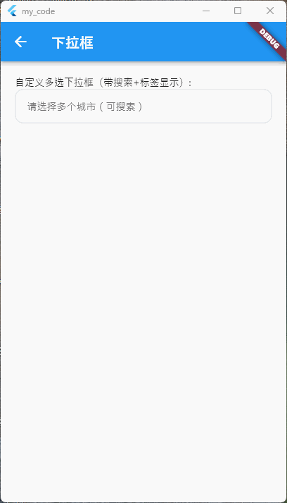
4. 高级自定义:多选 + 搜索 + 标签显示(自定义弹窗)
原生组件不支持多选功能,且当选项数量较多(>10个)时,缺乏搜索筛选能力。此时可通过InkWell触发自定义弹窗(showModalBottomSheet),内置搜索框和多选列表,实现“多选+搜索+标签化展示”的高级需求。
完整实现代码:
/// 自定义多选下拉框(带搜索+标签显示)
  Widget _buildMultiSelectSearchDropdown(BuildContext context) {
    return Column(
      mainAxisSize: MainAxisSize.min,
      children: [
        // 触发区域:标签化展示已选内容
        InkWell(
          onTap: () => _showMultiSelectSearchBottomSheet(context),
          child: Container(
            width: double.infinity,
            padding: const EdgeInsets.symmetric(horizontal: 16, vertical: 14),
            decoration: BoxDecoration(
              border: Border.all(color: const Color(0xFFE5E7EB), width: 1.5),
              borderRadius: BorderRadius.circular(12),
              color: Colors.grey[50],
            ),
            child: _buildSelectedTags(), // 动态构建已选标签
          ),
        ),
      ],
    );
  }

  /// 构建已选标签(无选中时显示提示)
  Widget _buildSelectedTags() {
    if (selectedValues.isEmpty) {
      return Text('请选择多个城市(可搜索)', style: TextStyle(color: Colors.grey[600]));
    }
    // 用Wrap包裹标签,自动换行
    return Wrap(
      spacing: 8, // 标签水平间距
      runSpacing: 4, // 标签垂直间距
      children: selectedValues.map((String value) {
        return Chip(
          label: Text(value, style: const TextStyle(fontSize: 14)),
          // 标签删除按钮(移除选中项)
          onDeleted: () {
            setState(() {
              selectedValues.remove(value);
            });
          },
          padding: const EdgeInsets.symmetric(horizontal: 4),
          backgroundColor: const Color(0xFFEFF6FF),
        );
      }).toList(),
    );
  }

  /// 自定义多选搜索弹窗(底部弹出)
  void _showMultiSelectSearchBottomSheet(BuildContext context) {
    List<String> filteredOptions = List.from(options);

    showModalBottomSheet(
      context: context,
      isScrollControlled: true,
      shape: const RoundedRectangleBorder(
        borderRadius: BorderRadius.vertical(top: Radius.circular(16)),
      ),
      builder: (context) => StatefulBuilder(
        builder: (modalContext, modalSetState) {
          return Column(mainAxisSize: MainAxisSize.min, children: [
            const Padding(
              padding: EdgeInsets.symmetric(vertical: 16),
              child: Text(
                '选择城市',
                style: TextStyle(fontSize: 18, fontWeight: FontWeight.w500),
              ),
            ),
            Padding(
              padding: const EdgeInsets.symmetric(horizontal: 16, vertical: 8),
              child: TextField(
                controller: _searchController,
                decoration: InputDecoration(
                  hintText: '搜索城市...',
                  prefixIcon: const Icon(Icons.search, color: Colors.grey),
                  border: OutlineInputBorder(
                    borderRadius: BorderRadius.circular(8),
                    borderSide: const BorderSide(color: Color(0xFFE5E7EB)),
                  ),
                  contentPadding: const EdgeInsets.symmetric(horizontal: 12, vertical: 10),
                ),
                onChanged: (String value) {
                  modalSetState(() {
                    // 使用 modalSetState 而不是 setState
                    filteredOptions = options.where((option) => option.toLowerCase().contains(value.toLowerCase())).toList();
                  });
                },
              ),
            ),

            // 多选列表(限制最大高度,避免超出屏幕)
            ConstrainedBox(
              constraints: const BoxConstraints(maxHeight: 300),
              child: ListView.builder(
                shrinkWrap: true,
                itemCount: filteredOptions.length,
                itemBuilder: (context, index) {
                  final String option = filteredOptions[index];
                  final bool isSelected = selectedValues.contains(option);
                  return ListTile(
                    title: Text(option),
                    // 选中状态图标(勾选/未勾选)
                    trailing: Icon(
                      isSelected ? Icons.check_circle : Icons.circle_outlined,
                      color: isSelected ? const Color(0xFF2563EB) : Colors.grey,
                    ),
                    onTap: () {
                      setState(() {
                        if (isSelected) {
                          selectedValues.remove(option);
                        } else {
                          selectedValues.add(option);
                        }
                      });
                      modalSetState(() {});
                    },
                  );
                },
              ),
            ),
            // 弹窗底部按钮(确认/取消)
            Padding(
                padding: const EdgeInsets.symmetric(horizontal: 16, vertical: 12),
                child: Row(
                  mainAxisAlignment: MainAxisAlignment.end,
                  children: [
                    TextButton(
                      onPressed: () {
                        // 取消:清空本次搜索输入,关闭弹窗
                        _searchController.clear();
                        Navigator.pop(context);
                      },
                      child: const Text('取消'),
                    ),
                    const SizedBox(width: 8),
                    ElevatedButton(
                      onPressed: () {
                        // 确认:保留选中状态,清空搜索输入,关闭弹窗
                        _searchController.clear();
                        Navigator.pop(context);
                        // 可选:触发选中后的业务逻辑(如筛选数据)
                        debugPrint("最终选中城市:$selectedValues");
                      },
                      child: const Text('确认'),
                    ),
                  ],
                ))
          ]);
        },
      ),
    );
  }
核心功能与实现逻辑:
-
触发区域定制:用
InkWell包裹Container作为触发区域,通过_buildSelectedTags方法动态展示已选内容(无选中时显示提示,有选中时显示标签),标签支持删除单个选项。 -
搜索筛选逻辑:弹窗内置
TextField,通过onChanged实时过滤options数据源,生成filteredOptions,实现模糊搜索。 -
多选状态管理:用
List<String> selectedValues存储选中项,点击列表项时切换“添加/移除”状态,通过图标直观反馈选中结果。 -
弹窗交互优化:使用
showModalBottomSheet实现底部弹出效果,设置isScrollControlled: true适配不同屏幕高度;添加确认/取消按钮,避免误操作。
适用场景:
选项数量多(>10个)、需要多选功能的场景(如多城市筛选、多标签选择)、需要快速定位选项的搜索需求(如全国城市选择、商品分类筛选)。
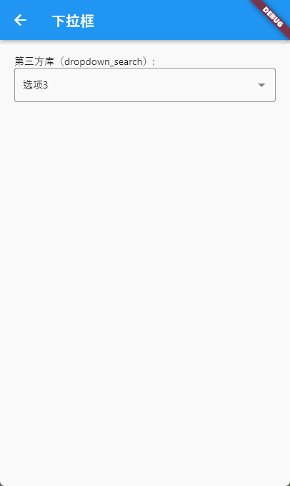
5. 高效开发:第三方库(dropdown_search)
对于需要“网络数据加载”“复杂筛选”“多主题适配”的场景,自定义实现成本较高。推荐使用成熟第三方库dropdown_search(pub.dev评分4.8+),该库内置搜索、单选/多选、本地/网络数据源支持,且提供丰富的自定义选项,可大幅提升开发效率。
前期准备:
1. 依赖添加:在pubspec.yaml中添加依赖(查看最新版本:dropdown_search):
dependencies:
  dropdown_search: ^5.0.6 # 请使用最新版本
2. 导入包:
import 'package:dropdown_search/dropdown_search.dart';完整实现代码(网络数据+搜索+多选):
/// 第三方库实现:网络数据下拉框(支持搜索+多选)
Widget _buildThirdPartyDropdown(BuildContext context) {
  return DropdownSearch<String>(
    key: dropDownKey,
    // 选择模式:单选(SINGLE) / 多选(MULTI)
    selectionMode: SelectionMode.MULTI,
    // 初始选中值(单选传String,多选传List<String>)
    selectedItems: selectedValues,
    // 数据源类型:本地数据源(items)/ 网络数据源(asyncItems)
    // 本地数据源示例:
    // items: options,
    // 网络数据源示例(模拟接口请求)
    asyncItems: (String? filter) async {
      // filter为搜索框输入文本,可传递给接口实现精准筛选
      await Future.delayed(const Duration(milliseconds: 500)); // 模拟网络延迟
      // 实际项目中替换为真实接口请求(如Dio)
      // final response = await Dio().get('https://api.example.com/cities?keyword=$filter');
      // return response.data.map<String>((e) => e['name']).toList();
      // 模拟接口返回数据(过滤关键词)
      return options
          .where((option) => option.toLowerCase().contains(filter?.toLowerCase() ?? ''))
          .toList();
    },
    // 输入框样式定制(与InputDecoration一致)
    dropdownSearchDecoration: InputDecoration(
      labelText: '选择城市',
      labelStyle: const TextStyle(color: Color(0xFF6B7280)),
      border: OutlineInputBorder(borderRadius: BorderRadius.circular(12)),
      contentPadding: const EdgeInsets.symmetric(horizontal: 16, vertical: 14),
    ),
    // 下拉菜单样式定制
    dropdownStyle: BoxDecoration(
      borderRadius: BorderRadius.circular(12),
      color: Colors.white,
      boxShadow: [
        BoxShadow(color: Colors.grey[200]!, blurRadius: 8, offset: const Offset(0, 2))
      ],
    ),
    // 选项文本样式
    itemAsString: (String? item) => item ?? '',
    // 选中值变化回调(多选时返回List<String>,单选返回String)
    onChanged: (List<String>? values) {
      if (values != null) {
        setState(() {
          selectedValues = values;
        });
        debugPrint("选中值变化:$values");
      }
    },
    // 搜索框提示文本
    searchBoxDecoration: const InputDecoration(
      hintText: '搜索城市...',
      hintStyle: TextStyle(fontSize: 14),
      prefixIcon: Icon(Icons.search, size: 20),
    ),
    // 空数据提示
    emptyBuilder: (context, searchEntry) => const Padding(
      padding: EdgeInsets.symmetric(vertical: 20),
      child: Text('未找到匹配城市,请重新输入'),
    ),
    // 加载中提示
    loadingBuilder: (context, searchEntry) => const Padding(
      padding: EdgeInsets.symmetric(vertical: 20),
      child: CircularProgressIndicator(strokeWidth: 2),
    ),
  );
}
第三方库核心优势:
-
多数据源支持:同时支持本地数据源(
items)和网络数据源(asyncItems),网络请求可直接集成,无需手动封装弹窗。 -
内置核心功能:原生支持搜索、单选/多选、加载中/空数据状态提示,无需重复开发基础功能。
-
全维度样式定制:输入框、下拉菜单、搜索框、空状态等均支持样式定制,适配不同UI需求。
-
稳定可靠:经过大量项目验证,兼容Flutter各版本,减少自定义实现的bug风险。
-
扩展功能丰富:支持远程数据缓存、自定义选项渲染、多语言适配等高级功能,满足复杂场景需求。
适用场景:
网络数据下拉选择(如接口返回的商品分类、地区列表)、需要快速实现搜索+多选的场景、追求高效开发且减少自定义bug的项目。
总结:方案选型指南
以上5种方案覆盖了Flutter开发中绝大多数下拉框需求,选择时可根据“功能需求”“UI要求”“开发效率”三个核心维度决策:
|
实现方案 |
核心优势 |
适用场景 |
开发成本 |
|---|---|---|---|
|
原生DropdownButton |
原生体验、无依赖、简单易用 |
简单单选、选项少(≤5个)、无需自定义样式 |
低 |
|
DropdownButtonFormField |
原生表单集成、支持校验 |
表单必填项、需要统一校验的多字段场景 |
低 |
|
样式定制版(InputDecoration) |
全维度UI定制、适配设计稿 |
高UI要求、多状态适配(默认/聚焦/错误) |
中 |
|
自定义多选搜索弹窗 |
完全自定义、支持多选+搜索 |
选项多、需要多选、特殊交互需求(如标签展示) |
高 |
|
第三方库(dropdown_search) |
高效开发、支持网络数据、内置核心功能 |
网络数据、搜索+多选、追求开发效率 |
低-中 |
核心建议:优先使用原生组件满足简单需求,复杂需求(多选、搜索、网络数据)优先选择成熟第三方库,避免重复造轮子;仅当第三方库无法满足特殊交互/UI需求时,再进行自定义弹窗开发。

腾讯云面向开发者汇聚海量精品云计算使用和开发经验,营造开放的云计算技术生态圈。
更多推荐
 22
22 0
0- 0


 已为社区贡献7条内容

所有评论(0)