Flutter for OpenHarmony 实战:TreeSelect 分类选择
欢迎加入开源鸿蒙跨平台社区: https://openharmonycrossplatform.csdn.net
前言:跨生态开发的新机遇
在移动开发领域,我们总是面临着选择与适配。今天,你的Flutter应用在Android和iOS上跑得正欢,明天可能就需要考虑一个新的平台:HarmonyOS(鸿蒙)。这不是一道选答题,而是很多团队正在面对的现实。
Flutter的优势很明确——写一套代码,就能在两个主要平台上运行,开发体验流畅。而鸿蒙代表的是下一个时代的互联生态,它不仅仅是手机系统,更着眼于未来全场景的体验。将现有的Flutter应用适配到鸿蒙,听起来像是一个“跨界”任务,但它本质上是一次有价值的技术拓展:让产品触达更多用户,也让技术栈覆盖更广。
不过,这条路走起来并不像听起来那么简单。Flutter和鸿蒙,从底层的架构到上层的工具链,都有着各自的设计逻辑。会遇到一些具体的问题:代码如何组织?原有的功能在鸿蒙上如何实现?那些平台特有的能力该怎么调用?更实际的是,从编译打包到上架部署,整个流程都需要重新摸索。
这篇文章想做的,就是把这些我们趟过的路、踩过的坑,清晰地摊开给你看。我们不会只停留在“怎么做”,还会聊到“为什么得这么做”,以及“如果出了问题该往哪想”。这更像是一份实战笔记,源自真实的项目经验,聚焦于那些真正卡住过我们的环节。
无论你是在为一个成熟产品寻找新的落地平台,还是从一开始就希望构建能面向多端的应用,这里的思路和解决方案都能提供直接的参考。理解了两套体系之间的异同,掌握了关键的衔接技术,不仅能完成这次迁移,更能积累起应对未来技术变化的能力。
混合工程结构深度解析
项目目录架构
当Flutter项目集成鸿蒙支持后,典型的项目结构会发生显著变化。以下是经过ohos_flutter插件初始化后的项目结构:
my_flutter_harmony_app/
├── lib/                          # Flutter业务代码(基本不变)
│   ├── main.dart                 # 应用入口
│   ├── home_page.dart           # 首页
│   └── utils/
│       └── platform_utils.dart  # 平台工具类
├── pubspec.yaml                  # Flutter依赖配置
├── ohos/                         # 鸿蒙原生层(核心适配区)
│   ├── entry/                    # 主模块
│   │   └── src/main/
│   │       ├── ets/              # ArkTS代码
│   │       │   ├── MainAbility/
│   │       │   │   ├── MainAbility.ts       # 主Ability
│   │       │   │   └── MainAbilityContext.ts
│   │       │   └── pages/
│   │       │       ├── Index.ets           # 主页面
│   │       │       └── Splash.ets          # 启动页
│   │       ├── resources/        # 鸿蒙资源文件
│   │       │   ├── base/
│   │       │   │   ├── element/  # 字符串等
│   │       │   │   ├── media/    # 图片资源
│   │       │   │   └── profile/  # 配置文件
│   │       │   └── en_US/        # 英文资源
│   │       └── config.json       # 应用核心配置
│   ├── ohos_test/               # 测试模块
│   ├── build-profile.json5      # 构建配置
│   └── oh-package.json5         # 鸿蒙依赖管理
└── README.md
展示效果图片
flutter 实时预览 效果展示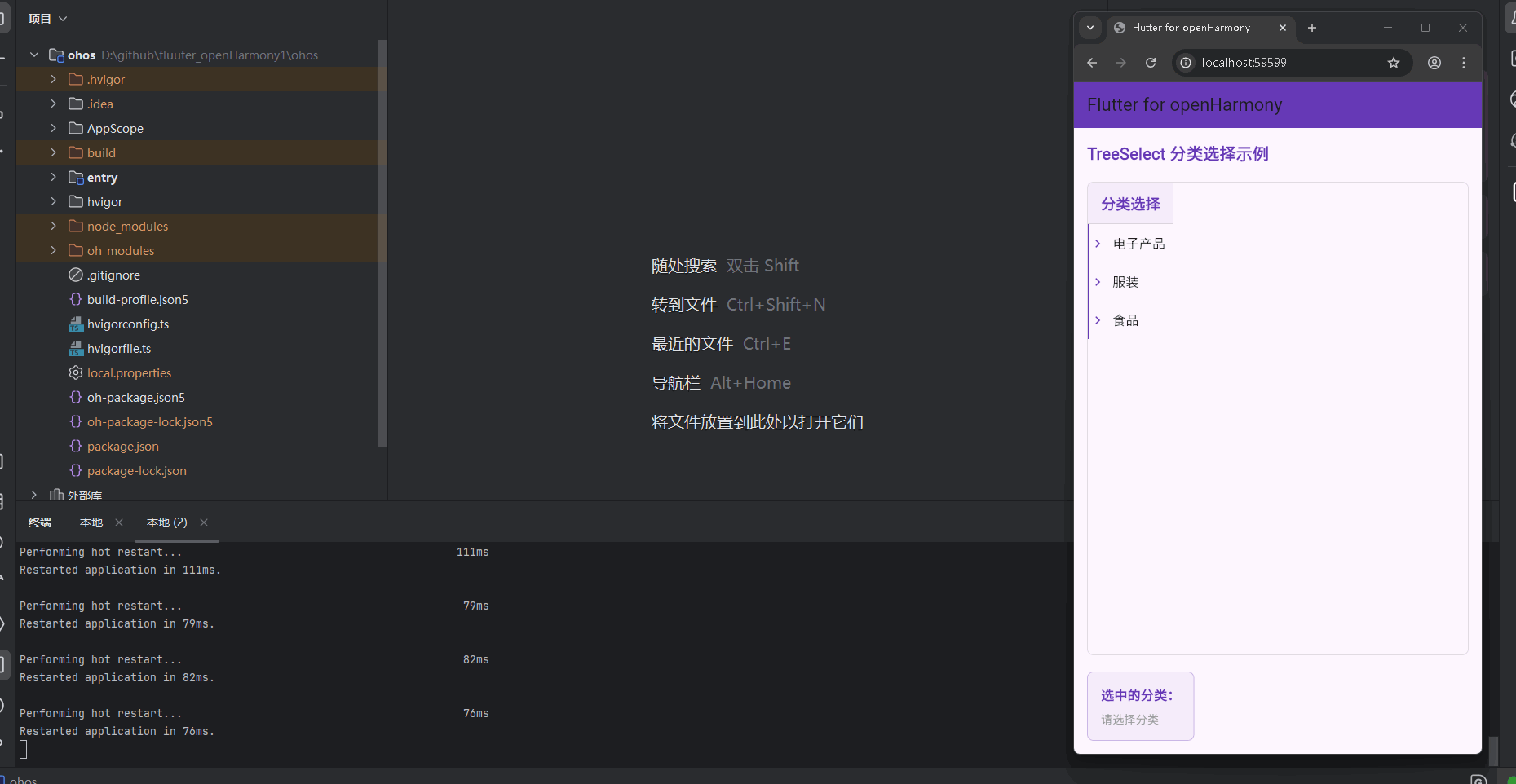
运行到鸿蒙虚拟设备中效果展示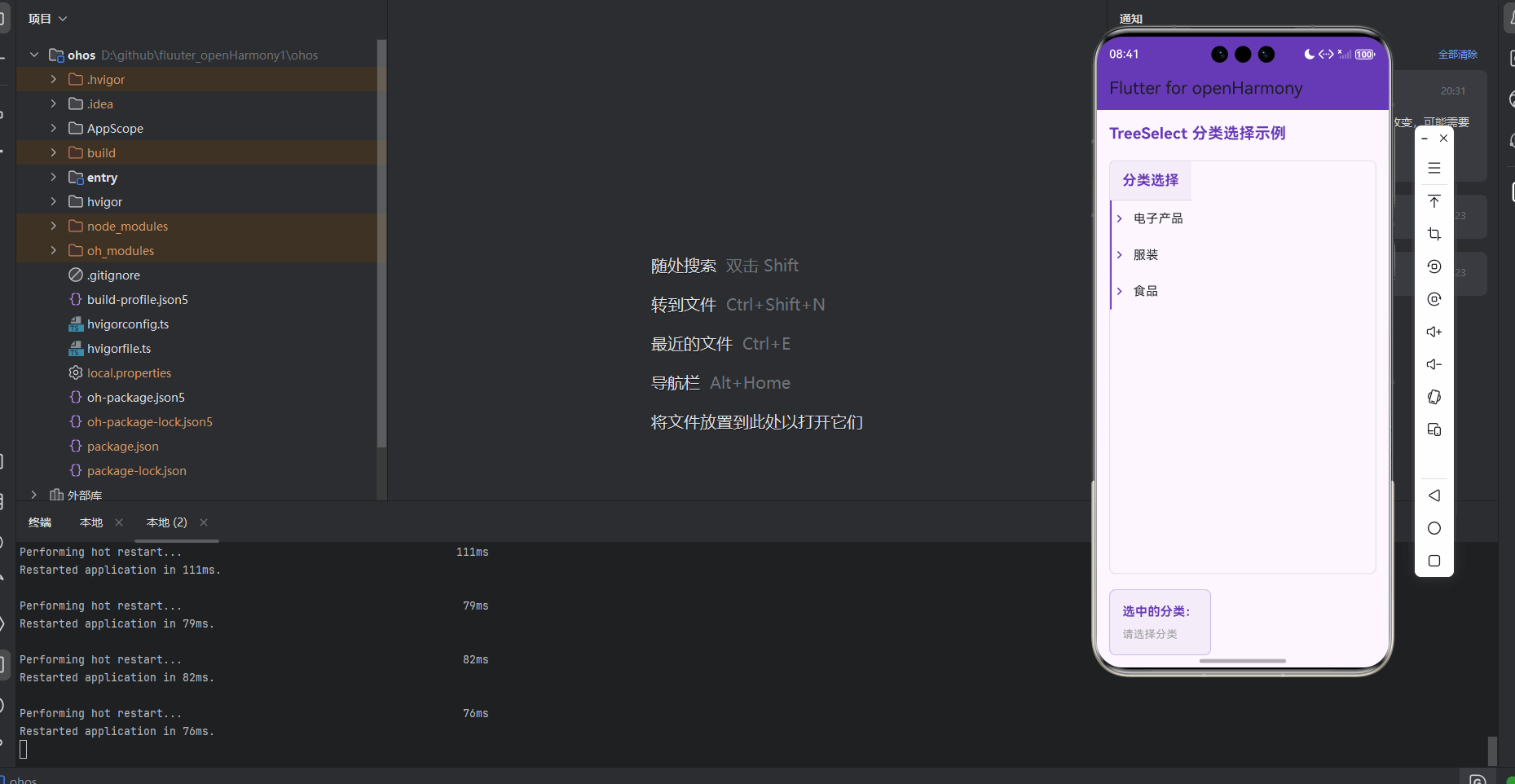
目录
功能代码实现
TreeSelect 组件设计与实现
组件结构设计
TreeSelect 组件采用了组件化设计思想,将树形分类选择功能完全封装,便于在不同页面复用。组件包含以下核心部分:
- 数据模型:定义了
TreeItem类来表示树形结构中的每个节点 - 状态管理:使用
StatefulWidget管理组件的展开/折叠和选择状态 - UI 渲染:通过递归方式构建树形结构的视觉表现
- 交互处理:实现了节点点击选择和展开/折叠功能
数据模型实现
首先,我们定义了 TreeItem 类来表示树形结构中的每个节点:
// 树形分类数据模型
class TreeItem {
  final String id;
  final String name;
  final List<TreeItem>? children;
  bool isExpanded;
  bool isSelected;

  TreeItem({
    required this.id,
    required this.name,
    this.children,
    this.isExpanded = false,
    this.isSelected = false,
  });
}
组件核心实现
TreeSelect 组件的核心实现如下:
// TreeSelect 组件
class TreeSelect extends StatefulWidget {
final List<TreeItem> items;
final Function(List<TreeItem>) onSelectionChanged;
const TreeSelect({
Key? key,
required this.items,
required this.onSelectionChanged,
}) : super(key: key);
State<TreeSelect> createState() => _TreeSelectState();
}
class _TreeSelectState extends State<TreeSelect> {
List<TreeItem> _selectedItems = [];
// 切换展开/折叠状态
void _toggleExpand(TreeItem item) {
setState(() {
item.isExpanded = !item.isExpanded;
});
}
// 切换选择状态
void _toggleSelect(TreeItem item) {
setState(() {
item.isSelected = !item.isSelected;
_updateSelectedItems();
widget.onSelectionChanged(_selectedItems);
});
}
// 更新选中项列表
void _updateSelectedItems() {
_selectedItems = [];
_collectSelectedItems(widget.items);
}
// 递归收集选中项
void _collectSelectedItems(List<TreeItem> items) {
for (var item in items) {
if (item.isSelected) {
_selectedItems.add(item);
}
if (item.children != null && item.children!.isNotEmpty) {
_collectSelectedItems(item.children!);
}
}
}
// 构建树形节点
Widget _buildTreeItem(TreeItem item, int level) {
return Column(
children: [
GestureDetector(
onTap: () => _toggleSelect(item),
child: Container(
padding: EdgeInsets.only(
left: 20.0 * level,
top: 12.0,
bottom: 12.0,
right: 16.0,
),
decoration: BoxDecoration(
color: item.isSelected
? Colors.deepPurple.withOpacity(0.1)
: Colors.transparent,
border: Border(
left: BorderSide(
color: Colors.deepPurple,
width: 2.0,
),
),
),
child: Row(
mainAxisAlignment: MainAxisAlignment.spaceBetween,
children: [
Row(
children: [
if (item.children != null && item.children!.isNotEmpty)
GestureDetector(
onTap: () => _toggleExpand(item),
child: Icon(
item.isExpanded
? Icons.keyboard_arrow_down
: Icons.keyboard_arrow_right,
color: Colors.deepPurple,
size: 20.0,
),
),
if (item.children != null && item.children!.isNotEmpty)
SizedBox(width: 8.0),
Text(
item.name,
style: TextStyle(
fontSize: 16.0,
color: item.isSelected
? Colors.deepPurple
: Colors.black87,
fontWeight: item.isSelected
? FontWeight.bold
: FontWeight.normal,
),
),
],
),
if (item.isSelected)
Icon(
Icons.check_circle,
color: Colors.deepPurple,
size: 20.0,
),
],
),
),
),
if (item.children != null &&
item.children!.isNotEmpty &&
item.isExpanded)
Column(
children: item.children!.map((child) {
return _buildTreeItem(child, level + 1);
}).toList(),
),
],
);
}
Widget build(BuildContext context) {
return Container(
decoration: BoxDecoration(
borderRadius: BorderRadius.circular(8.0),
border: Border.all(
color: Colors.grey.withOpacity(0.3),
width: 1.0,
),
),
child: Column(
crossAxisAlignment: CrossAxisAlignment.start,
children: [
Container(
padding: EdgeInsets.symmetric(
horizontal: 16.0,
vertical: 12.0,
),
decoration: BoxDecoration(
color: Colors.deepPurple.withOpacity(0.05),
border: Border(
bottom: BorderSide(
color: Colors.grey.withOpacity(0.3),
width: 1.0,
),
),
),
child: Text(
'分类选择',
style: TextStyle(
fontSize: 18.0,
fontWeight: FontWeight.bold,
color: Colors.deepPurple,
),
),
),
Column(
children: widget.items.map((item) {
return _buildTreeItem(item, 0);
}).toList(),
),
],
),
);
}
}
开发要点与注意事项
-
递归渲染优化
- 采用递归方式构建树形结构时,需要注意性能优化
- 对于层级较深的树形结构,建议添加虚拟滚动支持
- 避免在递归过程中创建过多临时对象
-
状态管理
- 使用
setState管理组件状态,确保 UI 与数据同步 - 实现了
_updateSelectedItems方法实时更新选中项列表 - 通过回调函数
onSelectionChanged将选中结果传递给父组件
- 使用
-
交互设计
- 区分了节点点击(选择/取消选择)和展开/折叠图标的点击事件
- 添加了视觉反馈:选中节点高亮显示,带有勾选图标
- 展开/折叠图标使用了 Material Design 风格的箭头图标
-
布局与样式
- 使用
Container和Border实现了节点的层级缩进效果 - 通过
level参数控制不同层级节点的左侧缩进距离 - 采用了卡片式设计,提升视觉层次感
- 使用
首页集成与使用
首页结构设计
在首页中,我们集成了 TreeSelect 组件,并添加了示例数据和选中结果展示区域:
class _MyHomePageState extends State<MyHomePage> {
// 示例树形分类数据
final List<TreeItem> _categoryItems = [
TreeItem(
id: '1',
name: '电子产品',
children: [
TreeItem(
id: '1-1',
name: '手机',
children: [
TreeItem(id: '1-1-1', name: '华为'),
TreeItem(id: '1-1-2', name: '苹果'),
TreeItem(id: '1-1-3', name: '小米'),
],
),
TreeItem(
id: '1-2',
name: '电脑',
children: [
TreeItem(id: '1-2-1', name: '笔记本'),
TreeItem(id: '1-2-2', name: '台式机'),
TreeItem(id: '1-2-3', name: '平板'),
],
),
TreeItem(
id: '1-3',
name: '家电',
children: [
TreeItem(id: '1-3-1', name: '电视'),
TreeItem(id: '1-3-2', name: '冰箱'),
TreeItem(id: '1-3-3', name: '洗衣机'),
],
),
],
),
TreeItem(
id: '2',
name: '服装',
children: [
TreeItem(
id: '2-1',
name: '男装',
children: [
TreeItem(id: '2-1-1', name: '上衣'),
TreeItem(id: '2-1-2', name: '裤子'),
TreeItem(id: '2-1-3', name: '鞋子'),
],
),
TreeItem(
id: '2-2',
name: '女装',
children: [
TreeItem(id: '2-2-1', name: '上衣'),
TreeItem(id: '2-2-2', name: '裙子'),
TreeItem(id: '2-2-3', name: '鞋子'),
],
),
],
),
TreeItem(
id: '3',
name: '食品',
children: [
TreeItem(id: '3-1', name: '水果'),
TreeItem(id: '3-2', name: '蔬菜'),
TreeItem(id: '3-3', name: '肉类'),
],
),
];
List<TreeItem> _selectedItems = [];
// 处理选择变化
void _handleSelectionChanged(List<TreeItem> selectedItems) {
setState(() {
_selectedItems = selectedItems;
});
}
Widget build(BuildContext context) {
return Scaffold(
appBar: AppBar(
title: Text(widget.title),
backgroundColor: Colors.deepPurple,
),
body: Padding(
padding: const EdgeInsets.all(16.0),
child: Column(
crossAxisAlignment: CrossAxisAlignment.start,
children: [
Text(
'TreeSelect 分类选择示例',
style: TextStyle(
fontSize: 20.0,
fontWeight: FontWeight.bold,
color: Colors.deepPurple,
),
),
SizedBox(height: 20.0),
// 集成 TreeSelect 组件
Expanded(
child: TreeSelect(
items: _categoryItems,
onSelectionChanged: _handleSelectionChanged,
),
),
SizedBox(height: 20.0),
// 显示选中结果
Container(
padding: EdgeInsets.all(16.0),
decoration: BoxDecoration(
borderRadius: BorderRadius.circular(8.0),
border: Border.all(
color: Colors.deepPurple.withOpacity(0.3),
width: 1.0,
),
color: Colors.deepPurple.withOpacity(0.05),
),
child: Column(
crossAxisAlignment: CrossAxisAlignment.start,
children: [
Text(
'选中的分类:',
style: TextStyle(
fontSize: 16.0,
fontWeight: FontWeight.bold,
color: Colors.deepPurple,
),
),
SizedBox(height: 8.0),
_selectedItems.isEmpty
? Text(
'请选择分类',
style: TextStyle(
fontSize: 14.0,
color: Colors.grey,
),
)
: Column(
crossAxisAlignment: CrossAxisAlignment.start,
children: _selectedItems.map((item) {
return Padding(
padding: const EdgeInsets.symmetric(vertical: 4.0),
child: Text(
'- ${item.name}',
style: TextStyle(
fontSize: 14.0,
color: Colors.deepPurple,
),
),
);
}).toList(),
),
],
),
),
],
),
),
);
}
}
使用方法
-
导入组件
import 'components/tree_select.dart'; -
创建数据源
- 根据业务需求构建树形结构的
TreeItem列表 - 支持任意层级的嵌套分类
- 根据业务需求构建树形结构的
-
集成组件
TreeSelect( items: _categoryItems, onSelectionChanged: _handleSelectionChanged, ) -
处理选择结果
- 实现
_handleSelectionChanged方法接收选中项列表 - 根据业务需求处理选中结果,如展示、提交等
- 实现
开发要点与注意事项
-
数据结构设计
- 合理设计
TreeItem数据结构,包含必要的字段 - 根据实际业务需求调整示例数据结构
- 合理设计
-
布局管理
- 使用
Expanded组件确保 TreeSelect 组件占据适当的空间 - 合理设置 padding 和 margin,提升页面美观度
- 使用
-
状态管理
- 在父组件中管理选中结果状态
- 通过
setState更新 UI 以反映选中状态变化
-
性能优化
- 对于大型分类数据,考虑使用懒加载或分页加载
- 避免在
build方法中重复创建数据结构
本次开发中容易遇到的问题
1. BoxDecoration 语法错误
问题描述
在开发 TreeSelect 组件时,使用了错误的 BoxDecoration 语法,导致编译失败:
// 错误示例
borderBottom: Border.all(
  color: Colors.grey.withOpacity(0.3),
  width: 1.0,
),
解决方案
修正为正确的 Border 语法:
// 正确示例
border: Border(
  bottom: BorderSide(
    color: Colors.grey.withOpacity(0.3),
    width: 1.0,
  ),
),
预防措施
- 熟悉 Flutter 的 BoxDecoration API 文档
- 使用 IDE 的自动补全功能,避免手动拼写复杂的语法结构
- 编写代码时注意类型检查,确保参数类型正确
2. 导入路径错误
问题描述
在 main.dart 中使用了错误的导入路径,导致找不到组件:
// 错误示例
import 'package:flutter_open_harmony1/components/tree_select.dart';
解决方案
使用相对导入路径:
// 正确示例
import 'components/tree_select.dart';
预防措施
- 了解 Flutter 项目的导入规则
- 优先使用相对导入路径,避免依赖包名
- 检查 pubspec.yaml 中的包名配置
3. 递归渲染性能问题
问题描述
对于层级较深、节点较多的树形结构,递归渲染可能导致性能下降和卡顿。
解决方案
- 对于大型树形结构,考虑使用虚拟滚动(ListView.builder)
- 实现节点的懒加载,只渲染当前可见的节点
- 优化递归算法,避免不必要的计算和对象创建
预防措施
- 在设计阶段评估数据规模,选择合适的渲染策略
- 对复杂组件进行性能测试,及时发现和解决性能瓶颈
- 考虑使用状态管理库(如 Provider、Bloc)管理复杂状态
4. 状态管理混乱
问题描述
在处理树形节点的展开/折叠和选择状态时,可能出现状态管理混乱,导致 UI 与数据不同步。
解决方案
- 集中管理状态,确保状态变更的可追踪性
- 使用回调函数将选中结果传递给父组件
- 实现
_updateSelectedItems方法统一更新选中状态
预防措施
- 设计清晰的状态管理策略
- 避免在多个地方修改同一状态
- 使用 immutable 数据结构,减少副作用
5. 布局适配问题
问题描述
在不同屏幕尺寸的设备上,TreeSelect 组件的布局可能出现适配问题,如节点缩进过大或过小。
解决方案
- 使用相对单位(如百分比、dp)而非绝对单位
- 实现响应式布局,根据屏幕尺寸调整布局参数
- 测试不同屏幕尺寸的显示效果
预防措施
- 采用响应式设计理念
- 使用 Flutter 的布局组件(如 Flexible、Expanded)
- 在多种设备上进行测试,确保布局一致性
总结本次开发中用到的技术点
1. 组件化开发
核心技术
- 使用
StatefulWidget和StatelessWidget构建组件 - 采用面向对象的设计思想,封装树形选择功能
- 实现组件的复用性和可扩展性
应用场景
- TreeSelect 组件可在任何需要分类选择功能的页面复用
- 组件化设计便于维护和测试
技术要点
- 组件的属性设计(items、onSelectionChanged)
- 组件的状态管理(展开/折叠、选择状态)
- 组件的生命周期管理
2. 树形结构处理
核心技术
- 使用递归算法构建树形结构
- 设计
TreeItem数据模型表示节点 - 实现节点的展开/折叠和选择功能
应用场景
- 分类选择、权限管理、菜单导航等需要层级结构的场景
技术要点
- 递归渲染算法
- 树形数据结构设计
- 节点状态管理
3. 状态管理
核心技术
- 使用
setState管理组件内部状态 - 通过回调函数传递状态变更
- 实现状态的统一更新和同步
应用场景
- 组件内部状态管理
- 父子组件间的状态传递
- 复杂交互场景的状态控制
技术要点
- 状态更新的时机和方式
- 状态传递的设计模式
- 避免状态管理混乱
4. 布局与样式
核心技术
- 使用
Container、Row、Column等布局组件 - 通过
BoxDecoration实现视觉效果 - 设计响应式布局,适配不同屏幕尺寸
应用场景
- 卡片式布局
- 层级缩进效果
- 视觉反馈设计
技术要点
- 布局组件的嵌套使用
- 样式属性的合理设置
- 响应式布局的实现
5. 交互设计
核心技术
- 使用
GestureDetector处理点击事件 - 实现节点的展开/折叠交互
- 设计选中状态的视觉反馈
应用场景
- 用户交互密集的界面
- 需要实时反馈的操作
- 复杂的用户操作流程
技术要点
- 事件处理的优先级
- 视觉反馈的设计原则
- 交互流程的优化
6. Flutter for OpenHarmony 适配
核心技术
- 了解 Flutter 与 OpenHarmony 的集成方式
- 适配 OpenHarmony 平台的特性
- 确保跨平台兼容性
应用场景
- Flutter 应用在 OpenHarmony 平台的部署
- 跨平台应用的开发和维护
技术要点
- 平台差异的识别和处理
- 兼容性测试和验证
- 性能优化和调优
7. 代码组织与管理
核心技术
- 合理组织项目目录结构
- 采用模块化设计思想
- 编写清晰、可维护的代码
应用场景
- 大型项目的代码管理
- 团队协作开发
- 代码的长期维护
技术要点
- 目录结构的设计
- 代码风格的统一
- 注释和文档的编写
8. 性能优化
核心技术
- 递归渲染的性能优化
- 状态更新的优化
- 布局渲染的优化
应用场景
- 复杂界面的流畅运行
- 大型数据的处理
- 资源受限设备的适配
技术要点
- 避免不必要的重建
- 优化渲染流程
- 合理使用缓存策略
通过本次开发,我们掌握了 Flutter 中树形分类选择组件的设计与实现,以及 Flutter for OpenHarmony 平台的适配技术。这些技术点不仅适用于本次项目,也为未来的跨平台应用开发积累了宝贵经验。
欢迎加入开源鸿蒙跨平台社区: https://openharmonycrossplatform.csdn.net

腾讯云面向开发者汇聚海量精品云计算使用和开发经验,营造开放的云计算技术生态圈。
更多推荐
 16
16 0
0- 0


 已为社区贡献10条内容

所有评论(0)