Flutter for OpenHarmony 实战:全屏弹窗实现
欢迎加入开源鸿蒙跨平台社区: https://openharmonycrossplatform.csdn.net
目录
前言:跨生态开发的新机遇
在移动开发领域,我们总是面临着选择与适配。今天,你的Flutter应用在Android和iOS上跑得正欢,明天可能就需要考虑一个新的平台:HarmonyOS(鸿蒙)。这不是一道选答题,而是很多团队正在面对的现实。
Flutter的优势很明确——写一套代码,就能在两个主要平台上运行,开发体验流畅。而鸿蒙代表的是下一个时代的互联生态,它不仅仅是手机系统,更着眼于未来全场景的体验。将现有的Flutter应用适配到鸿蒙,听起来像是一个“跨界”任务,但它本质上是一次有价值的技术拓展:让产品触达更多用户,也让技术栈覆盖更广。
不过,这条路走起来并不像听起来那么简单。Flutter和鸿蒙,从底层的架构到上层的工具链,都有着各自的设计逻辑。会遇到一些具体的问题:代码如何组织?原有的功能在鸿蒙上如何实现?那些平台特有的能力该怎么调用?更实际的是,从编译打包到上架部署,整个流程都需要重新摸索。
这篇文章想做的,就是把这些我们趟过的路、踩过的坑,清晰地摊开给你看。我们不会只停留在“怎么做”,还会聊到“为什么得这么做”,以及“如果出了问题该往哪想”。这更像是一份实战笔记,源自真实的项目经验,聚焦于那些真正卡住过我们的环节。
无论你是在为一个成熟产品寻找新的落地平台,还是从一开始就希望构建能面向多端的应用,这里的思路和解决方案都能提供直接的参考。理解了两套体系之间的异同,掌握了关键的衔接技术,不仅能完成这次迁移,更能积累起应对未来技术变化的能力。
混合工程结构深度解析
项目目录架构
当Flutter项目集成鸿蒙支持后,典型的项目结构会发生显著变化。以下是经过ohos_flutter插件初始化后的项目结构:
my_flutter_harmony_app/
├── lib/                          # Flutter业务代码(基本不变)
│   ├── main.dart                 # 应用入口
│   ├── home_page.dart           # 首页
│   └── utils/
│       └── platform_utils.dart  # 平台工具类
├── pubspec.yaml                  # Flutter依赖配置
├── ohos/                         # 鸿蒙原生层(核心适配区)
│   ├── entry/                    # 主模块
│   │   └── src/main/
│   │       ├── ets/              # ArkTS代码
│   │       │   ├── MainAbility/
│   │       │   │   ├── MainAbility.ts       # 主Ability
│   │       │   │   └── MainAbilityContext.ts
│   │       │   └── pages/
│   │       │       ├── Index.ets           # 主页面
│   │       │       └── Splash.ets          # 启动页
│   │       ├── resources/        # 鸿蒙资源文件
│   │       │   ├── base/
│   │       │   │   ├── element/  # 字符串等
│   │       │   │   ├── media/    # 图片资源
│   │       │   │   └── profile/  # 配置文件
│   │       │   └── en_US/        # 英文资源
│   │       └── config.json       # 应用核心配置
│   ├── ohos_test/               # 测试模块
│   ├── build-profile.json5      # 构建配置
│   └── oh-package.json5         # 鸿蒙依赖管理
└── README.md
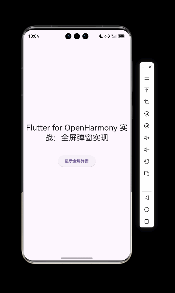
展示效果图片
flutter 实时预览 效果展示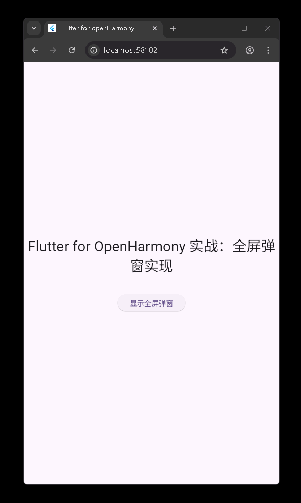
运行到鸿蒙虚拟设备中效果展示
功能代码实现
FullScreenDialog 组件实现
组件设计思路
FullScreenDialog 是一个全屏弹窗组件,采用 Material Design 风格,通过 Flutter 的路由系统实现全屏显示效果。该组件的设计目标是提供一个灵活、可定制的全屏对话框,支持自定义标题、内容、操作按钮、背景色和图标。
核心代码实现
import 'package:flutter/material.dart';
class FullScreenDialog extends StatelessWidget {
final String title;
final Widget content;
final List<DialogAction> actions;
final bool barrierDismissible;
final Color? backgroundColor;
final Widget? icon;
const FullScreenDialog({
super.key,
required this.title,
required this.content,
required this.actions,
this.barrierDismissible = true,
this.backgroundColor,
this.icon,
});
static Future<void> show(
BuildContext context, {
required String title,
required Widget content,
required List<DialogAction> actions,
bool barrierDismissible = true,
Color? backgroundColor,
Widget? icon,
}) {
return Navigator.of(context).push(
MaterialPageRoute(
builder: (context) => FullScreenDialog(
title: title,
content: content,
actions: actions,
barrierDismissible: barrierDismissible,
backgroundColor: backgroundColor,
icon: icon,
),
fullscreenDialog: true,
),
);
}
Widget build(BuildContext context) {
return Scaffold(
backgroundColor: backgroundColor ?? Colors.white,
appBar: AppBar(
title: Text(title),
leading: IconButton(
icon: const Icon(Icons.close),
onPressed: () => Navigator.of(context).pop(),
),
elevation: 0,
),
body: Column(
children: [
if (icon != null)
Padding(
padding: const EdgeInsets.all(24),
child: icon,
),
Expanded(
child: SingleChildScrollView(
padding: const EdgeInsets.all(24),
child: content,
),
),
Container(
padding: const EdgeInsets.all(16),
decoration: BoxDecoration(
border: Border(top: BorderSide(color: Colors.grey[200]!)),
),
child: Row(
mainAxisAlignment: MainAxisAlignment.end,
children: actions
.map((action) => _buildActionButton(context, action))
.toList(),
),
),
],
),
);
}
Widget _buildActionButton(BuildContext context, DialogAction action) {
return Container(
margin: const EdgeInsets.only(left: 8),
child: TextButton(
onPressed: () {
action.onPressed();
Navigator.of(context).pop();
},
style: TextButton.styleFrom(
foregroundColor: action.isDestructive
? Colors.red
: Theme.of(context).primaryColor,
),
child: Text(
action.title,
style: TextStyle(
fontWeight: action.isDefault ? FontWeight.bold : FontWeight.normal,
),
),
),
);
}
}
关键实现细节
-
路由实现:使用
Navigator.of(context).push方法推送一个MaterialPageRoute,并设置fullscreenDialog: true,确保弹窗以全屏模式显示。 -
组件结构:采用
Scaffold作为基础布局,包含以下部分:AppBar:显示标题和关闭按钮- 可选的图标区域
- 可滚动的内容区域
- 底部操作按钮区域
-
参数设计:
title:弹窗标题content:弹窗内容,支持任何 Widgetactions:操作按钮列表barrierDismissible:是否可通过点击遮罩层关闭backgroundColor:背景色icon:可选的图标
-
静态方法:提供
show静态方法,简化调用方式,提高代码可读性。
DialogAction 组件实现
组件设计思路
DialogAction 是 FullScreenDialog 的配套组件,用于定义弹窗底部的操作按钮。它支持设置按钮文本、点击回调、是否为默认按钮和是否为破坏性操作按钮。
核心代码实现
class DialogAction {
  final String title;
  final VoidCallback onPressed;
  final bool isDefault;
  final bool isDestructive;

  const DialogAction({
    required this.title,
    required this.onPressed,
    this.isDefault = false,
    this.isDestructive = false,
  });
}
关键实现细节
-
属性设计:
title:按钮文本onPressed:点击回调函数isDefault:是否为默认按钮(默认按钮会显示为粗体)isDestructive:是否为破坏性操作(破坏性操作会显示为红色)
-
使用方式:通过创建 DialogAction 实例并添加到 FullScreenDialog 的 actions 参数中使用。
组件使用方法
基本用法
FullScreenDialog.show(
  context,
  title: '用户设置',
  icon: const Icon(
    Icons.settings,
    size: 64,
    color: Colors.blue,
  ),
  content: Column(
    crossAxisAlignment: CrossAxisAlignment.start,
    children: [
      ListTile(
        leading: const Icon(Icons.person),
        title: const Text('个人资料'),
        subtitle: const Text('编辑个人信息'),
      ),
      ListTile(
        leading: const Icon(Icons.security),
        title: const Text('隐私设置'),
        subtitle: const Text('管理隐私权限'),
      ),
      // 更多内容...
    ],
  ),
  actions: [
    DialogAction(
      title: '取消',
      onPressed: () {
        print('取消操作');
      },
    ),
    DialogAction(
      title: '保存',
      onPressed: () {
        print('保存设置');
      },
      isDefault: true,
    ),
  ],
);
开发注意事项
-
路由管理:由于使用了
Navigator.push,关闭弹窗时需要使用Navigator.pop,确保路由栈正确管理。 -
内容滚动:内容区域使用
SingleChildScrollView包裹,确保内容超出屏幕时可以滚动。 -
按钮样式:通过
isDefault和isDestructive属性可以设置按钮的样式,提高用户体验。 -
背景色设置:可以通过
backgroundColor参数自定义弹窗背景色,适应不同的应用主题。 -
图标使用:通过
icon参数可以添加自定义图标,增强视觉效果。
本次开发中容易遇到的问题
1. 路由管理问题
问题描述
在使用 FullScreenDialog 时,可能会遇到路由栈管理不当的问题,导致弹窗无法正确关闭或多次打开。
解决方案
- 确保使用
Navigator.of(context).pop()关闭弹窗 - 避免在弹窗内部再次调用
FullScreenDialog.show,可能会导致路由栈过深 - 考虑使用
WillPopScope组件处理返回按钮事件,确保弹窗可以正确关闭
2. 内容溢出问题
问题描述
当弹窗内容过多时,可能会导致内容溢出屏幕,无法完全显示。
解决方案
- 确保内容被
SingleChildScrollView包裹 - 合理设计内容布局,避免嵌套过深的滚动组件
- 考虑使用
ListView或GridView等滚动组件展示列表数据
3. 样式一致性问题
问题描述
在不同平台(Android、iOS、HarmonyOS)上,弹窗的样式可能会有差异,影响用户体验的一致性。
解决方案
- 使用 Flutter 的 Material Design 组件,确保在不同平台上的样式一致性
- 避免使用平台特定的组件和样式
- 测试时在不同平台上验证弹窗的显示效果
4. 性能问题
问题描述
当弹窗内容包含复杂的组件或大量数据时,可能会导致弹窗打开时卡顿。
解决方案
- 优化内容组件的渲染性能
- 考虑使用
const构造器创建不变的组件 - 对于复杂内容,考虑使用懒加载或分页加载
总结本次开发中用到的技术点
1. Flutter 路由系统
使用 Navigator.push 和 MaterialPageRoute 实现全屏弹窗,通过设置 fullscreenDialog: true 确保弹窗以全屏模式显示。路由系统是 Flutter 中管理页面跳转的核心机制,掌握其使用方法对于构建复杂应用至关重要。
2. 组件化开发
采用组件化开发思想,将弹窗拆分为 FullScreenDialog 和 DialogAction 两个组件,提高代码的可复用性和可维护性。组件化开发是 Flutter 的核心开发理念,通过组合简单组件可以构建复杂的用户界面。
3. 布局管理
使用 Scaffold、Column、Expanded、SingleChildScrollView 等布局组件构建弹窗的布局结构,确保布局的灵活性和适应性。Flutter 的布局系统基于 widgets 树,通过组合不同的布局组件可以实现各种复杂的布局效果。
4. 状态管理
虽然本示例中没有使用复杂的状态管理方案,但通过 DialogAction 的 onPressed 回调函数实现了与父组件的通信。在实际应用中,可能需要结合 setState、Provider、Bloc 等状态管理方案来管理更复杂的状态。
5. 平台适配
通过使用 Flutter 的跨平台组件,确保弹窗在 Android、iOS 和 HarmonyOS 上都能正常显示。Flutter 的优势在于可以编写一套代码运行在多个平台上,减少了平台适配的工作量。
6. 代码组织
将组件代码放在 lib/components 目录下,遵循 Flutter 项目的代码组织规范,提高代码的可读性和可维护性。合理的代码组织是构建大型应用的基础,有助于团队协作和代码管理。
欢迎加入开源鸿蒙跨平台社区: https://openharmonycrossplatform.csdn.net

腾讯云面向开发者汇聚海量精品云计算使用和开发经验,营造开放的云计算技术生态圈。
更多推荐
 19
19 0
0- 0


 已为社区贡献11条内容

所有评论(0)