Flutter for OpenHarmony 实战:动作表实现
在移动开发领域,我们总是面临着选择与适配。今天,你的Flutter应用在Android和iOS上跑得正欢,明天可能就需要考虑一个新的平台:HarmonyOS(鸿蒙)。这不是一道选答题,而是很多团队正在面对的现实。Flutter的优势很明确——写一套代码,就能在两个主要平台上运行,开发体验流畅。而鸿蒙代表的是下一个时代的互联生态,它不仅仅是手机系统,更着眼于未来全场景的体验。
欢迎加入开源鸿蒙跨平台社区: https://openharmonycrossplatform.csdn.net
目录
前言:跨生态开发的新机遇
在移动开发领域,我们总是面临着选择与适配。今天,你的Flutter应用在Android和iOS上跑得正欢,明天可能就需要考虑一个新的平台:HarmonyOS(鸿蒙)。这不是一道选答题,而是很多团队正在面对的现实。
Flutter的优势很明确——写一套代码,就能在两个主要平台上运行,开发体验流畅。而鸿蒙代表的是下一个时代的互联生态,它不仅仅是手机系统,更着眼于未来全场景的体验。将现有的Flutter应用适配到鸿蒙,听起来像是一个“跨界”任务,但它本质上是一次有价值的技术拓展:让产品触达更多用户,也让技术栈覆盖更广。
不过,这条路走起来并不像听起来那么简单。Flutter和鸿蒙,从底层的架构到上层的工具链,都有着各自的设计逻辑。会遇到一些具体的问题:代码如何组织?原有的功能在鸿蒙上如何实现?那些平台特有的能力该怎么调用?更实际的是,从编译打包到上架部署,整个流程都需要重新摸索。
这篇文章想做的,就是把这些我们趟过的路、踩过的坑,清晰地摊开给你看。我们不会只停留在“怎么做”,还会聊到“为什么得这么做”,以及“如果出了问题该往哪想”。这更像是一份实战笔记,源自真实的项目经验,聚焦于那些真正卡住过我们的环节。
无论你是在为一个成熟产品寻找新的落地平台,还是从一开始就希望构建能面向多端的应用,这里的思路和解决方案都能提供直接的参考。理解了两套体系之间的异同,掌握了关键的衔接技术,不仅能完成这次迁移,更能积累起应对未来技术变化的能力。
混合工程结构深度解析
项目目录架构
当Flutter项目集成鸿蒙支持后,典型的项目结构会发生显著变化。以下是经过ohos_flutter插件初始化后的项目结构:
my_flutter_harmony_app/
├── lib/                          # Flutter业务代码(基本不变)
│   ├── main.dart                 # 应用入口
│   ├── home_page.dart           # 首页
│   └── utils/
│       └── platform_utils.dart  # 平台工具类
├── pubspec.yaml                  # Flutter依赖配置
├── ohos/                         # 鸿蒙原生层(核心适配区)
│   ├── entry/                    # 主模块
│   │   └── src/main/
│   │       ├── ets/              # ArkTS代码
│   │       │   ├── MainAbility/
│   │       │   │   ├── MainAbility.ts       # 主Ability
│   │       │   │   └── MainAbilityContext.ts
│   │       │   └── pages/
│   │       │       ├── Index.ets           # 主页面
│   │       │       └── Splash.ets          # 启动页
│   │       ├── resources/        # 鸿蒙资源文件
│   │       │   ├── base/
│   │       │   │   ├── element/  # 字符串等
│   │       │   │   ├── media/    # 图片资源
│   │       │   │   └── profile/  # 配置文件
│   │       │   └── en_US/        # 英文资源
│   │       └── config.json       # 应用核心配置
│   ├── ohos_test/               # 测试模块
│   ├── build-profile.json5      # 构建配置
│   └── oh-package.json5         # 鸿蒙依赖管理
└── README.md
展示效果图片
flutter 实时预览 效果展示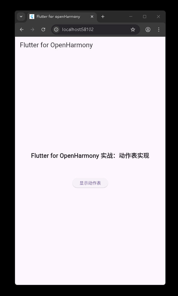
运行到鸿蒙虚拟设备中效果展示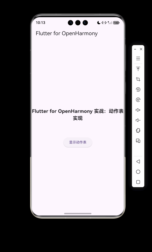
功能代码实现
ActionSheet 组件实现
组件设计思路
ActionSheet 是一个从屏幕底部弹出的动作表组件,采用 Flutter 的 showModalBottomSheet 实现底部弹出效果,支持自定义标题、消息、操作按钮和取消按钮。该组件的设计目标是提供一个灵活、可定制的动作表,用于让用户从多个选项中选择一个操作。
核心代码实现
import 'package:flutter/material.dart';
class ActionSheet extends StatelessWidget {
final String? title;
final String? message;
final List<ActionSheetAction> actions;
final String cancelButtonTitle;
final Function()? onCancel;
final Color? backgroundColor;
final Color? cancelButtonTextColor;
final bool isDismissible;
const ActionSheet({
super.key,
this.title,
this.message,
required this.actions,
this.cancelButtonTitle = '取消',
this.onCancel,
this.backgroundColor = Colors.white,
this.cancelButtonTextColor = Colors.black,
this.isDismissible = true,
});
static Future<T?> show<T>(
BuildContext context, {
String? title,
String? message,
required List<ActionSheetAction> actions,
String cancelButtonTitle = '取消',
Function()? onCancel,
Color? backgroundColor = Colors.white,
Color? cancelButtonTextColor = Colors.black,
bool isDismissible = true,
}) {
return showModalBottomSheet<T>(
context: context,
backgroundColor: Colors.transparent,
isDismissible: isDismissible,
builder: (context) => ActionSheet(
title: title,
message: message,
actions: actions,
cancelButtonTitle: cancelButtonTitle,
onCancel: onCancel,
backgroundColor: backgroundColor,
cancelButtonTextColor: cancelButtonTextColor,
isDismissible: isDismissible,
),
);
}
Widget build(BuildContext context) {
return Container(
decoration: const BoxDecoration(
color: Colors.transparent,
),
child: Column(
mainAxisAlignment: MainAxisAlignment.end,
children: [
Container(
decoration: BoxDecoration(
color: backgroundColor,
borderRadius: const BorderRadius.vertical(
top: Radius.circular(16),
),
),
child: Column(
mainAxisSize: MainAxisSize.min,
children: [
if (title != null || message != null)
Padding(
padding: const EdgeInsets.symmetric(
horizontal: 24,
vertical: 16,
),
child: Column(
crossAxisAlignment: CrossAxisAlignment.center,
children: [
if (title != null)
Text(
title!,
style: const TextStyle(
fontSize: 16,
fontWeight: FontWeight.bold,
),
),
if (message != null)
Padding(
padding: const EdgeInsets.only(top: 8),
child: Text(
message!,
style: const TextStyle(
fontSize: 14,
color: Colors.grey,
),
textAlign: TextAlign.center,
),
),
],
),
),
...actions.map((action) => _buildActionButton(context, action)),
const Divider(height: 1),
TextButton(
onPressed: () {
if (onCancel != null) {
onCancel!();
}
Navigator.of(context).pop();
},
style: TextButton.styleFrom(
padding: const EdgeInsets.symmetric(
vertical: 16,
),
foregroundColor: cancelButtonTextColor,
),
child: Text(
cancelButtonTitle,
style: const TextStyle(
fontSize: 16,
fontWeight: FontWeight.w500,
),
),
),
const SizedBox(height: 16),
],
),
),
],
),
);
}
Widget _buildActionButton(BuildContext context, ActionSheetAction action) {
return TextButton(
onPressed: () {
action.onPressed();
Navigator.of(context).pop(action.value);
},
style: TextButton.styleFrom(
padding: const EdgeInsets.symmetric(
horizontal: 24,
vertical: 16,
),
foregroundColor: action.textColor,
alignment: Alignment.centerLeft,
),
child: Text(
action.title,
style: TextStyle(
fontSize: 16,
fontWeight: FontWeight.w500,
color: action.textColor,
),
),
);
}
}
class ActionSheetAction<T> {
  final String title;
  final Function() onPressed;
  final Color textColor;
  final T? value;

  const ActionSheetAction({
    required this.title,
    required this.onPressed,
    this.textColor = Colors.black,
    this.value,
  });
}
关键实现细节
-
弹出效果实现:使用
showModalBottomSheet实现从底部弹出的效果,通过设置backgroundColor: Colors.transparent实现自定义背景。 -
组件结构:采用
Container和Column构建动作表的基本结构,包括标题、消息、操作按钮和取消按钮。 -
参数设计:
title:动作表标题message:动作表消息actions:操作按钮列表cancelButtonTitle:取消按钮标题onCancel:取消按钮点击回调backgroundColor:动作表背景色cancelButtonTextColor:取消按钮文字颜色isDismissible:是否可通过点击遮罩层关闭
-
静态方法:提供
show静态方法,简化调用方式,提高代码可读性。 -
操作按钮:通过
ActionSheetAction类定义操作按钮,支持自定义标题、点击回调、文字颜色和返回值。
ActionSheetAction 组件实现
组件设计思路
ActionSheetAction 是 ActionSheet 的配套组件,用于定义动作表中的操作按钮。它支持设置按钮标题、点击回调、文字颜色和返回值。
核心代码实现
class ActionSheetAction<T> {
final String title;
final Function() onPressed;
final Color textColor;
final T? value;
const ActionSheetAction({
required this.title,
required this.onPressed,
this.textColor = Colors.black,
this.value,
});
}
关键实现细节
-
泛型支持:使用泛型
T支持不同类型的返回值。 -
属性设计:
title:按钮标题onPressed:点击回调函数textColor:文字颜色value:返回值
-
使用方式:通过创建 ActionSheetAction 实例并添加到 ActionSheet 的 actions 参数中使用。
组件使用方法
基本用法
ElevatedButton(
  onPressed: () {
    ActionSheet.show(
      context,
      title: '选择操作',
      message: '请选择您要执行的操作',
      actions: [
        ActionSheetAction(
          title: '分享',
          onPressed: () {
            print('分享操作');
          },
          textColor: Colors.blue,
        ),
        ActionSheetAction(
          title: '编辑',
          onPressed: () {
            print('编辑操作');
          },
          textColor: Colors.green,
        ),
        ActionSheetAction(
          title: '删除',
          onPressed: () {
            print('删除操作');
          },
          textColor: Colors.red,
        ),
      ],
      cancelButtonTitle: '取消',
      onCancel: () {
        print('取消操作');
      },
    );
  },
  child: const Text('显示动作表'),
),
开发注意事项
-
上下文传递:确保在调用
ActionSheet.show时传递正确的BuildContext。 -
操作按钮数量:建议操作按钮数量不超过 5 个,以确保良好的用户体验。
-
文字长度:操作按钮的标题长度应适中,避免过长导致显示不全。
-
颜色选择:对于破坏性操作(如删除),建议使用红色等醒目的颜色,以提醒用户。
-
返回值处理:如果需要获取用户选择的操作,可以使用
ActionSheetAction的value属性和ActionSheet.show的返回值。
本次开发中容易遇到的问题
1. 弹出动画问题
问题描述
在使用 ActionSheet 组件时,可能会遇到弹出动画不流畅的问题,特别是在低端设备上。
解决方案
- 减少动作表中的操作按钮数量
- 优化动作表的布局,避免复杂的嵌套结构
- 考虑使用更简单的动画效果或减少动画持续时间
2. 背景色设置问题
问题描述
在设置 ActionSheet 的背景色时,可能会遇到背景色不生效的问题。
解决方案
- 确保在调用
ActionSheet.show时设置了backgroundColor参数 - 检查是否有其他样式覆盖了背景色设置
3. 点击事件处理问题
问题描述
在使用 ActionSheet 组件时,可能会遇到点击操作按钮后事件处理不正确的问题。
解决方案
- 确保为每个
ActionSheetAction设置了正确的onPressed回调函数 - 检查回调函数中的逻辑是否正确
- 对于需要异步处理的操作,确保正确处理异步逻辑
4. 屏幕适配问题
问题描述
在不同屏幕尺寸的设备上,ActionSheet 的显示效果可能会有差异,特别是在小屏幕设备上。
解决方案
- 使用相对尺寸和布局,避免使用固定值
- 考虑在小屏幕设备上调整操作按钮的大小和间距
- 测试在不同屏幕尺寸的设备上的显示效果
总结本次开发中用到的技术点
1. Flutter 弹出层系统
使用 showModalBottomSheet 实现从底部弹出的动作表效果。Flutter 的弹出层系统提供了丰富的 API,可以实现各种弹出效果,如对话框、底部动作表和侧边栏等。
2. 组件化开发
将动作表封装为独立的 ActionSheet 组件,提高代码的可复用性和可维护性。组件化开发是 Flutter 的核心开发理念,通过组合简单组件可以构建复杂的用户界面。
3. 泛型支持
在 ActionSheetAction 类中使用泛型 T 支持不同类型的返回值,提高代码的灵活性和类型安全性。泛型是 Dart 语言的重要特性,可以使代码更加通用和类型安全。
4. 静态方法
通过静态方法 show 简化组件的调用方式,提高代码的可读性和易用性。静态方法是一种常见的设计模式,用于提供便捷的工厂方法或工具方法。
5. 回调函数
使用回调函数处理用户交互事件,如按钮点击事件。回调函数是 Flutter 中处理用户交互的常见方式,通过将函数作为参数传递,可以实现组件之间的通信。
6. 布局管理
使用 Container、Column、Padding 等布局组件构建动作表的布局结构。Flutter 的布局系统基于 widgets 树,通过组合不同的布局组件可以实现各种复杂的布局效果。
7. 样式定制
支持自定义背景色、文字颜色等样式属性,提高组件的灵活性和可定制性。Flutter 提供了丰富的样式属性,可以通过构造函数参数或主题系统实现样式定制。
8. 平台适配
通过使用 Flutter 的跨平台组件,确保动作表在 Android、iOS 和 HarmonyOS 上都能正常显示。Flutter 的优势在于可以编写一套代码运行在多个平台上,减少了平台适配的工作量。
9. 代码组织
将组件代码放在 lib/components 目录下,遵循 Flutter 项目的代码组织规范,提高代码的可读性和可维护性。合理的代码组织是构建大型应用的基础,有助于团队协作和代码管理。
欢迎加入开源鸿蒙跨平台社区: https://openharmonycrossplatform.csdn.net

腾讯云面向开发者汇聚海量精品云计算使用和开发经验,营造开放的云计算技术生态圈。
更多推荐
 10
10 0
0- 0


 已为社区贡献8条内容

所有评论(0)