Flutter for OpenHarmony 身体健康状况记录App实战 - 健康记录列表实现
#
前言
健康记录列表是用户查看历史数据的主要入口。这个页面需要支持分类筛选、列表展示、快速添加等功能。我们会用到 TabBar 做分类切换,ListView.builder 做列表渲染,Get.bottomSheet 做底部弹窗。
这篇文章的代码量比较大,但每个部分都有明确的职责,拆开来看并不复杂。
页面状态管理
因为要用 TabController,所以需要混入 SingleTickerProviderStateMixin:
class RecordListPage extends StatefulWidget {
const RecordListPage({super.key});
State<RecordListPage> createState() => _RecordListPageState();
}
class _RecordListPageState extends State<RecordListPage> with SingleTickerProviderStateMixin {
late TabController _tabController;
final List<String> _tabs = ['全部', '体重', '血压', '血糖', '睡眠', '运动'];
void initState() {
super.initState();
_tabController = TabController(length: _tabs.length, vsync: this);
}
void dispose() {
_tabController.dispose();
super.dispose();
}
SingleTickerProviderStateMixin 提供了 vsync 参数需要的 TickerProvider。如果页面里有多个需要 Ticker 的动画,要用 TickerProviderStateMixin。
late 关键字告诉编译器这个变量会在使用前初始化,避免空安全检查报错。
dispose 方法里一定要调用 _tabController.dispose(),否则会造成内存泄漏。这是使用 Controller 类的标准模式。
页面整体结构
页面分为三个部分:顶部标题栏、Tab筛选栏、记录列表。另外还有一个浮动的添加按钮。
Widget build(BuildContext context) {
return Scaffold(
backgroundColor: const Color(0xFFFAFAFC),
body: SafeArea(
child: Column(
children: [
_buildHeader(),
_buildTabs(),
Expanded(child: _buildRecordList()),
],
),
),
floatingActionButton: FloatingActionButton(
onPressed: () => _showAddSheet(),
backgroundColor: const Color(0xFF6C63FF),
child: Icon(Icons.add_rounded, size: 28.w),
),
);
}
用 Column 垂直排列三个部分,列表用 Expanded 包裹,让它占据剩余空间。
FloatingActionButton 是 Material Design 的标准组件,默认会显示在右下角。我们把背景色改成主题色,图标用圆角的加号。
顶部标题栏
标题栏左边是大标题,右边是搜索按钮:
  Widget _buildHeader() {
    return Padding(
      padding: EdgeInsets.fromLTRB(20.w, 12.h, 20.w, 8.h),
      child: Row(
        mainAxisAlignment: MainAxisAlignment.spaceBetween,
        children: [
          Text('健康记录', style: TextStyle(
            fontSize: 24.sp,
            fontWeight: FontWeight.w700,
            color: const Color(0xFF1A1A2E)
          )),
          Container(
            padding: EdgeInsets.all(8.w),
            decoration: BoxDecoration(
              color: Colors.white,
              borderRadius: BorderRadius.circular(10.r),
            ),
            child: Icon(Icons.search_rounded, size: 22.w, color: Colors.grey[600]),
          ),
        ],
      ),
    );
  }
标题用 24sp 的大字号,加粗显示。搜索按钮用白色圆角容器包裹,和首页的通知按钮风格一致。
这里的搜索功能暂时没有实现,点击后可以跳转到搜索页面,或者展开一个搜索输入框。
Tab筛选栏
用 TabBar 实现分类筛选,支持横向滚动:
  Widget _buildTabs() {
    return Container(
      height: 40.h,
      margin: EdgeInsets.symmetric(vertical: 12.h),
      child: TabBar(
        controller: _tabController,
        isScrollable: true,
        labelColor: Colors.white,
        unselectedLabelColor: Colors.grey[600],
        labelStyle: TextStyle(fontSize: 13.sp, fontWeight: FontWeight.w500),
        indicator: BoxDecoration(
          color: const Color(0xFF6C63FF),
          borderRadius: BorderRadius.circular(20.r),
        ),
        indicatorSize: TabBarIndicatorSize.tab,
        dividerColor: Colors.transparent,
        padding: EdgeInsets.symmetric(horizontal: 16.w),
        labelPadding: EdgeInsets.symmetric(horizontal: 16.w),
        tabs: _tabs.map((t) => Tab(text: t)).toList(),
      ),
    );
  }
isScrollable: true 让 Tab 可以横向滚动,适合 Tab 数量较多的情况。
indicator 用 BoxDecoration 自定义样式,设置背景色和圆角。默认的下划线指示器不太好看,换成胶囊形状更现代。
indicatorSize: TabBarIndicatorSize.tab 让指示器宽度和 Tab 内容一样宽。如果设成 label,指示器只会和文字一样宽。
dividerColor: Colors.transparent 隐藏 TabBar 底部的分割线,Flutter 3.x 版本默认会显示这条线。
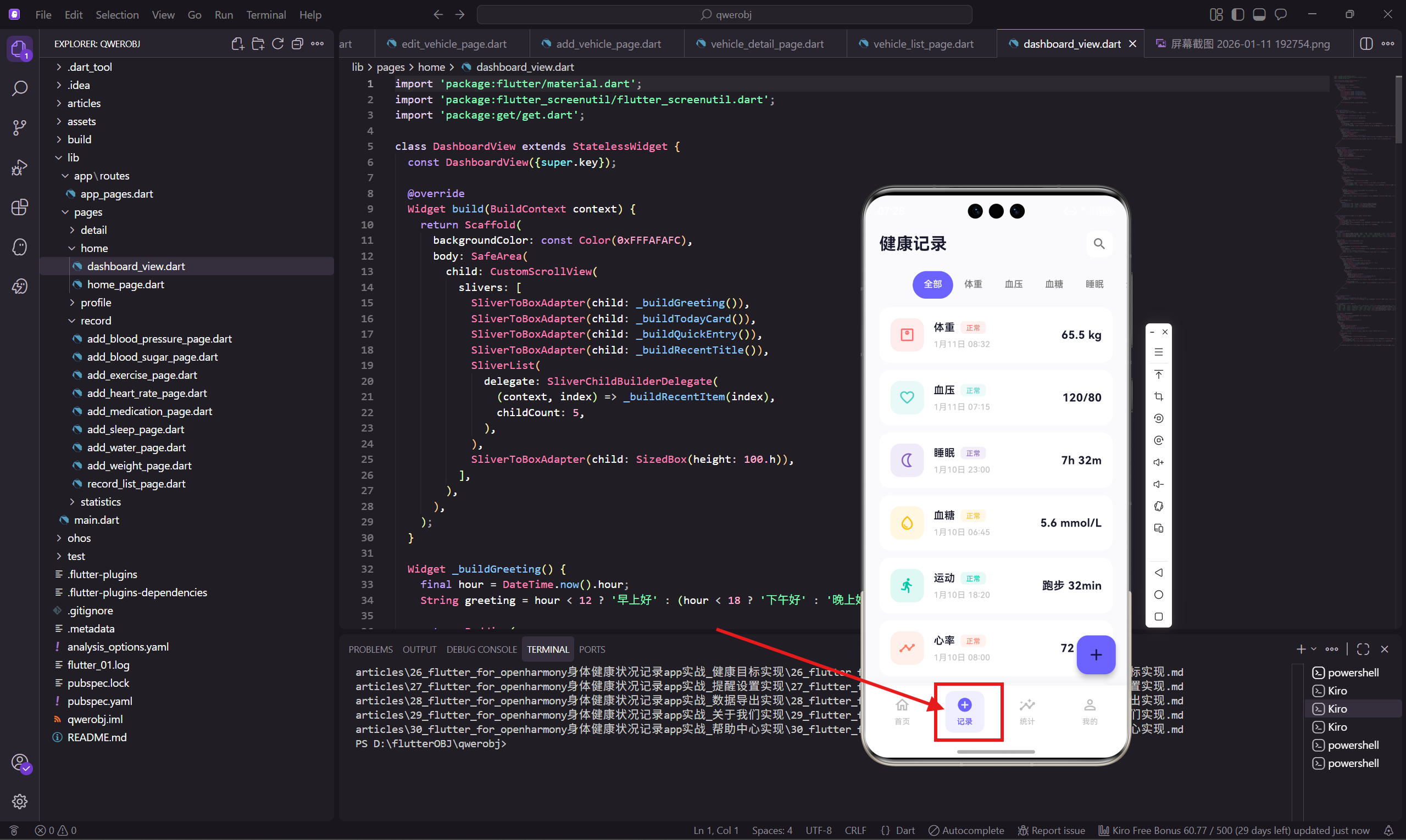
记录列表
用 ListView.builder 渲染列表,每条记录是一个可点击的卡片:
  Widget _buildRecordList() {
    return ListView.builder(
      padding: EdgeInsets.symmetric(horizontal: 20.w),
      itemCount: 12,
      itemBuilder: (context, index) {
        final records = [
          {'type': '体重', 'value': '65.5 kg', 'date': '1月11日', 'time': '08:32',
           'icon': Icons.monitor_weight_outlined, 'color': const Color(0xFFFF6B6B),
           'route': '/weight-detail'},
          {'type': '血压', 'value': '120/80', 'date': '1月11日', 'time': '07:15',
           'icon': Icons.favorite_border_rounded, 'color': const Color(0xFF4ECDC4),
           'route': '/blood-pressure-detail'},
          {'type': '睡眠', 'value': '7h 32m', 'date': '1月10日', 'time': '23:00',
           'icon': Icons.nightlight_outlined, 'color': const Color(0xFF845EC2),
           'route': '/sleep-detail'},
          {'type': '血糖', 'value': '5.6 mmol/L', 'date': '1月10日', 'time': '06:45',
           'icon': Icons.water_drop_outlined, 'color': const Color(0xFFFFBE0B),
           'route': '/blood-sugar-detail'},
          {'type': '运动', 'value': '跑步 32min', 'date': '1月10日', 'time': '18:20',
           'icon': Icons.directions_run_rounded, 'color': const Color(0xFF00C9A7),
           'route': '/exercise-detail'},
          {'type': '心率', 'value': '72 bpm', 'date': '1月10日', 'time': '08:00',
           'icon': Icons.timeline_rounded, 'color': const Color(0xFFFF8066),
           'route': '/heart-rate-detail'},
        ];
        final record = records[index % records.length];
这里用模拟数据演示,实际项目中数据应该从数据库或接口获取。index % records.length 让数据循环显示,方便测试滚动效果。
每条记录包含类型、数值、日期、时间、图标、颜色、跳转路由这些信息。用 Map 存储比定义一个类更灵活,适合这种展示型的数据。
记录卡片样式
每条记录渲染成一个白色卡片,左边是图标,中间是类型和时间,右边是数值:
        return GestureDetector(
          onTap: () => Get.toNamed(record['route'] as String),
          child: Container(
            margin: EdgeInsets.only(bottom: 10.h),
            padding: EdgeInsets.all(16.w),
            decoration: BoxDecoration(
              color: Colors.white,
              borderRadius: BorderRadius.circular(16.r),
            ),
            child: Row(
              children: [
                Container(
                  width: 48.w,
                  height: 48.w,
                  decoration: BoxDecoration(
                    color: (record['color'] as Color).withOpacity(0.12),
                    borderRadius: BorderRadius.circular(14.r),
                  ),
                  child: Icon(record['icon'] as IconData, size: 24.w,
                    color: record['color'] as Color),
                ),
                SizedBox(width: 14.w),
                Expanded(
                  child: Column(
                    crossAxisAlignment: CrossAxisAlignment.start,
                    children: [
                      Row(
                        children: [
                          Text(record['type'] as String, style: TextStyle(
                            fontSize: 15.sp,
                            fontWeight: FontWeight.w600,
                            color: const Color(0xFF1A1A2E)
                          )),
                          SizedBox(width: 8.w),
                          Container(
                            padding: EdgeInsets.symmetric(horizontal: 8.w, vertical: 2.h),
                            decoration: BoxDecoration(
                              color: (record['color'] as Color).withOpacity(0.1),
                              borderRadius: BorderRadius.circular(6.r),
                            ),
                            child: Text('正常', style: TextStyle(
                              fontSize: 10.sp,
                              color: record['color'] as Color
                            )),
                          ),
                        ],
                      ),
                      SizedBox(height: 4.h),
                      Text('${record['date']} ${record['time']}', style: TextStyle(
                        fontSize: 12.sp,
                        color: Colors.grey[400]
                      )),
                    ],
                  ),
                ),
                Text(record['value'] as String, style: TextStyle(
                  fontSize: 16.sp,
                  fontWeight: FontWeight.w700,
                  color: const Color(0xFF1A1A2E)
                )),
              ],
            ),
          ),
        );
      },
    );
  }
类型名称后面跟着一个状态标签,显示"正常"、"偏高"之类的状态。标签用记录的主题色,和左边的图标呼应。
点击卡片会跳转到对应的详情页面,路由地址存在 record['route'] 里。
添加记录弹窗
点击浮动按钮会弹出一个底部弹窗,显示所有可添加的记录类型:
  void _showAddSheet() {
    final options = [
      {'icon': Icons.monitor_weight_outlined, 'label': '体重',
       'route': '/add-weight', 'color': const Color(0xFFFF6B6B)},
      {'icon': Icons.favorite_border_rounded, 'label': '血压',
       'route': '/add-blood-pressure', 'color': const Color(0xFF4ECDC4)},
      {'icon': Icons.water_drop_outlined, 'label': '血糖',
       'route': '/add-blood-sugar', 'color': const Color(0xFFFFBE0B)},
      {'icon': Icons.timeline_rounded, 'label': '心率',
       'route': '/add-heart-rate', 'color': const Color(0xFFFF8066)},
      {'icon': Icons.nightlight_outlined, 'label': '睡眠',
       'route': '/add-sleep', 'color': const Color(0xFF845EC2)},
      {'icon': Icons.directions_run_rounded, 'label': '运动',
       'route': '/add-exercise', 'color': const Color(0xFF00C9A7)},
      {'icon': Icons.local_drink_outlined, 'label': '饮水',
       'route': '/add-water', 'color': const Color(0xFF4D96FF)},
      {'icon': Icons.medication_outlined, 'label': '用药',
       'route': '/add-medication', 'color': const Color(0xFFFF85A1)},
    ];
8种记录类型,每种都有自己的图标和颜色。这个配置数据可以抽到单独的文件里,方便维护。
弹窗布局
弹窗用 Get.bottomSheet 显示,内容是一个网格布局:
    Get.bottomSheet(
      Container(
        padding: EdgeInsets.fromLTRB(20.w, 8.h, 20.w, 30.h),
        decoration: BoxDecoration(
          color: Colors.white,
          borderRadius: BorderRadius.vertical(top: Radius.circular(24.r)),
        ),
        child: Column(
          mainAxisSize: MainAxisSize.min,
          children: [
            Container(
              width: 40.w,
              height: 4.h,
              decoration: BoxDecoration(
                color: Colors.grey[300],
                borderRadius: BorderRadius.circular(2.r)
              )
            ),
            SizedBox(height: 20.h),
            Text('添加记录', style: TextStyle(fontSize: 18.sp, fontWeight: FontWeight.w600)),
            SizedBox(height: 20.h),
            GridView.builder(
              shrinkWrap: true,
              physics: const NeverScrollableScrollPhysics(),
              gridDelegate: SliverGridDelegateWithFixedCrossAxisCount(
                crossAxisCount: 4,
                mainAxisSpacing: 16.h,
                crossAxisSpacing: 12.w,
                childAspectRatio: 0.9
              ),
              itemCount: options.length,
              itemBuilder: (context, index) {
                final opt = options[index];
                return GestureDetector(
                  onTap: () {
                    Get.back();
                    Get.toNamed(opt['route'] as String);
                  },
                  child: Column(
                    children: [
                      Container(
                        padding: EdgeInsets.all(14.w),
                        decoration: BoxDecoration(
                          color: (opt['color'] as Color).withOpacity(0.12),
                          borderRadius: BorderRadius.circular(16.r)
                        ),
                        child: Icon(opt['icon'] as IconData, size: 26.w,
                          color: opt['color'] as Color),
                      ),
                      SizedBox(height: 8.h),
                      Text(opt['label'] as String, style: TextStyle(
                        fontSize: 12.sp,
                        color: const Color(0xFF1A1A2E)
                      )),
                    ],
                  ),
                );
              },
            ),
          ],
        ),
      ),
    );
  }
}
顶部的小横条是底部弹窗的标准设计,暗示用户可以下拉关闭。
GridView.builder 用 shrinkWrap: true 让高度自适应内容,NeverScrollableScrollPhysics 禁用滚动,因为外层的 Column 会处理布局。
crossAxisCount: 4 表示每行4个,childAspectRatio: 0.9 让每个格子稍微高一点,给图标和文字留出足够空间。
点击选项时先调用 Get.back() 关闭弹窗,再跳转到对应的添加页面。这个顺序很重要,如果先跳转再关闭,会有奇怪的动画效果。
小结
这个健康记录列表页面实现了以下功能:
- Tab分类筛选,支持横向滚动
- 列表展示历史记录,点击可查看详情
- 浮动按钮触发底部弹窗
- 网格布局展示所有记录类型入口
页面的交互逻辑比较清晰:浏览记录用列表,添加记录用弹窗,查看详情用跳转。这种设计在健康类App中很常见。
下一篇会讲添加体重记录页面的实现,包括滑块选择器和数据保存。
欢迎加入开源鸿蒙跨平台社区:https://openharmonycrossplatform.csdn.net

腾讯云面向开发者汇聚海量精品云计算使用和开发经验,营造开放的云计算技术生态圈。
更多推荐
 12
12 0
0- 0


 已为社区贡献20条内容

所有评论(0)