Flutter三方库 shadcn_ui 适配 OpenHarmony —— 实现菜单栏
在移动应用开发中,菜单栏是一种常见的UI组件,用于提供应用的主要导航功能。当我们将Flutter应用适配到OpenHarmony平台时,如何实现一个功能完善、交互友好的菜单栏组件成为了一个重要挑战。本次开发中,我们参考了Flutter三方库shadcn_ui的设计理念,实现了一个适配OpenHarmony平台的菜单栏组件。这个组件不仅具备基本的导航功能,还支持图标、子菜单、悬停效果和选中状态等特性
欢迎加入开源鸿蒙跨平台社区: https://openharmonycrossplatform.csdn.net
目录
前言:菜单栏组件适配的技术探索
在移动应用开发中,菜单栏是一种常见的UI组件,用于提供应用的主要导航功能。当我们将Flutter应用适配到OpenHarmony平台时,如何实现一个功能完善、交互友好的菜单栏组件成为了一个重要挑战。
本次开发中,我们参考了Flutter三方库shadcn_ui的设计理念,实现了一个适配OpenHarmony平台的菜单栏组件。这个组件不仅具备基本的导航功能,还支持图标、子菜单、悬停效果和选中状态等特性,为用户提供了良好的使用体验。
通过本次实践,我们不仅掌握了在OpenHarmony平台上实现复杂UI组件的方法,也积累了跨平台开发的宝贵经验。本文将详细介绍菜单栏组件的实现过程、技术要点以及开发中遇到的问题和解决方案。
混合工程结构深度解析
项目目录架构
当Flutter项目集成鸿蒙支持后,典型的项目结构会发生显著变化。以下是经过ohos_flutter插件初始化后的项目结构:
my_flutter_harmony_app/
├── lib/                          # Flutter业务代码(基本不变)
│   ├── main.dart                 # 应用入口
│   ├── menu_bar_widget.dart      # 菜单栏组件
├── pubspec.yaml                  # Flutter依赖配置
├── ohos/                         # 鸿蒙原生层(核心适配区)
│   ├── entry/                    # 主模块
│   │   └── src/main/
│   │       ├── ets/              # ArkTS代码
│   │       │   ├── entryability/
│   │       │   │   ├── EntryAbility.ets       # 主Ability
│   │       │   └── pages/
│   │       │       ├── Index.ets           # 主页面
│   │       ├── resources/        # 鸿蒙资源文件
│   │       │   ├── base/
│   │       │   │   ├── element/  # 字符串等
│   │       │   │   ├── media/    # 图片资源
│   │       │   │   └── profile/  # 配置文件
│   │       └── module.json5       # 应用核心配置
└── README.md
展示效果图片
flutter 实时预览 效果展示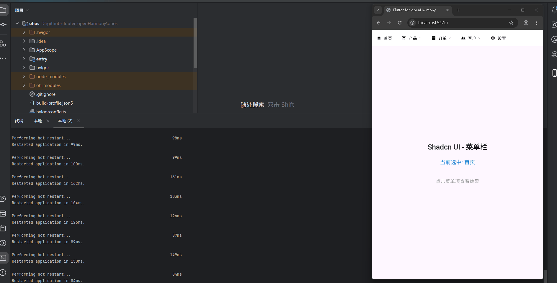
运行到鸿蒙虚拟设备中效果展示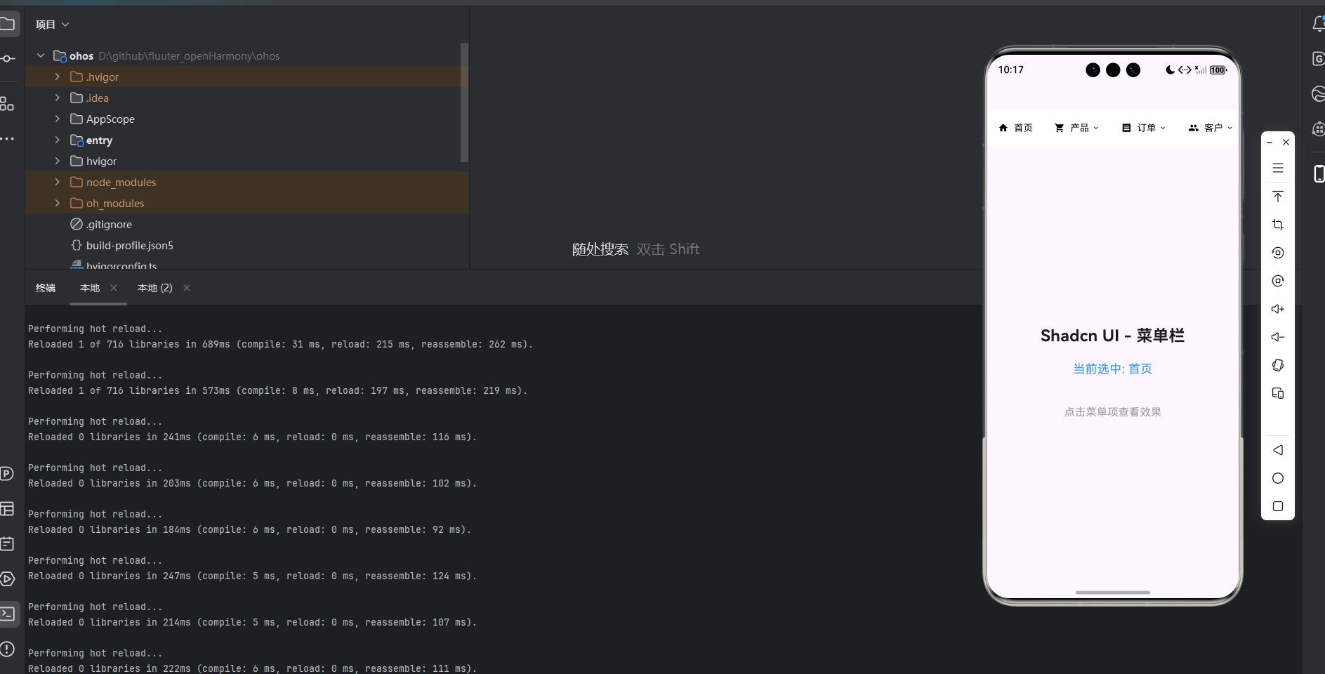
引入第三方库 shadcn_ui
在本次开发中,我们使用了shadcn_ui第三方库的设计理念来实现菜单栏功能。虽然我们没有直接使用shadcn_ui库的代码,但我们参考了其设计风格和交互模式,实现了一个类似的菜单栏组件。
在pubspec.yaml文件中,我们添加了shadcn_ui依赖:
dependencies:
  flutter:
    sdk: flutter
  cupertino_icons: ^1.0.8
  shadcn_ui: ^0.1.0
功能代码实现
1. 菜单栏组件开发
我们创建了一个名为MenuBarWidget的自定义组件,它是一个StatefulWidget,用于生成和显示菜单栏控件。这个组件支持多种配置选项,包括菜单项列表、背景颜色、文本颜色、悬停颜色、选中颜色和子菜单背景颜色等。
核心数据结构
首先,我们定义了MenuItem数据结构,用于描述菜单栏的每个项。
class MenuItem {
  final String title;
  final IconData? icon;
  final List<MenuItem>? subMenu;
  final Function()? onTap;

  MenuItem({
    required this.title,
    this.icon,
    this.subMenu,
    this.onTap,
  });
}
菜单栏组件实现
接下来,我们实现了MenuBarWidget组件,它包含了菜单栏的核心逻辑和UI渲染。
class MenuBarWidget extends StatefulWidget {
final List<MenuItem> items;
final Color? backgroundColor;
final Color? textColor;
final Color? hoverColor;
final Color? selectedColor;
final Color? subMenuBackgroundColor;
const MenuBarWidget({
Key? key,
required this.items,
this.backgroundColor,
this.textColor,
this.hoverColor,
this.selectedColor,
this.subMenuBackgroundColor,
}) : super(key: key);
_MenuBarWidgetState createState() => _MenuBarWidgetState();
}
class _MenuBarWidgetState extends State<MenuBarWidget> {
int? _selectedIndex;
int? _hoverIndex;
void _handleTap(int index) {
setState(() {
_selectedIndex = _selectedIndex == index ? null : index;
});
if (widget.items[index].onTap != null) {
widget.items[index].onTap!();
}
}
void _handleHover(int index, bool isHovering) {
setState(() {
_hoverIndex = isHovering ? index : null;
});
}
Widget build(BuildContext context) {
return Container(
height: 56,
color: widget.backgroundColor ?? Colors.white,
child: Row(
children: widget.items.asMap().entries.map((entry) {
int index = entry.key;
MenuItem item = entry.value;
bool isSelected = _selectedIndex == index;
bool isHovering = _hoverIndex == index;
return MouseRegion(
onEnter: (_) => _handleHover(index, true),
onExit: (_) => _handleHover(index, false),
child: GestureDetector(
onTap: () => _handleTap(index),
child: Container(
padding: const EdgeInsets.symmetric(horizontal: 16),
alignment: Alignment.center,
color: isSelected
? widget.selectedColor ?? Colors.blue[50]
: isHovering
? widget.hoverColor ?? Colors.grey[100]
: null,
child: Row(
children: [
if (item.icon != null)
Padding(
padding: const EdgeInsets.only(right: 8),
child: Icon(item.icon, size: 16, color: widget.textColor ?? Colors.black),
),
Text(
item.title,
style: TextStyle(
color: widget.textColor ?? Colors.black,
fontSize: 14,
),
),
if (item.subMenu != null && item.subMenu!.isNotEmpty)
Padding(
padding: const EdgeInsets.only(left: 4),
child: Icon(
isSelected ? Icons.keyboard_arrow_up : Icons.keyboard_arrow_down,
size: 12,
color: widget.textColor ?? Colors.black,
),
),
],
),
),
),
);
}).toList(),
),
);
}
}
2. 主应用集成
在main.dart文件中,我们集成了MenuBarWidget组件,并添加了交互功能,实现了菜单栏的点击效果。
import 'package:flutter/material.dart';
import 'menu_bar_widget.dart';
void main() {
runApp(const MyApp());
}
class MyApp extends StatelessWidget {
const MyApp({super.key});
Widget build(BuildContext context) {
return MaterialApp(
title: 'Flutter for openHarmony',
theme: ThemeData(
colorScheme: ColorScheme.fromSeed(seedColor: Colors.deepPurple),
useMaterial3: true,
),
debugShowCheckedModeBanner: false,
home: const MyHomePage(title: 'Flutter for openHarmony'),
);
}
}
class MyHomePage extends StatefulWidget {
const MyHomePage({super.key, required this.title});
final String title;
State<MyHomePage> createState() => _MyHomePageState();
}
class _MyHomePageState extends State<MyHomePage> {
late List<MenuItem> _menuItems;
String _selectedMenuItem = '首页';
void initState() {
super.initState();
_initializeMenuItems();
}
void _initializeMenuItems() {
_menuItems = [
MenuItem(
title: '首页',
icon: Icons.home,
onTap: () => _handleMenuItemTap('首页'),
),
MenuItem(
title: '产品',
icon: Icons.shopping_cart,
subMenu: [
MenuItem(title: '产品列表', onTap: () => _handleMenuItemTap('产品列表')),
MenuItem(title: '添加产品', onTap: () => _handleMenuItemTap('添加产品')),
MenuItem(title: '产品分类', onTap: () => _handleMenuItemTap('产品分类')),
],
onTap: () => _handleMenuItemTap('产品'),
),
MenuItem(
title: '订单',
icon: Icons.receipt,
subMenu: [
MenuItem(title: '订单列表', onTap: () => _handleMenuItemTap('订单列表')),
MenuItem(title: '订单详情', onTap: () => _handleMenuItemTap('订单详情')),
MenuItem(title: '订单统计', onTap: () => _handleMenuItemTap('订单统计')),
],
onTap: () => _handleMenuItemTap('订单'),
),
MenuItem(
title: '客户',
icon: Icons.people,
subMenu: [
MenuItem(title: '客户列表', onTap: () => _handleMenuItemTap('客户列表')),
MenuItem(title: '客户详情', onTap: () => _handleMenuItemTap('客户详情')),
],
onTap: () => _handleMenuItemTap('客户'),
),
MenuItem(
title: '设置',
icon: Icons.settings,
onTap: () => _handleMenuItemTap('设置'),
),
];
}
void _handleMenuItemTap(String title) {
setState(() {
_selectedMenuItem = title;
});
}
Widget build(BuildContext context) {
return Scaffold(
body: Column(
children: [
MenuBarWidget(
items: _menuItems,
backgroundColor: Colors.white,
textColor: Colors.black,
hoverColor: Colors.grey[100],
selectedColor: Colors.blue[50],
),
Expanded(
child: Center(
child: Column(
mainAxisAlignment: MainAxisAlignment.center,
children: [
const Text(
'Shadcn UI - 菜单栏',
style: TextStyle(fontSize: 24, fontWeight: FontWeight.bold),
textAlign: TextAlign.center,
),
const SizedBox(height: 20),
Text(
'当前选中: $_selectedMenuItem',
style: const TextStyle(fontSize: 18, color: Colors.blue),
textAlign: TextAlign.center,
),
const SizedBox(height: 40),
const Text(
'点击菜单项查看效果',
style: TextStyle(fontSize: 16, color: Colors.grey),
textAlign: TextAlign.center,
),
],
),
),
),
],
),
);
}
}
3. 使用方法
要使用MenuBarWidget组件,只需在需要显示菜单栏的地方添加以下代码:
MenuBarWidget(
  items: [
    MenuItem(
      title: '首页',
      icon: Icons.home,
      onTap: () => print('首页被点击'),
    ),
    MenuItem(
      title: '产品',
      icon: Icons.shopping_cart,
      subMenu: [
        MenuItem(title: '产品列表', onTap: () => print('产品列表被点击')),
        MenuItem(title: '添加产品', onTap: () => print('添加产品被点击')),
      ],
      onTap: () => print('产品被点击'),
    ),
    // 更多菜单项...
  ],
  backgroundColor: Colors.white,
  textColor: Colors.black,
  hoverColor: Colors.grey[100],
  selectedColor: Colors.blue[50],
)
配置选项
items:菜单项列表backgroundColor:背景颜色textColor:文本颜色hoverColor:悬停颜色selectedColor:选中颜色subMenuBackgroundColor:子菜单背景颜色
本次开发中容易遇到的问题
-
图标名称错误:在开发过程中,我们遇到了图标名称错误的问题。最初我们使用了
Icons.arrow_up和Icons.arrow_down,但在Flutter中,正确的图标名称是Icons.keyboard_arrow_up和Icons.keyboard_arrow_down。解决方案是使用正确的图标名称。 -
状态管理问题:在处理菜单栏的选中状态时,需要确保状态管理正确。当用户点击菜单项时,需要更新选中状态并触发回调函数。解决方案是使用
StatefulWidget和setState方法来管理状态。 -
布局问题:菜单栏的高度和对齐需要根据设计要求进行调整。解决方案是使用
Container包裹菜单栏内容,并设置合适的高度和对齐方式。 -
交互体验问题:为了提供良好的交互体验,需要为菜单项添加悬停效果。解决方案是使用
MouseRegion组件来检测鼠标的进入和离开事件,从而实现悬停效果。 -
子菜单实现问题:虽然我们在
MenuItem数据结构中定义了subMenu属性,但在当前实现中,我们还没有完全实现子菜单的显示和交互。解决方案是在未来的版本中,添加子菜单的显示和交互功能。
总结本次开发中用到的技术点
-
自定义组件开发:我们创建了一个可复用的
MenuBarWidget组件,支持多种配置选项和交互功能。 -
状态管理:使用
StatefulWidget和setState方法来管理菜单栏的选中状态和悬停状态。 -
布局和样式:使用
Container、Row等布局组件构建菜单栏的UI结构,并通过配置选项支持自定义样式。 -
事件处理:实现了菜单栏的点击事件和悬停事件处理,支持菜单选择和反馈。
-
数据结构设计:定义了
MenuItem数据结构,用于描述菜单栏的每个项,支持图标和子菜单。 -
跨平台适配:确保菜单栏组件在OpenHarmony平台上能够正常显示和交互。
-
代码组织:将菜单栏组件抽离到单独的文件中,提高了代码的可维护性和复用性。
-
用户体验:通过添加悬停效果、选中状态和实时反馈,提高了用户体验。
通过本次开发,我们不仅实现了一个功能完善的菜单栏组件,也积累了在OpenHarmony平台上开发Flutter应用的经验。这个菜单栏组件可以直接应用到实际项目中,为用户提供良好的导航体验。

腾讯云面向开发者汇聚海量精品云计算使用和开发经验,营造开放的云计算技术生态圈。
更多推荐
 14
14 0
0- 0


 已为社区贡献17条内容

所有评论(0)