flutter_for_openharmony手语学习app实战+练习中心实现
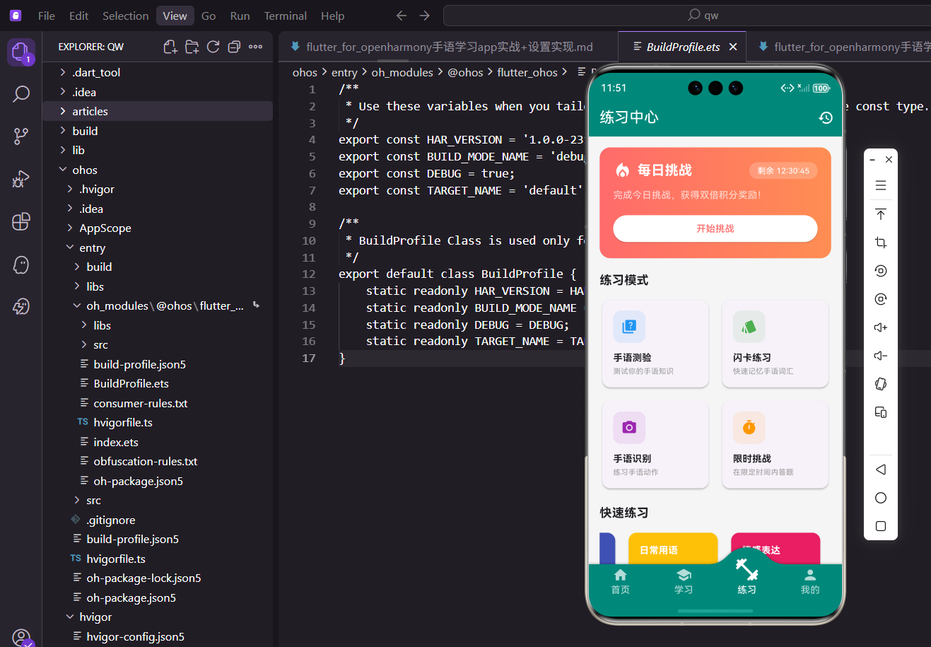
本文介绍了手语学习App练习中心页面的实现方案。该页面包含四大功能模块:每日挑战区域采用渐变背景和倒计时设计提升用户参与度;四种练习模式(手语测验、闪卡练习、手语识别和限时挑战)通过不同颜色和图标区分;快速练习入口方便用户继续学习;练习统计展示学习进度。页面采用StatelessWidget实现,通过外部Provider管理状态,整体布局清晰合理,交互体验流畅。
练习中心是手语学习App的核心功能模块之一。用户在这里可以通过多种练习方式巩固所学的手语知识,包括手语测验、闪卡练习、手语识别和限时挑战等。一个设计良好的练习中心能够激发用户的学习兴趣,帮助他们更高效地掌握手语技能。
本文将详细介绍练习中心页面的实现过程,包括每日挑战区域、练习模式选择、快速练习入口以及练习统计展示等功能模块的具体实现方式。
页面基本结构
练习中心页面使用StatelessWidget实现,因为页面数据主要来自外部Provider,不需要管理内部状态。
class PracticeScreen extends StatelessWidget {
const PracticeScreen({super.key});
Widget build(BuildContext context) {
return Scaffold(
appBar: AppBar(
title: const Text('练习中心'),
actions: [
IconButton(
icon: const Icon(Icons.history),
onPressed: () => Navigator.push(
context,
MaterialPageRoute(
builder: (_) => const PracticeHistoryScreen(),
),
),
),
],
),
body: SingleChildScrollView(
padding: EdgeInsets.all(16.w),
child: Column(
crossAxisAlignment: CrossAxisAlignment.start,
children: [
_buildDailyChallenge(context),
SizedBox(height: 20.h),
_buildPracticeTypes(context),
SizedBox(height: 20.h),
_buildQuickPractice(context),
SizedBox(height: 20.h),
_buildPracticeStats(),
],
),
),
);
}
}
AppBar右侧添加了历史记录按钮,方便用户查看过往的练习记录。
SingleChildScrollView包裹整个内容区域,确保内容较多时页面可以正常滚动。
页面内容分为四个主要区块,通过SizedBox设置合适的间距让布局更加清晰。
每日挑战区域
每日挑战是吸引用户每天打开App的重要功能,通过限时奖励机制提升用户粘性。
Widget _buildDailyChallenge(BuildContext context) {
  return Container(
    padding: EdgeInsets.all(20.w),
    decoration: BoxDecoration(
      gradient: const LinearGradient(
        colors: [Color(0xFFFF6B6B), Color(0xFFFF8E53)],
      ),
      borderRadius: BorderRadius.circular(16.r),
    ),
    child: Column(
      crossAxisAlignment: CrossAxisAlignment.start,
      children: [
        Row(
          children: [
            Icon(
              Icons.local_fire_department,
              color: Colors.white,
              size: 28.sp,
            ),
            SizedBox(width: 8.w),
            Text(
              '每日挑战',
              style: TextStyle(
                fontSize: 20.sp,
                fontWeight: FontWeight.bold,
                color: Colors.white,
              ),
            ),
            const Spacer(),
            _buildCountdownBadge(),
          ],
        ),
        SizedBox(height: 12.h),
        Text(
          '完成今日挑战,获得双倍积分奖励!',
          style: TextStyle(
            fontSize: 14.sp,
            color: Colors.white70,
          ),
        ),
        SizedBox(height: 16.h),
        _buildChallengeButton(context),
      ],
    ),
  );
}
使用渐变背景让每日挑战区域更加醒目,红橙色调传递出紧迫感和活力。
圆角设计让卡片看起来更加柔和,符合现代UI设计趋势。
火焰图标强化了挑战的视觉印象,让用户一眼就能识别这个区域的功能。
倒计时标签
显示每日挑战的剩余时间:
Widget _buildCountdownBadge() {
  return Container(
    padding: EdgeInsets.symmetric(
      horizontal: 12.w,
      vertical: 4.h,
    ),
    decoration: BoxDecoration(
      color: Colors.white.withOpacity(0.2),
      borderRadius: BorderRadius.circular(12.r),
    ),
    child: Text(
      '剩余 12:30:45',
      style: TextStyle(
        color: Colors.white,
        fontSize: 12.sp,
      ),
    ),
  );
}
倒计时使用半透明白色背景,既能突出显示又不会过于抢眼。
实际项目中这里需要接入真实的倒计时逻辑,可以用Timer来实现动态更新。
挑战按钮
引导用户开始挑战的按钮:
Widget _buildChallengeButton(BuildContext context) {
  return SizedBox(
    width: double.infinity,
    child: ElevatedButton(
      onPressed: () => Navigator.push(
        context,
        MaterialPageRoute(
          builder: (_) => const ChallengeScreen(),
        ),
      ),
      style: ElevatedButton.styleFrom(
        backgroundColor: Colors.white,
        foregroundColor: const Color(0xFFFF6B6B),
        padding: EdgeInsets.symmetric(vertical: 12.h),
        shape: RoundedRectangleBorder(
          borderRadius: BorderRadius.circular(8.r),
        ),
      ),
      child: const Text('开始挑战'),
    ),
  );
}
按钮采用白色背景配红色文字,与卡片背景形成鲜明对比更加醒目。
按钮宽度设为double.infinity撑满整个容器宽度,增大点击区域提升体验。
练习模式数据
定义四种练习模式的配置数据:
Widget _buildPracticeTypes(BuildContext context) {
  final types = [
    {
      'title': '手语测验',
      'description': '测试你的手语知识',
      'icon': Icons.quiz,
      'color': Colors.blue,
      'screen': const QuizScreen(),
    },
    {
      'title': '闪卡练习',
      'description': '快速记忆手语词汇',
      'icon': Icons.style,
      'color': Colors.green,
      'screen': const FlashcardScreen(),
    },
    {
      'title': '手语识别',
      'description': '练习手语动作',
      'icon': Icons.camera_alt,
      'color': Colors.purple,
      'screen': const RecognitionScreen(),
    },
    {
      'title': '限时挑战',
      'description': '在限定时间内答题',
      'icon': Icons.timer,
      'color': Colors.orange,
      'screen': const ChallengeScreen(),
    },
  ];

  return Column(
    crossAxisAlignment: CrossAxisAlignment.start,
    children: [
      Text(
        '练习模式',
        style: TextStyle(
          fontSize: 18.sp,
          fontWeight: FontWeight.bold,
        ),
      ),
      SizedBox(height: 12.h),
      _buildPracticeGrid(context, types),
    ],
  );
}
使用List存储练习模式数据,方便后续遍历生成UI组件。
每种模式都有独特的颜色标识,帮助用户快速区分不同功能入口。
screen字段存储目标页面实例,点击时直接导航过去非常方便。
练习模式网格
使用GridView展示四种练习模式:
Widget _buildPracticeGrid(
  BuildContext context,
  List<Map<String, dynamic>> types,
) {
  return GridView.builder(
    shrinkWrap: true,
    physics: const NeverScrollableScrollPhysics(),
    gridDelegate: SliverGridDelegateWithFixedCrossAxisCount(
      crossAxisCount: 2,
      crossAxisSpacing: 12.w,
      mainAxisSpacing: 12.h,
      childAspectRatio: 1.2,
    ),
    itemCount: types.length,
    itemBuilder: (context, index) {
      final type = types[index];
      return _buildPracticeCard(context, type);
    },
  );
}
shrinkWrap让GridView根据内容自适应高度,不会占据多余空间。
NeverScrollableScrollPhysics禁用GridView自身的滚动,由外层ScrollView统一处理滚动。
childAspectRatio设置卡片宽高比为1.2,让卡片呈现横向矩形效果更美观。
练习模式卡片
单个练习模式卡片的实现:
Widget _buildPracticeCard(
  BuildContext context,
  Map<String, dynamic> type,
) {
  return Card(
    elevation: 2,
    shape: RoundedRectangleBorder(
      borderRadius: BorderRadius.circular(12.r),
    ),
    child: InkWell(
      onTap: () => Navigator.push(
        context,
        MaterialPageRoute(
          builder: (_) => type['screen'] as Widget,
        ),
      ),
      borderRadius: BorderRadius.circular(12.r),
      child: Padding(
        padding: EdgeInsets.all(16.w),
        child: Column(
          crossAxisAlignment: CrossAxisAlignment.start,
          children: [
            _buildCardIcon(type),
            const Spacer(),
            Text(
              type['title'] as String,
              style: TextStyle(
                fontSize: 14.sp,
                fontWeight: FontWeight.bold,
              ),
            ),
            SizedBox(height: 2.h),
            Text(
              type['description'] as String,
              style: TextStyle(
                fontSize: 11.sp,
                color: Colors.grey,
              ),
            ),
          ],
        ),
      ),
    ),
  );
}
Card组件提供阴影效果,让卡片有立体感看起来更精致。
InkWell添加点击水波纹效果,提升交互体验让用户知道点击有响应。
Spacer将图标和文字分开,图标在上方文字在下方布局清晰。
卡片图标
练习模式卡片的图标区域:
Widget _buildCardIcon(Map<String, dynamic> type) {
  final color = type['color'] as Color;
  return Container(
    width: 48.w,
    height: 48.w,
    decoration: BoxDecoration(
      color: color.withOpacity(0.1),
      borderRadius: BorderRadius.circular(12.r),
    ),
    child: Icon(
      type['icon'] as IconData,
      color: color,
      size: 24.sp,
    ),
  );
}
图标背景使用对应颜色的浅色版本,形成统一的视觉风格。
圆角容器包裹图标让整体看起来更加柔和协调。
快速练习区域
快速练习提供按主题分类的练习入口:
Widget _buildQuickPractice(BuildContext context) {
  return Column(
    crossAxisAlignment: CrossAxisAlignment.start,
    children: [
      Text(
        '快速练习',
        style: TextStyle(
          fontSize: 18.sp,
          fontWeight: FontWeight.bold,
        ),
      ),
      SizedBox(height: 12.h),
      SizedBox(
        height: 100.h,
        child: ListView(
          scrollDirection: Axis.horizontal,
          children: [
            _buildQuickCard(
              '基础问候', '5题',
              Colors.teal, context,
            ),
            _buildQuickCard(
              '数字手语', '10题',
              Colors.indigo, context,
            ),
            _buildQuickCard(
              '日常用语', '8题',
              Colors.amber, context,
            ),
            _buildQuickCard(
              '情感表达', '6题',
              Colors.pink, context,
            ),
          ],
        ),
      ),
    ],
  );
}
使用水平滚动的ListView展示多个快速练习选项,节省垂直空间。
固定高度100.h确保列表区域大小一致,不会因内容变化而跳动。
不同主题使用不同颜色,让用户能够快速识别和选择想要练习的内容。
快速练习卡片
单个快速练习卡片的实现:
Widget _buildQuickCard(
  String title,
  String count,
  Color color,
  BuildContext context,
) {
  return Container(
    width: 140.w,
    margin: EdgeInsets.only(right: 12.w),
    child: Card(
      color: color,
      elevation: 3,
      shape: RoundedRectangleBorder(
        borderRadius: BorderRadius.circular(12.r),
      ),
      child: InkWell(
        onTap: () => Navigator.push(
          context,
          MaterialPageRoute(
            builder: (_) => const QuizScreen(),
          ),
        ),
        borderRadius: BorderRadius.circular(12.r),
        child: Padding(
          padding: EdgeInsets.all(16.w),
          child: Column(
            crossAxisAlignment: CrossAxisAlignment.start,
            mainAxisAlignment: MainAxisAlignment.spaceBetween,
            children: [
              Text(
                title,
                style: TextStyle(
                  fontSize: 14.sp,
                  fontWeight: FontWeight.bold,
                  color: Colors.white,
                ),
              ),
              Row(
                mainAxisAlignment: MainAxisAlignment.spaceBetween,
                children: [
                  Text(
                    count,
                    style: TextStyle(
                      fontSize: 12.sp,
                      color: Colors.white70,
                    ),
                  ),
                  Icon(
                    Icons.arrow_forward,
                    color: Colors.white,
                    size: 20.sp,
                  ),
                ],
              ),
            ],
          ),
        ),
      ),
    ),
  );
}
固定宽度140.w让所有卡片大小一致,形成整齐的视觉效果。
margin设置右边距让卡片之间有适当的间隔不会挤在一起。
卡片使用纯色背景配合白色文字,简洁明了一目了然。
箭头图标暗示这是一个可点击的入口,引导用户进行操作。
练习统计区域
展示用户本周的练习数据统计:
Widget _buildPracticeStats() {
  return Card(
    elevation: 2,
    shape: RoundedRectangleBorder(
      borderRadius: BorderRadius.circular(12.r),
    ),
    child: Padding(
      padding: EdgeInsets.all(16.w),
      child: Column(
        crossAxisAlignment: CrossAxisAlignment.start,
        children: [
          Text(
            '本周练习统计',
            style: TextStyle(
              fontSize: 16.sp,
              fontWeight: FontWeight.bold,
            ),
          ),
          SizedBox(height: 16.h),
          Row(
            mainAxisAlignment: MainAxisAlignment.spaceAround,
            children: [
              _buildStatItem(
                '完成题目', '128',
                Icons.check_circle, Colors.green,
              ),
              _buildStatItem(
                '正确率', '85%',
                Icons.analytics, Colors.blue,
              ),
              _buildStatItem(
                '练习时长', '2.5h',
                Icons.timer, Colors.orange,
              ),
            ],
          ),
        ],
      ),
    ),
  );
}
统计数据帮助用户了解自己的学习进度,形成正向激励促进持续学习。
三个指标分别展示数量、质量和时间维度的数据,全面反映练习情况。
spaceAround让三个统计项均匀分布,视觉上更加平衡美观。
统计项组件
单个统计项的实现:
Widget _buildStatItem(
  String label,
  String value,
  IconData icon,
  Color color,
) {
  return Column(
    children: [
      Icon(
        icon,
        color: color,
        size: 28.sp,
      ),
      SizedBox(height: 8.h),
      Text(
        value,
        style: TextStyle(
          fontSize: 20.sp,
          fontWeight: FontWeight.bold,
        ),
      ),
      SizedBox(height: 4.h),
      Text(
        label,
        style: TextStyle(
          fontSize: 12.sp,
          color: Colors.grey,
        ),
      ),
    ],
  );
}
图标在最上方用颜色区分不同类型的数据,一眼就能识别。
数值使用大号粗体字让用户一眼就能看到关键信息。
标签使用小号灰色字作为数值的说明,不喧宾夺主保持简洁。
小结
练习中心页面整合了多种练习方式,为用户提供了丰富的学习选择。通过每日挑战机制激励用户坚持练习,通过统计数据让用户看到自己的进步,形成良好的学习闭环。
页面设计注重视觉层次和交互体验,不同区域使用不同的颜色和样式进行区分。代码结构清晰,各个功能模块独立封装,便于后续维护和功能扩展。
在实际开发中还可以考虑添加练习提醒、成就系统等功能,进一步提升用户的学习积极性。
欢迎加入开源鸿蒙跨平台社区:https://openharmonycrossplatform.csdn.net

腾讯云面向开发者汇聚海量精品云计算使用和开发经验,营造开放的云计算技术生态圈。
更多推荐
 15
15 0
0- 0


 已为社区贡献19条内容

所有评论(0)