Flutter for OpenHarmony 实战:Carousel 走马灯
在移动开发领域,我们总是面临着选择与适配。今天,你的Flutter应用在Android和iOS上跑得正欢,明天可能就需要考虑一个新的平台:HarmonyOS(鸿蒙)。这不是一道选答题,而是很多团队正在面对的现实。Flutter的优势很明确——写一套代码,就能在两个主要平台上运行,开发体验流畅。而鸿蒙代表的是下一个时代的互联生态,它不仅仅是手机系统,更着眼于未来全场景的体验。
欢迎加入开源鸿蒙跨平台社区: https://openharmonycrossplatform.csdn.net
目录
前言:跨生态开发的新机遇
在移动开发领域,我们总是面临着选择与适配。今天,你的Flutter应用在Android和iOS上跑得正欢,明天可能就需要考虑一个新的平台:HarmonyOS(鸿蒙)。这不是一道选答题,而是很多团队正在面对的现实。
Flutter的优势很明确——写一套代码,就能在两个主要平台上运行,开发体验流畅。而鸿蒙代表的是下一个时代的互联生态,它不仅仅是手机系统,更着眼于未来全场景的体验。将现有的Flutter应用适配到鸿蒙,听起来像是一个“跨界”任务,但它本质上是一次有价值的技术拓展:让产品触达更多用户,也让技术栈覆盖更广。
不过,这条路走起来并不像听起来那么简单。Flutter和鸿蒙,从底层的架构到上层的工具链,都有着各自的设计逻辑。会遇到一些具体的问题:代码如何组织?原有的功能在鸿蒙上如何实现?那些平台特有的能力该怎么调用?更实际的是,从编译打包到上架部署,整个流程都需要重新摸索。
这篇文章想做的,就是把这些我们趟过的路、踩过的坑,清晰地摊开给你看。我们不会只停留在“怎么做”,还会聊到“为什么得这么做”,以及“如果出了问题该往哪想”。这更像是一份实战笔记,源自真实的项目经验,聚焦于那些真正卡住过我们的环节。
无论你是在为一个成熟产品寻找新的落地平台,还是从一开始就希望构建能面向多端的应用,这里的思路和解决方案都能提供直接的参考。理解了两套体系之间的异同,掌握了关键的衔接技术,不仅能完成这次迁移,更能积累起应对未来技术变化的能力。
混合工程结构深度解析
项目目录架构
当Flutter项目集成鸿蒙支持后,典型的项目结构会发生显著变化。以下是经过ohos_flutter插件初始化后的项目结构:
my_flutter_harmony_app/
├── lib/                          # Flutter业务代码(基本不变)
│   ├── main.dart                 # 应用入口
│   ├── home_page.dart           # 首页
│   └── utils/
│       └── platform_utils.dart  # 平台工具类
├── pubspec.yaml                  # Flutter依赖配置
├── ohos/                         # 鸿蒙原生层(核心适配区)
│   ├── entry/                    # 主模块
│   │   └── src/main/
│   │       ├── ets/              # ArkTS代码
│   │       │   ├── MainAbility/
│   │       │   │   ├── MainAbility.ts       # 主Ability
│   │       │   │   └── MainAbilityContext.ts
│   │       │   └── pages/
│   │       │       ├── Index.ets           # 主页面
│   │       │       └── Splash.ets          # 启动页
│   │       ├── resources/        # 鸿蒙资源文件
│   │       │   ├── base/
│   │       │   │   ├── element/  # 字符串等
│   │       │   │   ├── media/    # 图片资源
│   │       │   │   └── profile/  # 配置文件
│   │       │   └── en_US/        # 英文资源
│   │       └── config.json       # 应用核心配置
│   ├── ohos_test/               # 测试模块
│   ├── build-profile.json5      # 构建配置
│   └── oh-package.json5         # 鸿蒙依赖管理
└── README.md
展示效果图片
flutter 实时预览 效果展示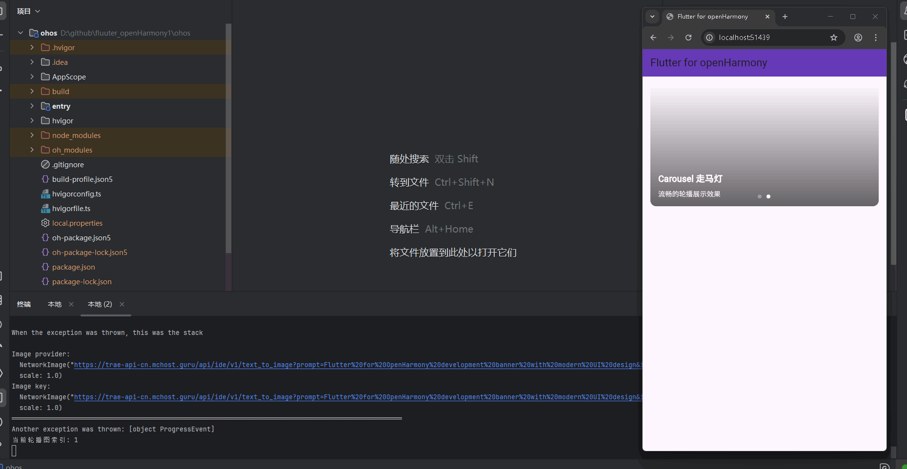
运行到鸿蒙虚拟设备中效果展示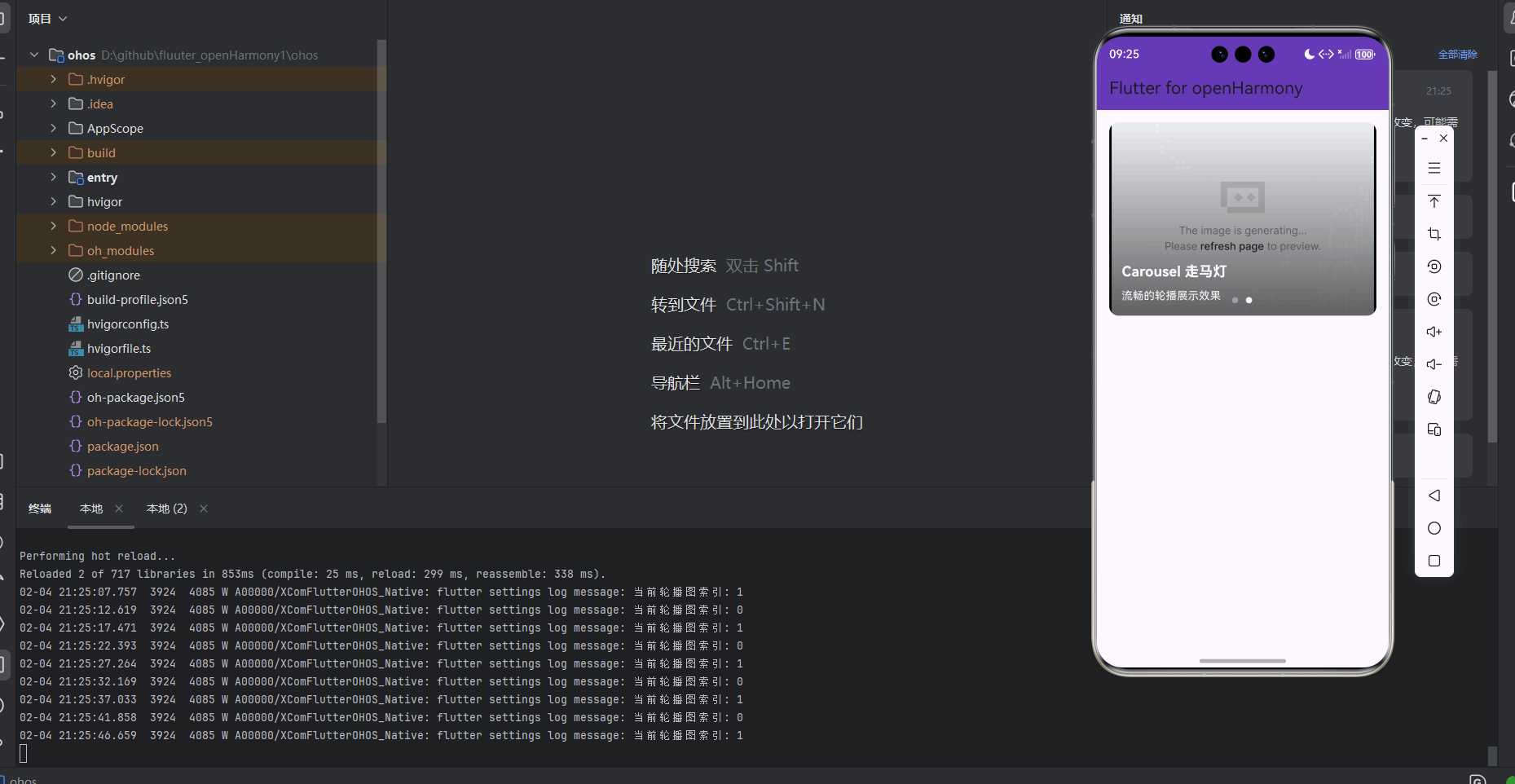
功能代码实现
Carousel 走马灯组件设计与实现
组件结构设计
Carousel 组件采用了组件化设计思想,将轮播图展示和交互功能完全封装,便于在不同页面复用。组件包含以下核心部分:
- 数据模型:定义了
CarouselItem类来表示轮播图中的每个项 - 核心组件:实现了
CarouselWidget组件,支持自动播放、无限滚动等功能 - 指示器:提供了圆点、数字和无指示器三种类型
- 交互处理:实现了点击交互效果和页面变化回调
- 图片加载:实现了
CarouselImage组件,支持图片加载状态和错误处理
数据模型实现
首先,我们定义了 CarouselItem 类来表示轮播图中的每个项:
// 轮播图数据模型
class CarouselItem {
  final String id;
  final String title;
  final String imageUrl;
  final String? subtitle;
  final Function()? onTap;

  CarouselItem({
    required this.id,
    required this.title,
    required this.imageUrl,
    this.subtitle,
    this.onTap,
  });
}
核心组件实现
CarouselWidget 组件
CarouselWidget 是整个轮播图的核心组件,实现了自动播放、无限滚动、指示器等功能。
// 走马灯组件
enum CarouselIndicatorType {
dots, // 圆点指示器
numbers, // 数字指示器
none, // 无指示器
}
class CarouselWidget extends StatefulWidget {
final List<CarouselItem> items; // 轮播项列表
final bool autoPlay; // 是否自动播放
final Duration autoPlayInterval; // 自动播放间隔
final Duration autoPlayAnimationDuration; // 自动播放动画持续时间
final bool enableInfiniteScroll; // 是否启用无限滚动
final CarouselIndicatorType indicatorType; // 指示器类型
final Color indicatorActiveColor; // 活动指示器颜色
final Color indicatorInactiveColor; // 非活动指示器颜色
final double height; // 轮播图高度
final BoxFit imageFit; // 图片适配方式
final BorderRadius borderRadius; // 圆角半径
final Function(int)? onPageChanged; // 页面变化回调
const CarouselWidget({
Key? key,
required this.items,
this.autoPlay = true,
this.autoPlayInterval = const Duration(seconds: 3),
this.autoPlayAnimationDuration = const Duration(milliseconds: 800),
this.enableInfiniteScroll = true,
this.indicatorType = CarouselIndicatorType.dots,
this.indicatorActiveColor = Colors.white,
this.indicatorInactiveColor = Colors.grey,
this.height = 200.0,
this.imageFit = BoxFit.cover,
this.borderRadius = BorderRadius.zero,
this.onPageChanged,
}) : super(key: key);
State<CarouselWidget> createState() => _CarouselWidgetState();
}
class _CarouselWidgetState extends State<CarouselWidget> {
final PageController _pageController = PageController(initialPage: 0);
int _currentPage = 0;
Timer? _autoPlayTimer;
bool _isUserScrolling = false;
void initState() {
super.initState();
if (widget.autoPlay) {
_startAutoPlay();
}
}
void dispose() {
_autoPlayTimer?.cancel();
_pageController.dispose();
super.dispose();
}
void didUpdateWidget(covariant CarouselWidget oldWidget) {
super.didUpdateWidget(oldWidget);
if (widget.autoPlay != oldWidget.autoPlay) {
if (widget.autoPlay) {
_startAutoPlay();
} else {
_autoPlayTimer?.cancel();
}
}
}
// 开始自动播放
void _startAutoPlay() {
_autoPlayTimer?.cancel();
_autoPlayTimer = Timer.periodic(widget.autoPlayInterval, (timer) {
if (!_isUserScrolling) {
_nextPage();
}
});
}
// 切换到下一页
void _nextPage() {
if (_pageController.hasClients) {
int nextPage = _currentPage + 1;
if (nextPage >= widget.items.length) {
if (widget.enableInfiniteScroll) {
_pageController.animateToPage(
0,
duration: widget.autoPlayAnimationDuration,
curve: Curves.easeInOut,
);
}
} else {
_pageController.animateToPage(
nextPage,
duration: widget.autoPlayAnimationDuration,
curve: Curves.easeInOut,
);
}
}
}
// 处理页面变化
void _handlePageChanged(int index) {
setState(() {
_currentPage = index % widget.items.length;
});
widget.onPageChanged?.call(_currentPage);
}
// 构建轮播项
Widget _buildCarouselItem(CarouselItem item, int index) {
return GestureDetector(
onTap: item.onTap,
child: Container(
height: widget.height,
decoration: BoxDecoration(
borderRadius: widget.borderRadius,
image: DecorationImage(
image: NetworkImage(item.imageUrl),
fit: widget.imageFit,
),
),
child: Container(
decoration: BoxDecoration(
borderRadius: widget.borderRadius,
gradient: LinearGradient(
begin: Alignment.topCenter,
end: Alignment.bottomCenter,
colors: [
Colors.transparent,
Colors.black.withOpacity(0.6),
],
),
),
child: Padding(
padding: const EdgeInsets.all(16.0),
child: Column(
mainAxisAlignment: MainAxisAlignment.end,
crossAxisAlignment: CrossAxisAlignment.start,
children: [
Text(
item.title,
style: TextStyle(
fontSize: 18.0,
fontWeight: FontWeight.bold,
color: Colors.white,
),
),
if (item.subtitle != null)
Padding(
padding: const EdgeInsets.only(top: 8.0),
child: Text(
item.subtitle!,
style: TextStyle(
fontSize: 14.0,
color: Colors.white.withOpacity(0.9),
),
),
),
],
),
),
),
),
);
}
// 构建指示器
Widget _buildIndicator() {
if (widget.indicatorType == CarouselIndicatorType.none) {
return SizedBox.shrink();
}
return Positioned(
bottom: 16.0,
left: 0,
right: 0,
child: Row(
mainAxisAlignment: MainAxisAlignment.center,
children: widget.items.asMap().entries.map((entry) {
int index = entry.key;
return Padding(
padding: const EdgeInsets.symmetric(horizontal: 4.0),
child: widget.indicatorType == CarouselIndicatorType.dots
? Container(
width: _currentPage == index ? 12.0 : 8.0,
height: 8.0,
decoration: BoxDecoration(
shape: BoxShape.circle,
color: _currentPage == index
? widget.indicatorActiveColor
: widget.indicatorInactiveColor,
),
)
: Text(
'${index + 1}/${widget.items.length}',
style: TextStyle(
color: _currentPage == index
? widget.indicatorActiveColor
: widget.indicatorInactiveColor,
fontSize: 12.0,
),
),
);
}).toList(),
),
);
}
Widget build(BuildContext context) {
if (widget.items.isEmpty) {
return Container(
height: widget.height,
decoration: BoxDecoration(
borderRadius: widget.borderRadius,
color: Colors.grey[200],
),
child: Center(
child: Text('No items to display'),
),
);
}
return Container(
height: widget.height,
child: Stack(
children: [
NotificationListener<ScrollNotification>(
onNotification: (notification) {
if (notification is ScrollStartNotification) {
_isUserScrolling = true;
_autoPlayTimer?.cancel();
} else if (notification is ScrollEndNotification) {
_isUserScrolling = false;
if (widget.autoPlay) {
_startAutoPlay();
}
}
return false;
},
child: PageView.builder(
controller: _pageController,
itemCount: widget.enableInfiniteScroll ? null : widget.items.length,
onPageChanged: _handlePageChanged,
itemBuilder: (context, index) {
final int itemIndex = index % widget.items.length;
return _buildCarouselItem(widget.items[itemIndex], itemIndex);
},
),
),
_buildIndicator(),
],
),
);
}
}
CarouselImage 组件
为了优化图片加载体验,我们实现了 CarouselImage 组件,支持图片加载状态和错误处理:
// 自定义图片加载组件
class CarouselImage extends StatelessWidget {
final String imageUrl;
final BoxFit fit;
final double width;
final double height;
const CarouselImage({
Key? key,
required this.imageUrl,
this.fit = BoxFit.cover,
this.width = double.infinity,
this.height = double.infinity,
}) : super(key: key);
Widget build(BuildContext context) {
return Image.network(
imageUrl,
fit: fit,
width: width,
height: height,
loadingBuilder: (context, child, loadingProgress) {
if (loadingProgress == null) {
return child;
}
return Container(
width: width,
height: height,
color: Colors.grey[200],
child: Center(
child: CircularProgressIndicator(
value: loadingProgress.expectedTotalBytes != null
? loadingProgress.cumulativeBytesLoaded / loadingProgress.expectedTotalBytes!
: null,
),
),
);
},
errorBuilder: (context, error, stackTrace) {
return Container(
width: width,
height: height,
color: Colors.grey[200],
child: Center(
child: Icon(
Icons.image_not_supported,
color: Colors.grey[400],
size: 48.0,
),
),
);
},
);
}
}
首页集成与使用
在首页中,我们集成了 Carousel 组件,并添加了示例数据和交互效果:
// 示例轮播图数据
final List<CarouselItem> _carouselItems = [
  CarouselItem(
    id: '1',
    title: 'Flutter for OpenHarmony',
    subtitle: '跨平台开发新机遇',
    imageUrl: 'https://trae-api-cn.mchost.guru/api/ide/v1/text_to_image?prompt=Flutter%20for%20OpenHarmony%20development%20banner%20with%20modern%20UI%20design&image_size=landscape_16_9',
    onTap: () {
      print('点击了 Flutter for OpenHarmony');
    },
  ),
  CarouselItem(
    id: '2',
    title: 'Carousel 走马灯',
    subtitle: '流畅的轮播展示效果',
    imageUrl: 'https://trae-api-cn.mchost.guru/api/ide/v1/text_to_image?prompt=Carousel%20banner%20slider%20with%20smooth%20transition%20effects&image_size=landscape_16_9',
    onTap: () {
      print('点击了 Carousel 走马灯');
    },
  ),
];

// 集成 CarouselWidget 组件
Container(
  margin: EdgeInsets.only(top: 16.0, left: 16.0, right: 16.0),
  child: CarouselWidget(
    items: _carouselItems,
    autoPlay: true,
    autoPlayInterval: Duration(seconds: 4),
    enableInfiniteScroll: true,
    indicatorType: CarouselIndicatorType.dots,
    height: 250.0,
    borderRadius: BorderRadius.circular(12.0),
    onPageChanged: (index) {
      print('当前轮播图索引: $index');
    },
  ),
),
开发要点与注意事项
-
数据结构设计
- 合理设计
CarouselItem数据模型,包含 id、title、imageUrl、subtitle 和 onTap 字段 - 支持自定义点击回调,实现轮播图的交互功能
- 合理设计
-
自动播放实现
- 使用
Timer.periodic实现自动播放功能 - 处理用户手动滑动时暂停自动播放,滑动结束后恢复自动播放
- 确保在组件销毁时取消定时器,避免内存泄漏
- 使用
-
无限滚动实现
- 通过
PageView.builder的itemCount设为 null 实现无限滚动 - 使用
index % widget.items.length计算实际的 item 索引
- 通过
-
指示器实现
- 提供圆点、数字和无指示器三种类型
- 动态更新指示器状态,反映当前轮播图索引
-
图片加载处理
- 实现
CarouselImage组件,支持图片加载状态和错误处理 - 提供加载中和加载失败的占位符,提升用户体验
- 实现
-
性能优化
- 避免在
build方法中创建不必要的对象 - 合理使用
const构造函数 - 确保定时器在组件销毁时被正确取消
- 避免在
本次开发中容易遇到的问题
Carousel 组件开发中容易遇到的问题
1. 内存泄漏问题
问题描述
在使用 Carousel 组件时,如果不正确管理定时器,可能会导致内存泄漏。当组件被销毁时,定时器没有被正确取消,会继续运行并持有组件的引用。
解决方案
在组件的 dispose 方法中取消定时器:
void dispose() {
_autoPlayTimer?.cancel();
_pageController.dispose();
super.dispose();
}
注意事项
- 确保在组件销毁时取消所有定时器
- 合理使用
?操作符,避免空指针异常 - 定期使用 Flutter DevTools 检查内存使用情况
2. 图片加载失败问题
问题描述
当网络不稳定或图片 URL 无效时,轮播图可能会显示空白或错误信息,影响用户体验。
解决方案
实现 CarouselImage 组件,支持图片加载状态和错误处理:
Image.network(
  imageUrl,
  fit: fit,
  width: width,
  height: height,
  loadingBuilder: (context, child, loadingProgress) {
    if (loadingProgress == null) {
      return child;
    }
    return Container(
      width: width,
      height: height,
      color: Colors.grey[200],
      child: Center(
        child: CircularProgressIndicator(
          value: loadingProgress.expectedTotalBytes != null
              ? loadingProgress.cumulativeBytesLoaded / loadingProgress.expectedTotalBytes!
              : null,
        ),
      ),
    );
  },
  errorBuilder: (context, error, stackTrace) {
    return Container(
      width: width,
      height: height,
      color: Colors.grey[200],
      child: Center(
        child: Icon(
          Icons.image_not_supported,
          color: Colors.grey[400],
          size: 48.0,
        ),
      ),
    );
  },
);
注意事项
- 为图片加载提供明确的加载中和加载失败状态
- 使用占位符提升用户体验
- 考虑添加图片缓存机制,减少重复加载
3. 无限滚动实现问题
问题描述
在实现无限滚动时,可能会遇到页面索引计算错误或滚动动画不流畅的问题。
解决方案
使用以下方法实现无限滚动:
// 设置 itemCount 为 null
itemCount: widget.enableInfiniteScroll ? null : widget.items.length,

// 计算实际的 item 索引
final int itemIndex = index % widget.items.length;

// 处理页面变化
void _handlePageChanged(int index) {
  setState(() {
    _currentPage = index % widget.items.length;
  });
  widget.onPageChanged?.call(_currentPage);
}
注意事项
- 确保索引计算正确,避免数组越界
- 合理处理页面变化回调,确保回调的索引在有效范围内
- 测试无限滚动的流畅性,避免卡顿
4. 自动播放与用户交互冲突问题
问题描述
当用户手动滑动轮播图时,自动播放功能可能会继续运行,导致用户体验不佳。
解决方案
在用户开始滑动时暂停自动播放,滑动结束后恢复自动播放:
NotificationListener<ScrollNotification>(
  onNotification: (notification) {
    if (notification is ScrollStartNotification) {
      _isUserScrolling = true;
      _autoPlayTimer?.cancel();
    } else if (notification is ScrollEndNotification) {
      _isUserScrolling = false;
      if (widget.autoPlay) {
        _startAutoPlay();
      }
    }
    return false;
  },
  child: PageView.builder(
    // ...
  ),
);
注意事项
- 确保用户交互的优先级高于自动播放
- 提供清晰的视觉反馈,让用户知道当前是否处于自动播放状态
- 测试不同滑动速度下的自动播放恢复行为
总结本次开发中用到的技术点
Carousel 组件开发中用到的技术点
1. Flutter组件化开发
技术要点
- 采用组件化设计思想,将轮播图展示和交互功能完全封装
- 实现了
CarouselWidget和CarouselImage组件 - 支持通过参数配置组件行为,如自动播放、无限滚动等
- 提供回调函数
onTap和onPageChanged与父组件通信
应用场景
- 适用于需要在多个页面复用轮播图的场景
- 便于后续功能扩展和维护
- 提高代码复用率和开发效率
2. 定时器管理
技术要点
- 使用
Timer.periodic实现自动播放功能 - 在组件的
initState方法中初始化定时器 - 在组件的
dispose方法中取消定时器,避免内存泄漏 - 处理用户交互时的定时器状态管理
应用场景
- 适用于需要自动轮播的场景,如广告轮播、新闻轮播等
- 确保定时器在组件生命周期内正确管理
- 提高应用的性能和稳定性
3. 无限滚动实现
技术要点
- 通过
PageView.builder的itemCount设为 null 实现无限滚动 - 使用
index % widget.items.length计算实际的 item 索引 - 处理页面变化回调,确保回调的索引在有效范围内
应用场景
- 适用于需要循环展示内容的场景
- 提高用户体验,避免用户感知到轮播图的开始和结束
- 简化代码逻辑,无需处理边界情况
4. 图片加载与错误处理
技术要点
- 实现
CarouselImage组件,支持图片加载状态和错误处理 - 使用
Image.network的loadingBuilder和errorBuilder回调 - 提供加载中和加载失败的占位符,提升用户体验
应用场景
- 适用于网络图片加载的场景
- 提高应用的健壮性,应对网络不稳定情况
- 提升用户体验,避免空白或错误信息
5. 手势检测与用户交互
技术要点
- 使用
GestureDetector实现轮播项的点击交互 - 利用
NotificationListener<ScrollNotification>监听页面滚动状态 - 在用户滑动时暂停自动播放,滑动结束后恢复自动播放
应用场景
- 适用于需要用户交互的轮播图场景
- 提高用户体验,确保用户操作的优先级高于自动播放
- 提供清晰的交互反馈
6. 样式设计与视觉效果
技术要点
- 使用
BoxDecoration实现轮播项的背景和边框效果 - 通过
LinearGradient添加渐变遮罩,提升文字可读性 - 实现多种类型的指示器,如圆点和数字
- 动态更新指示器状态,反映当前轮播图索引
应用场景
- 适用于需要美观视觉效果的轮播图场景
- 提高品牌形象和用户体验
- 确保轮播图在不同主题下的可读性
欢迎加入开源鸿蒙跨平台社区: https://openharmonycrossplatform.csdn.net

腾讯云面向开发者汇聚海量精品云计算使用和开发经验,营造开放的云计算技术生态圈。
更多推荐
 22
22 0
0- 0


 已为社区贡献24条内容

所有评论(0)