Flutter for OpenHarmony 看书管理记录App实战:添加目标实现
摘要 本文介绍了一个Flutter目标设置页面的实现方案。页面主要包含四个功能模块:目标类型选择(年度/月度/每日/笔记)、目标数值设置(滑块+按钮)、提醒配置和提交按钮。关键技术点包括: 状态管理使用StatefulWidget管理目标类型、数值和单位三个核心状态 交互设计采用卡片式布局和网格视图,选中状态有视觉反馈 数值输入结合滑块和加减按钮,比纯文本输入更直观 自适应布局使用ScreenUt
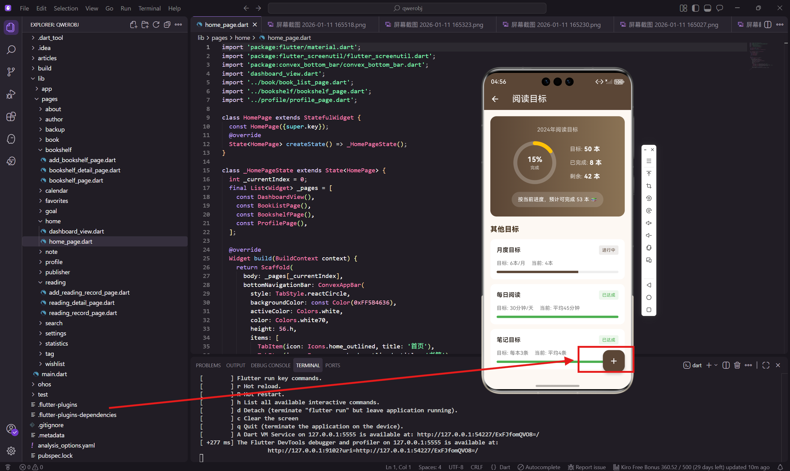
添加目标页面让用户可以创建自己的阅读目标。这个页面需要让用户选择目标类型、设置目标数值、配置提醒等。交互设计上要简单直观,让用户几步就能完成目标创建。
做这个页面的时候,我特别注意了数值输入的体验。用滑块加按钮的组合,比单纯的文本输入更直观,用户可以快速调整到想要的数值。
状态管理
添加目标页面需要管理多个状态,所以用 StatefulWidget 实现。
import 'package:flutter/material.dart';
import 'package:flutter_screenutil/flutter_screenutil.dart';
import 'package:get/get.dart';
导入必要的依赖包。
状态变量定义
class AddGoalPage extends StatefulWidget {
const AddGoalPage({super.key});
State<AddGoalPage> createState() => _AddGoalPageState();
}
class _AddGoalPageState extends State<AddGoalPage> {
String _goalType = '年度阅读';
int _targetValue = 50;
String _unit = '本';
三个主要状态:目标类型、目标数值、单位。单位会根据目标类型自动变化,比如选择"每日时长"时单位变成"分钟"。
页面主体结构
Widget build(BuildContext context) {
return Scaffold(
backgroundColor: const Color(0xFFFDF8F3),
appBar: AppBar(
title: const Text('添加目标'),
backgroundColor: const Color(0xFF5B4636),
foregroundColor: Colors.white,
),
标准的页面结构,AppBar 标题是"添加目标"。
页面内容布局
      body: SingleChildScrollView(
        padding: EdgeInsets.all(16.w),
        child: Column(
          crossAxisAlignment: CrossAxisAlignment.start,
          children: [
            _buildGoalTypeSection(),
            SizedBox(height: 20.h),
            _buildTargetSection(),
            SizedBox(height: 20.h),
            _buildReminderSection(),
            SizedBox(height: 30.h),
            _buildSubmitButton(),
          ],
        ),
      ),
    );
  }
页面分四个部分:目标类型选择、目标数值设置、提醒设置、提交按钮。
目标类型选择
  Widget _buildGoalTypeSection() {
    final types = [
      {'name': '年度阅读', 'icon': Icons.calendar_today, 'unit': '本'},
      {'name': '月度阅读', 'icon': Icons.date_range, 'unit': '本'},
      {'name': '每日时长', 'icon': Icons.timer, 'unit': '分钟'},
      {'name': '笔记数量', 'icon': Icons.edit_note, 'unit': '条'},
    ];
四种目标类型,每种有名称、图标、单位三个属性。用数组存储方便后续渲染。
类型选择卡片
    return Container(
      padding: EdgeInsets.all(16.w),
      decoration: BoxDecoration(
        color: Colors.white,
        borderRadius: BorderRadius.circular(12.r),
      ),
      child: Column(
        crossAxisAlignment: CrossAxisAlignment.start,
        children: [
          Text('目标类型', style: TextStyle(
            fontSize: 16.sp,
            fontWeight: FontWeight.bold,
            color: const Color(0xFF3D2914),
          )),
          SizedBox(height: 16.h),
类型选择放在白色卡片里,标题用深棕色加粗。
类型网格布局
          GridView.count(
            shrinkWrap: true,
            physics: const NeverScrollableScrollPhysics(),
            crossAxisCount: 2,
            mainAxisSpacing: 12.h,
            crossAxisSpacing: 12.w,
            childAspectRatio: 2.5,
            children: types.map((t) => GestureDetector(
              onTap: () => setState(() {
                _goalType = t['name'] as String;
                _unit = t['unit'] as String;
              }),
用 GridView.count 实现 2 列网格布局。shrinkWrap: true 让网格高度自适应内容,NeverScrollableScrollPhysics 禁用网格自身的滚动。
点击时同时更新目标类型和单位。
类型选项样式
              child: Container(
                decoration: BoxDecoration(
                  color: _goalType == t['name']
                      ? const Color(0xFF5B4636)
                      : Colors.grey[100],
                  borderRadius: BorderRadius.circular(8.r),
                ),
                child: Row(
                  mainAxisAlignment: MainAxisAlignment.center,
                  children: [
                    Icon(
                      t['icon'] as IconData,
                      size: 18.sp,
                      color: _goalType == t['name'] ? Colors.white : Colors.grey[600],
                    ),
                    SizedBox(width: 8.w),
                    Text(
                      t['name'] as String,
                      style: TextStyle(
                        color: _goalType == t['name'] ? Colors.white : Colors.grey[700],
                        fontSize: 13.sp,
                      ),
                    ),
                  ],
                ),
              ),
            )).toList(),
          ),
        ],
      ),
    );
  }
选中的类型用主题色背景、白色文字,未选中的用灰色背景、深色文字。每个选项有图标和文字,方便用户识别。
目标数值设置
  Widget _buildTargetSection() {
    return Container(
      padding: EdgeInsets.all(16.w),
      decoration: BoxDecoration(
        color: Colors.white,
        borderRadius: BorderRadius.circular(12.r),
      ),
      child: Column(
        crossAxisAlignment: CrossAxisAlignment.start,
        children: [
          Text('目标数值', style: TextStyle(
            fontSize: 16.sp,
            fontWeight: FontWeight.bold,
            color: const Color(0xFF3D2914),
          )),
          SizedBox(height: 20.h),
数值设置区域也是白色卡片,标题和类型选择保持一致。
数值调整按钮
          Row(
            mainAxisAlignment: MainAxisAlignment.center,
            children: [
              IconButton(
                onPressed: () => setState(() =>
                    _targetValue = (_targetValue - 5).clamp(5, 500)),
                icon: Container(
                  padding: EdgeInsets.all(8.w),
                  decoration: BoxDecoration(
                    color: Colors.grey[200],
                    shape: BoxShape.circle,
                  ),
                  child: const Icon(Icons.remove),
                ),
              ),
              SizedBox(width: 20.w),
减号按钮用灰色圆形背景,每次点击减 5。clamp(5, 500) 限制数值范围在 5 到 500 之间。
数值显示
              Column(
                children: [
                  Text(
                    '$_targetValue',
                    style: TextStyle(
                      fontSize: 48.sp,
                      fontWeight: FontWeight.bold,
                      color: const Color(0xFF5B4636),
                    ),
                  ),
                  Text(
                    _unit,
                    style: TextStyle(
                      fontSize: 16.sp,
                      color: Colors.grey[600],
                    ),
                  ),
                ],
              ),
              SizedBox(width: 20.w),
中间显示当前数值,字号 48,非常醒目。下面显示单位,会根据目标类型自动变化。
加号按钮
              IconButton(
                onPressed: () => setState(() =>
                    _targetValue = (_targetValue + 5).clamp(5, 500)),
                icon: Container(
                  padding: EdgeInsets.all(8.w),
                  decoration: const BoxDecoration(
                    color: Color(0xFF5B4636),
                    shape: BoxShape.circle,
                  ),
                  child: const Icon(Icons.add, color: Colors.white),
                ),
              ),
            ],
          ),
加号按钮用主题色背景,和减号按钮形成对比。每次点击加 5。
滑块调整
          SizedBox(height: 16.h),
          Slider(
            value: _targetValue.toDouble(),
            min: 5,
            max: 200,
            divisions: 39,
            activeColor: const Color(0xFF5B4636),
            onChanged: (v) => setState(() => _targetValue = v.round()),
          ),
        ],
      ),
    );
  }
滑块提供另一种调整方式,适合快速设置大范围的数值。divisions: 39 把滑块分成 39 段,每段 5 个单位。
提醒设置
  Widget _buildReminderSection() {
    return Container(
      padding: EdgeInsets.all(16.w),
      decoration: BoxDecoration(
        color: Colors.white,
        borderRadius: BorderRadius.circular(12.r),
      ),
      child: Column(
        crossAxisAlignment: CrossAxisAlignment.start,
        children: [
          Text('提醒设置', style: TextStyle(
            fontSize: 16.sp,
            fontWeight: FontWeight.bold,
            color: const Color(0xFF3D2914),
          )),
          SizedBox(height: 12.h),
提醒设置让用户可以开启每日提醒,帮助他们坚持阅读。
提醒开关
          SwitchListTile(
            title: Text('每日提醒', style: TextStyle(fontSize: 14.sp)),
            subtitle: Text(
              '每天提醒你完成阅读目标',
              style: TextStyle(fontSize: 12.sp, color: Colors.grey[600]),
            ),
            value: true,
            activeColor: const Color(0xFF5B4636),
            onChanged: (v) {},
            contentPadding: EdgeInsets.zero,
          ),
用 SwitchListTile 实现开关,有标题和副标题说明。开关颜色用主题色。
提醒时间
          Divider(height: 1),
          ListTile(
            title: Text('提醒时间', style: TextStyle(fontSize: 14.sp)),
            trailing: Text(
              '21:00',
              style: TextStyle(
                color: const Color(0xFF5B4636),
                fontSize: 14.sp,
              ),
            ),
            contentPadding: EdgeInsets.zero,
            onTap: () {},
          ),
        ],
      ),
    );
  }
提醒时间用 ListTile 展示,点击可以弹出时间选择器。默认设置为晚上 9 点,这是大多数人阅读的时间。
提交按钮
  Widget _buildSubmitButton() {
    return SizedBox(
      width: double.infinity,
      child: ElevatedButton(
        onPressed: () {
          Get.back();
          Get.snackbar('成功', '目标已创建');
        },
        style: ElevatedButton.styleFrom(
          backgroundColor: const Color(0xFF5B4636),
          foregroundColor: Colors.white,
          padding: EdgeInsets.symmetric(vertical: 16.h),
          shape: RoundedRectangleBorder(
            borderRadius: BorderRadius.circular(12.r),
          ),
        ),
        child: Text('创建目标', style: TextStyle(fontSize: 16.sp)),
      ),
    );
  }
}
提交按钮用主题色背景,宽度撑满屏幕。点击后返回上一页并显示成功提示。
交互设计思考
数值输入用按钮加滑块的组合,有几个好处:
按钮适合微调,每次加减 5,精确控制。
滑块适合大范围调整,快速设置到目标值附近。
两种方式互补,满足不同场景的需求。
数据验证
实际项目中应该加上数据验证:
目标数值不能为 0 或负数。
提醒时间要在合理范围内。
如果开启提醒,需要申请通知权限。
小结
添加目标页面通过清晰的分区和直观的交互,让用户可以快速创建阅读目标。类型选择用网格布局,数值设置用按钮加滑块,提醒设置用开关和列表。
每个模块都有明确的功能,用户不会感到困惑。主题色的运用让页面有统一的视觉风格。
下一篇会讲笔记列表页面的实现,展示用户的所有读书笔记。
欢迎加入开源鸿蒙跨平台社区:https://openharmonycrossplatform.csdn.net

腾讯云面向开发者汇聚海量精品云计算使用和开发经验,营造开放的云计算技术生态圈。
更多推荐
 9
9 0
0- 0


 已为社区贡献21条内容

所有评论(0)