第7天:Flutter新手必看—搞定高颜值底部导航栏(附完整源码)
·
作为Flutter新手,今天主要完成Flutter底部导航栏完整案例,代码可直接CV使用,看完就能上手!
🎯 先看效果
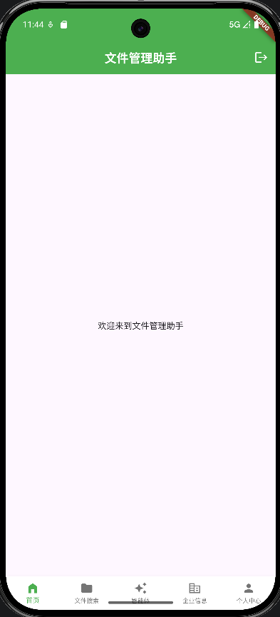
我们要实现的是一个包含5个导航项的底部Tab栏,支持点击切换页面、选中态样式变化、适配不同屏幕尺寸,最终效果如下:
- 5个核心页面:首页/文件搜索/智能体/企业信息/个人中心
- 选中项高亮为绿色,未选中为灰色
- 图标+文字组合,选中态有不同的图标样式
- 适配安全区,无布局溢出问题
📚 核心知识点拆解(小白友好版)
先给大家梳理代码中涉及的核心概念,先理解再写代码,事半功倍!
1. StatefulWidget - 为什么用有状态组件?
class HomeScreen extends StatefulWidget {
const HomeScreen({Key? key}) : super(key: key);
State<StatefulWidget> createState() => _HomeScreenState();
}
- 核心原因:底部导航栏需要切换页面(改变选中索引),界面会动态变化,所以必须用
StatefulWidget - 对比记忆:如果界面纯展示、不会变化,用
StatelessWidget(无状态组件)就够了 createState():用来创建组件的状态类,所有动态逻辑都写在_HomeScreenState里
2. 核心状态变量 - 控制页面切换
int _currentIndex = 0; // 当前选中的导航索引
final List<Widget> _screens = [ // 导航对应的页面列表
  HomePage(),
  LawSearch(),
  AiPage(),
  CompanyPage(),
  ProfilePage(),
];
_currentIndex:用数字标记当前选中的导航项(0=首页、1=文件搜索…)_screens:把所有页面存在列表里,索引和导航项一一对应,切换时直接取对应页面
3. Scaffold - Flutter页面的"骨架"
return Scaffold(
  appBar: AppBar(...), // 顶部导航栏
  body: SafeArea(child: _screens[_currentIndex]), // 页面主体
  bottomNavigationBar: BottomNavigationBar(...), // 底部导航栏
);
Scaffold是Flutter官方提供的页面骨架,包含了App最常用的布局结构:
appBar:顶部标题栏(可加返回键、菜单、操作按钮)body:页面主要内容区(我们这里显示选中的页面)bottomNavigationBar:底部导航栏(核心)SafeArea:自动适配刘海屏/底部安全区,避免内容被遮挡
4. BottomNavigationBar - 底部导航栏核心
这是本次案例的重点,我们逐行拆解关键配置:
(1)基础配置 - 解决5个导航项溢出问题
type: BottomNavigationBarType.fixed, // 关键!5个项必须设为fixed
iconSize: 22, // 图标大小
selectedFontSize: 11, // 选中文字大小
unselectedFontSize: 10, // 未选中文字大小
- 划重点:当导航项超过4个时,必须设置
type: fixed,否则会自动折叠成"更多",新手必踩坑! - 调整字体/图标大小:避免文字过长导致布局溢出
(2)样式配置 - 让导航栏更美观
selectedItemColor: Colors.green, // 选中颜色
unselectedItemColor: Colors.grey.shade600, // 未选中颜色
backgroundColor: Colors.white, // 背景色
showSelectedLabels: true, // 显示选中项文字
showUnselectedLabels: true, // 显示未选中项文字
- 颜色搭配:主色(绿色)+ 中性色(灰色),符合App设计规范
- 显示标签:默认4个项以上不显示未选中文字,这里强制显示提升易用性
(3)点击切换逻辑 - 核心交互
onTap: (index) {
  setState(() {
    _currentIndex = index; // 更新选中索引
  });
},
onTap:监听导航项点击事件,参数index是点击的导航项序号setState:Flutter刷新界面的核心方法,修改状态后调用,界面会重新构建
(4)导航项配置 - 图标+文字+选中态
BottomNavigationBarItem(
  icon: Icon(Icons.home), // 未选中图标
  label: '首页', // 文字
  activeIcon: Icon(Icons.home_filled), // 选中图标
),
activeIcon:选中时显示的图标,让选中态更醒目- 使用Material内置图标:无需自己切图,Flutter自带上千个图标
5. 适配安全区 - 解决底部溢出
MediaQuery.removePadding(
  context: context,
  removeBottom: true, // 移除底部额外padding
  child: BottomNavigationBar(...),
)
- 问题:部分手机底部有安全区,会导致导航栏高度溢出
- 解决方案:用
MediaQuery.removePadding移除底部多余的内边距
🚀 完整代码(可直接复制)
import 'package:flutter/material.dart';
// 替换成你自己的页面路径
import 'package:envhelper/src/pages/law_search.dart';
import 'package:envhelper/src/pages/ai_page.dart';
import 'package:envhelper/src/pages/company_page.dart';
import 'package:envhelper/src/pages/profile_page.dart';
import 'package:envhelper/src/pages/home_page.dart';
class HomeScreen extends StatefulWidget {
const HomeScreen({Key? key}) : super(key: key);
State<StatefulWidget> createState() => _HomeScreenState();
}
class _HomeScreenState extends State<HomeScreen> {
int _currentIndex = 0;
// 导航对应的页面列表
final List<Widget> _screens = [
HomePage(),
LawSearch(),
AiPage(),
CompanyPage(),
ProfilePage(),
];
Widget build(BuildContext context) {
return Scaffold(
appBar: AppBar(
centerTitle: true,
title: const Text(
'文件管理助手',
style: TextStyle(
color: Colors.white,
fontFamily: 'sans-serif',
fontSize: 20,
fontWeight: FontWeight.bold,
),
),
backgroundColor: Colors.green,
actions: [
IconButton(
icon: const Icon(Icons.logout),
color: Colors.white,
onPressed: () {
// 登出逻辑,跳转到登录页
Navigator.of(context).pushReplacementNamed('/login');
},
),
],
),
// 显示当前选中的页面,SafeArea适配安全区
body: SafeArea(child: _screens[_currentIndex]),
bottomNavigationBar: MediaQuery.removePadding(
context: context,
removeBottom: true, // 移除底部安全区padding
child: BottomNavigationBar(
type: BottomNavigationBarType.fixed, // 5个项必须设为fixed
currentIndex: _currentIndex, // 当前选中索引
iconSize: 22, // 图标大小
selectedFontSize: 11, // 选中文字大小
unselectedFontSize: 10, // 未选中文字大小
selectedItemColor: Colors.green, // 选中颜色
unselectedItemColor: Colors.grey.shade600, // 未选中颜色
backgroundColor: Colors.white, // 背景色
showSelectedLabels: true, // 显示选中文字
showUnselectedLabels: true, // 显示未选中文字
// 点击切换
onTap: (index) {
setState(() {
_currentIndex = index;
});
},
// 导航项配置
items: const [
BottomNavigationBarItem(
icon: Icon(Icons.home),
label: '首页',
activeIcon: Icon(Icons.home_filled),
),
BottomNavigationBarItem(
icon: Icon(Icons.folder),
label: '文件搜索',
activeIcon: Icon(Icons.folder_open),
),
BottomNavigationBarItem(
icon: Icon(Icons.auto_awesome),
label: '智能体',
activeIcon: Icon(Icons.auto_awesome_outlined),
),
BottomNavigationBarItem(
icon: Icon(Icons.corporate_fare),
label: '企业信息',
),
BottomNavigationBarItem(
icon: Icon(Icons.person),
label: '个人中心',
activeIcon: Icon(Icons.person_rounded),
),
]
),
),
);
}
}
🛠 新手使用指南
- 替换页面:把代码中的
HomePage()、LawSearch()等替换成你自己的页面组件 - 修改样式:根据自己的App配色,调整
selectedItemColor(选中颜色)、backgroundColor(背景色)等 - 调整图标:在Flutter图标库中找你需要的图标替换
- 测试适配:在不同尺寸的模拟器/真机上测试,确保没有布局溢出
❓ 常见问题解答
Q1:为什么我的导航栏文字显示不全?
A1:检查两个点:① 设置了type: fixed ② 调整了selectedFontSize/unselectedFontSize,减小字体大小
Q2:为什么页面切换后状态会丢失?
A2:当前代码每次切换都会重建页面,如需保留页面状态,可使用PageView + AutomaticKeepAliveClientMixin,后续会单独出教程!
Q3:如何给导航项加角标(小红点)?
A3:可以用Badge组件包裹Icon,Flutter官方的badges包就能实现,安装后直接用:
icon: Badge(
  label: Text('3'),
  child: Icon(Icons.notifications),
),
### 总结
- Flutter实现底部导航栏的核心是
BottomNavigationBar+StatefulWidget,通过_currentIndex控制页面切换; - 导航项超过4个时必须设置
type: fixed,并调整字体/图标大小避免溢出; - 利用
SafeArea和MediaQuery.removePadding适配不同设备的安全区,提升用户体验。
这个案例是Flutter开发中最常用的底部导航栏实现方式,代码简洁易上手,新手可以直接CV使用,记得根据自己的需求调整样式和页面哦!如果有问题,欢迎在评论区交流~

腾讯云面向开发者汇聚海量精品云计算使用和开发经验,营造开放的云计算技术生态圈。
更多推荐
 13
13 0
0- 0


 已为社区贡献10条内容

所有评论(0)