Flutter for OpenHarmony 看书管理记录App实战:统计分析实现
本文介绍了阅读类App中的统计分析页面设计与实现。页面采用fl_chart图表库展示数据可视化,包含四个核心模块:数据概览卡片(展示累计和本月阅读数据)、本周阅读柱状图(按天显示阅读时长)、分类统计和月度统计。重点讲解了柱状图的配置方法,包括Y轴最大值设置、坐标轴标签自定义等交互细节。页面设计注重数据可视化效果,通过渐变背景、合理间距和主次分明的文字样式提升用户体验,帮助用户直观了解阅读习惯和进度
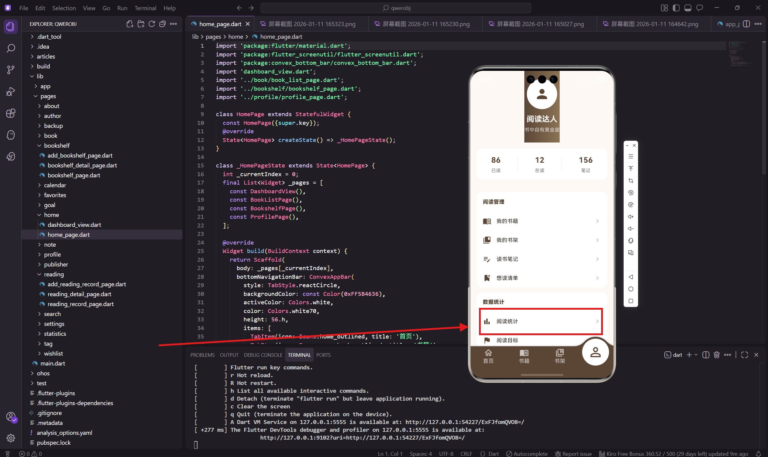
统计分析页面是整个App的数据中心,用来展示用户的阅读数据汇总。这个页面会用到图表来可视化数据,让用户一眼就能看出自己的阅读情况。
做这个页面的时候,我选择了 fl_chart 这个图表库,它支持柱状图、饼图、折线图等常见图表类型,而且在鸿蒙设备上运行也很流畅。
依赖引入
import 'package:flutter/material.dart';
import 'package:flutter_screenutil/flutter_screenutil.dart';
import 'package:get/get.dart';
import 'package:fl_chart/fl_chart.dart';
import '../../app/routes/app_routes.dart';
除了常规的依赖,这里多引入了 fl_chart,这是一个纯 Dart 实现的图表库,不依赖原生代码,所以在 OpenHarmony 上也能正常使用。
页面主体结构
class StatisticsPage extends StatelessWidget {
const StatisticsPage({super.key});
Widget build(BuildContext context) {
return Scaffold(
backgroundColor: const Color(0xFFFDF8F3),
appBar: AppBar(
title: const Text('阅读统计'),
backgroundColor: const Color(0xFF5B4636),
foregroundColor: Colors.white,
actions: [
IconButton(
icon: const Icon(Icons.description),
onPressed: () => Get.toNamed(AppRoutes.readingReport),
),
],
),
AppBar 右上角有个按钮可以跳转到阅读报告页面,那个页面会展示更详细的分析数据。
页面内容布局
      body: SingleChildScrollView(
        padding: EdgeInsets.all(16.w),
        child: Column(
          crossAxisAlignment: CrossAxisAlignment.start,
          children: [
            _buildOverview(),
            SizedBox(height: 20.h),
            _buildWeeklyChart(),
            SizedBox(height: 20.h),
            _buildCategoryChart(),
            SizedBox(height: 20.h),
            _buildMonthlyStats(),
          ],
        ),
      ),
    );
  }
页面分四个模块:数据概览、本周阅读图表、分类统计、月度统计。每个模块之间留 20 的间距。
数据概览卡片
  Widget _buildOverview() {
    return Container(
      padding: EdgeInsets.all(20.w),
      decoration: BoxDecoration(
        gradient: const LinearGradient(
          colors: [Color(0xFF5B4636), Color(0xFF8B7355)],
        ),
        borderRadius: BorderRadius.circular(16.r),
      ),
概览卡片用渐变背景,从深棕色到浅棕色,让这个最重要的模块更加醒目。
概览数据展示
      child: Column(
        children: [
          Row(
            mainAxisAlignment: MainAxisAlignment.spaceAround,
            children: [
              _buildOverviewItem('总阅读', '86 本'),
              _buildOverviewItem('总时长', '320 小时'),
              _buildOverviewItem('总页数', '28,500 页'),
            ],
          ),
          SizedBox(height: 16.h),
          Divider(color: Colors.white24, height: 1),
          SizedBox(height: 16.h),
          Row(
            mainAxisAlignment: MainAxisAlignment.spaceAround,
            children: [
              _buildOverviewItem('本月阅读', '4 本'),
              _buildOverviewItem('本月时长', '32 小时'),
              _buildOverviewItem('连续天数', '12 天'),
            ],
          ),
        ],
      ),
    );
  }
概览分两行,第一行是累计数据,第二行是本月数据。中间用一条半透明的分割线隔开。
这种布局让用户既能看到长期积累,也能看到近期表现。
概览数据项
  Widget _buildOverviewItem(String label, String value) {
    return Column(
      children: [
        Text(value, style: TextStyle(
          color: Colors.white,
          fontSize: 18.sp,
          fontWeight: FontWeight.bold,
        )),
        SizedBox(height: 4.h),
        Text(label, style: TextStyle(color: Colors.white70, fontSize: 12.sp)),
      ],
    );
  }
每个数据项是数值在上、标签在下的布局。数值用白色加粗,标签用半透明白色,形成主次关系。
本周阅读柱状图
  Widget _buildWeeklyChart() {
    return Container(
      padding: EdgeInsets.all(16.w),
      decoration: BoxDecoration(
        color: Colors.white,
        borderRadius: BorderRadius.circular(12.r),
      ),
      child: Column(
        crossAxisAlignment: CrossAxisAlignment.start,
        children: [
          Text('本周阅读时长', style: TextStyle(
            fontSize: 16.sp,
            fontWeight: FontWeight.bold,
            color: const Color(0xFF3D2914),
          )),
          SizedBox(height: 20.h),
柱状图展示本周每天的阅读时长,让用户看到自己的阅读规律。
柱状图配置
          SizedBox(
            height: 180.h,
            child: BarChart(
              BarChartData(
                alignment: BarChartAlignment.spaceAround,
                maxY: 3,
                barTouchData: BarTouchData(enabled: false),
BarChart 是 fl_chart 提供的柱状图组件。maxY: 3 设置 Y 轴最大值为 3 小时,barTouchData 禁用了触摸交互,因为这里不需要。
坐标轴配置
                titlesData: FlTitlesData(
                  show: true,
                  bottomTitles: AxisTitles(
                    sideTitles: SideTitles(
                      showTitles: true,
                      getTitlesWidget: (v, m) => Text(
                        ['一', '二', '三', '四', '五', '六', '日'][v.toInt()],
                        style: TextStyle(fontSize: 12.sp, color: Colors.grey[600]),
                      ),
                    ),
                  ),
                  leftTitles: AxisTitles(
                    sideTitles: SideTitles(
                      showTitles: true,
                      reservedSize: 30,
                      getTitlesWidget: (v, m) => Text(
                        '${v.toInt()}h',
                        style: TextStyle(fontSize: 10.sp, color: Colors.grey[500]),
                      ),
                    ),
                  ),
                  topTitles: const AxisTitles(sideTitles: SideTitles(showTitles: false)),
                  rightTitles: const AxisTitles(sideTitles: SideTitles(showTitles: false)),
                ),
底部显示星期几,用中文的"一二三四五六日"。左边显示小时数,带"h"后缀。顶部和右边的标题隐藏掉,让图表更简洁。
网格线和柱子
                borderData: FlBorderData(show: false),
                gridData: FlGridData(
                  show: true,
                  drawVerticalLine: false,
                  horizontalInterval: 1,
                  getDrawingHorizontalLine: (v) => FlLine(
                    color: Colors.grey[200]!,
                    strokeWidth: 1,
                  ),
                ),
                barGroups: [1.5, 2.0, 1.0, 2.5, 1.8, 2.2, 1.2]
                    .asMap()
                    .entries
                    .map((e) => BarChartGroupData(
                          x: e.key,
                          barRods: [
                            BarChartRodData(
                              toY: e.value,
                              color: const Color(0xFF5B4636),
                              width: 20.w,
                              borderRadius: BorderRadius.vertical(top: Radius.circular(4.r)),
                            ),
                          ],
                        ))
                    .toList(),
              ),
            ),
          ),
        ],
      ),
    );
  }
网格线只显示水平线,不显示垂直线,这样更清爽。柱子用主题色,顶部有圆角,看起来更柔和。
数据暂时写死,实际项目中应该从数据库读取每天的阅读时长。
分类统计饼图
  Widget _buildCategoryChart() {
    return Container(
      padding: EdgeInsets.all(16.w),
      decoration: BoxDecoration(
        color: Colors.white,
        borderRadius: BorderRadius.circular(12.r),
      ),
      child: Column(
        crossAxisAlignment: CrossAxisAlignment.start,
        children: [
          Text('分类统计', style: TextStyle(
            fontSize: 16.sp,
            fontWeight: FontWeight.bold,
            color: const Color(0xFF3D2914),
          )),
          SizedBox(height: 16.h),
分类统计用饼图展示,让用户看到自己读的书都是什么类型的。
饼图布局
          SizedBox(
            height: 160.h,
            child: Row(
              children: [
                Expanded(
                  child: PieChart(
                    PieChartData(
                      sectionsSpace: 2,
                      centerSpaceRadius: 30.r,
                      sections: [
                        PieChartSectionData(
                          value: 35,
                          color: const Color(0xFF5B4636),
                          title: '35%',
                          radius: 40.r,
                          titleStyle: TextStyle(
                            color: Colors.white,
                            fontSize: 11.sp,
                            fontWeight: FontWeight.bold,
                          ),
                        ),
饼图用 PieChart 组件,centerSpaceRadius 设置中间空心的半径,形成环形图的效果。每个扇区之间留 2 像素的间隙。
饼图其他扇区
                        PieChartSectionData(
                          value: 25,
                          color: const Color(0xFF2E7D32),
                          title: '25%',
                          radius: 40.r,
                          titleStyle: TextStyle(
                            color: Colors.white,
                            fontSize: 11.sp,
                            fontWeight: FontWeight.bold,
                          ),
                        ),
                        PieChartSectionData(
                          value: 20,
                          color: const Color(0xFF1565C0),
                          title: '20%',
                          radius: 40.r,
                          titleStyle: TextStyle(
                            color: Colors.white,
                            fontSize: 11.sp,
                            fontWeight: FontWeight.bold,
                          ),
                        ),
                        PieChartSectionData(
                          value: 20,
                          color: const Color(0xFFE65100),
                          title: '20%',
                          radius: 40.r,
                          titleStyle: TextStyle(
                            color: Colors.white,
                            fontSize: 11.sp,
                            fontWeight: FontWeight.bold,
                          ),
                        ),
                      ],
                    ),
                  ),
                ),
四个分类用四种不同的颜色:棕色是文学,绿色是科技,蓝色是历史,橙色是其他。每个扇区上显示百分比。
图例说明
                SizedBox(width: 16.w),
                Column(
                  mainAxisAlignment: MainAxisAlignment.center,
                  crossAxisAlignment: CrossAxisAlignment.start,
                  children: [
                    _buildLegendItem(const Color(0xFF5B4636), '文学', '30本'),
                    _buildLegendItem(const Color(0xFF2E7D32), '科技', '22本'),
                    _buildLegendItem(const Color(0xFF1565C0), '历史', '17本'),
                    _buildLegendItem(const Color(0xFFE65100), '其他', '17本'),
                  ],
                ),
              ],
            ),
          ),
        ],
      ),
    );
  }
饼图右边是图例,说明每种颜色代表什么分类,以及具体的书籍数量。
图例项组件
  Widget _buildLegendItem(Color color, String label, String value) {
    return Padding(
      padding: EdgeInsets.symmetric(vertical: 4.h),
      child: Row(
        children: [
          Container(
            width: 12.w,
            height: 12.w,
            decoration: BoxDecoration(
              color: color,
              borderRadius: BorderRadius.circular(3.r),
            ),
          ),
          SizedBox(width: 8.w),
          Text(label, style: TextStyle(fontSize: 12.sp, color: Colors.grey[700])),
          SizedBox(width: 8.w),
          Text(value, style: TextStyle(fontSize: 12.sp, color: Colors.grey[500])),
        ],
      ),
    );
  }
每个图例项是一个小色块加分类名称加数量。色块用圆角矩形,和饼图的颜色对应。
月度统计列表
  Widget _buildMonthlyStats() {
    final months = [
      {'month': '1月', 'books': 4, 'hours': 32},
      {'month': '12月', 'books': 5, 'hours': 38},
      {'month': '11月', 'books': 3, 'hours': 28},
    ];
    return Container(
      padding: EdgeInsets.all(16.w),
      decoration: BoxDecoration(
        color: Colors.white,
        borderRadius: BorderRadius.circular(12.r),
      ),
月度统计用列表形式展示最近几个月的数据,让用户看到阅读趋势。
月度数据渲染
      child: Column(
        crossAxisAlignment: CrossAxisAlignment.start,
        children: [
          Text('月度统计', style: TextStyle(
            fontSize: 16.sp,
            fontWeight: FontWeight.bold,
            color: const Color(0xFF3D2914),
          )),
          SizedBox(height: 12.h),
          ...months.map((m) => Padding(
            padding: EdgeInsets.symmetric(vertical: 8.h),
            child: Row(
              children: [
                Text(m['month'] as String, style: TextStyle(
                  fontSize: 14.sp,
                  fontWeight: FontWeight.w500,
                )),
                const Spacer(),
                Text('${m['books']} 本', style: TextStyle(
                  color: const Color(0xFF5B4636),
                  fontSize: 13.sp,
                )),
                SizedBox(width: 20.w),
                Text('${m['hours']} 小时', style: TextStyle(
                  color: Colors.grey[600],
                  fontSize: 13.sp,
                )),
              ],
            ),
          )).toList(),
        ],
      ),
    );
  }
}
每行显示月份、阅读书籍数、阅读时长。书籍数用主题色突出显示,时长用灰色作为次要信息。
图表库选择
选择 fl_chart 而不是其他图表库,主要有几个原因:
第一是纯 Dart 实现,不依赖原生代码,在 OpenHarmony 上兼容性好。
第二是 API 设计合理,配置项清晰,学习成本低。
第三是性能不错,即使数据量大也能流畅渲染。
小结
统计分析页面通过图表直观地展示阅读数据,让用户对自己的阅读情况有清晰的认识。柱状图展示时间分布,饼图展示分类占比,列表展示月度趋势。
fl_chart 库的使用让图表实现变得简单,只需要配置好数据和样式就能得到漂亮的图表效果。
下一篇会讲阅读报告页面的实现,那个页面会有更详细的数据分析和阅读习惯总结。
欢迎加入开源鸿蒙跨平台社区:https://openharmonycrossplatform.csdn.net

腾讯云面向开发者汇聚海量精品云计算使用和开发经验,营造开放的云计算技术生态圈。
更多推荐
 11
11 0
0- 0


 已为社区贡献21条内容

所有评论(0)