Flutter for OpenHarmony 万能游戏库App实战 - 游戏分类入口实现
本文介绍了如何实现游戏库App的分类入口页面,通过网格布局优化用户查找体验。文章详细讲解了底部导航栏设计(使用IndexedStack保留页面状态)、分类数据模型定义(实现数据与UI分离)、游戏中心页面实现(包含主题切换功能)以及分类卡片设计(采用渐变背景增强视觉效果)。重点展示了如何使用GridView.builder构建2列网格布局,并强调通过Provider管理主题状态时read与watch
游戏库App的核心就是让用户快速找到想要的内容。首页推荐是一种方式,但更直接的方式是提供一个游戏分类中心,用户可以一眼看到所有可用的游戏模块。这篇文章我们来实现一个网格布局的游戏分类入口页面,包括分类卡片设计、导航跳转、以及主题切换等功能。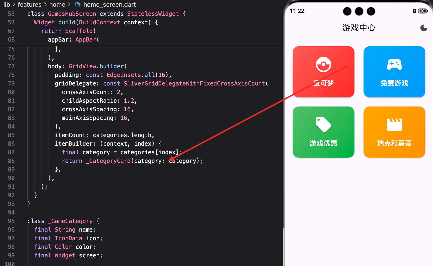
为什么需要分类入口
想象一下,用户打开App后想玩宝可梦,但首页只有热门游戏推荐,用户需要滑动很久才能找到。如果有一个专门的"游戏"Tab,展示所有可用的游戏分类,用户点一下就能进去,这样的体验明显更好。
底部导航栏的设计
首先看看App的整体结构。我们用底部导航栏来组织不同的功能模块:
class HomeScreen extends StatefulWidget {
const HomeScreen({super.key});
State<HomeScreen> createState() => _HomeScreenState();
}
class _HomeScreenState extends State<HomeScreen> {
int _currentIndex = 0;
Widget build(BuildContext context) {
final l10n = AppLocalizations.of(context);
final List<Widget> screens = [
const DiscoverScreen(),
const GamesHubScreen(),
const FavoritesScreen(),
const ProfileScreen(),
];
return Scaffold(
body: IndexedStack(
index: _currentIndex,
children: screens,
),
bottomNavigationBar: NavigationBar(
selectedIndex: _currentIndex,
onDestinationSelected: (index) => setState(() => _currentIndex = index),
destinations: [
NavigationDestination(icon: const Icon(Icons.explore_outlined), selectedIcon: const Icon(Icons.explore), label: l10n.discover),
NavigationDestination(icon: const Icon(Icons.games_outlined), selectedIcon: const Icon(Icons.games), label: l10n.games),
NavigationDestination(icon: const Icon(Icons.favorite_outline), selectedIcon: const Icon(Icons.favorite), label: l10n.favorites),
NavigationDestination(icon: const Icon(Icons.person_outline), selectedIcon: const Icon(Icons.person), label: l10n.profile),
],
),
);
}
}
这里用了IndexedStack而不是PageView。为什么?因为IndexedStack会保留所有页面的状态,用户切换Tab时不会丢失滚动位置或输入框内容。NavigationBar是Material 3的新组件,比BottomNavigationBar更现代。
注意每个NavigationDestination都有outlined和filled两个图标,这样选中和未选中时的视觉反馈更明显。
游戏分类数据模型
接下来定义游戏分类的数据结构。这个模型很简单,但设计得很灵活:
class _GameCategory {
  final String name;
  final IconData icon;
  final Color color;
  final Widget screen;

  _GameCategory(this.name, this.icon, this.color, this.screen);
}
这个模型包含了分类卡片所需的所有信息:名称、图标、颜色和目标页面。为什么要把目标页面也存在这里?这样做的好处是数据和UI逻辑分离,如果以后要添加新的分类,只需要在列表里加一条数据就行,不需要修改UI代码。
游戏中心页面的实现
GamesHubScreen是游戏分类的主页面,它负责展示所有分类:
class GamesHubScreen extends StatelessWidget {
const GamesHubScreen({super.key});
Widget build(BuildContext context) {
final l10n = AppLocalizations.of(context);
final categories = [
_GameCategory(l10n.pokemon, Icons.catching_pokemon, Colors.red, const PokemonListScreen()),
_GameCategory(l10n.freeGames, Icons.sports_esports, Colors.blue, const FreeGamesScreen()),
_GameCategory(l10n.gameDeals, Icons.local_offer, Colors.green, const DealsScreen()),
_GameCategory(l10n.rickMorty, Icons.movie, Colors.orange, const RickMortyScreen()),
];
return Scaffold(
appBar: AppBar(
title: Text(l10n.gameCenter),
actions: [
IconButton(
icon: Icon(context.watch<ThemeProvider>().themeMode == ThemeMode.dark ? Icons.light_mode : Icons.dark_mode),
onPressed: () => context.read<ThemeProvider>().toggleTheme(),
),
],
),
页面的AppBar里有一个主题切换按钮。用
context.watch<ThemeProvider>()监听主题变化,当主题改变时按钮图标会自动更新。这是Provider模式的典型用法。
注意这里用了**context.read()**来改变主题,而不是watch。为什么?因为我们只需要在点击时改变一次,不需要监听主题变化。read和watch的区别很重要:watch会在数据变化时rebuild,read只是获取当前值。
网格布局的部分:
      body: GridView.builder(
        padding: const EdgeInsets.all(16),
        gridDelegate: const SliverGridDelegateWithFixedCrossAxisCount(
          crossAxisCount: 2,
          childAspectRatio: 1.2,
          crossAxisSpacing: 16,
          mainAxisSpacing: 16,
        ),
        itemCount: categories.length,
        itemBuilder: (context, index) {
          final category = categories[index];
          return _CategoryCard(category: category);
        },
      ),
GridView.builder用SliverGridDelegateWithFixedCrossAxisCount来定义网格参数。crossAxisCount: 2表示每行2列,childAspectRatio: 1.2表示宽高比是1.2,这样卡片看起来不会太方也不会太扁。crossAxisSpacing和mainAxisSpacing分别控制列间距和行间距,都设成16让布局更舒服。
分类卡片的设计
分类卡片是整个页面的视觉重点,我们要让它看起来吸引人:
class _CategoryCard extends StatelessWidget {
final _GameCategory category;
const _CategoryCard({required this.category});
Widget build(BuildContext context) {
return Card(
clipBehavior: Clip.antiAlias,
child: InkWell(
onTap: () => Navigator.push(context, MaterialPageRoute(builder: (_) => category.screen)),
child: Container(
decoration: BoxDecoration(
gradient: LinearGradient(
begin: Alignment.topLeft,
end: Alignment.bottomRight,
colors: [category.color.withOpacity(0.8), category.color],
),
),
卡片使用了渐变背景,从左上到右下,颜色从半透明到完全不透明。这样做的好处是视觉层次更丰富,不会显得单调。withOpacity(0.8)让颜色稍微淡一些,这样白色的文字和图标会更清晰。
卡片内部的内容:
          child: Column(
            mainAxisAlignment: MainAxisAlignment.center,
            children: [
              Icon(category.icon, size: 48, color: Colors.white),
              const SizedBox(height: 12),
              Text(category.name, style: const TextStyle(color: Colors.white, fontSize: 18, fontWeight: FontWeight.bold)),
            ],
          ),
内容垂直居中,这样不管卡片多高都能看起来平衡。图标大小48,文字大小18,这个比例是经过测试的,看起来最舒服。所有文字和图标都是白色,这样在彩色背景上对比度最高。
导航跳转的实现
点击卡片时,我们用Navigator.push来跳转到对应的页面:
onTap: () => Navigator.push(context, MaterialPageRoute(builder: (_) => category.screen)),
这里用的是push而不是pushReplacement。push会把新页面压到栈上,用户可以返回。如果用pushReplacement,用户返回时会直接回到首页,这不是我们想要的。
国际化的处理
你可能注意到代码里用了l10n.pokemon、l10n.freeGames这样的写法。这是Flutter的国际化方案:
final categories = [
  _GameCategory(l10n.pokemon, Icons.catching_pokemon, Colors.red, const PokemonListScreen()),
  _GameCategory(l10n.freeGames, Icons.sports_esports, Colors.blue, const FreeGamesScreen()),
  _GameCategory(l10n.gameDeals, Icons.local_offer, Colors.green, const DealsScreen()),
  _GameCategory(l10n.rickMorty, Icons.movie, Colors.orange, const RickMortyScreen()),
];
所有的文本都从AppLocalizations获取,这样切换语言时分类名称会自动更新。如果直接写死字符串,就没办法支持多语言了。
主题切换的实现细节
AppBar右上角的主题切换按钮是这样实现的:
IconButton(
  icon: Icon(context.watch<ThemeProvider>().themeMode == ThemeMode.dark ? Icons.light_mode : Icons.dark_mode),
  onPressed: () => context.read<ThemeProvider>().toggleTheme(),
),
这里用了三元运算符来判断当前主题。如果是深色模式,显示light_mode图标(表示可以切换到浅色);如果是浅色模式,显示dark_mode图标(表示可以切换到深色)。这样用户一眼就能看出点击按钮会发生什么。
context.watch()会在ThemeProvider改变时自动rebuild这个按钮,所以切换主题后图标会立即更新。
扩展性的考虑
这个设计有很好的扩展性。如果以后要添加新的游戏分类,比如"纸牌游戏"或"笑话生成器",只需要在categories列表里加一条数据:
final categories = [
  _GameCategory(l10n.pokemon, Icons.catching_pokemon, Colors.red, const PokemonListScreen()),
  _GameCategory(l10n.freeGames, Icons.sports_esports, Colors.blue, const FreeGamesScreen()),
  _GameCategory(l10n.gameDeals, Icons.local_offer, Colors.green, const DealsScreen()),
  _GameCategory(l10n.rickMorty, Icons.movie, Colors.orange, const RickMortyScreen()),
  // 新增分类
  _GameCategory(l10n.cardGames, Icons.style, Colors.purple, const CardsScreen()),
  _GameCategory(l10n.funJokes, Icons.sentiment_very_satisfied, Colors.amber, const JokesScreen()),
];
不需要修改GridView或卡片的代码,只需要添加数据。这就是数据驱动UI的好处。
性能优化
虽然这个页面看起来简单,但也有一些性能相关的考虑:
1. 使用const构造函数
const _CategoryCard({required this.category});
const构造函数让Flutter能够复用Widget实例,减少内存占用。
2. 避免不必要的rebuild
onPressed: () => context.read<ThemeProvider>().toggleTheme(),
用read而不是watch,这样点击按钮时只改变主题,不会rebuild整个页面。
3. GridView的懒加载
GridView.builder本身就是懒加载的,但由于我们只有4个分类,这个优化的效果不明显。如果以后分类数量增加,这个优势就会体现出来。
用户体验的细节
1. 视觉反馈
InkWell提供了点击时的水波纹效果,用户点击卡片时能看到明显的反馈。
2. 颜色的选择
每个分类都有不同的颜色,这样用户能快速识别。宝可梦用红色(宝可梦球的颜色),免费游戏用蓝色,优惠用绿色,这些都是有意义的。
3. 图标的选择
catching_pokemon、sports_esports、local_offer、movie这些图标都能直观地表达分类的含义,用户不需要思考就能理解。
总结
这篇文章我们实现了一个完整的游戏分类入口页面。虽然代码不多,但涉及到的知识点很丰富:
- 底部导航栏的实现和状态管理
- 网格布局的参数调整
- 渐变背景的使用
- Provider模式的read和watch区别
- 国际化的处理
- 导航跳转的实现
这些都是Flutter开发中非常实用的技能。好的分类设计能让用户快速找到想要的内容,这对App的用户体验至关重要。
欢迎加入开源鸿蒙跨平台社区:https://openharmonycrossplatform.csdn.net

腾讯云面向开发者汇聚海量精品云计算使用和开发经验,营造开放的云计算技术生态圈。
更多推荐
 20
20 0
0- 0


 已为社区贡献19条内容

所有评论(0)