uniapp定义一个简单的全局弹窗组件
兼容H5、微信小程序、安卓APP
(1)封装成组件
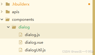
dialog.js
export default {
	/* 链接处理 */
	getLink(params){
		let url = "/components/dialog/dialog";
		if(params){
			let paramStr = "";
			for(let name in params){
				paramStr+=`&${name}=${params[name]}`
			}
			if(paramStr){
				url +=`?${paramStr.substr(1)}`
			}
		}
		return url;
	},
	/* APP全局弹窗 */
	dialog(params={},callback){
		const store = getApp().globalData.store
		store.commit('setAppDialogShow', true)
		uni.navigateTo({
			url:this.getLink(params),
			success(e) {
				uni.$off("wujw_common_dialog");
				uni.$on("wujw_common_dialog",(type)=>{
					callback&&callback(type)
				})
			}
		})
	},
	/*弹出提示弹窗  */
	alert(data={},callback,close){
		let params = {type:"alert",isCloseBtn:'0',isMaskClose:'0',...data};
		this.dialog(params,(type)=>{
			if("confirm"==type){
				callback&&callback()
			}else {
				close&&close()
			}
		})
	},
	/*确认提示框弹窗 */
	confirm(data={},confirm,cancel,close){
		let params = {type:"confirm",isCloseBtn:'0',isMaskClose:'0',...data};
		this.dialog(params,(type)=>{
			if("confirm"==type){
				confirm&&confirm()
			}else if("cancel"==type){
				cancel&&cancel()
			}else if("close"==type){
				close&&close()
			}
		})
	},

}
dialog.vue
<template>
	<view @click="itemClick('mask')" class="mask-content">
		<view class="dialog-content" @click.stop="">
			<view class="head-content " v-if="info.title" :style="info.content?'':'min-height:90rpx;padding:30rpx'">
				<text>{{info.title}}</text>
			</view>
			<scroll-view class="main-content" scroll-y v-if="info.content">
				<view class="info-content">
					<text>{{info.content}}</text>
				</view>
			</scroll-view>
			<view class="foot-content alert" v-if="'alert'==info.type">
				<view class="btn active" @click.stop="itemClick('confirm')">
					{{info.confirmText}}
				</view>
			</view>
			<view class="foot-content confirm" v-if="'confirm'==info.type">
				<view class="btn cancel" @click="itemClick('cancel')">
					{{info.cancelText}}
				</view>
				<view class="btn active" @click.stop="itemClick('confirm')">
					{{info.confirmText}}
				</view>
			</view>
		</view>
	</view>
</template>

<script>
	export default {
		data() {
			return {
				info: {
					type: "alert", //alert:单按钮,confirm:双按钮
					title: "", //
					content: "",
					cancelText: "取消",
					confirmText: "确定",
					isMaskClose: "1", //1点击遮罩层关闭弹窗
				}
			}
		},
		onLoad(info = {}) {
			this.info = {
				...this.info,
				...info
			};
		},
		methods: {
			itemClick(type) {
				if (type == "mask" && this.info.isMaskClose != '1') {
					return;
				}
				uni.navigateBack()
				uni.$emit("wujw_common_dialog", type);
				// #ifdef APP
				const store = getApp().globalData.store
				store.commit('setAppDialogShow', false)
				// #endif
			}
		}
	}
</script>

<style lang="scss">
	$btncolor: #ff6a00;

	page {
		background: transparent;
	}

	.mask-content {
		position: fixed;
		left: 0;
		top: 0;
		right: 0;
		bottom: 0;
		display: flex;
		justify-content: center;
		align-items: center;
		background-color: rgba(0, 0, 0, 0.4);

		.dialog-content {
			background-color: #FFFFFF;
			width: 580rpx;
			border-radius: 10rpx;

			.head-content {
				display: flex;
				align-items: center;
				justify-content: center;
				color: #343434;
				font-weight: bold;
				font-size: 32rpx;
				padding: 20rpx 30rpx;
			}

			.main-content {
				max-height: 330rpx;

				.info-content {
					min-height: 80rpx;
					padding: 10rpx 30rpx;
					color: #636463;
					font-size: 30rpx;
					display: flex;
					justify-content: center;
					align-items: center;
				}
			}

			.foot-content {
				display: flex;
				justify-content: center;
				align-items: center;
				height: 110rpx;

				.btn {
					font-size: 28rpx;
					border-radius: 66rpx;
					height: 66rpx;
					display: flex;
					justify-content: center;
					align-items: center;

					&:active{
						background-color: #eeeeee;
					}
				}

				&.alert {
					.btn {
						background-color: $btncolor;
						color: #FFFFFF;
						font-size: 28rpx;
						border-radius: 60rpx;
						height: 66rpx;
						width: 300rpx;
						padding: 0 40rpx;
						display: flex;
						justify-content: center;
						align-items: center;
					}
				}

				&.confirm {
					justify-content: space-around;

					.btn {
						min-width: 230rpx;

						&.active {
							background-color: $btncolor;
							color: #FFFFFF;
						}

						&.cancel {
							border: 1rpx solid $btncolor;
							color: $btncolor;
							border-radius: 66rpx;
						}
					}
				}

			}
		}
	}
</style>
dialogUtil.js
import dialog from "@/components/dialog/dialog.js"
export default {
	/**
	 * 弹出提示
	 */
	alert({
		title = "",
		content = "",
		confirmText = '确定',
		callback,
	}) {
		// #ifdef APP-PLUS
		dialog.alert({
			content,
			title,
			confirmText
		}, callback)
		// #endif
		// #ifndef APP-PLUS
		uni.showModal({
			title,
			content,
			confirmText,
			showCancel: false,
			confirmColor: '#ff6a00',
			success: callback
		})
		// #endif
	},
	/**
	 * 确认提示框
	 */
	confirm({
		title = "提示",
		content = "",
		confirmText = '确定',
		cancelText = '取消',
		confirm,
		cancel
	}) {
		// #ifdef APP-PLUS
		dialog.confirm({
			content,
			title,
			confirmText,
			cancelText,
		}, confirm, cancel)
		// #endif
		// #ifndef APP-PLUS
		uni.showModal({
			title,
			content,
			cancelText,
			confirmText,
			confirmColor: '#ff6a00',
			success: (e) => {
				if (e.confirm) {
					confirm && confirm()
				} else if (e.cancel) {
					cancel && cancel()
				}
			},
			fail: (e) => {
				console.log(e)
			}
		})
		// #endif
	},
}
(2)配置page.json
在pages的最底部设置(APP端才需要)
		// #ifdef APP-PLUS
		, {
			"path": "components/dialog/dialog",
			"style": {
				"navigationStyle": "custom",
				// #ifdef APP-PLUS
				"backgroundColor": "transparent",
				"backgroundColorTop": "transparent",
				"backgroundColorBottom": "transparent",
				// #endif
				"app-plus": {
					"animationType": "fade-in",
					"background": "transparent",
					"popGesture": "none"
				}
			}
		}
		// #endif
(3)配置App.vue
<script>
	import dialog from "@/components/dialog/dialogUtil.js"
	export default {
		async onLaunch() {
			uni['dialog'] = dialog;
		},
	}
</script>
(4)调用
注意:不需要再次引入组件,可直接在script调用
				// 显示双按钮
				uni.dialog.confirm({
					title: "温馨提示",
					content: "您当前的网络不稳定,请检查网络状态",
					confirmText: "好的",
					confirm: () => {
						console.log("已点击确认");
					},
				});
				// 显示单按钮
				uni.dialog.alert({
					content: "您当前的网络不稳定,请检查网络状态",
					confirm: () => {
						console.log("已点击确认");
					},
				});
(5)注意App端的一个问题
在uniapp(App端)中实现自定义弹框,可以通过创建一个透明页面来实现。点击进入当前页面时,页面背景会变透明,用户可以根据自己的需求进行自定义,最终效果类似于弹框。
遇到问题:当打开弹窗(进入弹窗页面)就会触发当前页面的onHide函数,关闭弹窗(跳出弹窗页面)就会触发上一页的onShow函数。有时候我们在onShow、onHide函数会定义自己的逻辑处理,比如在onShow函数发请求、在onHide销毁定时器,那么当打开关闭弹窗都会触发一遍。当打开关闭弹窗避免不触发自己定义的逻辑处理,这问题怎么解决呢?
解决逻辑:
1、我们可以在vuex定义一个变量,默认为false,当打开弹窗(进入弹窗页面)之前把该变量改成true,关闭弹窗(跳出弹窗页面)之后把该变量改成false。(或者直接使用uni.getStorageSync本地存储和uni.removeStorageSync删除缓存也可以。)
2、在调用弹窗的页面的onShow、onHide函数获取到该变量,判断变量如果为true,直接结束函数。
vuex的store 定义一个弹窗状态和改变状态的方法
	state: {
		appDialogShow: false,
	},
	mutations: {
		setAppDialogShow(state, show) {
		   state.appDialogShow = show;
	},
App进入、进出弹窗页面改变弹窗状态
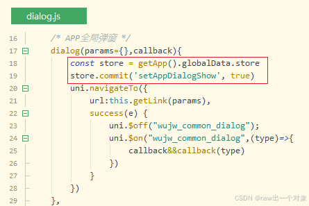
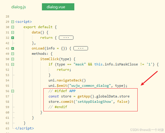
App端在页面调用弹窗组件,就会触发onShow、onHide函数,需要做判断禁止再次触发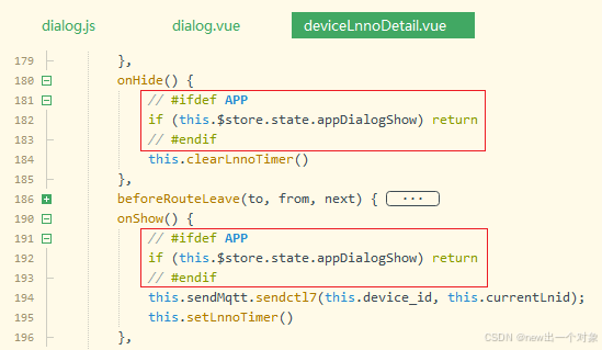
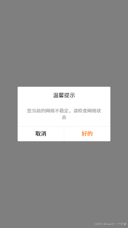
H5效果图
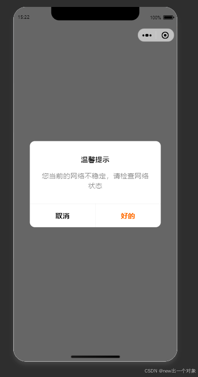
微信小程序效果图
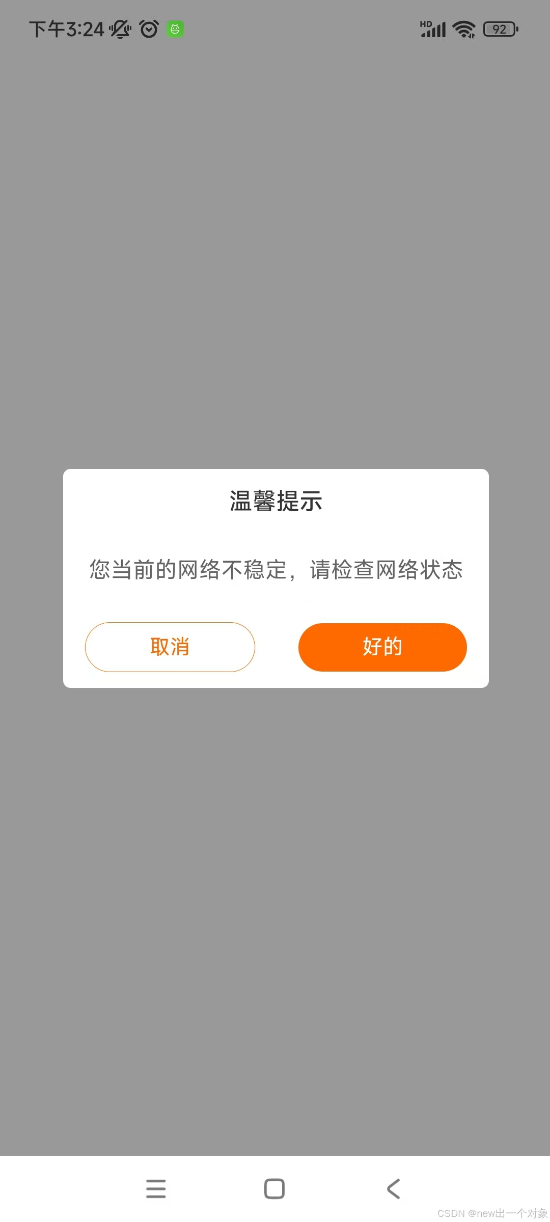
App效果图

腾讯云面向开发者汇聚海量精品云计算使用和开发经验,营造开放的云计算技术生态圈。
更多推荐
 5
5 0
0- 0


 已为社区贡献3条内容

所有评论(0)