flutter_for_openharmony小区门禁管理app实战+缴费详情实现
本文介绍了小区门禁管理系统中缴费详情页面的实现方案。该页面采用Flutter开发,主要功能包括账单明细展示、缴费项目选择和支付流程处理。页面设计遵循"信息透明+选择灵活+支付安全"的原则,通过StatefulWidget管理账单选中状态和支付状态,默认选中所有账单提升用户体验。页面布局分为可滚动的账单列表和固定底部的支付区域,账单项采用卡片式设计,通过边框颜色区分选中状态。支付
缴费详情是小区门禁管理系统中的核心功能,它为住户提供了查看账单明细、选择缴费项目、选择支付方式、完成缴费流程的完整体验。
在实际项目中,缴费详情页面需要解决几个关键问题:
- 如何清晰展示账单的详细信息和费用明细
- 如何支持灵活的账单选择和费用计算
- 如何集成多种支付方式并提供安全保障
- 如何处理缴费成功后的状态更新和通知
这篇讲缴费详情页面的实现,重点是如何让缴费流程既安全又便捷。
对应源码
lib/pages/home/payment_detail_page.dart
缴费详情页面的设计思路是:信息透明 + 选择灵活 + 支付安全。
import 'package:flutter/material.dart';
import 'package:flutter_screenutil/flutter_screenutil.dart';
import 'package:get/get.dart';
首先引入核心依赖包,flutter/material.dart 提供基础UI组件,flutter_screenutil 用于屏幕适配,get 则是常用的状态管理工具,为后续页面开发奠定基础。
class PaymentDetailPage extends StatefulWidget {
final List<Map<String, dynamic>> bills;
const PaymentDetailPage({
Key? key,
required this.bills,
}) : super(key: key);
State<PaymentDetailPage> createState() => _PaymentDetailPageState();
}
将页面定义为StatefulWidget,因为缴费页面需要维护账单选中状态、支付状态等可变数据;通过构造函数接收bills参数,用于展示外部传入的账单列表数据。
class _PaymentDetailPageState extends State<PaymentDetailPage> {
  final List<bool> _selectedBills = [];
  String _paymentMethod = 'wechat';
  bool _isProcessing = false;
  bool _isCalculating = false;
在状态类中定义核心状态变量:_selectedBills 存储每个账单的选中状态,_paymentMethod 默认选中微信支付,_isProcessing 标记支付是否正在处理中,避免重复操作。
基础结构说明:
- 缴费详情页面需要维护账单选择和支付状态,所以用
StatefulWidget。 - 接收
bills参数,显示指定账单的详情。 _selectedBills存储每个账单的选中状态。_paymentMethod存储选择的支付方式。
void initState() {
super.initState();
_initializeBills();
}
重写initState生命周期方法,页面初始化时调用_initializeBills方法,完成账单选中状态的初始赋值。
  void _initializeBills() {
    setState(() {
      _selectedBills = List<bool>.filled(widget.bills.length, (index) => true);
    });
  }
_initializeBills方法通过setState更新状态,默认将所有账单设置为选中状态,提升用户操作效率,无需手动逐个勾选。
void dispose() {
super.dispose();
}
重写dispose方法,此处暂未添加额外清理逻辑,若后续有定时器、监听器等资源,可在此处释放,避免内存泄漏。
Widget build(BuildContext context) {
return Scaffold(
appBar: AppBar(
title: const Text('选择缴费'),
centerTitle: true,
),
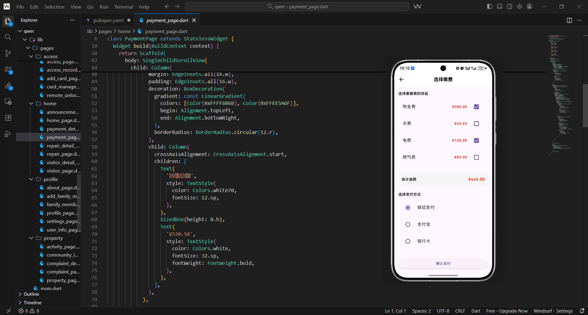
build方法构建页面核心布局,首先返回Scaffold组件,配置顶部导航栏,标题为“选择缴费”并居中显示,符合移动端UI设计习惯。
      body: Column(
        children: [
          // 账单列表
          Expanded(
            child: SingleChildScrollView(
              padding: EdgeInsets.all(16.w),
              child: Column(
                crossAxisAlignment: CrossAxisAlignment.start,
                children: [
                  Text(
                    '选择要缴费的项目',
                    style: TextStyle(
                      fontSize: 16.sp,
                      fontWeight: FontWeight.bold,
                    ),
                  ),
页面主体采用Column布局,分为账单列表和底部支付区域两部分;账单列表外层包裹Expanded和SingleChildScrollView,保证账单数量过多时可滚动,同时填充剩余空间;首先显示“选择要缴费的项目”标题,通过字体加粗突出层级。
                  SizedBox(height: 16.h),

                  // 账单列表
                  ...widget.bills.asMap().entries.map((entry) {
                    final index = entry.key;
                    final bill = entry.value;
                    return _buildBillItem(bill, index);
                  }).toList(),
                ],
              ),
            ),
          ),
通过SizedBox设置标题与账单列表的间距,提升页面呼吸感;遍历bills列表,通过asMap()获取索引,调用_buildBillItem方法构建每个账单项,将账单数据和索引传入,实现账单列表的动态渲染。
          // 底部支付区域
          _buildPaymentSection(),
        ],
      ),
    );
  }
最后调用_buildPaymentSection构建底部支付区域,固定在页面底部,方便用户随时操作支付,无需滚动到底部,提升操作便捷性。
页面布局设计:
- 使用
Column布局,上部是账单列表,底部是支付区域。 - 账单列表使用
SingleChildScrollView确保可滚动。 - 底部支付区域固定显示,便于用户操作。
- 初始化时默认选中所有账单。
  Widget _buildBillItem(Map<String, dynamic> bill, int index) {
    final isSelected = _selectedBills[index];

    return Container(
      margin: EdgeInsets.only(bottom: 12.h),
      padding: EdgeInsets.all(16.w),
      decoration: BoxDecoration(
        color: Colors.white,
        borderRadius: BorderRadius.circular(12.r),
_buildBillItem方法接收单个账单数据和索引,首先获取该账单的选中状态;返回的容器组件设置底部外边距和内边距,白色背景搭配圆角,符合移动端卡片式设计风格,提升视觉舒适度。
        border: Border.all(
          color: isSelected ? Colors.blue[300]! : Colors.grey[300]!,
          width: isSelected ? 2.w : 1.w,
        ),
        boxShadow: [
          BoxShadow(
            color: Colors.grey.withOpacity(0.1),
            blurRadius: 4.r,
            offset: Offset(0, 2.h),
          ),
        ],
      ),
为卡片添加边框样式,选中状态下使用蓝色边框且宽度更粗,未选中时为灰色细边框,视觉上清晰区分选中状态;同时添加轻微阴影,增强卡片的立体感。
      child: Column(
        children: [
          // 账单头部
          Row(
            children: [
              // 选择框
              Checkbox(
                value: isSelected,
                onChanged: (value) {
                  setState(() {
                    _selectedBills[index] = value!;
                  });
                },
                activeColor: Colors.blue,
              ),
卡片内部采用Column布局,首先是账单头部的Row布局;左侧放置Checkbox复选框,绑定当前账单的选中状态,点击时通过setState更新_selectedBills对应索引的状态,实现选中状态的实时切换。
              SizedBox(width: 12.w),

              // 账单信息
              Expanded(
                child: Column(
                  crossAxisAlignment: CrossAxisAlignment.start,
                  children: [
                    Row(
                      mainAxisAlignment: MainAxisAlignment.spaceBetween,
                      children: [
                        Text(
                          bill['name'],
                          style: TextStyle(
                            fontSize: 16.sp,
                            fontWeight: FontWeight.bold,
                          ),
                        ),
复选框右侧通过SizedBox设置间距,然后用Expanded包裹账单信息区域,避免内容溢出;账单名称使用加粗字体,突出显示核心信息,提升可读性。
                        Container(
                          padding: EdgeInsets.symmetric(
                            horizontal: 8.w,
                            vertical: 4.h,
                          ),
                          decoration: BoxDecoration(
                            color: _getStatusColor(bill['status']),
                            borderRadius: BorderRadius.circular(8.r),
                          ),
                          child: Text(
                            _getStatusText(bill['status']),
                            style: TextStyle(
                              fontSize: 10.sp,
                              color: Colors.white,
                            ),
                          ),
                        ),
                      ],
                    ),
账单名称右侧放置状态标签,通过_getStatusColor和_getStatusText获取对应状态的颜色和文本,标签采用圆角设计,小字体搭配内边距,样式简洁且信息明确。
                    SizedBox(height: 8.h),

                    // 账单详情
                    Row(
                      mainAxisAlignment: MainAxisAlignment.spaceBetween,
                      children: [
                        Text(
                          '账单编号:${bill['id']}',
                          style: TextStyle(
                            fontSize: 12.sp,
                            color: Colors.grey[600],
                          ),
                        ),
                        Text(
                          '截止日期:${bill['dueDate']}',
                          style: TextStyle(
                            fontSize: 12.sp,
                            color: Colors.grey[600],
                          ),
                        ),
                      ],
                    ),
                  ],
                ),
              ),
            ],
          ),
账单名称下方展示账单编号和截止日期,采用灰色小字,与核心信息区分层级,同时通过MainAxisAlignment.spaceBetween让两个信息分别居左、居右,布局更规整。
          SizedBox(height: 12.h),

          // 费用明细
          Container(
            width: double.infinity,
            padding: EdgeInsets.all(12.w),
            decoration: BoxDecoration(
              color: Colors.grey[50],
              borderRadius: BorderRadius.circular(8.r),
            ),
账单头部下方设置间距后,构建费用明细区域;该区域使用浅灰色背景,与白色卡片主体形成对比,同时铺满整行宽度,内边距和圆角设计让区域边界更清晰。
            child: Column(
              crossAxisAlignment: CrossAxisAlignment.start,
              children: [
                Text(
                  '费用明细',
                  style: TextStyle(
                    fontSize: 12.sp,
                    fontWeight: FontWeight.w500,
                    color: Colors.grey[700],
                  ),
                ),
                SizedBox(height: 8.h),
费用明细区域首先显示“费用明细”标题,字体稍粗,与下方明细项区分;通过SizedBox设置标题与明细项的间距,优化视觉布局。
                // 费用项目
                if (bill['details'] != null)
                  ...bill['details'].map<Widget>((detail) {
                    return Padding(
                      padding: EdgeInsets.only(bottom: 4.h),
                      child: Row(
                        mainAxisAlignment: MainAxisAlignment.spaceBetween,
                        children: [
                          Text(
                            detail['name'],
                            style: TextStyle(
                              fontSize: 11.sp,
                              color: Colors.grey[600],
                            ),
                          ),
                          Text(
                            '¥${detail['amount']}',
                            style: TextStyle(
                              fontSize: 11.sp,
                              color: Colors.grey[700],
                            ),
                          ),
                        ],
                      ),
                    );
                  }).toList(),
判断账单是否有明细数据,若有则遍历渲染每个费用项;每个费用项包含名称和金额,分别居左、居右排列,使用更小的字体,同时设置底部内边距,让明细项之间有清晰的间隔。
                Divider(height: 12.h),

                // 合计金额
                Row(
                  mainAxisAlignment: MainAxisAlignment.spaceBetween,
                  children: [
                    Text(
                      '合计金额',
                      style: TextStyle(
                        fontSize: 12.sp,
                        fontWeight: FontWeight.bold,
                        color: Colors.grey[700],
                      ),
                    ),
                    Text(
                      '¥${bill['amount']}',
                      style: TextStyle(
                        fontSize: 14.sp,
                        fontWeight: FontWeight.bold,
                        color: Colors.red,
                      ),
                    ),
                  ],
                ),
              ],
            ),
          ),
        ],
      ),
    );
  }
明细项下方添加分割线,分隔明细和合计金额;合计金额使用加粗字体,金额部分用红色突出显示,让用户快速感知需要支付的总金额,符合用户对金额的视觉关注习惯。
账单项组件:
- 显示账单名称、状态、编号、截止日期等信息。
- 使用
Checkbox支持账单选择。 - 费用明细区域展示具体的费用项目和金额。
- 选中状态用蓝色边框突出显示。
  Color _getStatusColor(String status) {
    switch (status) {
      case 'unpaid':
        return Colors.red;
      case 'paid':
        return Colors.green;
      case 'overdue':
        return Colors.orange;
      default:
        return Colors.grey;
    }
  }
_getStatusColor方法根据账单状态返回对应颜色,未缴为红色、已缴为绿色、逾期为橙色,通过色彩直观区分账单状态,符合用户的视觉认知习惯。
  String _getStatusText(String status) {
    switch (status) {
      case 'unpaid':
        return '未缴';
      case 'paid':
        return '已缴';
      case 'overdue':
        return '逾期';
      default:
        return '未知';
    }
  }
_getStatusText方法将英文状态值转换为中文文本,适配中文用户场景,确保界面文字通俗易懂,降低理解成本。
状态处理方法:
_getStatusColor获取状态对应的颜色。_getStatusText获取状态的中文文本。- 未缴(红色)、已缴(绿色)、逾期(橙色)。
  Widget _buildPaymentSection() {
    return Container(
      padding: EdgeInsets.all(16.w),
      decoration: BoxDecoration(
        color: Colors.white,
        boxShadow: [
          BoxShadow(
            color: Colors.grey.withOpacity(0.2),
            blurRadius: 4.r,
            offset: Offset(0, -2.h),
          ),
        ],
      ),
_buildPaymentSection方法构建底部支付区域,容器设置白色背景和顶部阴影,模拟悬浮效果,与上方的账单列表形成视觉区分,同时内边距保证内容不贴边。
      child: Column(
        children: [
          // 合计信息
          Container(
            width: double.infinity,
            padding: EdgeInsets.all(16.w),
            decoration: BoxDecoration(
              color: Colors.grey[50],
              borderRadius: BorderRadius.circular(8.r),
            ),
支付区域内部首先是合计信息模块,浅灰色背景搭配圆角,与底部白色背景区分,突出合计信息的重要性。
            child: Row(
              mainAxisAlignment: MainAxisAlignment.spaceBetween,
              children: [
                Column(
                  crossAxisAlignment: CrossAxisAlignment.start,
                  children: [
                    Text(
                      '已选择 ${_getSelectedCount()} 项',
                      style: TextStyle(
                        fontSize: 12.sp,
                        color: Colors.grey[600],
                      ),
                    ),
                    Text(
                      '合计金额',
                      style: TextStyle(
                        fontSize: 14.sp,
                        fontWeight: FontWeight.bold,
                        color: Colors.grey[700],
                      ),
                    ),
                  ],
                ),
合计信息模块采用Row布局,左侧显示选中项数量和“合计金额”标题,选中项数量用灰色小字,标题加粗,层级分明,让用户清楚知晓选择的账单数量。
                Text(
                  '¥${_getTotalAmount()}',
                  style: TextStyle(
                    fontSize: 20.sp,
                    fontWeight: FontWeight.bold,
                    color: Colors.red,
                  ),
                ),
              ],
            ),
          ),
右侧显示合计金额,使用大号加粗红色字体,成为视觉焦点,让用户快速看到需要支付的总金额,符合金额展示的设计规范。
          SizedBox(height: 16.h),

          // 支付方式选择
          Text(
            '选择支付方式',
            style: TextStyle(
              fontSize: 14.sp,
              fontWeight: FontWeight.w500,
            ),
          ),
          SizedBox(height: 12.h),
合计信息下方设置间距后,显示“选择支付方式”标题,字体稍粗,与下方支付方式选项区分,同时通过SizedBox设置标题与选项的间距。
          Row(
            children: [
              _buildPaymentMethod('wechat', '微信支付', Icons.wechat),
              SizedBox(width: 12.w),
              _buildPaymentMethod('alipay', '支付宝', Icons.account_balance_wallet),
              SizedBox(width: 12.w),
              _buildPaymentMethod('card', '银行卡', Icons.credit_card),
            ],
          ),
采用Row布局横向排列三种支付方式,分别是微信支付、支付宝、银行卡,通过_buildPaymentMethod方法构建统一样式的支付方式选项,选项之间设置间距,布局更均匀。
          SizedBox(height: 16.h),

          // 支付按钮
          SizedBox(
            width: double.infinity,
            child: ElevatedButton(
              onPressed: _getSelectedCount() > 0 && !_isProcessing
                  ? _processPayment
                  : null,
支付方式下方设置间距后,构建确认支付按钮,按钮宽度铺满整行,点击回调通过判断选中账单数量和支付状态,只有选中账单且非处理中时才触发支付逻辑,避免无效点击。
              style: ElevatedButton.styleFrom(
                backgroundColor: Colors.blue,
                foregroundColor: Colors.white,
                padding: EdgeInsets.symmetric(vertical: 16.h),
                shape: RoundedRectangleBorder(
                  borderRadius: BorderRadius.circular(8.r),
                ),
              ),
按钮样式设置为蓝色背景、白色文字,垂直内边距保证按钮点击区域足够大,圆角设计符合移动端按钮风格,提升点击体验。
              child: _isProcessing
                  ? Row(
                      mainAxisAlignment: MainAxisAlignment.center,
                      children: [
                        SizedBox(
                          width: 20.w,
                          height: 20.w,
                          child: CircularProgressIndicator(
                            strokeWidth: 2.w,
                            valueColor: AlwaysStoppedAnimation<Color>(Colors.white),
                          ),
                        ),
                        SizedBox(width: 12.w),
                        const Text('处理中...'),
                      ],
                    )
支付处理中时,按钮显示加载动画和“处理中…”文本,替换原有文字,告知用户当前状态,避免重复点击;加载动画为白色细圆环,与蓝色按钮背景对比清晰。
                  : const Text(
                      '确认支付',
                      style: TextStyle(fontSize: 16.sp),
                    ),
            ),
          ),
        ],
      ),
    );
  }
非处理状态下,按钮显示“确认支付”文字,字体大小适中,清晰易读,引导用户完成支付操作。
支付区域设计:
- 显示选中账单数量和合计金额。
- 提供三种支付方式:微信支付、支付宝、银行卡。
- 支付按钮在无选中账单或处理中时禁用。
- 处理过程中显示进度器,防止重复操作。
  Widget _buildPaymentMethod(String value, String label, IconData icon) {
    final isSelected = _paymentMethod == value;

    return GestureDetector(
      onTap: () {
        setState(() {
          _paymentMethod = value;
        });
      },
_buildPaymentMethod方法构建统一的支付方式选项,接收值、标签、图标参数;通过GestureDetector实现点击选中,点击时更新_paymentMethod状态,切换选中的支付方式。
      child: Container(
        padding: EdgeInsets.all(12.w),
        decoration: BoxDecoration(
          color: isSelected ? Colors.blue[50] : Colors.grey[50],
          borderRadius: BorderRadius.circular(8.r),
          border: Border.all(
            color: isSelected ? Colors.blue : Colors.grey[300]!,
            width: isSelected ? 2.w : 1.w,
          ),
        ),
支付方式选项容器设置内边距和圆角,选中状态下使用浅蓝色背景和蓝色粗边框,未选中时为浅灰色背景和灰色细边框,视觉上清晰区分选中状态。
        child: Column(
          children: [
            Icon(
              icon,
              color: isSelected ? Colors.blue : Colors.grey[600],
              size: 24.sp,
            ),
            SizedBox(height: 4.h),
            Text(
              label,
              style: TextStyle(
                fontSize: 10.sp,
                color: isSelected ? Colors.blue : Colors.grey[600],
              ),
            ),
          ],
        ),
      ),
    );
  }
选项内部显示图标和标签,图标颜色与边框颜色对应,选中时为蓝色,未选中时为灰色,标签字体较小,整体样式简洁统一,符合支付方式选项的设计风格。
支付方式组件:
- 使用
GestureDetector支持点击选择。 - 选中状态用蓝色背景和边框突出显示。
- 显示支付方式图标和标签。
- 三种支付方式水平排列,便于选择。
  int _getSelectedCount() {
    return _selectedBills.where((selected) => selected).length;
  }
_getSelectedCount方法通过遍历_selectedBills列表,统计选中状态为true的数量,返回选中的账单数量,用于合计信息区域展示。
  double _getTotalAmount() {
    double total = 0.0;
    for (int i = 0; i < widget.bills.length; i++) {
      if (_selectedBills[i]) {
        total += double.parse(widget.bills[i]['amount'].toString());
      }
    }
    return total;
  }
_getTotalAmount方法遍历账单列表,累加选中账单的金额,实现实时计算选中账单的总金额,确保金额计算的准确性。
  Future<void> _processPayment() async {
    setState(() {
      _isProcessing = true;
    });

    try {
      // 模拟支付处理
      await Future.delayed(const Duration(seconds: 3));
_processPayment方法处理支付逻辑,首先将_isProcessing设为true,标记支付中状态;通过Future.delayed模拟3秒的支付接口请求过程,模拟真实的网络请求耗时。
      final paymentData = {
        'bills': widget.bills.where((bill) {
          final index = widget.bills.indexOf(bill);
          return _selectedBills[index];
        }).toList(),
        'paymentMethod': _paymentMethod,
        'totalAmount': _getTotalAmount(),
        'paymentTime': DateTime.now().toIso8601String(),
      };
模拟支付成功后,构建支付数据对象,包含选中的账单、支付方式、总金额、支付时间等信息,便于后续接口调用或数据存储。
      // 实际项目中这里会调用支付接口
      print('支付数据:$paymentData');

      ScaffoldMessenger.of(context).showSnackBar(
        const SnackBar(
          content: Text('支付成功'),
          backgroundColor: Colors.green,
        ),
      );

      Navigator.pop(context, paymentData);
打印支付数据便于调试,然后显示绿色的“支付成功”提示条,告知用户支付结果;最后返回上一级页面,并携带支付数据,方便上级页面处理后续逻辑。
    } catch (e) {
      setState(() {
        _isProcessing = false;
      });

      ScaffoldMessenger.of(context).showSnackBar(
        const SnackBar(
          content: Text('支付失败,请重试'),
          backgroundColor: Colors.red,
        ),
      );
    }
  }
}
捕获支付过程中的异常,将_isProcessing重置为false,恢复按钮可点击状态;同时显示红色的“支付失败,请重试”提示条,告知用户失败原因,引导用户重新操作。
支付处理逻辑:
_getSelectedCount计算选中的账单数量。_getTotalAmount计算选中账单的总金额。_processPayment模拟3秒支付处理过程。- 支付成功后返回支付数据并显示提示。
用户体验设计
缴费详情页面的用户体验重点:
- 信息透明:清晰展示账单明细和费用构成
- 选择灵活:支持多账单选择和实时计算
- 支付安全:提供多种支付方式和处理状态
- 操作便捷:底部固定支付区域,便于操作
这些设计让缴费流程既安全又便捷。
数据管理策略
缴费详情的数据管理考虑:
- 状态管理:账单选中状态和支付状态
- 金额计算:实时计算选中账单的总金额
- 支付集成:支持多种支付方式的集成
- 状态同步:支付成功后同步更新账单状态
这些策略确保缴费数据的准确性和一致性。
欢迎加入开源鸿蒙跨平台社区:https://openharmonycrossplatform.csdn.net

腾讯云面向开发者汇聚海量精品云计算使用和开发经验,营造开放的云计算技术生态圈。
更多推荐
 18
18 0
0- 0


 已为社区贡献39条内容

所有评论(0)