flutter_for_openharmony小区门禁管理app实战+卡片管理实现
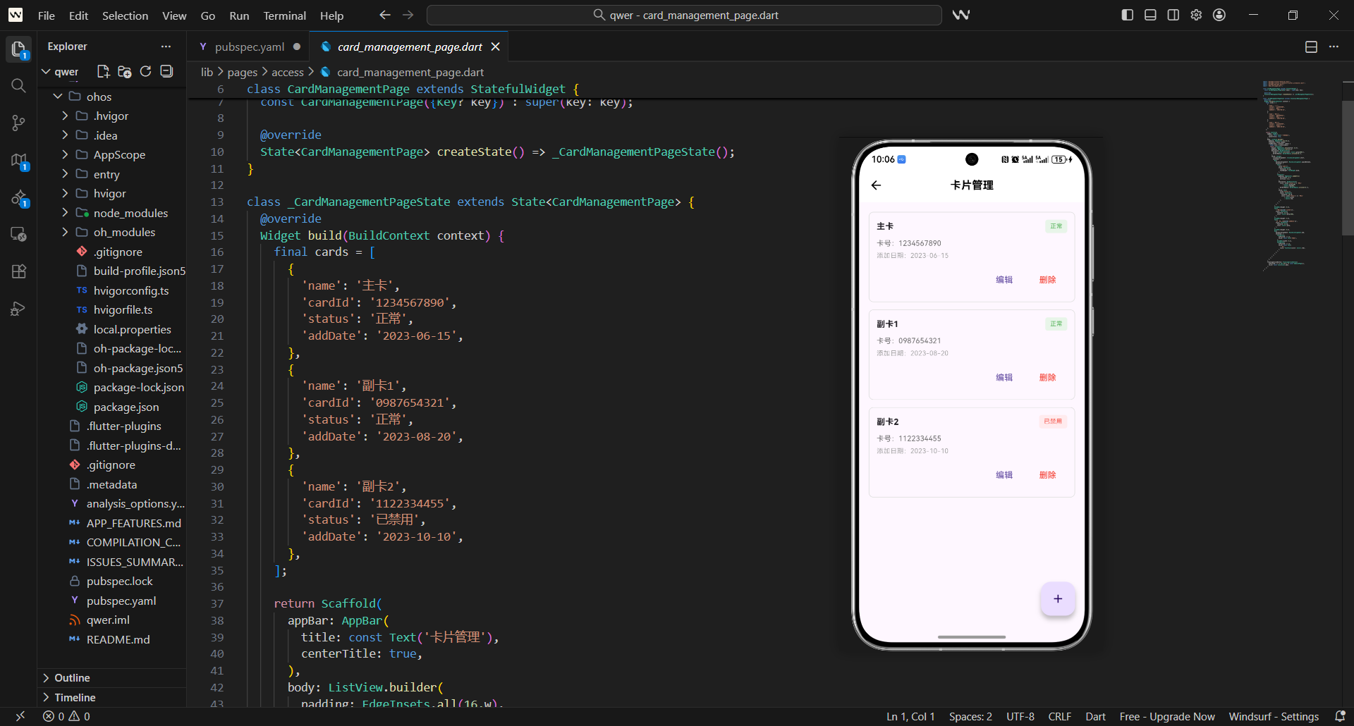
本文介绍了门禁系统中卡片管理页面的实现方案,重点解决卡片状态展示、操作便捷性和信息完整性问题。页面采用状态可视化设计,顶部展示卡片统计信息(总数、正常、停用),下方为卡片列表,每张卡片通过边框颜色区分状态(绿色表示激活)。功能实现包括:1) 卡片状态切换;2) 下拉刷新;3) 快速添加卡片入口;4) 加载状态提示。代码结构清晰,使用StatefulWidget管理卡片数据,通过自定义组件统一统计项
·
卡片管理是门禁系统中的核心功能之一,它直接关系到住户的通行权限和安全管理。
在实际项目中,卡片管理需要解决几个关键问题:
- 如何清晰展示所有门禁卡的状态
- 如何支持卡片的启用/禁用操作
- 如何处理卡片的挂失和补办流程
- 如何展示卡片的使用统计信息
这篇讲卡片管理页面的实现,重点是如何让复杂的卡片管理操作变得简单直观。
对应源码
lib/pages/access/card_management_page.dart
卡片管理页面的设计思路是:状态可视化 + 操作便捷化 + 信息完整化。
import 'package:flutter/material.dart';
import 'package:flutter_screenutil/flutter_screenutil.dart';
import 'package:get/get.dart';
import 'add_card_page.dart';
class CardManagementPage extends StatefulWidget {
const CardManagementPage({Key? key}) : super(key: key);
State<CardManagementPage> createState() => _CardManagementPageState();
}
class _CardManagementPageState extends State<CardManagementPage> {
List<Map<String, dynamic>> _cards = [];
bool _isLoading = false;
void initState() {
super.initState();
_loadCards();
}
基础结构说明:
- 卡片管理页面需要维护卡片列表状态,所以用
StatefulWidget。 - 导入
add_card_page.dart支持跳转到添加卡片页面。 _cards存储所有门禁卡信息,包含状态和使用统计。_isLoading控制加载状态,提供良好的用户体验。
Widget build(BuildContext context) {
return Scaffold(
appBar: AppBar(
title: const Text('卡片管理'),
centerTitle: true,
actions: [
IconButton(
icon: const Icon(Icons.add),
onPressed: () => Get.to(() => const AddCardPage()),
),
],
),
body: RefreshIndicator(
onRefresh: _refreshCards,
child: Column(
children: [
// 统计信息
Container(
width: double.infinity,
padding: EdgeInsets.all(16.w),
margin: EdgeInsets.all(16.w),
decoration: BoxDecoration(
gradient: const LinearGradient(
colors: [Color(0xFF2196F3), Color(0xFF1976D2)],
begin: Alignment.topLeft,
end: Alignment.bottomRight,
),
borderRadius: BorderRadius.circular(12.r),
),
child: Column(
children: [
Text(
'卡片统计',
style: TextStyle(
color: Colors.white70,
fontSize: 12.sp,
),
),
SizedBox(height: 8.h),
Row(
mainAxisAlignment: MainAxisAlignment.spaceAround,
children: [
_buildStatItem('总数', '${_cards.length}'),
_buildStatItem('正常', '${_getActiveCardsCount()}'),
_buildStatItem('停用', '${_getInactiveCardsCount()}'),
],
),
],
),
),
统计信息设计:
- 顶部统计卡片使用蓝色渐变背景,突出重要性。
- 显示卡片总数、正常数量和停用数量,一目了然。
- 使用
_buildStatItem统一统计项的样式。 - 统计信息实时更新,反映当前卡片状态。
            // 卡片列表
            Expanded(
              child: _isLoading
                  ? const Center(child: CircularProgressIndicator())
                  : ListView.builder(
                      padding: EdgeInsets.symmetric(horizontal: 16.w),
                      itemCount: _cards.length,
                      itemBuilder: (context, index) {
                        return _buildCardItem(_cards[index], index);
                      },
                    ),
            ),
          ],
        ),
      ),
      floatingActionButton: FloatingActionButton(
        onPressed: () => Get.to(() => const AddCardPage()),
        child: const Icon(Icons.add),
      ),
    );
  }
页面布局设计:
- 使用
RefreshIndicator支持下拉刷新。 - 统计信息固定在顶部,卡片列表占据主要空间。
- 加载状态显示圆形进度器,用户体验友好。
- 浮动按钮提供快速添加卡片的入口。
  Widget _buildStatItem(String label, String value) {
    return Column(
      children: [
        Text(
          value,
          style: TextStyle(
            color: Colors.white,
            fontSize: 20.sp,
            fontWeight: FontWeight.bold,
          ),
        ),
        SizedBox(height: 4.h),
        Text(
          label,
          style: TextStyle(
            color: Colors.white70,
            fontSize: 12.sp,
          ),
        ),
      ],
    );
  }
统计项组件:
- 统一的统计项样式,数值大而醒目。
- 标签使用较小字体和半透明白色。
- 垂直布局,数值在上,标签在下。
- 三个统计项均匀分布,视觉平衡。
  Widget _buildCardItem(Map<String, dynamic> card, int index) {
    final isActive = card['status'] == 'active';
    return Container(
      margin: EdgeInsets.only(bottom: 12.h),
      padding: EdgeInsets.all(16.w),
      decoration: BoxDecoration(
        color: Colors.white,
        borderRadius: BorderRadius.circular(12.r),
        border: Border.all(
          color: isActive ? Colors.green[300]! : Colors.grey[300]!,
          width: isActive ? 2.w : 1.w,
        ),
        boxShadow: [
          BoxShadow(
            color: Colors.grey.withOpacity(0.1),
            blurRadius: 4.r,
            offset: Offset(0, 2.h),
          ),
        ],
      ),
      child: Column(
        children: [
          Row(
            children:
              // 卡片信息
              Expanded(
                child: Column(
                  crossAxisAlignment: CrossAxisAlignment.start,
                  children: [
                    Row(
                      children: [
                        Text(
                          card['name'],
                          style: TextStyle(
                            fontSize: 16.sp,
                            fontWeight: FontWeight.bold,
                          ),
                        ),
                        SizedBox(width: 8.w),
                        Container(
                          padding: EdgeInsets.symmetric(
                            horizontal: 6.w,
                            vertical: 2.h,
                          ),
                          decoration: BoxDecoration(
                            color: isActive ? Colors.green[100] : Colors.grey[200],
                            borderRadius: BorderRadius.circular(10.r),
                          ),
                          child: Text(
                            isActive ? '正常' : '停用',
                            style: TextStyle(
                              fontSize: 10.sp,
                              color: isActive ? Colors.green[700] : Colors.grey[600],
                            ),
                          ),
                        ),
                      ],
                    ),
                    SizedBox(height: 4.h),
                    Text(
                      '卡号:${card['cardNumber']}',
                      style: TextStyle(
                        fontSize: 12.sp,
                        color: Colors.grey[600],
                      ),
                    ),
                    SizedBox(height: 2.h),
                    Text(
                      '持卡人:${card['holder']}',
                      style: TextStyle(
                        fontSize: 12.sp,
                        color: Colors.grey[600],
                      ),
                    ),
                  ],
                ),
              ),
卡片条目设计:
- 活跃卡片用绿色边框突出显示。
- 卡片图标根据状态显示不同颜色。
- 显示卡片名称、卡号、持卡人等关键信息。
- 右侧操作菜单提供启用、停用、编辑、挂失、删除等功能。
          SizedBox(height: 12.h),

          // 使用统计
          Container(
            padding: EdgeInsets.all(12.w),
            decoration: BoxDecoration(
              color: Colors.grey[50],
              borderRadius: BorderRadius.circular(8.r),
            ),
            child: Row(
              mainAxisAlignment: MainAxisAlignment.spaceAround,
              children: [
                _buildUsageItem('本月使用', '${card['monthlyUsage']}次'),
                _buildUsageItem('最后使用', card['lastUsed']),
                _buildUsageItem('有效期至', card['expiryDate']),
              ],
            ),
          ),
        ],
      ),
    );
  }
使用统计设计:
- 灰色背景区域显示使用统计信息。
- 包含本月使用次数、最后使用时间、有效期等。
- 三个统计项均匀分布,信息密度适中。
- 使用
_buildUsageItem统一样式,保持一致性。
  Widget _buildUsageItem(String label, String value) {
    return Column(
      children: [
        Text(
          value,
          style: TextStyle(
            fontSize: 12.sp,
            fontWeight: FontWeight.bold,
            color: Colors.grey[700],
          ),
        ),
        SizedBox(height: 2.h),
        Text(
          label,
          style: TextStyle(
            fontSize: 10.sp,
            color: Colors.grey[500],
          ),
        ),
      ],
    );
  }
使用统计项组件:
- 紧凑的统计项设计,节省空间。
- 数值使用加粗样式,标签使用较小字体。
- 灰色系配色,与卡片主体形成层次。
- 垂直布局,信息展示清晰。
  Future<void> _loadCards() async {
    setState(() {
      _isLoading = true;
    });

    // 模拟网络请求
    await Future.delayed(const Duration(seconds: 1));

    final mockCards = [
      {
        'id': '1',
        'name': '主卡',
        'cardNumber': '6222****1234',
        'holder': '张三',
        'status': 'active',
        'monthlyUsage': 45,
        'lastUsed': '今天 08:30',
        'expiryDate': '2025-12-31',
      },
      {
        'id': '2',
        'name': '副卡',
        'cardNumber': '6222****5678',
        'holder': '李四',
        'status': 'active',
        'monthlyUsage': 23,
        'lastUsed': '昨天 18:45',
        'expiryDate': '2025-06-30',
      },
      {
        'id': '3',
        'name': '临时卡',
        'cardNumber': '6222****9012',
        'holder': '王五',
        'status': 'inactive',
        'monthlyUsage': 8,
        'lastUsed': '3天前',
        'expiryDate': '2024-03-31',
      },
    ];

    setState(() {
      _cards = mockCards;
      _isLoading = false;
    });
  }
数据加载逻辑:
- 模拟网络请求加载卡片数据。
- 包含完整的卡片信息:ID、名称、卡号、持卡人、状态等。
- 使用统计信息:本月使用次数、最后使用时间、有效期。
- 加载完成后更新UI状态。
  Future<void> _refreshCards() async {
    await _loadCards();
  }

  int _getActiveCardsCount() {
    return _cards.where((card) => card['status'] == 'active').length;
  }

  int _getInactiveCardsCount() {
    return _cards.where((card) => card['status'] == 'inactive').length;
  }

  void _handleCardAction(String action, Map<String, dynamic> card) async {
    switch (action) {
      case 'enable':
        await _toggleCardStatus(card, true);
        break;
      case 'disable':
        await _toggleCardStatus(card, false);
        break;
      case 'edit':
        _editCard(card);
        break;
      case 'lost':
        _reportLost(card);
        break;
      case 'delete':
        _deleteCard(card);
        break;
    }
  }
操作处理逻辑:
_getActiveCardsCount和_getInactiveCardsCount计算统计数量。_handleCardAction根据操作类型调用相应处理方法。- 支持启用、停用、编辑、挂失、删除等操作。
- 每个操作都有对应的异步处理方法。
  Future<void> _toggleCardStatus(Map<String, dynamic> card, bool active) async {
    final index = _cards.indexWhere((c) => c['id'] == card['id']);
    if (index != -1) {
      setState(() {
        _cards[index]['status'] = active ? 'active' : 'inactive';
      });

      ScaffoldMessenger.of(context).showSnackBar(
        SnackBar(
          content: Text(active ? '卡片已启用' : '卡片已停用'),
          backgroundColor: active ? Colors.green : Colors.orange,
        ),
      );
    }
  }

  void _editCard(Map<String, dynamic> card) {
    // 跳转到编辑页面
    ScaffoldMessenger.of(context).showSnackBar(
      const SnackBar(content: Text('编辑功能开发中...')),
    );
  }

  void _reportLost(Map<String, dynamic> card) {
    showDialog(
      context: context,
      builder: (context) => AlertDialog(
        title: const Text('确认挂失'),
        content: Text('确定要挂失卡片"${card['name']}"吗?\n挂失后该卡片将无法使用。'),
        actions: [
          TextButton(
            onPressed: () => Navigator.pop(context),
            child: const Text('取消'),
          ),
          TextButton(
            onPressed: () {
              Navigator.pop(context);
              _toggleCardStatus(card, false);
              ScaffoldMessenger.of(context).showSnackBar(
                const SnackBar(
                  content: Text('卡片已挂失'),
                  backgroundColor: Colors.red,
                ),
              );
            },
            child: const Text('确认'),
          ),
        ],
      ),
    );
  }
具体操作实现:
_toggleCardStatus切换卡片状态并显示提示。_editCard预留编辑功能接口。_reportLost挂失操作需要用户确认,避免误操作。- 所有操作都有相应的用户反馈。
  void _deleteCard(Map<String, dynamic> card) {
    showDialog(
      context: context,
      builder: (context) => AlertDialog(
        title: const Text('确认删除'),
        content: Text('确定要删除卡片"${card['name']}"吗?\n删除后无法恢复。'),
        actions: [
          TextButton(
            onPressed: () => Navigator.pop(context),
            child: const Text('取消'),
          ),
          TextButton(
            onPressed: () {
              Navigator.pop(context);
              setState(() {
                _cards.removeWhere((c) => c['id'] == card['id']);
              });
              ScaffoldMessenger.of(context).showSnackBar(
                const SnackBar(
                  content: Text('卡片已删除'),
                  backgroundColor: Colors.red,
                ),
              );
            },
            child: const Text('删除'),
          ),
        ],
      ),
    );
  }
}
删除操作实现:
- 删除操作需要二次确认,防止误删。
- 确认后从列表中移除对应卡片。
- 删除成功后显示红色提示信息。
- 操作完成后自动刷新统计信息。
用户体验设计
卡片管理页面的用户体验设计重点:
- 状态可视化:用颜色和边框区分卡片状态
- 操作便捷性:右键菜单集中所有操作
- 信息完整性:显示卡片所有关键信息
- 反馈及时性:每个操作都有明确的反馈
这些设计让复杂的卡片管理变得简单直观。
安全性考虑
卡片管理涉及安全,需要特别注意:
- 操作确认:危险操作需要二次确认
- 权限控制:不同用户有不同的操作权限
- 日志记录:所有操作都应该有日志记录
- 数据验证:输入数据需要严格验证
这些安全措施确保卡片管理的可靠性。
欢迎加入开源鸿蒙跨平台社区:https://openharmonycrossplatform.csdn.net

腾讯云面向开发者汇聚海量精品云计算使用和开发经验,营造开放的云计算技术生态圈。
更多推荐
 5
5 0
0- 0


 已为社区贡献39条内容

所有评论(0)