Flutter框架跨平台鸿蒙开发——Card样式定制
Card组件提供了丰富的样式定制选项,开发者可以根据应用的设计需求灵活调整卡片的外观。通过合理的样式定制,可以让界面更加美观、统一,并提升用户的视觉体验。
·
一、Card样式定制简介
Card组件提供了丰富的样式定制选项,开发者可以根据应用的设计需求灵活调整卡片的外观。通过合理的样式定制,可以让界面更加美观、统一,并提升用户的视觉体验。
样式定制的重要性
二、形状定制
圆角定制
Card默认使用圆角矩形,可以通过RoundedRectangleBorder来调整圆角大小:
Card(
  shape: RoundedRectangleBorder(
    borderRadius: BorderRadius.circular(8),
  ),
  child: Padding(
    padding: EdgeInsets.all(16),
    child: Text('圆角为8的卡片'),
  ),
)
不同圆角大小的视觉效果对比:
| 圆角值 | 适用场景 | 视觉效果 | 推荐用途 |
|---|---|---|---|
| 0-4px | 紧凑布局 | 硬朗、严肃 | 专业应用 |
| 8-12px | 常规卡片 | 平衡、舒适 | 通用场景 |
| 16-20px | 突出卡片 | 柔和、友好 | 特色内容 |
| 24px+ | 特殊卡片 | 圆润、可爱 | 儿童应用 |
异形卡片
除了圆角矩形,Card还支持其他形状:
// 矩形卡片(无圆角)
Card(
  shape: RoundedRectangleBorder(
    borderRadius: BorderRadius.zero,
  ),
  child: Padding(
    padding: EdgeInsets.all(16),
    child: Text('矩形卡片'),
  ),
)

// 圆形卡片
Card(
  shape: CircleBorder(),
  child: Container(
    width: 100,
    height: 100,
    child: Center(child: Text('圆形')),
  ),
)
三、边框定制
边框样式
通过shape属性的side参数可以添加边框:
Card(
  shape: RoundedRectangleBorder(
    borderRadius: BorderRadius.circular(12),
    side: BorderSide(
      color: Colors.blue,
      width: 2,
      style: BorderStyle.solid,
    ),
  ),
  child: Padding(
    padding: EdgeInsets.all(16),
    child: Text('带蓝色边框的卡片'),
  ),
)
虚线边框
Card(
  shape: RoundedRectangleBorder(
    borderRadius: BorderRadius.circular(12),
    side: BorderSide(
      color: Colors.grey.shade400,
      width: 2,
      style: BorderStyle.solid,
    ),
  ),
  child: Padding(
    padding: EdgeInsets.all(16),
    child: Text('虚线效果需要自定义实现'),
  ),
)
双色边框
Card(
  child: Container(
    decoration: BoxDecoration(
      borderRadius: BorderRadius.circular(12),
      border: Border.all(
        color: Colors.blue,
        width: 2,
      ),
    ),
    padding: EdgeInsets.all(16),
    child: Text('自定义边框效果'),
  ),
)
四、阴影定制
阴影级别
elevation属性控制卡片的立体感,不同的elevation值产生不同的视觉效果:
阴影应用场景
| elevation值 | 应用场景 | 视觉感受 | 使用建议 |
|---|---|---|---|
| 0 | 列表项、信息卡 | 平面、简洁 | 密集列表 |
| 1-2 | 普通内容卡 | 轻微立体 | 常规内容 |
| 3-4 | 重要信息卡 | 标准立体 | 突出内容 |
| 6-8 | 交互卡片 | 明显立体 | 悬浮操作 |
| 12+ | 特殊卡片 | 强烈立体 | 模态弹窗 |
五、背景颜色定制
纯色背景
Card(
  color: Colors.blue.shade50,
  child: Padding(
    padding: EdgeInsets.all(16),
    child: Text('蓝色背景卡片'),
  ),
)
渐变背景
使用Container配合BoxDecoration实现渐变效果:
Card(
  child: Container(
    decoration: BoxDecoration(
      borderRadius: BorderRadius.circular(8),
      gradient: LinearGradient(
        colors: [Colors.blue.shade400, Colors.purple.shade400],
        begin: Alignment.topLeft,
        end: Alignment.bottomRight,
      ),
    ),
    padding: EdgeInsets.all(20),
    child: Text(
      '渐变背景卡片',
      style: TextStyle(color: Colors.white, fontSize: 18),
    ),
  ),
)
透明度控制
Card(
  color: Colors.blue.withOpacity(0.3),
  child: Padding(
    padding: EdgeInsets.all(16),
    child: Text('半透明卡片'),
  ),
)
六、尺寸定制
固定尺寸
Card(
  child: SizedBox(
    width: 200,
    height: 150,
    child: Center(
      child: Text('固定尺寸卡片'),
    ),
  ),
)
自适应尺寸
Card(
  child: Padding(
    padding: EdgeInsets.all(16),
    child: Column(
      mainAxisSize: MainAxisSize.min,
      children: [
        Text('自适应尺寸'),
        SizedBox(height: 8),
        Text('内容决定卡片大小'),
      ],
    ),
  ),
)
宽度填充
Card(
  child: Row(
    children: [
      Expanded(
        child: Padding(
          padding: EdgeInsets.all(16),
          child: Text('填充可用宽度的卡片'),
        ),
      ),
    ],
  ),
)
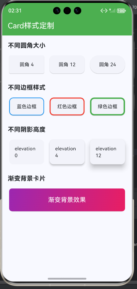
七、完整示例
class CardStyleCustomizationExample extends StatelessWidget {
const CardStyleCustomizationExample({super.key});
Widget build(BuildContext context) {
return Scaffold(
appBar: AppBar(title: const Text('Card样式定制')),
body: ListView(
padding: const EdgeInsets.all(16),
children: [
// 不同圆角
_buildSectionTitle('不同圆角大小'),
const SizedBox(height: 12),
Row(
children: [
Expanded(
child: Card(
shape: RoundedRectangleBorder(
borderRadius: BorderRadius.circular(4),
),
child: Container(
padding: const EdgeInsets.all(16),
child: Center(child: Text('圆角 4')),
),
),
),
const SizedBox(width: 8),
Expanded(
child: Card(
shape: RoundedRectangleBorder(
borderRadius: BorderRadius.circular(12),
),
child: Container(
padding: const EdgeInsets.all(16),
child: Center(child: Text('圆角 12')),
),
),
),
const SizedBox(width: 8),
Expanded(
child: Card(
shape: RoundedRectangleBorder(
borderRadius: BorderRadius.circular(24),
),
child: Container(
padding: const EdgeInsets.all(16),
child: Center(child: Text('圆角 24')),
),
),
),
],
),
const SizedBox(height: 24),
// 不同边框
_buildSectionTitle('不同边框样式'),
const SizedBox(height: 12),
Row(
children: [
Expanded(
child: Card(
shape: RoundedRectangleBorder(
borderRadius: BorderRadius.circular(12),
side: BorderSide(color: Colors.blue, width: 2),
),
child: Container(
padding: const EdgeInsets.all(16),
child: Center(child: Text('蓝色边框')),
),
),
),
const SizedBox(width: 8),
Expanded(
child: Card(
shape: RoundedRectangleBorder(
borderRadius: BorderRadius.circular(12),
side: BorderSide(color: Colors.red, width: 3),
),
child: Container(
padding: const EdgeInsets.all(16),
child: Center(child: Text('红色边框')),
),
),
),
const SizedBox(width: 8),
Expanded(
child: Card(
shape: RoundedRectangleBorder(
borderRadius: BorderRadius.circular(12),
side: BorderSide(color: Colors.green, width: 4),
),
child: Container(
padding: const EdgeInsets.all(16),
child: Center(child: Text('绿色边框')),
),
),
),
],
),
const SizedBox(height: 24),
// 不同阴影
_buildSectionTitle('不同阴影高度'),
const SizedBox(height: 12),
Row(
children: [
Expanded(
child: Card(
elevation: 0,
child: Container(
padding: const EdgeInsets.all(16),
child: Center(child: Text('elevation 0')),
),
),
),
const SizedBox(width: 8),
Expanded(
child: Card(
elevation: 4,
child: Container(
padding: const EdgeInsets.all(16),
child: Center(child: Text('elevation 4')),
),
),
),
const SizedBox(width: 8),
Expanded(
child: Card(
elevation: 12,
child: Container(
padding: const EdgeInsets.all(16),
child: Center(child: Text('elevation 12')),
),
),
),
],
),
const SizedBox(height: 24),
// 渐变背景
_buildSectionTitle('渐变背景卡片'),
const SizedBox(height: 12),
Card(
child: Container(
decoration: BoxDecoration(
borderRadius: BorderRadius.circular(8),
gradient: LinearGradient(
colors: [Colors.purple.shade400, Colors.pink.shade400],
begin: Alignment.topLeft,
end: Alignment.bottomRight,
),
),
padding: const EdgeInsets.all(20),
child: const Text(
'渐变背景效果',
style: TextStyle(color: Colors.white, fontSize: 18),
textAlign: TextAlign.center,
),
),
),
const SizedBox(height: 24),
// 主题色卡片
_buildSectionTitle('主题色卡片'),
const SizedBox(height: 12),
Wrap(
spacing: 12,
runSpacing: 12,
children: [
_buildColorCard(Colors.blue, '蓝色'),
_buildColorCard(Colors.green, '绿色'),
_buildColorCard(Colors.orange, '橙色'),
_buildColorCard(Colors.purple, '紫色'),
_buildColorCard(Colors.teal, '青色'),
_buildColorCard(Colors.indigo, '靛蓝'),
],
),
],
),
);
}
Widget _buildSectionTitle(String title) {
return Text(
title,
style: const TextStyle(fontSize: 18, fontWeight: FontWeight.bold),
);
}
Widget _buildColorCard(Color color, String label) {
return Card(
color: color.withOpacity(0.2),
shape: RoundedRectangleBorder(
borderRadius: BorderRadius.circular(12),
side: BorderSide(color: color, width: 2),
),
child: Container(
width: 100,
padding: const EdgeInsets.all(16),
child: Column(
children: [
Text(
label,
style: TextStyle(
color: color.shade800,
fontWeight: FontWeight.bold,
),
),
const SizedBox(height: 4),
Text(
'主题色',
style: TextStyle(
color: color.shade600,
fontSize: 12,
),
),
],
),
),
);
}
}
八、Card样式复用策略
提取样式为独立组件
当多个Card使用相同样式时,可以提取为独立组件:
样式复用方法对比
| 复用方式 | 复杂度 | 灵活性 | 适用场景 | 维护成本 |
|---|---|---|---|---|
| 组件封装 | 高 | 高 | 多个相同Card | 低 |
| 配置对象 | 中 | 中 | 样式集中管理 | 中 |
| mixin | 低 | 低 | 简单样式复用 | 中 |
| Theme | 低 | 低 | 全局样式统一 | 低 |
欢迎加入开源鸿蒙跨平台社区:https://openharmonycrossplatform.csdn.net

腾讯云面向开发者汇聚海量精品云计算使用和开发经验,营造开放的云计算技术生态圈。
更多推荐
 9
9 0
0- 0


 已为社区贡献13条内容

所有评论(0)