Flutter 三方库 flutter_shimmer 适配 OpenHarmony ————实现骨架屏
在移动应用开发中,骨架屏(Skeleton)已经成为提升用户体验的重要手段。当应用加载数据时,骨架屏能够提供视觉反馈,减少用户的等待感。本文将详细介绍如何在 Flutter 项目中集成shimmer库,并适配到 OpenHarmony 平台,实现多种类型的骨架屏效果。Flutter 的跨平台特性让我们可以使用一套代码覆盖多个平台,而 OpenHarmony 作为新兴的全场景分布式操作系统,为应用提
欢迎加入开源鸿蒙跨平台社区: https://openharmonycrossplatform.csdn.net
前言
在移动应用开发中,骨架屏(Skeleton)已经成为提升用户体验的重要手段。当应用加载数据时,骨架屏能够提供视觉反馈,减少用户的等待感。本文将详细介绍如何在 Flutter 项目中集成 shimmer 库,并适配到 OpenHarmony 平台,实现多种类型的骨架屏效果。
Flutter 的跨平台特性让我们可以使用一套代码覆盖多个平台,而 OpenHarmony 作为新兴的全场景分布式操作系统,为应用提供了更广阔的发展空间。将骨架屏功能适配到 OpenHarmony 平台,不仅能提升应用在该平台的用户体验,也能为跨平台开发积累宝贵经验。
混合工程结构深度解析
项目目录架构
当 Flutter 项目集成鸿蒙支持后,典型的项目结构会发生显著变化。以下是经过 ohos_flutter 插件初始化后的项目结构:
my_flutter_harmony_app/
├── lib/                          # Flutter 业务代码(基本不变)
│   ├── main.dart                 # 应用入口
│   ├── components/               # 组件目录
│   │   └── skeleton_screen.dart  # 骨架屏组件
│   └── utils/                    # 工具类目录
├── pubspec.yaml                  # Flutter 依赖配置
├── ohos/                         # 鸿蒙原生层(核心适配区)
│   ├── entry/                    # 主模块
│   │   └── src/main/
│   │       ├── ets/              # ArkTS 代码
│   │       │   ├── entryability/ # 入口能力
│   │       │   │   └── EntryAbility.ets
│   │       │   └── pages/        # 页面
│   │       │       └── Index.ets
│   │       ├── resources/        # 鸿蒙资源文件
│   │       └── module.json5      # 模块配置
│   ├── build-profile.json5       # 构建配置
│   └── oh-package.json5          # 鸿蒙依赖管理
└── README.md                     # 项目说明
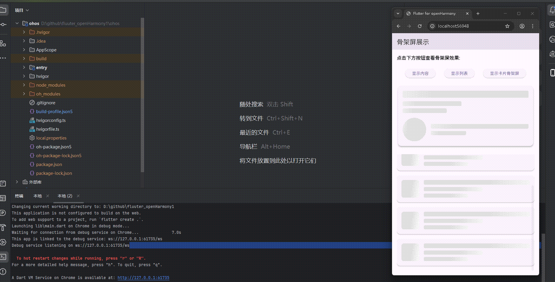
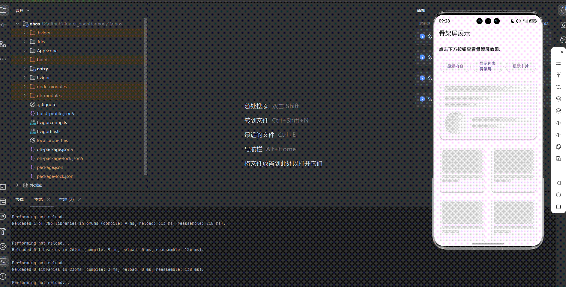
展示效果图片
Flutter 实时预览效果展示
运行到鸿蒙虚拟设备中效果展示
目录
引入第三方库 shimmer
在项目中引入了 shimmer 库,版本为 ^3.0.0,用于实现骨架屏效果。在 pubspec.yaml 文件中添加了如下依赖:
dependencies:
  flutter:
    sdk: flutter
  cupertino_icons: ^1.0.8
  shimmer: ^3.0.0
功能代码实现
骨架屏组件
创建了一个 SkeletonScreen 组件,用于展示和交互骨架屏效果。该组件包含以下功能:
- 基本骨架屏展示
- 列表骨架屏展示
- 卡片骨架屏展示
- 点击按钮切换骨架屏和实际内容
组件实现
import 'package:flutter/material.dart';
import 'package:shimmer/shimmer.dart';
class ShimmerBox extends StatelessWidget {
final double width;
final double height;
final BorderRadius borderRadius;
const ShimmerBox({
Key? key,
required this.width,
required this.height,
required this.borderRadius,
}) : super(key: key);
Widget build(BuildContext context) {
return Shimmer.fromColors(
baseColor: Colors.grey[300]!,
highlightColor: Colors.grey[100]!,
child: Container(
width: width,
height: height,
decoration: BoxDecoration(
color: Colors.white,
borderRadius: borderRadius,
),
),
);
}
}
class SkeletonScreen extends StatefulWidget {
const SkeletonScreen({super.key});
State<SkeletonScreen> createState() => _SkeletonScreenState();
}
class _SkeletonScreenState extends State<SkeletonScreen> {
bool _showSkeleton = true;
bool _showListSkeleton = false;
bool _showCardSkeleton = false;
void _toggleSkeleton() {
setState(() {
_showSkeleton = !_showSkeleton;
});
}
void _toggleListSkeleton() {
setState(() {
_showListSkeleton = !_showListSkeleton;
});
}
void _toggleCardSkeleton() {
setState(() {
_showCardSkeleton = !_showCardSkeleton;
});
}
Widget build(BuildContext context) {
return Scaffold(
appBar: AppBar(
title: const Text('骨架屏展示'),
),
body: Padding(
padding: const EdgeInsets.all(16.0),
child: Column(
crossAxisAlignment: CrossAxisAlignment.stretch,
children: [
const Text(
'点击下方按钮查看骨架屏效果:',
style: TextStyle(
fontSize: 16,
fontWeight: FontWeight.bold,
),
),
const SizedBox(height: 24),
// 按钮组
Row(
mainAxisAlignment: MainAxisAlignment.spaceEvenly,
children: [
ElevatedButton(
onPressed: _toggleSkeleton,
child: Text(_showSkeleton ? '显示内容' : '显示骨架屏'),
),
ElevatedButton(
onPressed: _toggleListSkeleton,
child: Text(_showListSkeleton ? '显示列表' : '显示列表骨架屏'),
),
ElevatedButton(
onPressed: _toggleCardSkeleton,
child: Text(_showCardSkeleton ? '显示卡片' : '显示卡片骨架屏'),
),
],
),
const SizedBox(height: 24),
// 基本骨架屏
if (_showSkeleton)
Card(
elevation: 4,
child: Padding(
padding: const EdgeInsets.all(16.0),
child: Column(
crossAxisAlignment: CrossAxisAlignment.start,
children: [
const ShimmerBox(
width: double.infinity,
height: 24,
borderRadius: BorderRadius.all(Radius.circular(4)),
),
const SizedBox(height: 12),
const ShimmerBox(
width: 200,
height: 16,
borderRadius: BorderRadius.all(Radius.circular(4)),
),
const SizedBox(height: 8),
const ShimmerBox(
width: 150,
height: 16,
borderRadius: BorderRadius.all(Radius.circular(4)),
),
const SizedBox(height: 16),
Row(
children: [
const ShimmerBox(
width: 80,
height: 80,
borderRadius: BorderRadius.all(Radius.circular(40)),
),
const SizedBox(width: 16),
Expanded(
child: Column(
crossAxisAlignment: CrossAxisAlignment.start,
children: [
const ShimmerBox(
width: double.infinity,
height: 16,
borderRadius: BorderRadius.all(Radius.circular(4)),
),
const SizedBox(height: 8),
const ShimmerBox(
width: 120,
height: 14,
borderRadius: BorderRadius.all(Radius.circular(4)),
),
],
),
),
],
),
],
),
),
)
else
Card(
elevation: 4,
child: Padding(
padding: const EdgeInsets.all(16.0),
child: Column(
crossAxisAlignment: CrossAxisAlignment.start,
children: [
const Text(
'示例标题',
style: TextStyle(
fontSize: 24,
fontWeight: FontWeight.bold,
),
),
const SizedBox(height: 12),
const Text('这是一段示例文本,用于展示内容加载后的效果。'),
const SizedBox(height: 8),
const Text('骨架屏可以提升用户体验,减少加载时的等待感。'),
const SizedBox(height: 16),
Row(
children: [
Container(
width: 80,
height: 80,
decoration: const BoxDecoration(
color: Colors.deepPurple,
shape: BoxShape.circle,
),
child: const Center(
child: Text(
'A',
style: TextStyle(
color: Colors.white,
fontSize: 32,
fontWeight: FontWeight.bold,
),
),
),
),
const SizedBox(width: 16),
Expanded(
child: Column(
crossAxisAlignment: CrossAxisAlignment.start,
children: [
const Text('用户名'),
const SizedBox(height: 8),
const Text('用户简介'),
],
),
),
],
),
],
),
),
),
const SizedBox(height: 24),
// 列表骨架屏
if (_showListSkeleton)
Expanded(
child: ListView.builder(
itemCount: 5,
itemBuilder: (context, index) {
return Card(
margin: const EdgeInsets.only(bottom: 16),
elevation: 2,
child: Padding(
padding: const EdgeInsets.all(16.0),
child: Row(
children: [
const ShimmerBox(
width: 60,
height: 60,
borderRadius: BorderRadius.all(Radius.circular(8)),
),
const SizedBox(width: 16),
Expanded(
child: Column(
crossAxisAlignment: CrossAxisAlignment.start,
children: [
const ShimmerBox(
width: double.infinity,
height: 16,
borderRadius: BorderRadius.all(Radius.circular(4)),
),
const SizedBox(height: 8),
const ShimmerBox(
width: 200,
height: 14,
borderRadius: BorderRadius.all(Radius.circular(4)),
),
const SizedBox(height: 8),
const ShimmerBox(
width: 150,
height: 14,
borderRadius: BorderRadius.all(Radius.circular(4)),
),
],
),
),
],
),
),
);
},
),
)
else if (!_showListSkeleton && _showCardSkeleton == false)
Expanded(
child: ListView.builder(
itemCount: 5,
itemBuilder: (context, index) {
return Card(
margin: const EdgeInsets.only(bottom: 16),
elevation: 2,
child: Padding(
padding: const EdgeInsets.all(16.0),
child: Row(
children: [
Container(
width: 60,
height: 60,
decoration: BoxDecoration(
color: Colors.deepPurple.shade200,
borderRadius: BorderRadius.circular(8),
),
),
const SizedBox(width: 16),
Expanded(
child: Column(
crossAxisAlignment: CrossAxisAlignment.start,
children: [
const Text(
'列表项标题',
style: TextStyle(
fontWeight: FontWeight.bold,
),
),
const SizedBox(height: 8),
const Text('这是列表项的描述文本,用于展示内容。'),
const SizedBox(height: 8),
const Text('2026-02-28'),
],
),
),
],
),
),
);
},
),
),
// 卡片骨架屏
if (_showCardSkeleton)
Expanded(
child: GridView.builder(
gridDelegate: const SliverGridDelegateWithFixedCrossAxisCount(
crossAxisCount: 2,
crossAxisSpacing: 16,
mainAxisSpacing: 16,
),
itemCount: 4,
itemBuilder: (context, index) {
return Card(
elevation: 2,
child: Padding(
padding: const EdgeInsets.all(16.0),
child: Column(
crossAxisAlignment: CrossAxisAlignment.start,
children: [
const ShimmerBox(
width: double.infinity,
height: 120,
borderRadius: BorderRadius.all(Radius.circular(8)),
),
const SizedBox(height: 12),
const ShimmerBox(
width: double.infinity,
height: 16,
borderRadius: BorderRadius.all(Radius.circular(4)),
),
const SizedBox(height: 8),
const ShimmerBox(
width: 100,
height: 14,
borderRadius: BorderRadius.all(Radius.circular(4)),
),
],
),
),
);
},
),
)
else if (!_showCardSkeleton && _showListSkeleton == false)
Expanded(
child: GridView.builder(
gridDelegate: const SliverGridDelegateWithFixedCrossAxisCount(
crossAxisCount: 2,
crossAxisSpacing: 16,
mainAxisSpacing: 16,
),
itemCount: 4,
itemBuilder: (context, index) {
return Card(
elevation: 2,
child: Padding(
padding: const EdgeInsets.all(16.0),
child: Column(
crossAxisAlignment: CrossAxisAlignment.start,
children: [
Container(
width: double.infinity,
height: 120,
decoration: BoxDecoration(
color: Colors.deepPurple.shade200,
borderRadius: BorderRadius.circular(8),
),
),
const SizedBox(height: 12),
const Text(
'卡片标题',
style: TextStyle(
fontWeight: FontWeight.bold,
),
),
const SizedBox(height: 8),
const Text('卡片描述文本'),
],
),
),
);
},
),
),
],
),
),
);
}
}
集成到首页
在 main.dart 文件中,将 SkeletonScreen 组件集成到首页:
import 'package:flutter/material.dart';
import 'package:aa/components/skeleton_screen.dart';
void main() {
runApp(const MyApp());
}
class MyApp extends StatelessWidget {
const MyApp({super.key});
Widget build(BuildContext context) {
return MaterialApp(
title: 'Flutter for openHarmony',
theme: ThemeData(
colorScheme: ColorScheme.fromSeed(seedColor: Colors.deepPurple),
useMaterial3: true,
),
debugShowCheckedModeBanner: false,
home: const MyHomePage(title: 'Flutter for openHarmony'),
);
}
}
class MyHomePage extends StatefulWidget {
const MyHomePage({super.key, required this.title});
final String title;
State<MyHomePage> createState() => _MyHomePageState();
}
class _MyHomePageState extends State<MyHomePage> {
Widget build(BuildContext context) {
return const SkeletonScreen();
}
}
组件使用方法
-
引入组件:在需要使用骨架屏组件的文件中,导入
skeleton_screen.dart文件。 -
添加到页面:将
SkeletonScreen组件添加到页面的 build 方法中。 -
交互操作:点击按钮可以切换骨架屏和实际内容的显示状态。
开发注意事项
-
骨架屏设计:根据实际内容的布局设计相应的骨架屏,保持视觉一致性。
-
性能优化:骨架屏应该轻量,避免过于复杂的动画效果影响性能。
-
用户体验:合理使用骨架屏,避免过度使用导致用户疲劳。
-
适配不同屏幕:确保骨架屏在不同屏幕尺寸下都能正确显示。
本次开发中容易遇到的问题
-
依赖安装问题:
- 确保在
pubspec.yaml文件中正确添加了flutter_shimmer依赖 - 运行
flutter pub get来安装依赖
- 确保在
-
骨架屏布局问题:
- 确保骨架屏的布局与实际内容的布局一致,避免切换时的视觉跳动
- 调整骨架屏元素的大小和位置,使其与实际内容匹配
-
性能问题:
- 避免在骨架屏中使用过于复杂的动画效果
- 对于长列表,考虑使用分页加载或虚拟列表
-
OpenHarmony 适配:
- 确保骨架屏动画在 OpenHarmony 平台上正常运行
- 测试不同屏幕尺寸下的显示效果
-
状态管理:
- 正确管理骨架屏和实际内容的显示状态
- 确保数据加载完成后能及时切换到实际内容
-
布局溢出问题:
- 确保骨架屏元素不会导致布局溢出
- 合理设置骨架屏元素的尺寸和间距
总结本次开发中用到的技术点
-
Flutter 组件化开发:
- 创建了独立的
SkeletonScreen组件 - 实现了组件的状态管理和生命周期
- 创建了独立的
-
第三方库集成:
- 集成了
flutter_shimmer库用于实现骨架屏效果 - 了解了如何在 Flutter 项目中添加和使用第三方依赖
- 集成了
-
骨架屏实现:
- 使用
ShimmerBox组件创建骨架屏效果 - 实现了不同类型的骨架屏(基本、列表、卡片)
- 使用
-
用户交互:
- 实现了按钮点击事件处理
- 添加了骨架屏和实际内容的切换功能
-
布局设计:
- 使用 Card 组件展示内容
- 实现了响应式布局,适应不同屏幕尺寸
- 使用 ListView 和 GridView 实现列表和卡片布局
-
状态管理:
- 使用
setState管理组件状态 - 维护骨架屏的显示状态
- 使用
-
OpenHarmony 适配:
- 确保代码在 OpenHarmony 平台上正常运行
- 考虑了平台特定的显示和交互特性
-
用户体验优化:
- 通过骨架屏提升加载过程中的用户体验
- 实现了平滑的内容切换效果
通过本次开发,成功实现了 Flutter 三方库 flutter_shimmer 在 OpenHarmony 平台上的适配,创建了一个功能完整的骨架屏展示应用,包含了点击交互效果和多种类型的骨架屏展示。

腾讯云面向开发者汇聚海量精品云计算使用和开发经验,营造开放的云计算技术生态圈。
更多推荐
 15
15 0
0- 0


 已为社区贡献23条内容

所有评论(0)