高校四六级报名管理系统 —— 基于 Flutter × OpenHarmony 的报名状态卡片实现解析
本文介绍了基于Flutter和OpenHarmony的高校四六级报名管理系统开发方案,重点解析了"报名状态卡片"组件的实现。系统通过跨端技术实现多平台适配,核心功能包括报名状态展示、考试级别选择和操作入口。文章详细拆解了卡片组件的代码实现,展示了如何利用Flutter的Material设计规范构建美观、响应式的UI界面,包括状态标签、费用显示和报名按钮等元素。设计上采用主题适配
文章目录
高校四六级报名管理系统 —— 基于 Flutter × OpenHarmony 的报名状态卡片实现解析
前言
在现代高校信息化管理中,四六级考试报名是一个高频、标准化的业务场景。传统的网页或单端应用往往存在跨平台适配难、交互体验不统一的问题。随着 Flutter 与 OpenHarmony 的崛起,我们可以通过跨端开发实现一次开发、多端运行的解决方案,从而极大提升系统的开发效率和用户体验。
本文将以“报名状态卡片”为核心功能模块,结合 Flutter × OpenHarmony 跨端开发技术,讲解如何从零构建一个美观、交互友好的报名状态组件,并对代码进行详细拆解解析。
背景
高校四六级考试报名管理系统主要包括以下功能模块:
- 报名状态展示:显示学生当前报名状态,如“可报名”“已报名”“已缴费”等。
- 考试级别选择:区分四级和六级,并显示相应报名费用。
- 操作入口:提供“立即报名”按钮,触发报名逻辑。
- 跨端适配:支持 Android、iOS、OpenHarmony 设备等多端运行。
在实现过程中,UI 模块需要做到简洁、美观、响应式,而业务逻辑模块需要确保数据准确、操作安全。Flutter × OpenHarmony 的组合,使得这一需求可以高效实现。
Flutter × OpenHarmony 跨端开发介绍
Flutter 是 Google 推出的跨平台 UI 框架,支持 Android、iOS、Web 等多个平台。
OpenHarmony 是华为开源的分布式操作系统,支持多设备协同和轻量化应用部署。
结合二者,我们可以:
- 利用 Flutter 构建统一 UI 组件,保证视觉一致性;
- 利用 OpenHarmony 的多设备特性,实现报名数据在手机、平板、智能屏等端同步;
- 通过统一的状态管理和主题体系,保证组件样式和交互逻辑统一。
开发核心代码及详细解析
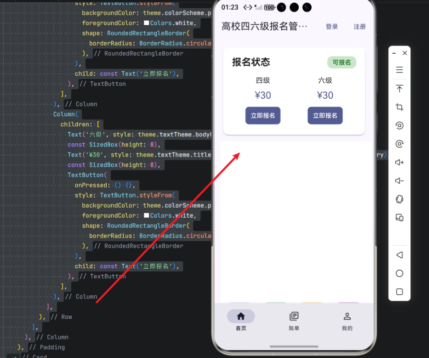
以下为“报名状态卡片”的核心实现代码:
Widget _buildRegistrationStatus(ThemeData theme) {
  return Card(
    elevation: 2,
    shape: RoundedRectangleBorder(
      borderRadius: BorderRadius.circular(12),
    ),
    child: Padding(
      padding: const EdgeInsets.all(20),
      child: Column(
        crossAxisAlignment: CrossAxisAlignment.start,
        children: [
          Row(
            mainAxisAlignment: MainAxisAlignment.spaceBetween,
            children: [
              Text(
                '报名状态',
                style: theme.textTheme.titleLarge?.copyWith(
                  fontWeight: FontWeight.bold,
                ),
              ),
              Container(
                padding: const EdgeInsets.symmetric(horizontal: 12, vertical: 4),
                decoration: BoxDecoration(
                  color: Colors.green[100],
                  borderRadius: BorderRadius.circular(12),
                ),
                child: Text(
                  '可报名',
                  style: TextStyle(
                    color: Colors.green[800],
                    fontWeight: FontWeight.bold,
                  ),
                ),
              ),
            ],
          ),
          const SizedBox(height: 16),
          Row(
            mainAxisAlignment: MainAxisAlignment.spaceAround,
            children: [
              Column(
                children: [
                  Text('四级', style: theme.textTheme.bodyLarge),
                  const SizedBox(height: 8),
                  Text('¥30', style: theme.textTheme.titleLarge?.copyWith(color: theme.colorScheme.primary)),
                  const SizedBox(height: 8),
                  TextButton(
                    onPressed: () {},
                    style: TextButton.styleFrom(
                      backgroundColor: theme.colorScheme.primary,
                      foregroundColor: Colors.white,
                      shape: RoundedRectangleBorder(
                        borderRadius: BorderRadius.circular(8),
                      ),
                    ),
                    child: const Text('立即报名'),
                  ),
                ],
              ),
              Column(
                children: [
                  Text('六级', style: theme.textTheme.bodyLarge),
                  const SizedBox(height: 8),
                  Text('¥30', style: theme.textTheme.titleLarge?.copyWith(color: theme.colorScheme.primary)),
                  const SizedBox(height: 8),
                  TextButton(
                    onPressed: () {},
                    style: TextButton.styleFrom(
                      backgroundColor: theme.colorScheme.primary,
                      foregroundColor: Colors.white,
                      shape: RoundedRectangleBorder(
                        borderRadius: BorderRadius.circular(8),
                      ),
                    ),
                    child: const Text('立即报名'),
                  ),
                ],
              ),
            ],
          ),
        ],
      ),
    ),
  );
}
逐行解析
-
Widget _buildRegistrationStatus(ThemeData theme)
定义一个私有函数,返回一个 Widget,接收ThemeData参数用于动态适配主题样式。 -
Card
使用 Material 风格的卡片组件:elevation: 2提供轻微阴影,增加层次感;shape设置圆角,使用RoundedRectangleBorder。
-
Padding
对卡片内容整体设置内边距20px,确保视觉舒适。 -
Column
使用纵向布局:crossAxisAlignment: CrossAxisAlignment.start保证左对齐;- 子组件包括状态标题和级别报名信息。
-
Row(报名状态行)
mainAxisAlignment: MainAxisAlignment.spaceBetween:标题和状态标签左右分布;- 左侧
Text('报名状态'):使用主题titleLarge加粗; - 右侧
Container:状态标签,“可报名”,背景色淡绿,文字深绿,圆角设计。
-
SizedBox(height: 16)
用于状态行与报名信息行之间的间距。 -
Row(四级/六级报名信息行)
-
mainAxisAlignment: MainAxisAlignment.spaceAround:两列信息均匀分布; -
每列
Column包含:Text('四级'/'六级')显示考试级别;Text('¥30')显示费用,颜色使用主题主色;TextButton:“立即报名”按钮,背景色为主题主色,文字白色,圆角 8px;onPressed: () {}目前为空,可绑定报名逻辑。
-
设计亮点
- 跨端统一风格
使用ThemeData和colorScheme保证不同平台色彩和字体一致。 - 响应式布局
Row + Column 的组合适合不同屏幕尺寸,支持手机、平板、鸿蒙屏幕。 - 可扩展性强
增加其他考试类型只需复制 Column 并修改参数即可。
心得
- Flutter 的优势明显
对 UI 组件的控制非常精细,卡片、圆角、阴影、按钮样式都可以灵活配置。 - OpenHarmony 跨端适配
结合 Flutter 的渲染能力,可以在鸿蒙设备上获得原生体验,无需额外适配代码。 - UI 与业务解耦
UI 层独立封装,未来可通过状态管理(如 Provider、Riverpod、GetX)与后台数据交互,实现动态报名状态显示。
总结
本文详细讲解了高校四六级报名管理系统中“报名状态卡片”的实现方案。通过 Flutter × OpenHarmony 的跨端开发,开发者可以一次编写组件,多端运行,同时保持视觉和交互体验一致。
关键要点包括:
- 使用
Card + Column + Row实现模块化布局; - 利用
ThemeData动态适配主题风格; - 按钮、标签、间距等 UI 细节保证可用性和美观性;
- 代码可扩展、易维护,为整个报名系统提供良好基础。
通过本文示例,开发者可以快速上手高校报名系统的 UI 模块开发,也为更多校园管理应用提供参考。
欢迎加入开源鸿蒙跨平台社区:https://openharmonycrossplatform.csdn.net

腾讯云面向开发者汇聚海量精品云计算使用和开发经验,营造开放的云计算技术生态圈。
更多推荐
 9
9 0
0- 0


 已为社区贡献19条内容

所有评论(0)