Flutter三方库 font_awesome_flutter 适配 OpenHarmony —— 实现图标
图标是移动应用界面的重要组成部分,它们能够直观地传达功能和操作意图,提升用户体验。Font Awesome 是一套广泛使用的图标库,提供了丰富的图标资源。在 Flutter 中,我们可以通过 font_awesome_flutter 库来轻松使用这些图标。本次开发任务聚焦于如何在 OpenHarmony 平台上实现 Font Awesome 图标的适配。我们将通过抽离组件的方式,构建一个可复用的图
欢迎加入开源鸿蒙跨平台社区: https://openharmonycrossplatform.csdn.net
前言:实现 Flutter Font Awesome 图标在 OpenHarmony 上的适配
图标是移动应用界面的重要组成部分,它们能够直观地传达功能和操作意图,提升用户体验。Font Awesome 是一套广泛使用的图标库,提供了丰富的图标资源。在 Flutter 中,我们可以通过 font_awesome_flutter 库来轻松使用这些图标。
本次开发任务聚焦于如何在 OpenHarmony 平台上实现 Font Awesome 图标的适配。我们将通过抽离组件的方式,构建一个可复用的图标展示组件,并直接集成到首页显示,同时添加点击交互效果,让用户能够直观感受图标的使用效果。
通过本次实践,我们不仅能够掌握 font_awesome_flutter 库的基本使用方法,还能了解 Flutter 应用在 OpenHarmony 平台上的适配要点,为后续更复杂的功能开发打下基础。
混合工程结构深度解析
项目目录架构
当Flutter项目集成鸿蒙支持后,典型的项目结构会发生显著变化。以下是经过ohos_flutter插件初始化后的项目结构:
my_flutter_harmony_app/
├── lib/                          # Flutter业务代码(基本不变)
│   ├── main.dart                 # 应用入口
│   ├── home_page.dart           # 首页
│   └── utils/
│       └── platform_utils.dart  # 平台工具类
├── pubspec.yaml                  # Flutter依赖配置
├── ohos/                         # 鸿蒙原生层(核心适配区)
│   ├── entry/                    # 主模块
│   │   └── src/main/
│   │       ├── ets/              # ArkTS代码
│   │       │   ├── MainAbility/
│   │       │   │   ├── MainAbility.ts       # 主Ability
│   │       │   │   └── MainAbilityContext.ts
│   │       │   └── pages/
│   │       │       ├── Index.ets           # 主页面
│   │       │       └── Splash.ets          # 启动页
│   │       ├── resources/        # 鸿蒙资源文件
│   │       │   ├── base/
│   │       │   │   ├── element/  # 字符串等
│   │       │   │   ├── media/    # 图片资源
│   │       │   │   └── profile/  # 配置文件
│   │       │   └── en_US/        # 英文资源
│   │       └── config.json       # 应用核心配置
│   ├── ohos_test/               # 测试模块
│   ├── build-profile.json5      # 构建配置
│   └── oh-package.json5         # 鸿蒙依赖管理
└── README.md
展示效果图片
flutter 实时预览 效果展示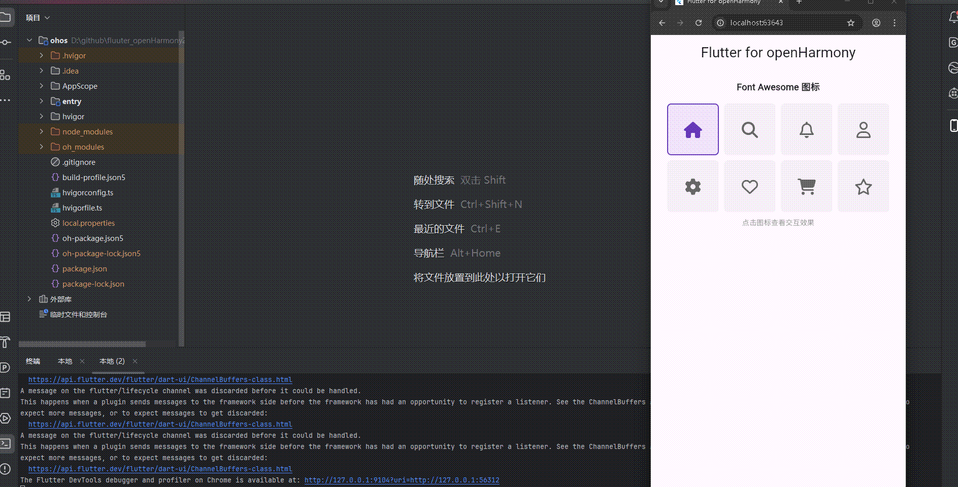
运行到鸿蒙虚拟设备中效果展示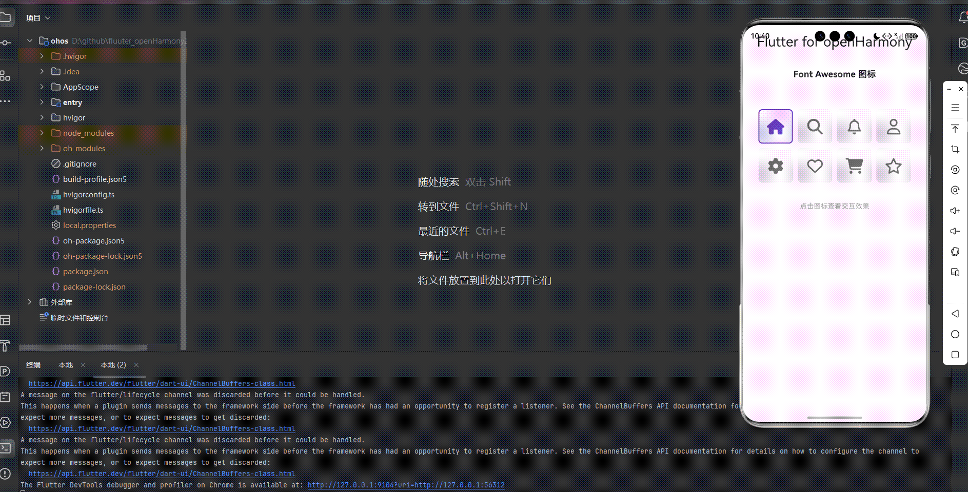
目录
- 前言:实现 Flutter Font Awesome 图标在 OpenHarmony 上的适配
- 混合工程结构深度解析
- 展示效果图片
- 引入第三方库 font_awesome_flutter
- 功能代码实现
- 本次开发中容易遇到的问题
- 总结本次开发中用到的技术点
引入第三方库 font_awesome_flutter
要使用 font_awesome_flutter 库,首先需要在 pubspec.yaml 文件中添加依赖:
dependencies:
  flutter:
    sdk: flutter
  cupertino_icons: ^1.0.8
  font_awesome_flutter: ^10.7.0
然后运行 flutter pub get 命令来获取依赖。
功能代码实现
Font Awesome 图标组件
我们创建了一个专门的 FontAwesomeIconComponent 组件来展示 Font Awesome 图标:
import 'package:flutter/material.dart';
import 'package:font_awesome_flutter/font_awesome_flutter.dart';
class FontAwesomeIconComponent extends StatefulWidget {
const FontAwesomeIconComponent({Key? key}) : super(key: key);
State<FontAwesomeIconComponent> createState() => _FontAwesomeIconComponentState();
}
class _FontAwesomeIconComponentState extends State<FontAwesomeIconComponent> {
int _selectedIconIndex = 0;
final List<IconData> _icons = [
FontAwesomeIcons.home,
FontAwesomeIcons.search,
FontAwesomeIcons.bell,
FontAwesomeIcons.user,
FontAwesomeIcons.gear,
FontAwesomeIcons.heart,
FontAwesomeIcons.shoppingCart,
FontAwesomeIcons.star,
];
void _selectIcon(int index) {
setState(() {
_selectedIconIndex = index;
});
ScaffoldMessenger.of(context).showSnackBar(
SnackBar(
content: Text('点击了图标 ${index + 1}'),
duration: const Duration(seconds: 1),
),
);
}
Widget build(BuildContext context) {
return Container(
padding: const EdgeInsets.all(16.0),
child: Column(
children: [
const Text(
'Font Awesome 图标',
style: TextStyle(fontSize: 18, fontWeight: FontWeight.bold),
),
const SizedBox(height: 20),
GridView.builder(
shrinkWrap: true,
physics: const NeverScrollableScrollPhysics(),
gridDelegate: const SliverGridDelegateWithFixedCrossAxisCount(
crossAxisCount: 4,
crossAxisSpacing: 10.0,
mainAxisSpacing: 10.0,
),
itemCount: _icons.length,
itemBuilder: (context, index) {
return GestureDetector(
onTap: () => _selectIcon(index),
child: Container(
decoration: BoxDecoration(
color: _selectedIconIndex == index
? Colors.deepPurple.withOpacity(0.1)
: Colors.grey.withOpacity(0.1),
borderRadius: BorderRadius.circular(8),
border: _selectedIconIndex == index
? Border.all(color: Colors.deepPurple, width: 2)
: null,
),
child: Center(
child: FaIcon(
_icons[index],
size: 32,
color: _selectedIconIndex == index
? Colors.deepPurple
: Colors.grey[700],
),
),
),
);
},
),
const SizedBox(height: 10),
const Text(
'点击图标查看交互效果',
style: TextStyle(fontSize: 14, color: Colors.grey),
),
],
),
);
}
}
集成到首页
将组件集成到 main.dart 文件中:
import 'package:flutter/material.dart';
import 'components/font_awesome_icon_component.dart';
void main() {
runApp(const MyApp());
}
class MyApp extends StatelessWidget {
const MyApp({super.key});
Widget build(BuildContext context) {
return MaterialApp(
title: 'Flutter for openHarmony',
theme: ThemeData(
colorScheme: ColorScheme.fromSeed(seedColor: Colors.deepPurple),
useMaterial3: true,
),
debugShowCheckedModeBanner: false,
home: const MyHomePage(title: 'Flutter for openHarmony'),
);
}
}
class MyHomePage extends StatefulWidget {
const MyHomePage({super.key, required this.title});
final String title;
State<MyHomePage> createState() => _MyHomePageState();
}
class _MyHomePageState extends State<MyHomePage> {
Widget build(BuildContext context) {
return Scaffold(
body: SingleChildScrollView(
padding: const EdgeInsets.all(16.0),
child: Column(
children: [
Text(
widget.title,
style: Theme.of(context).textTheme.headlineMedium,
),
const SizedBox(height: 20),
const FontAwesomeIconComponent(),
],
),
),
);
}
}
本次开发中容易遇到的问题
-
图标名称错误:在使用 Font Awesome 图标时,需要注意图标名称的正确性。例如,
FontAwesomeIcons.settings在某些版本中可能不存在,需要使用FontAwesomeIcons.gear代替。 -
依赖版本问题:font_awesome_flutter 库的不同版本可能有不同的图标集合和API,需要选择适合项目的版本。
-
布局适配问题:在不同屏幕尺寸的设备上,图标网格布局可能需要调整,以确保图标显示美观。
-
性能优化问题:如果展示大量图标,可能会影响应用性能,建议合理控制图标数量或使用懒加载。
-
平台兼容性问题:在 OpenHarmony 平台上,需要确保 font_awesome_flutter 库的功能能够正常工作,可能需要进行一些平台特定的调整。
总结本次开发中用到的技术点
-
Flutter 状态管理:使用
StatefulWidget和setState()来管理组件状态,实现图标选择效果。 -
Font Awesome 图标集成:使用
font_awesome_flutter库提供的FaIcon组件来展示各种图标。 -
网格布局:使用
GridView.builder实现图标网格布局,方便展示多个图标。 -
手势检测:使用
GestureDetector实现图标点击交互,触发相应的操作。 -
布局设计:使用
Container、Column、SizedBox等布局组件构建用户界面,确保界面美观整洁。 -
用户反馈:使用
ScaffoldMessenger显示 SnackBar 提示,提供用户交互反馈。 -
OpenHarmony 适配:确保代码在 OpenHarmony 平台上正常运行,保持跨平台兼容性。
欢迎加入开源鸿蒙跨平台社区: https://openharmonycrossplatform.csdn.net

腾讯云面向开发者汇聚海量精品云计算使用和开发经验,营造开放的云计算技术生态圈。
更多推荐
 13
13 0
0- 0


 已为社区贡献17条内容

所有评论(0)