Flutter for OpenHarmony轻量级开源记事本app实战:反馈功能
本文介绍了Flutter应用中反馈系统的设计与实现。系统采用GetX框架管理状态,核心FeedbackService类处理反馈提交、历史记录加载等功能。数据模型定义了包含标题、内容、分类、附件等完整属性的Feedback类,支持JSON序列化。系统具备本地存储、网络提交、异常处理等机制,通过响应式编程确保UI状态同步。设计注重健壮性和用户体验,包括防止重复提交、数据容错处理等功能,为应用提供完整的
设计理念
反馈功能是应用与用户沟通的重要桥梁,它让用户能够报告问题、提出建议和分享使用体验。一个好的反馈系统应该提供便捷的反馈渠道、智能的问题分类和及时的响应机制。本文将详细介绍如何实现一个功能完整的反馈系统。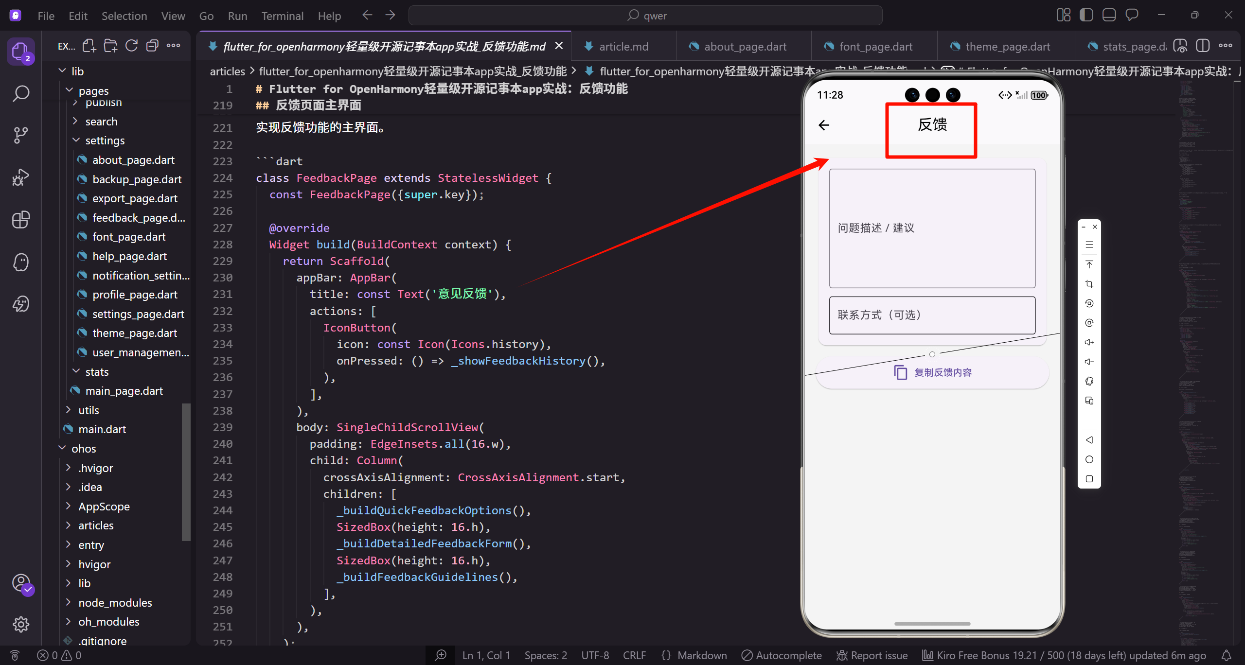
反馈服务的核心架构
反馈系统的核心是FeedbackService类,它负责管理所有反馈相关的业务逻辑。我们首先需要导入必要的依赖包,并定义服务类的基本结构。
import 'package:flutter/material.dart';
import 'package:get/get.dart';
import 'package:flutter_screenutil/flutter_screenutil.dart';
import 'package:shared_preferences/shared_preferences.dart';
import 'package:http/http.dart' as http;
import 'dart:convert';
这里导入了Flutter的核心包和第三方依赖。GetX用于状态管理和依赖注入,提供响应式编程能力。ScreenUtil用于屏幕适配,确保在不同设备上的显示效果一致。SharedPreferences用于本地数据持久化,http包用于网络请求。这些依赖共同构成了反馈系统的技术基础。
class FeedbackService extends GetxController {
var isSubmitting = false.obs;
var feedbackHistory = <Feedback>[].obs;
var unreadCount = 0.obs;
void onInit() {
super.onInit();
initialize();
}
FeedbackService继承自GetxController,这使得它能够被GetX框架管理生命周期。isSubmitting是一个响应式布尔值,用于控制提交按钮的状态,防止重复提交。feedbackHistory存储用户的历史反馈记录,使用obs使其成为可观察对象。unreadCount记录未读的反馈回复数量。onInit方法在控制器初始化时自动调用,用于执行初始化逻辑。
  Future<void> initialize() async {
    await _loadFeedbackHistory();
    await _checkUnreadReplies();
  }

  Future<void> _loadFeedbackHistory() async {
    final prefs = await SharedPreferences.getInstance();
    final historyJson = prefs.getString('feedback_history');
    if (historyJson != null) {
      final List<dynamic> decoded = json.decode(historyJson);
      feedbackHistory.value = decoded.map((e) => Feedback.fromJson(e)).toList();
    }
  }
initialize方法负责加载本地存储的反馈历史和检查未读回复。_loadFeedbackHistory从SharedPreferences中读取JSON格式的历史数据,然后反序列化为Feedback对象列表。这种设计确保了应用重启后用户仍能查看之前的反馈记录。使用异步操作避免阻塞UI线程,提升用户体验。
  Future<void> submitFeedback(Feedback feedback) async {
    isSubmitting.value = true;

    try {
      await _sendFeedbackToServer(feedback);
      feedbackHistory.insert(0, feedback);
      await _saveFeedbackHistory();
      Get.snackbar('成功', '反馈已提交,感谢您的建议',
        snackPosition: SnackPosition.BOTTOM);
    } catch (e) {
      Get.snackbar('错误', '提交失败:${e.toString()}',
        snackPosition: SnackPosition.BOTTOM);
    } finally {
      isSubmitting.value = false;
    }
  }
submitFeedback是提交反馈的核心方法。首先设置isSubmitting为true,禁用提交按钮防止重复提交。使用try-catch-finally结构确保异常处理的完整性。成功提交后将反馈插入到历史记录的开头,使最新的反馈显示在最前面。finally块确保无论成功或失败,isSubmitting都会被重置,避免UI状态异常。
反馈数据模型设计
反馈数据模型是整个系统的核心数据结构,它定义了反馈信息的完整属性和行为。一个良好的数据模型应该包含足够的信息用于问题定位,同时保持结构的清晰性。
class Feedback {
  final String id;
  final String title;
  final String content;
  final FeedbackType type;
  final FeedbackCategory category;
  final List<String> attachments;
  final String userEmail;
  final String deviceInfo;
  final DateTime createdAt;
  final String status;
Feedback类定义了反馈的完整数据结构。id使用时间戳生成,确保唯一性。title和content是反馈的核心内容,title用于快速识别问题,content提供详细描述。type和category提供双重分类维度,便于问题的归类和统计。attachments数组支持多个附件,如截图或日志文件。deviceInfo记录设备和系统信息,帮助开发者重现问题。
  const Feedback({
    required this.id,
    required this.title,
    required this.content,
    required this.type,
    required this.category,
    this.attachments = const [],
    this.userEmail = '',
    this.deviceInfo = '',
    required this.createdAt,
    this.status = 'pending',
  });
构造函数使用const修饰符,允许创建编译时常量,提升性能。必填字段使用required关键字标记,确保创建对象时提供必要信息。可选字段提供默认值,如attachments默认为空列表,status默认为pending(待处理)。这种设计在保证数据完整性的同时,也提供了使用的灵活性。
  Map<String, dynamic> toJson() {
    return {
      'id': id,
      'title': title,
      'content': content,
      'type': type.name,
      'category': category.name,
      'attachments': attachments,
      'userEmail': userEmail,
      'deviceInfo': deviceInfo,
      'createdAt': createdAt.toIso8601String(),
      'status': status,
    };
  }
toJson方法实现对象到JSON的序列化,用于数据持久化和网络传输。枚举类型使用name属性转换为字符串,保证跨平台兼容性。DateTime使用ISO8601格式字符串,这是国际标准的日期时间表示方法。这种序列化方式确保了数据在不同环境下的一致性和可读性。
  factory Feedback.fromJson(Map<String, dynamic> json) {
    return Feedback(
      id: json['id'],
      title: json['title'],
      content: json['content'],
      type: FeedbackType.values.firstWhere(
        (e) => e.name == json['type'],
        orElse: () => FeedbackType.bug,
      ),
      category: FeedbackCategory.values.firstWhere(
        (e) => e.name == json['category'],
        orElse: () => FeedbackCategory.general,
      ),
fromJson工厂构造函数实现JSON到对象的反序列化。使用factory关键字允许返回缓存的实例或子类实例。枚举类型的反序列化使用firstWhere方法查找匹配的枚举值,orElse参数提供默认值,防止数据异常时抛出异常。这种容错设计提高了系统的健壮性,即使数据格式有变化也能正常运行。
      attachments: List<String>.from(json['attachments'] ?? []),
      userEmail: json['userEmail'] ?? '',
      deviceInfo: json['deviceInfo'] ?? '',
      createdAt: DateTime.parse(json['createdAt']),
      status: json['status'] ?? 'pending',
    );
  }
}
对于可能为null的字段,使用??运算符提供默认值,避免空指针异常。List.from方法创建新的列表实例,防止共享引用导致的数据污染。DateTime.parse解析ISO8601格式的日期字符串。这种防御性编程确保了即使接收到不完整的数据,系统也能正常工作,不会崩溃。
反馈类型枚举定义
反馈类型的分类是反馈系统的重要组成部分,它帮助开发者快速识别问题的性质。通过枚举类型和扩展方法,我们可以为每种类型提供丰富的元数据。
enum FeedbackType {
  bug('Bug报告'),
  feature('功能建议'),
  improvement('改进建议'),
  other('其他');

  final String label;
  const FeedbackType(this.label);
}
FeedbackType枚举定义了四种主要的反馈类型。bug用于报告程序错误和异常行为,feature用于提出新功能需求,improvement用于现有功能的优化建议,other用于其他类型的反馈。每个枚举值关联一个label字符串,这是Dart 2.17引入的增强枚举特性,使枚举更加强大和灵活。
extension FeedbackTypeExtension on FeedbackType {
  String get displayName {
    switch (this) {
      case FeedbackType.bug:
        return 'Bug报告';
      case FeedbackType.feature:
        return '功能建议';
      case FeedbackType.improvement:
        return '改进建议';
      case FeedbackType.other:
        return '其他';
    }
  }
扩展方法为FeedbackType添加displayName属性,返回用户友好的显示名称。使用switch语句确保所有枚举值都被处理,如果添加新的枚举值而忘记处理,编译器会发出警告。这种设计将显示逻辑与数据模型分离,便于国际化和主题定制。
  IconData get iconData {
    switch (this) {
      case FeedbackType.bug:
        return Icons.bug_report;
      case FeedbackType.feature:
        return Icons.lightbulb_outline;
      case FeedbackType.improvement:
        return Icons.build;
      case FeedbackType.other:
        return Icons.chat_bubble_outline;
    }
  }
iconData属性为每种反馈类型提供对应的Material图标。bug使用bug_report图标,feature使用灯泡图标象征创意,improvement使用工具图标表示优化,other使用对话气泡图标。这种视觉化设计提升了用户体验,使不同类型的反馈一目了然。
  Color get color {
    switch (this) {
      case FeedbackType.bug:
        return Colors.red;
      case FeedbackType.feature:
        return Colors.blue;
      case FeedbackType.improvement:
        return Colors.orange;
      case FeedbackType.other:
        return Colors.grey;
    }
  }
}
color属性为每种类型分配特定的颜色,用于UI中的视觉区分。红色表示bug的紧急性,蓝色表示功能建议的创新性,橙色表示改进的优化性,灰色表示其他类型的中性。这种色彩编码系统帮助用户和开发者快速识别反馈的性质和优先级。
反馈分类枚举定义
除了类型分类,我们还需要按问题领域进行分类,这样可以将反馈路由到相应的开发团队。
enum FeedbackCategory {
  ui('界面问题'),
  functionality('功能问题'),
  performance('性能问题'),
  data('数据问题'),
  compatibility('兼容性问题'),
  general('一般问题');

  final String label;
  const FeedbackCategory(this.label);
}
FeedbackCategory枚举定义了六个问题领域分类。ui分类涵盖界面显示、布局和交互问题,functionality涵盖功能逻辑错误,performance涵盖卡顿、内存泄漏等性能问题,data涵盖数据存储和同步问题,compatibility涵盖设备和系统兼容性问题,general用于无法明确分类的问题。这种细粒度的分类有助于问题的快速定位和分配。
extension FeedbackCategoryExtension on FeedbackCategory {
  String get displayName {
    switch (this) {
      case FeedbackCategory.ui:
        return '界面问题';
      case FeedbackCategory.functionality:
        return '功能问题';
      case FeedbackCategory.performance:
        return '性能问题';
      case FeedbackCategory.data:
        return '数据问题';
      case FeedbackCategory.compatibility:
        return '兼容性问题';
      case FeedbackCategory.general:
        return '一般问题';
    }
  }
displayName扩展方法提供分类的显示名称。与FeedbackType类似,使用switch语句确保完整性。这种一致的设计模式使代码易于理解和维护。分类名称采用中文,符合国内用户的使用习惯,提升了用户体验。
  String get description {
    switch (this) {
      case FeedbackCategory.ui:
        return '界面显示异常、布局错乱、交互问题等';
      case FeedbackCategory.functionality:
        return '功能无法使用、逻辑错误、操作失败等';
      case FeedbackCategory.performance:
        return '应用卡顿、响应慢、内存占用高等';
      case FeedbackCategory.data:
        return '数据丢失、同步失败、存储异常等';
      case FeedbackCategory.compatibility:
        return '特定设备或系统版本的兼容性问题';
      case FeedbackCategory.general:
        return '其他类型的问题或建议';
    }
  }
}
description属性为每个分类提供详细说明,帮助用户选择正确的分类。这些描述列举了典型的问题场景,降低了用户的选择难度。清晰的分类说明可以提高反馈的质量,减少分类错误,使开发者能够更快地理解和处理问题。
反馈页面主界面设计
反馈页面是用户与系统交互的主要入口,需要提供清晰的导航和完整的功能布局。我们采用Scaffold作为页面骨架,组织各个功能模块。
class FeedbackPage extends StatefulWidget {
const FeedbackPage({super.key});
State<FeedbackPage> createState() => _FeedbackPageState();
}
class _FeedbackPageState extends State<FeedbackPage> {
final _feedbackService = Get.find<FeedbackService>();
final _formKey = GlobalKey<FormState>();
FeedbackPage使用StatefulWidget因为需要管理表单状态和用户输入。通过Get.find获取FeedbackService实例,这是GetX依赖注入的标准用法。GlobalKey用于表单验证,它提供了访问表单状态的能力,可以触发验证和保存操作。这种设计将UI和业务逻辑分离,提高了代码的可测试性。
Widget build(BuildContext context) {
return Scaffold(
appBar: AppBar(
title: const Text('意见反馈'),
actions: [
IconButton(
icon: const Icon(Icons.history),
onPressed: () => _showFeedbackHistory(),
),
],
),
AppBar提供页面标题和操作按钮。历史记录按钮放在右上角,符合用户的操作习惯。使用IconButton而不是文字按钮节省空间,同时保持界面简洁。onPressed回调触发历史记录页面的显示,这种设计让用户可以随时查看之前提交的反馈。
      body: SingleChildScrollView(
        padding: EdgeInsets.all(16.w),
        child: Form(
          key: _formKey,
          child: Column(
            crossAxisAlignment: CrossAxisAlignment.start,
            children: [
              _buildQuickFeedbackOptions(),
              SizedBox(height: 24.h),
              _buildDetailedFeedbackForm(),
              SizedBox(height: 24.h),
              _buildFeedbackGuidelines(),
            ],
          ),
        ),
      ),
    );
  }
}
SingleChildScrollView确保内容超出屏幕时可以滚动,避免内容被截断。Form组件包裹所有输入控件,统一管理验证逻辑。Column的crossAxisAlignment设置为start,使内容左对齐。使用ScreenUtil的扩展方法(.w和.h)进行屏幕适配,确保在不同设备上保持一致的视觉效果。各个构建方法之间使用SizedBox提供合适的间距。
快速反馈选项实现
快速反馈选项为用户提供了一键反馈常见问题的便捷方式,降低了反馈的门槛。
Widget _buildQuickFeedbackOptions() {
  return Card(
    elevation: 2,
    child: Padding(
      padding: EdgeInsets.all(16.w),
      child: Column(
        crossAxisAlignment: CrossAxisAlignment.start,
        children: [
          Text(
            '快速反馈',
            style: TextStyle(
              fontSize: 18.sp,
              fontWeight: FontWeight.bold,
            ),
          ),
Card组件提供卡片式的视觉容器,elevation参数设置阴影深度,创造层次感。Padding为内容提供内边距,使布局不会过于紧凑。标题使用粗体和较大字号,突出显示区块的功能。这种卡片式设计符合Material Design规范,提供了良好的视觉分组效果。
          SizedBox(height: 16.h),
          Wrap(
            spacing: 12.w,
            runSpacing: 12.h,
            children: [
              _QuickFeedbackOption(
                icon: Icons.bug_report,
                color: Colors.red,
                title: '应用崩溃',
                subtitle: '应用意外关闭',
                onTap: () => _submitQuickFeedback(
                  '应用崩溃', FeedbackType.bug, FeedbackCategory.functionality),
              ),
Wrap组件自动处理子组件的换行,适合响应式布局。spacing和runSpacing分别控制水平和垂直间距。每个快速反馈选项都是独立的组件,包含图标、颜色、标题和副标题。onTap回调传递预设的反馈信息,用户点击后直接提交,无需填写详细表单。这种设计大大简化了常见问题的反馈流程。
              _QuickFeedbackOption(
                icon: Icons.error_outline,
                color: Colors.orange,
                title: '功能异常',
                subtitle: '功能无法正常使用',
                onTap: () => _submitQuickFeedback(
                  '功能异常', FeedbackType.bug, FeedbackCategory.functionality),
              ),
              _QuickFeedbackOption(
                icon: Icons.speed,
                color: Colors.blue,
                title: '性能问题',
                subtitle: '应用运行缓慢',
                onTap: () => _submitQuickFeedback(
                  '性能问题', FeedbackType.bug, FeedbackCategory.performance),
              ),
不同的快速反馈选项使用不同的图标和颜色,提供视觉区分。应用崩溃使用红色表示严重性,功能异常使用橙色表示警告,性能问题使用蓝色表示一般问题。每个选项都预设了合适的类型和分类,确保反馈被正确归类。这种预分类机制提高了反馈处理的效率。
              _QuickFeedbackOption(
                icon: Icons.palette,
                color: Colors.purple,
                title: '界面问题',
                subtitle: 'UI显示异常',
                onTap: () => _submitQuickFeedback(
                  '界面问题', FeedbackType.bug, FeedbackCategory.ui),
              ),
            ],
          ),
        ],
      ),
    ),
  );
}
界面问题使用调色板图标和紫色,符合UI相关的视觉联想。四个快速选项覆盖了最常见的问题类型,满足大部分用户的快速反馈需求。如果用户需要提供更详细的信息,可以使用下方的详细反馈表单。这种双轨制设计兼顾了便捷性和完整性。
快速反馈选项组件
快速反馈选项需要一个专门的组件来实现统一的视觉效果和交互行为。
class _QuickFeedbackOption extends StatelessWidget {
  final IconData icon;
  final Color color;
  final String title;
  final String subtitle;
  final VoidCallback onTap;

  const _QuickFeedbackOption({
    required this.icon,
    required this.color,
    required this.title,
    required this.subtitle,
    required this.onTap,
  });
_QuickFeedbackOption是一个无状态组件,因为它只负责展示和响应点击,不需要管理内部状态。所有属性都是必需的,确保组件被正确初始化。icon和color用于视觉识别,title和subtitle提供文字说明,onTap处理用户交互。这种参数化设计使组件高度可复用。
Widget build(BuildContext context) {
return InkWell(
onTap: onTap,
borderRadius: BorderRadius.circular(12),
child: Container(
width: 160.w,
padding: EdgeInsets.all(16.w),
decoration: BoxDecoration(
color: color.withOpacity(0.1),
borderRadius: BorderRadius.circular(12),
border: Border.all(color: color.withOpacity(0.3)),
),
InkWell提供Material风格的水波纹点击效果,提升交互体验。borderRadius使水波纹效果与容器边界一致。Container设置固定宽度确保选项大小统一。背景色使用主色的10%透明度,边框使用30%透明度,创造柔和的视觉效果。这种半透明设计既突出了颜色区分,又不会过于刺眼。
        child: Column(
          mainAxisSize: MainAxisSize.min,
          children: [
            Icon(icon, size: 36.sp, color: color),
            SizedBox(height: 12.h),
            Text(
              title,
              style: TextStyle(
                fontSize: 15.sp,
                fontWeight: FontWeight.w600,
                color: Colors.black87,
              ),
            ),
            SizedBox(height: 4.h),
            Text(
              subtitle,
              style: TextStyle(
                fontSize: 12.sp,
                color: Colors.grey[600],
              ),
              textAlign: TextAlign.center,
              maxLines: 2,
              overflow: TextOverflow.ellipsis,
            ),
          ],
        ),
      ),
    );
  }
}
Column垂直排列图标和文字,mainAxisSize.min使列高度适应内容。图标使用较大尺寸(36sp)确保可见性,颜色与主题色一致。标题使用中等粗细字体突出显示,副标题使用灰色和较小字号作为辅助说明。maxLines和overflow处理文字过长的情况,确保布局不会被破坏。这种层次分明的设计提供了良好的可读性。
详细反馈表单设计
详细反馈表单为需要提供完整信息的用户提供了全面的输入界面,支持类型选择、分类选择、标题和内容输入等功能。
Widget _buildDetailedFeedbackForm() {
  return Card(
    elevation: 2,
    child: Padding(
      padding: EdgeInsets.all(16.w),
      child: Column(
        crossAxisAlignment: CrossAxisAlignment.start,
        children: [
          Text(
            '详细反馈',
            style: TextStyle(
              fontSize: 18.sp,
              fontWeight: FontWeight.bold,
            ),
          ),
详细反馈表单同样使用Card组件提供视觉容器。标题"详细反馈"与"快速反馈"形成对比,明确区分两种反馈方式。使用相同的标题样式保持界面一致性。这种设计让用户可以根据需求选择合适的反馈方式,既有快速通道,也有详细通道。
          SizedBox(height: 16.h),
          _buildTypeSelector(),
          SizedBox(height: 16.h),
          _buildCategorySelector(),
          SizedBox(height: 16.h),
          _buildTitleField(),
          SizedBox(height: 16.h),
          _buildContentField(),
          SizedBox(height: 16.h),
          _buildEmailField(),
          SizedBox(height: 24.h),
          _buildSubmitButton(),
        ],
      ),
    ),
  );
}
表单按照逻辑顺序排列各个输入组件:先选择类型和分类,再输入标题和内容,最后是可选的邮箱和提交按钮。每个组件之间使用16.h的间距,提交按钮前使用24.h的较大间距,形成视觉分组。这种渐进式的表单设计符合用户的思维流程,降低了填写难度。
类型选择器实现
类型选择器让用户明确反馈的性质,是Bug报告、功能建议还是改进建议。
Widget _buildTypeSelector() {
  return Column(
    crossAxisAlignment: CrossAxisAlignment.start,
    children: [
      Text(
        '反馈类型 *',
        style: TextStyle(
          fontSize: 16.sp,
          fontWeight: FontWeight.w600,
        ),
      ),
      SizedBox(height: 12.h),
标签文字添加星号(*)表示必填项,这是表单设计的通用约定。使用w600的字重使标签更加醒目。SizedBox提供标签和选项之间的间距,避免视觉上的拥挤。这种清晰的标注帮助用户理解哪些是必填项,哪些是可选项。
      Wrap(
        spacing: 10.w,
        runSpacing: 10.h,
        children: FeedbackType.values.map((type) {
          final isSelected = _selectedType == type;
          return ChoiceChip(
            label: Row(
              mainAxisSize: MainAxisSize.min,
              children: [
                Icon(type.iconData, size: 18.sp),
                SizedBox(width: 6.w),
                Text(type.displayName),
              ],
            ),
            selected: isSelected,
            onSelected: (selected) {
              setState(() {
                _selectedType = type;
              });
            },
使用ChoiceChip而不是普通按钮,因为它专为单选场景设计,提供了选中状态的视觉反馈。label中包含图标和文字,增强了可识别性。selected属性控制选中状态,onSelected回调更新状态。map方法遍历所有FeedbackType枚举值,自动生成选项,这种动态生成方式使代码更易维护。
            selectedColor: type.color.withOpacity(0.2),
            checkmarkColor: type.color,
            labelStyle: TextStyle(
              color: isSelected ? type.color : Colors.black87,
              fontWeight: isSelected ? FontWeight.w600 : FontWeight.normal,
            ),
          );
        }).toList(),
      ),
    ],
  );
}
selectedColor使用类型对应颜色的20%透明度作为选中背景,checkmarkColor设置勾选标记的颜色。labelStyle根据选中状态动态调整文字颜色和粗细,选中时使用类型颜色和粗体,未选中时使用默认样式。这种细致的视觉反馈让用户清楚地知道当前选择,提升了交互体验。
分类选择器实现
分类选择器帮助用户指定问题所属的领域,便于开发团队快速定位和处理。
Widget _buildCategorySelector() {
  return Column(
    crossAxisAlignment: CrossAxisAlignment.start,
    children: [
      Text(
        '问题分类 *',
        style: TextStyle(
          fontSize: 16.sp,
          fontWeight: FontWeight.w600,
        ),
      ),
      SizedBox(height: 12.h),
分类选择器的标签样式与类型选择器保持一致,确保界面的统一性。同样标记为必填项,因为分类信息对于问题的路由和处理至关重要。这种一致的设计语言降低了用户的学习成本。
      DropdownButtonFormField<FeedbackCategory>(
        value: _selectedCategory,
        decoration: InputDecoration(
          border: OutlineInputBorder(
            borderRadius: BorderRadius.circular(8),
          ),
          contentPadding: EdgeInsets.symmetric(
            horizontal: 16.w,
            vertical: 12.h,
          ),
          hintText: '请选择问题分类',
        ),
使用DropdownButtonFormField而不是ChoiceChip,因为分类选项较多,下拉菜单更节省空间。OutlineInputBorder提供边框样式,borderRadius设置圆角。contentPadding调整内边距使下拉框与其他输入框高度一致。hintText提供占位提示,引导用户操作。这种设计在保持界面简洁的同时,提供了完整的选项列表。
        items: FeedbackCategory.values.map((category) {
          return DropdownMenuItem(
            value: category,
            child: Column(
              crossAxisAlignment: CrossAxisAlignment.start,
              mainAxisSize: MainAxisSize.min,
              children: [
                Text(category.displayName),
                Text(
                  category.description,
                  style: TextStyle(
                    fontSize: 11.sp,
                    color: Colors.grey[600],
                  ),
                ),
              ],
            ),
          );
        }).toList(),
每个下拉选项不仅显示分类名称,还显示详细描述,帮助用户理解每个分类的含义。使用Column垂直排列名称和描述,描述使用较小字号和灰色,作为辅助信息。这种设计减少了用户选择错误的可能性,提高了反馈的准确性。
        onChanged: (category) {
          if (category != null) {
            setState(() {
              _selectedCategory = category;
            });
          }
        },
        validator: (value) {
          if (value == null) {
            return '请选择问题分类';
          }
          return null;
        },
      ),
    ],
  );
}
onChanged回调在用户选择时更新状态,null检查确保安全性。validator函数验证用户是否已选择分类,如果未选择则返回错误提示。这种验证机制确保了数据的完整性,防止用户提交不完整的反馈。
标题输入框实现
标题输入框要求用户简要概括问题或建议,是反馈的核心摘要。
Widget _buildTitleField() {
  return TextFormField(
    controller: _titleController,
    decoration: InputDecoration(
      labelText: '反馈标题 *',
      hintText: '请简要描述问题或建议',
      border: OutlineInputBorder(
        borderRadius: BorderRadius.circular(8),
      ),
      prefixIcon: const Icon(Icons.title),
      counterText: '',
    ),
    maxLength: 50,
TextFormField是Flutter表单的标准输入组件。labelText显示字段名称,hintText提供输入示例。prefixIcon添加标题图标,增强视觉识别。counterText设置为空字符串隐藏默认的字符计数器,因为我们会在validator中显示自定义提示。maxLength限制为50个字符,确保标题简洁明了。
    validator: (value) {
      if (value == null || value.trim().isEmpty) {
        return '请输入反馈标题';
      }
      if (value.trim().length < 5) {
        return '标题至少需要5个字符';
      }
      if (value.trim().length > 50) {
        return '标题不能超过50个字符';
      }
      return null;
    },
    onChanged: (value) {
      setState(() {});
    },
  );
}
validator函数实现多层验证:首先检查是否为空,然后检查最小长度,最后检查最大长度。使用trim()去除首尾空格,避免用户输入无效空格。每个验证失败都返回具体的错误提示,帮助用户理解问题。onChanged触发setState刷新UI,使字符计数实时更新。这种严格的验证确保了标题的质量。
内容输入框实现
内容输入框允许用户详细描述问题的现象、重现步骤和期望结果。
Widget _buildContentField() {
  return TextFormField(
    controller: _contentController,
    decoration: InputDecoration(
      labelText: '详细描述 *',
      hintText: '请详细描述问题,包括:\n1. 问题现象\n2. 重现步骤\n3. 期望结果',
      border: OutlineInputBorder(
        borderRadius: BorderRadius.circular(8),
      ),
      alignLabelWithHint: true,
      counterText: '',
    ),
hintText使用多行文本提供详细的填写指导,明确告诉用户应该包含哪些信息。alignLabelWithHint设置为true使标签与提示文本顶部对齐,这在多行输入框中提供更好的视觉效果。这种详细的提示帮助用户提供高质量的反馈,减少信息不完整的情况。
    maxLines: 6,
    minLines: 4,
    maxLength: 500,
    validator: (value) {
      if (value == null || value.trim().isEmpty) {
        return '请输入详细描述';
      }
      if (value.trim().length < 10) {
        return '描述至少需要10个字符';
      }
      return null;
    },
    onChanged: (value) {
      setState(() {});
    },
  );
}
maxLines设置为6,minLines设置为4,提供足够的输入空间同时保持界面紧凑。maxLength限制为500字符,平衡了详细性和可读性。validator要求至少10个字符,确保用户提供了基本的问题描述。这种设计鼓励用户提供详细信息,同时避免过长的描述。
邮箱输入框实现
邮箱输入框是可选字段,用于接收反馈处理结果的通知。
Widget _buildEmailField() {
  return TextFormField(
    controller: _emailController,
    decoration: InputDecoration(
      labelText: '联系邮箱(可选)',
      hintText: '用于接收反馈处理结果',
      border: OutlineInputBorder(
        borderRadius: BorderRadius.circular(8),
      ),
      prefixIcon: const Icon(Icons.email),
    ),
    keyboardType: TextInputType.emailAddress,
标签明确标注"可选",降低用户的填写压力。prefixIcon使用邮件图标,增强字段的可识别性。keyboardType设置为emailAddress,在移动设备上会显示专门的邮箱键盘,包含@符号等常用字符,提升输入效率。这种细节优化体现了对用户体验的关注。
    validator: (value) {
      if (value != null && value.isNotEmpty) {
        final emailRegex = RegExp(
          r'^[\w-\.]+@([\w-]+\.)+[\w-]{2,4}$',
        );
        if (!emailRegex.hasMatch(value)) {
          return '请输入有效的邮箱地址';
        }
      }
      return null;
    },
  );
}
validator只在用户输入了内容时才进行验证,因为这是可选字段。使用正则表达式验证邮箱格式,确保输入的邮箱地址有效。正则表达式匹配标准的邮箱格式,包括用户名、@符号和域名。这种验证在不强制用户填写的同时,确保了填写内容的有效性。
提交按钮实现
提交按钮是表单的最后一步,需要处理提交状态、加载动画和用户反馈。
Widget _buildSubmitButton() {
  return Obx(
    () => SizedBox(
      width: double.infinity,
      height: 50.h,
      child: ElevatedButton(
        onPressed: _feedbackService.isSubmitting.value
            ? null
            : _handleSubmit,
        style: ElevatedButton.styleFrom(
          backgroundColor: Colors.blue,
          foregroundColor: Colors.white,
使用Obx包裹按钮,监听isSubmitting状态的变化。SizedBox设置按钮宽度为全宽,高度为50.h,提供足够的点击区域。onPressed根据提交状态动态设置,提交中时设置为null禁用按钮,防止重复提交。backgroundColor和foregroundColor设置按钮的背景色和文字颜色,使用蓝色作为主色调,符合Material Design规范。
          shape: RoundedRectangleBorder(
            borderRadius: BorderRadius.circular(8),
          ),
          elevation: 2,
        ),
        child: _feedbackService.isSubmitting.value
            ? Row(
                mainAxisAlignment: MainAxisAlignment.center,
                children: [
                  SizedBox(
                    width: 20.w,
                    height: 20.h,
                    child: const CircularProgressIndicator(
                      strokeWidth: 2,
                      valueColor: AlwaysStoppedAnimation<Color>(Colors.white),
                    ),
                  ),
shape设置按钮的圆角,elevation设置阴影深度。按钮内容根据提交状态动态切换:提交中时显示加载动画。CircularProgressIndicator使用白色,strokeWidth设置为2使其更精致。SizedBox限制加载动画的大小,避免过大影响布局。这种视觉反馈让用户知道系统正在处理他们的请求。
                  SizedBox(width: 12.w),
                  const Text('提交中...'),
                ],
              )
            : const Text(
                '提交反馈',
                style: TextStyle(
                  fontSize: 16,
                  fontWeight: FontWeight.w600,
                ),
              ),
      ),
    ),
  );
}
加载动画旁边显示"提交中…"文字,提供明确的状态说明。正常状态下显示"提交反馈"文字,使用较大字号和粗体,确保可读性。这种状态切换设计提供了清晰的用户反馈,避免用户因不确定状态而重复点击。
反馈提交处理逻辑
提交处理逻辑需要验证表单、收集数据、调用服务和处理结果。
void _handleSubmit() async {
  if (!_formKey.currentState!.validate()) {
    Get.snackbar(
      '提示',
      '请检查并完善表单信息',
      snackPosition: SnackPosition.BOTTOM,
    );
    return;
  }

  final deviceInfo = await _getDeviceInfo();
首先调用表单的validate方法,触发所有字段的验证器。如果验证失败,显示提示信息并返回,不执行后续操作。这种前置验证确保了数据的完整性和有效性。_getDeviceInfo异步获取设备信息,包括操作系统、设备型号等,这些信息对于问题重现非常重要。
  final feedback = Feedback(
    id: DateTime.now().millisecondsSinceEpoch.toString(),
    title: _titleController.text.trim(),
    content: _contentController.text.trim(),
    type: _selectedType,
    category: _selectedCategory!,
    userEmail: _emailController.text.trim(),
    deviceInfo: deviceInfo,
    createdAt: DateTime.now(),
    status: 'pending',
  );
创建Feedback对象,使用时间戳作为唯一ID。所有文本字段使用trim()去除首尾空格,确保数据的整洁性。type和category使用用户选择的值,userEmail可能为空(可选字段)。deviceInfo包含设备信息,createdAt记录创建时间,status初始化为pending(待处理)。这种完整的数据收集为后续处理提供了充分的信息。
  try {
    await _feedbackService.submitFeedback(feedback);
    Get.back();
    Get.snackbar(
      '成功',
      '感谢您的反馈,我们会尽快处理',
      snackPosition: SnackPosition.BOTTOM,
      backgroundColor: Colors.green,
      colorText: Colors.white,
    );
    _clearForm();
  } catch (e) {
    Get.snackbar(
      '错误',
      '提交失败:${e.toString()}',
      snackPosition: SnackPosition.BOTTOM,
      backgroundColor: Colors.red,
      colorText: Colors.white,
    );
  }
}
使用try-catch处理提交过程中可能出现的异常。成功提交后关闭当前页面,显示绿色的成功提示,并清空表单。失败时显示红色的错误提示,包含具体的错误信息。这种完善的错误处理确保了用户始终能得到明确的反馈,知道操作是否成功。
设备信息收集
收集设备信息帮助开发者了解问题发生的环境,便于重现和调试。
Future<String> _getDeviceInfo() async {
  try {
    final deviceInfo = DeviceInfoPlugin();
    String info = '';

    if (Platform.isAndroid) {
      final androidInfo = await deviceInfo.androidInfo;
      info = 'Android ${androidInfo.version.release} '
             '(SDK ${androidInfo.version.sdkInt})\n'
             'Device: ${androidInfo.manufacturer} ${androidInfo.model}';
    } else if (Platform.isIOS) {
      final iosInfo = await deviceInfo.iosInfo;
      info = 'iOS ${iosInfo.systemVersion}\n'
             'Device: ${iosInfo.model}';
    }
使用DeviceInfoPlugin获取设备信息。根据平台类型(Android或iOS)获取相应的信息。Android信息包括系统版本、SDK版本、制造商和型号。iOS信息包括系统版本和设备型号。这些信息对于定位平台特定的问题非常重要,特别是兼容性问题。
    final packageInfo = await PackageInfo.fromPlatform();
    info += '\nApp Version: ${packageInfo.version} '
            '(${packageInfo.buildNumber})';

    return info;
  } catch (e) {
    return 'Unable to get device info';
  }
}
PackageInfo获取应用的版本信息,包括版本号和构建号。将设备信息和应用版本组合成完整的环境描述。使用try-catch处理获取信息失败的情况,返回默认提示而不是抛出异常。这种防御性编程确保了即使信息收集失败,反馈提交流程也能继续。
表单清空逻辑
提交成功后需要清空表单,为下次使用做准备。
void _clearForm() {
  _titleController.clear();
  _contentController.clear();
  _emailController.clear();
  setState(() {
    _selectedType = FeedbackType.bug;
    _selectedCategory = null;
  });
}
clear方法清空所有TextEditingController的内容。setState重置选择状态,type重置为默认的bug类型,category重置为null(未选择)。这种彻底的清空确保了下次打开表单时是干净的状态,避免残留数据造成混淆。
快速反馈提交逻辑
快速反馈使用预设的信息,简化提交流程。
void _submitQuickFeedback(
  String title,
  FeedbackType type,
  FeedbackCategory category,
) async {
  final deviceInfo = await _getDeviceInfo();

  final feedback = Feedback(
    id: DateTime.now().millisecondsSinceEpoch.toString(),
    title: title,
    content: '快速反馈:$title\n\n设备信息:\n$deviceInfo',
    type: type,
    category: category,
    createdAt: DateTime.now(),
    deviceInfo: deviceInfo,
    status: 'pending',
  );
快速反馈方法接收预设的标题、类型和分类。content自动生成,包含标题和设备信息。不需要用户输入邮箱,因为快速反馈强调便捷性。这种设计让用户可以一键提交常见问题,大大降低了反馈门槛。
  try {
    await _feedbackService.submitFeedback(feedback);
    Get.snackbar(
      '成功',
      '反馈已提交,感谢您的支持',
      snackPosition: SnackPosition.BOTTOM,
      backgroundColor: Colors.green,
      colorText: Colors.white,
      duration: const Duration(seconds: 2),
    );
  } catch (e) {
    Get.snackbar(
      '错误',
      '提交失败,请稍后重试',
      snackPosition: SnackPosition.BOTTOM,
      backgroundColor: Colors.red,
      colorText: Colors.white,
    );
  }
}
提交逻辑与详细反馈类似,但不需要关闭页面,因为用户可能还想继续浏览。成功提示的duration设置为2秒,比默认时间短,避免过度打扰用户。这种细节优化提升了快速反馈的流畅性。
反馈指南设计
反馈指南帮助用户了解如何提供高质量的反馈,提升反馈的有效性。
Widget _buildFeedbackGuidelines() {
  return Card(
    elevation: 2,
    child: Padding(
      padding: EdgeInsets.all(16.w),
      child: Column(
        crossAxisAlignment: CrossAxisAlignment.start,
        children: [
          Row(
            children: [
              Icon(Icons.info_outline, color: Colors.blue),
              SizedBox(width: 8.w),
              Text(
                '反馈指南',
                style: TextStyle(
                  fontSize: 18.sp,
                  fontWeight: FontWeight.bold,
                ),
              ),
            ],
          ),
反馈指南使用Card组件提供视觉容器。标题行包含信息图标和文字,图标使用蓝色增强视觉吸引力。Row布局使图标和文字水平排列,SizedBox提供间距。这种设计使指南区域更加醒目,吸引用户阅读。
          SizedBox(height: 16.h),
          _buildGuidelineItem(
            Icons.description,
            '详细描述',
            '请尽可能详细地描述问题,包括具体的操作步骤、'
            '问题出现的频率和影响范围。',
            Colors.blue,
          ),
          _buildGuidelineItem(
            Icons.camera_alt,
            '提供截图',
            '如果是界面问题,请提供相关截图或录屏,'
            '帮助我们更快地定位和解决问题。',
            Colors.green,
          ),
使用_buildGuidelineItem方法创建统一样式的指南项。每个指南项包含图标、标题、描述和颜色。"详细描述"强调提供完整信息的重要性,"提供截图"说明视觉证据的价值。不同的颜色帮助区分不同的指南项,提升可读性。
          _buildGuidelineItem(
            Icons.devices,
            '环境信息',
            '系统会自动收集设备和应用版本信息,'
            '这些信息对于重现和修复问题非常重要。',
            Colors.orange,
          ),
          _buildGuidelineItem(
            Icons.schedule,
            '及时响应',
            '我们会在1-3个工作日内处理您的反馈,'
            '如果留下邮箱,会及时通知处理结果。',
            Colors.purple,
          ),
        ],
      ),
    ),
  );
}
"环境信息"说明自动收集的信息及其用途,让用户了解隐私政策。"及时响应"设定用户期望,说明处理时间和通知方式。四个指南项覆盖了反馈的关键要素,帮助用户提供高质量的反馈。这种教育性设计提升了整体反馈质量。
指南项组件实现
指南项组件提供统一的视觉样式和布局结构。
Widget _buildGuidelineItem(
  IconData icon,
  String title,
  String description,
  Color color,
) {
  return Padding(
    padding: EdgeInsets.only(bottom: 16.h),
    child: Row(
      crossAxisAlignment: CrossAxisAlignment.start,
      children: [
        Container(
          padding: EdgeInsets.all(8.w),
          decoration: BoxDecoration(
            color: color.withOpacity(0.1),
            borderRadius: BorderRadius.circular(8),
          ),
          child: Icon(icon, size: 24.sp, color: color),
        ),
每个指南项使用Padding提供底部间距。Row水平排列图标和文字,crossAxisAlignment设置为start使内容顶部对齐。图标容器使用颜色的10%透明度作为背景,创造柔和的视觉效果。圆角和padding使图标容器更加精致。这种设计提供了清晰的视觉层次。
        SizedBox(width: 12.w),
        Expanded(
          child: Column(
            crossAxisAlignment: CrossAxisAlignment.start,
            children: [
              Text(
                title,
                style: TextStyle(
                  fontSize: 15.sp,
                  fontWeight: FontWeight.w600,
                  color: Colors.black87,
                ),
              ),
              SizedBox(height: 4.h),
              Text(
                description,
                style: TextStyle(
                  fontSize: 13.sp,
                  color: Colors.grey[600],
                  height: 1.4,
                ),
              ),
            ],
          ),
        ),
      ],
    ),
  );
}
Expanded使文字内容占据剩余空间,避免被图标挤压。Column垂直排列标题和描述。标题使用较大字号和粗体,描述使用灰色和较小字号。height属性设置行高为1.4,提升多行文字的可读性。这种层次分明的设计使信息易于理解和记忆。
反馈历史记录页面
历史记录页面让用户查看之前提交的反馈及其处理状态。
void _showFeedbackHistory() {
Get.to(() => const FeedbackHistoryPage());
}
class FeedbackHistoryPage extends StatelessWidget {
const FeedbackHistoryPage({super.key});
Widget build(BuildContext context) {
final feedbackService = Get.find<FeedbackService>();
return Scaffold(
appBar: AppBar(
title: const Text('反馈历史'),
),
_showFeedbackHistory使用GetX的导航方法跳转到历史页面。FeedbackHistoryPage通过Get.find获取服务实例,访问历史数据。Scaffold提供页面结构,AppBar显示页面标题。这种简洁的导航设计符合用户的操作习惯。
      body: Obx(
        () {
          if (feedbackService.feedbackHistory.isEmpty) {
            return Center(
              child: Column(
                mainAxisAlignment: MainAxisAlignment.center,
                children: [
                  Icon(
                    Icons.inbox_outlined,
                    size: 80.sp,
                    color: Colors.grey[400],
                  ),
                  SizedBox(height: 16.h),
                  Text(
                    '暂无反馈记录',
                    style: TextStyle(
                      fontSize: 16.sp,
                      color: Colors.grey[600],
                    ),
                  ),
                ],
              ),
            );
          }
使用Obx监听历史记录的变化,实现响应式更新。当历史为空时,显示空状态页面。使用收件箱图标和提示文字,清晰地传达"无内容"的状态。图标使用灰色,尺寸较大,提供良好的视觉效果。这种空状态设计避免了用户的困惑,提供了友好的用户体验。
          return ListView.builder(
            padding: EdgeInsets.all(16.w),
            itemCount: feedbackService.feedbackHistory.length,
            itemBuilder: (context, index) {
              final feedback = feedbackService.feedbackHistory[index];
              return _FeedbackHistoryCard(feedback: feedback);
            },
          );
        },
      ),
    );
  }
}
有数据时使用ListView.builder构建列表,这是处理动态列表的最佳实践。itemCount设置为历史记录的数量,itemBuilder为每条记录创建卡片组件。这种懒加载方式在数据量大时也能保持良好性能。将卡片抽取为独立组件,提高代码的可维护性。
反馈历史卡片组件
历史卡片展示单条反馈的摘要信息和状态。
class _FeedbackHistoryCard extends StatelessWidget {
final Feedback feedback;
const _FeedbackHistoryCard({required this.feedback});
Widget build(BuildContext context) {
return Card(
margin: EdgeInsets.only(bottom: 12.h),
child: InkWell(
onTap: () => _showFeedbackDetail(context, feedback),
borderRadius: BorderRadius.circular(12),
child: Padding(
padding: EdgeInsets.all(16.w),
child: Column(
crossAxisAlignment: CrossAxisAlignment.start,
children: [
卡片使用margin提供底部间距,避免卡片之间过于紧密。InkWell提供点击效果,点击后显示详情页面。borderRadius与Card的圆角一致,确保水波纹效果不会溢出。Padding为内容提供内边距。这种可点击的卡片设计符合用户的操作预期。
              Row(
                children: [
                  Container(
                    padding: EdgeInsets.symmetric(
                      horizontal: 8.w,
                      vertical: 4.h,
                    ),
                    decoration: BoxDecoration(
                      color: feedback.type.color.withOpacity(0.1),
                      borderRadius: BorderRadius.circular(4),
                    ),
                    child: Row(
                      mainAxisSize: MainAxisSize.min,
                      children: [
                        Icon(
                          feedback.type.iconData,
                          size: 14.sp,
                          color: feedback.type.color,
                        ),
                        SizedBox(width: 4.w),
                        Text(
                          feedback.type.displayName,
                          style: TextStyle(
                            fontSize: 12.sp,
                            color: feedback.type.color,
                          ),
                        ),
                      ],
                    ),
                  ),
顶部显示反馈类型标签,使用类型对应的颜色和图标。Container提供背景色和圆角,Row排列图标和文字。这种标签设计让用户一眼就能识别反馈的类型,提供了良好的视觉分类效果。
                  SizedBox(width: 8.w),
                  _buildStatusBadge(feedback.status),
                  const Spacer(),
                  Text(
                    _formatDate(feedback.createdAt),
                    style: TextStyle(
                      fontSize: 12.sp,
                      color: Colors.grey[600],
                    ),
                  ),
                ],
              ),
              SizedBox(height: 12.h),
              Text(
                feedback.title,
                style: TextStyle(
                  fontSize: 16.sp,
                  fontWeight: FontWeight.w600,
                ),
                maxLines: 2,
                overflow: TextOverflow.ellipsis,
              ),
类型标签后显示状态徽章,Spacer将日期推到右侧。日期使用灰色小字显示,不抢占视觉焦点。标题使用较大字号和粗体,最多显示两行,超出部分用省略号表示。这种布局清晰地展示了反馈的关键信息。
              SizedBox(height: 8.h),
              Text(
                feedback.content,
                style: TextStyle(
                  fontSize: 14.sp,
                  color: Colors.grey[700],
                ),
                maxLines: 3,
                overflow: TextOverflow.ellipsis,
              ),
            ],
          ),
        ),
      ),
    );
  }
}
内容预览使用灰色和较小字号,最多显示三行。maxLines和overflow确保内容不会撑破卡片布局。这种摘要式展示让用户可以快速浏览历史记录,点击后查看完整内容。整体设计平衡了信息密度和可读性。
状态徽章组件
状态徽章用不同颜色表示反馈的处理状态。
Widget _buildStatusBadge(String status) {
  Color color;
  String text;

  switch (status) {
    case 'pending':
      color = Colors.orange;
      text = '待处理';
      break;
    case 'processing':
      color = Colors.blue;
      text = '处理中';
      break;
    case 'resolved':
      color = Colors.green;
      text = '已解决';
      break;
    case 'closed':
      color = Colors.grey;
      text = '已关闭';
      break;
    default:
      color = Colors.grey;
      text = '未知';
  }
根据状态字符串确定徽章的颜色和文字。pending(待处理)使用橙色表示等待,processing(处理中)使用蓝色表示进行中,resolved(已解决)使用绿色表示完成,closed(已关闭)使用灰色表示结束。这种色彩编码系统直观地传达了状态信息。
  return Container(
    padding: EdgeInsets.symmetric(horizontal: 8.w, vertical: 4.h),
    decoration: BoxDecoration(
      color: color.withOpacity(0.1),
      borderRadius: BorderRadius.circular(4),
      border: Border.all(color: color.withOpacity(0.3)),
    ),
    child: Text(
      text,
      style: TextStyle(
        fontSize: 12.sp,
        color: color,
        fontWeight: FontWeight.w500,
      ),
    ),
  );
}
徽章使用颜色的10%透明度作为背景,30%透明度作为边框,文字使用完整颜色。这种设计既突出了状态,又不会过于刺眼。小字号和中等粗细的字体确保了可读性。圆角和padding使徽章更加精致。
日期格式化工具
日期格式化将DateTime转换为用户友好的显示格式。
String _formatDate(DateTime date) {
  final now = DateTime.now();
  final difference = now.difference(date);

  if (difference.inDays == 0) {
    if (difference.inHours == 0) {
      if (difference.inMinutes == 0) {
        return '刚刚';
      }
      return '${difference.inMinutes}分钟前';
    }
    return '${difference.inHours}小时前';
  } else if (difference.inDays == 1) {
    return '昨天';
  } else if (difference.inDays < 7) {
    return '${difference.inDays}天前';
  }
计算当前时间与反馈创建时间的差值。根据时间差返回相对时间描述:刚刚、X分钟前、X小时前、昨天、X天前。这种相对时间表示更符合用户的认知习惯,比绝对时间更直观。嵌套的if语句按照时间粒度从小到大判断。
  return '${date.year}-${date.month.toString().padLeft(2, '0')}-'
         '${date.day.toString().padLeft(2, '0')}';
}
超过7天的反馈显示绝对日期,格式为YYYY-MM-DD。padLeft方法确保月份和日期始终是两位数,如"2024-01-05"而不是"2024-1-5"。这种格式化策略在提供友好体验的同时,也保证了时间信息的准确性。
反馈详情页面
详情页面展示反馈的完整信息和处理进度。
void _showFeedbackDetail(BuildContext context, Feedback feedback) {
Get.to(() => FeedbackDetailPage(feedback: feedback));
}
class FeedbackDetailPage extends StatelessWidget {
final Feedback feedback;
const FeedbackDetailPage({super.key, required this.feedback});
Widget build(BuildContext context) {
return Scaffold(
appBar: AppBar(
title: const Text('反馈详情'),
),
详情页面接收Feedback对象作为参数,展示完整信息。使用GetX导航跳转到详情页面。Scaffold提供页面结构,AppBar显示标题和返回按钮。这种标准的详情页设计符合用户的使用习惯。
      body: SingleChildScrollView(
        padding: EdgeInsets.all(16.w),
        child: Column(
          crossAxisAlignment: CrossAxisAlignment.start,
          children: [
            _buildHeader(),
            SizedBox(height: 24.h),
            _buildInfoSection(),
            SizedBox(height: 24.h),
            _buildContentSection(),
            SizedBox(height: 24.h),
            _buildDeviceInfoSection(),
            if (feedback.userEmail.isNotEmpty) ...[
              SizedBox(height: 24.h),
              _buildContactSection(),
            ],
          ],
        ),
      ),
    );
  }
}
SingleChildScrollView确保内容可滚动。Column垂直排列各个信息区块:头部、基本信息、内容、设备信息和联系方式。使用24.h的较大间距分隔区块,形成清晰的视觉分组。if语句条件渲染联系方式区块,只在用户提供了邮箱时显示。这种模块化设计使页面结构清晰,易于维护。
详情页头部设计
头部展示反馈的标题、类型和状态等关键信息。
Widget _buildHeader() {
  return Column(
    crossAxisAlignment: CrossAxisAlignment.start,
    children: [
      Row(
        children: [
          Container(
            padding: EdgeInsets.all(12.w),
            decoration: BoxDecoration(
              color: feedback.type.color.withOpacity(0.1),
              borderRadius: BorderRadius.circular(12),
            ),
            child: Icon(
              feedback.type.iconData,
              size: 32.sp,
              color: feedback.type.color,
            ),
          ),
头部使用大图标突出显示反馈类型。图标容器使用类型颜色的10%透明度作为背景,创造柔和的视觉效果。较大的图标尺寸(32sp)和圆角容器提供了良好的视觉焦点。这种设计让用户立即了解反馈的性质。
          SizedBox(width: 16.w),
          Expanded(
            child: Column(
              crossAxisAlignment: CrossAxisAlignment.start,
              children: [
                Text(
                  feedback.type.displayName,
                  style: TextStyle(
                    fontSize: 14.sp,
                    color: Colors.grey[600],
                  ),
                ),
                SizedBox(height: 4.h),
                _buildStatusBadge(feedback.status),
              ],
            ),
          ),
        ],
      ),
      SizedBox(height: 16.h),
      Text(
        feedback.title,
        style: TextStyle(
          fontSize: 20.sp,
          fontWeight: FontWeight.bold,
        ),
      ),
    ],
  );
}
图标右侧显示类型名称和状态徽章。Expanded使这部分占据剩余空间。标题使用大字号和粗体,单独成行,突出显示。这种层次分明的布局使关键信息一目了然,用户可以快速了解反馈的核心内容。
完整日期格式化
完整日期格式化提供详细的时间信息。
String _formatFullDate(DateTime date) {
  final weekdays = ['周一', '周二', '周三', '周四', '周五', '周六', '周日'];
  final weekday = weekdays[date.weekday - 1];

  return '${date.year}年${date.month}月${date.day}日 '
         '$weekday '
         '${date.hour.toString().padLeft(2, '0')}:'
         '${date.minute.toString().padLeft(2, '0')}';
}
完整日期格式包含年月日、星期和时分。weekdays数组定义中文星期名称,date.weekday返回1-7,需要减1作为数组索引。时和分使用padLeft确保两位数格式。这种详细的时间格式帮助用户准确了解反馈的提交时间,也便于追踪问题的时间线。
总结
反馈功能是应用与用户沟通的重要桥梁,通过本文的详细介绍,我们实现了一个功能完整、用户友好的反馈系统。
系统的核心特性包括:响应式状态管理、完善的数据模型、直观的类型和分类系统、快速反馈和详细反馈双轨制、严格的表单验证、自动设备信息收集、历史记录管理和详细的反馈指南。这些功能共同构成了一个专业的反馈解决方案。
在实现过程中,我们注重了多个方面的设计考虑:用户体验方面,提供了快速反馈选项降低门槛,详细表单满足完整需求;数据完整性方面,通过表单验证和设备信息收集确保反馈质量;视觉设计方面,使用色彩编码、图标和卡片式布局提供清晰的信息层次;代码质量方面,采用组件化设计、响应式编程和防御性编程提高可维护性。
良好的反馈系统不仅提升了用户体验,还为产品改进提供了宝贵的数据来源。通过持续优化反馈流程、及时响应用户意见、分析反馈数据趋势,反馈功能将成为应用持续发展的重要推动力。
欢迎加入开源鸿蒙跨平台社区:https://openharmonycrossplatform.csdn.net

腾讯云面向开发者汇聚海量精品云计算使用和开发经验,营造开放的云计算技术生态圈。
更多推荐
 4
4 0
0- 0


 已为社区贡献13条内容

所有评论(0)