Flutter for OpenHarmony 实战:文本样式定制与多语言适配
为了让 Flutter 的本地化体系认识自定义的@override@override@override用于声明支持的语言范围,与中的键保持一致。load通过立即返回一个实例,避免不必要的异步开销,非常适合这种纯内存表驱动的多语言场景。返回false,意味着在应用运行期间不需要重新加载委托,简化生命周期管理。实际使用时,我们没有把这个委托挂到全局上,而是通过局部的在需要的局部组件内覆盖语言环境,这一
欢迎加入开源鸿蒙跨平台社区: https://openharmonycrossplatform.csdn.net
前言:跨生态开发的新机遇
在移动开发领域,我们总是面临着选择与适配。今天,你的Flutter应用在Android和iOS上跑得正欢,明天可能就需要考虑一个新的平台:HarmonyOS(鸿蒙)。这不是一道选答题,而是很多团队正在面对的现实。
Flutter的优势很明确——写一套代码,就能在两个主要平台上运行,开发体验流畅。而鸿蒙代表的是下一个时代的互联生态,它不仅仅是手机系统,更着眼于未来全场景的体验。将现有的Flutter应用适配到鸿蒙,听起来像是一个“跨界”任务,但它本质上是一次有价值的技术拓展:让产品触达更多用户,也让技术栈覆盖更广。
不过,这条路走起来并不像听起来那么简单。Flutter和鸿蒙,从底层的架构到上层的工具链,都有着各自的设计逻辑。会遇到一些具体的问题:代码如何组织?原有的功能在鸿蒙上如何实现?那些平台特有的能力该怎么调用?更实际的是,从编译打包到上架部署,整个流程都需要重新摸索。
这篇文章想做的,就是把这些我们趟过的路、踩过的坑,清晰地摊开给你看。我们不会只停留在“怎么做”,还会聊到“为什么得这么做”,以及“如果出了问题该往哪想”。这更像是一份实战笔记,源自真实的项目经验,聚焦于那些真正卡住过我们的环节。
无论你是在为一个成熟产品寻找新的落地平台,还是从一开始就希望构建能面向多端的应用,这里的思路和解决方案都能提供直接的参考。理解了两套体系之间的异同,掌握了关键的衔接技术,不仅能完成这次迁移,更能积累起应对未来技术变化的能力。
混合工程结构深度解析
项目目录架构
当Flutter项目集成鸿蒙支持后,典型的项目结构会发生显著变化。以下是经过ohos_flutter插件初始化后的项目结构:
my_flutter_harmony_app/
├── lib/                          # Flutter业务代码(基本不变)
│   ├── main.dart                 # 应用入口
│   ├── home_page.dart           # 首页
│   └── utils/
│       └── platform_utils.dart  # 平台工具类
├── pubspec.yaml                  # Flutter依赖配置
├── ohos/                         # 鸿蒙原生层(核心适配区)
│   ├── entry/                    # 主模块
│   │   └── src/main/
│   │       ├── ets/              # ArkTS代码
│   │       │   ├── MainAbility/
│   │       │   │   ├── MainAbility.ts       # 主Ability
│   │       │   │   └── MainAbilityContext.ts
│   │       │   └── pages/
│   │       │       ├── Index.ets           # 主页面
│   │       │       └── Splash.ets          # 启动页
│   │       ├── resources/        # 鸿蒙资源文件
│   │       │   ├── base/
│   │       │   │   ├── element/  # 字符串等
│   │       │   │   ├── media/    # 图片资源
│   │       │   │   └── profile/  # 配置文件
│   │       │   └── en_US/        # 英文资源
│   │       └── config.json       # 应用核心配置
│   ├── ohos_test/               # 测试模块
│   ├── build-profile.json5      # 构建配置
│   └── oh-package.json5         # 鸿蒙依赖管理
└── README.md
展示效果图片
flutter 实时预览 效果展示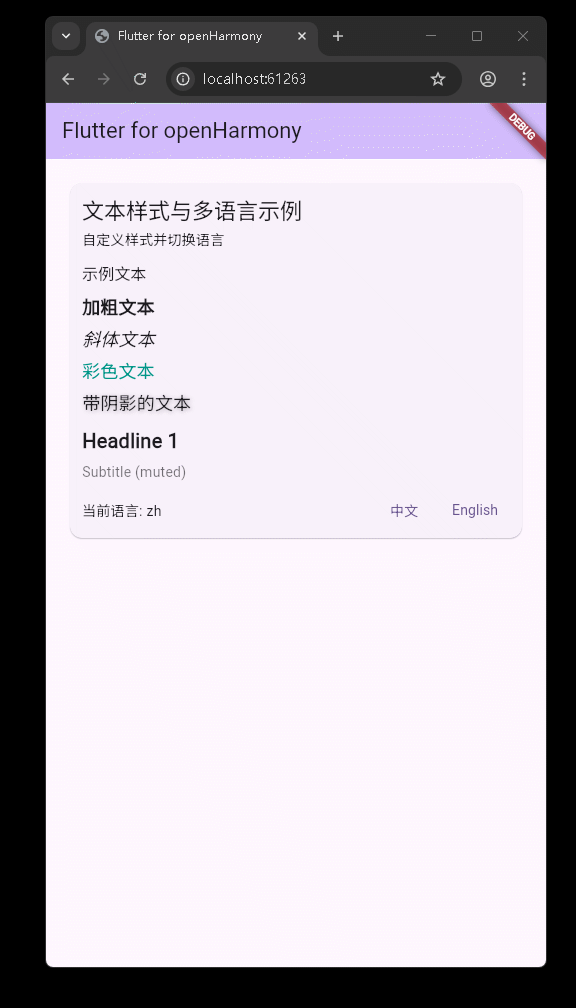
运行到鸿蒙虚拟设备中效果展示
目录
功能代码实现
在当前示例工程中,我们围绕“文本样式定制”和“轻量级多语言适配”实现了一整套可直接复用的组件,同时补充了一个基于 CustomPaint 的自定义柱状图示例,便于后续扩展到更多数据可视化场景。本节将从入口结构、本地化核心、UI 组件以及图表组件几个维度,对代码实现与使用方式进行逐一拆解。
应用入口与页面结构(main.dart)
入口文件位于 [lib/main.dart](file:///Volumes/D/my/HuaWei/FluttrerObj/aa/lib/main.dart),主要职责是:
- 初始化
MaterialApp,配置主题与系统级多语言支持。 - 将首页
MyHomePage作为应用根页面承载业务组件。
核心代码结构如下:
void main() {
runApp(const MyApp());
}
class MyApp extends StatelessWidget {
const MyApp({super.key});
Widget build(BuildContext context) {
return MaterialApp(
title: 'Flutter for openHarmony',
theme: ThemeData(
colorScheme: ColorScheme.fromSeed(seedColor: Colors.deepPurple),
useMaterial3: true,
),
localizationsDelegates: const [
GlobalMaterialLocalizations.delegate,
GlobalWidgetsLocalizations.delegate,
GlobalCupertinoLocalizations.delegate,
],
supportedLocales: const [Locale('en'), Locale('zh')],
home: const MyHomePage(title: 'Flutter for openHarmony'),
);
}
}
使用方式与注意点:
supportedLocales中仅声明了en和zh,与后文自定义本地化中的语言代码完全一致,避免出现“系统语言切换但文案表中无对应语言”的情况。- 这里使用的是 Flutter 自带的
GlobalMaterialLocalizations等委托,仅负责基础组件的多语言;业务文案交由后文的AppLocalizations自行管理。
首页结构中,当前只保留了“文本样式与多语言演示”这一块内容:
class _MyHomePageState extends State<MyHomePage> {
Widget build(BuildContext context) {
return Scaffold(
appBar: AppBar(
backgroundColor: Theme.of(context).colorScheme.inversePrimary,
title: Text(widget.title),
),
body: SafeArea(
child: SingleChildScrollView(
child: Column(
crossAxisAlignment: CrossAxisAlignment.stretch,
children: const [
Padding(
padding: EdgeInsets.symmetric(vertical: 12, horizontal: 12),
child: TextStyleI18nDemo(),
),
],
),
),
),
);
}
}
这样设计的好处:
- 通过
SafeArea + SingleChildScrollView + Column,在小屏、异形屏设备上都能保证内容安全显示且可滚动。 - 把实际业务组件
TextStyleI18nDemo作为一个独立的 Widget 嵌入,后续若要在其他页面复用,只需直接引用该组件即可。
轻量级本地化核心:AppLocalizations
业务多语言的核心实现位于 [lib/widgets/text_style_i18n_demo.dart](file:///Volumes/D/my/HuaWei/FluttrerObj/aa/lib/widgets/text_style_i18n_demo.dart) 顶部,通过一个简单的 Map 管理多语言文案:
class AppLocalizations {
  final Locale locale;
  AppLocalizations(this.locale);

  static AppLocalizations of(BuildContext context) {
    return Localizations.of<AppLocalizations>(context, AppLocalizations)!;
  }

  static final Map<String, Map<String, String>> _localizedValues = {
    'en': {
      'title': 'Text Styles & i18n Demo',
      'subtitle': 'Customize styles and switch language',
      'sample_heading': 'Sample Texts',
      'bold': 'Bold Text',
      'italic': 'Italic Text',
      'colored': 'Colored Text',
      'shadow': 'Text with Shadow',
      'switch_locale': 'Switch Language',
      'current_locale': 'Current Locale',
    },
    'zh': {
      'title': '文本样式与多语言示例',
      'subtitle': '自定义样式并切换语言',
      'sample_heading': '示例文本',
      'bold': '加粗文本',
      'italic': '斜体文本',
      'colored': '彩色文本',
      'shadow': '带阴影的文本',
      'switch_locale': '切换语言',
      'current_locale': '当前语言',
    }
  };

  String get(String key) {
    final map = _localizedValues[locale.languageCode];
    if (map == null) return key;
    return map[key] ?? key;
  }
}
使用方式:
- 在业务组件中,通过
AppLocalizations.of(context).get('title')获取当前语言下的文案。 - 所有文案 Key 统一集中在
_localizedValues中管理,便于后续新增文案或接入自动化校对。
开发时需要特别注意:
locale.languageCode必须与_localizedValues的顶层 key 对应(如'en'、'zh'),否则会返回默认的 key 字符串,容易在界面上出现未翻译的“占位字样”。- 文案 key 建议保持语义化且稳定,比如
'sample_heading',避免使用数字或临时命名,后期维护会更轻松。
自定义 LocalizationsDelegate:AppLocalizationsDelegate
为了让 Flutter 的本地化体系认识自定义的 AppLocalizations,我们实现了一个简单的委托类:
class AppLocalizationsDelegate extends LocalizationsDelegate<AppLocalizations> {
const AppLocalizationsDelegate();
bool isSupported(Locale locale) => ['en', 'zh'].contains(locale.languageCode);
Future<AppLocalizations> load(Locale locale) =>
SynchronousFuture<AppLocalizations>(AppLocalizations(locale));
bool shouldReload(covariant LocalizationsDelegate<AppLocalizations> old) => false;
}
实现思路:
isSupported用于声明支持的语言范围,与_localizedValues中的键保持一致。load通过SynchronousFuture立即返回一个AppLocalizations实例,避免不必要的异步开销,非常适合这种纯内存表驱动的多语言场景。shouldReload返回false,意味着在应用运行期间不需要重新加载委托,简化生命周期管理。
实际使用时,我们没有把这个委托挂到全局 MaterialApp 上,而是通过局部的 Localizations.override 在需要的局部组件内覆盖语言环境,这一点在下一节会详细说明。
文本样式与语言切换组件:TextStyleI18nDemo
TextStyleI18nDemo 是本次示例的核心展示组件,既负责控制当前语言,又集中展示了多种文本样式。整体结构如下:
class TextStyleI18nDemo extends StatefulWidget {
const TextStyleI18nDemo({Key? key}) : super(key: key);
State<TextStyleI18nDemo> createState() => _TextStyleI18nDemoState();
}
class _TextStyleI18nDemoState extends State<TextStyleI18nDemo> {
Locale _locale = const Locale('zh');
void _setLocale(Locale locale) {
setState(() => _locale = locale);
}
Widget build(BuildContext context) {
return Localizations.override(
context: context,
locale: _locale,
delegates: const [AppLocalizationsDelegate()],
child: Builder(builder: (ctx) {
final l = AppLocalizations.of(ctx);
return Card(
margin: const EdgeInsets.all(12),
child: Padding(
padding: const EdgeInsets.all(12),
child: Column(
crossAxisAlignment: CrossAxisAlignment.start,
children: [
Text(l.get('title'), style: Theme.of(ctx).textTheme.titleLarge),
const SizedBox(height: 6),
Text(l.get('subtitle'), style: Theme.of(ctx).textTheme.bodyMedium),
const SizedBox(height: 12),
// 样式演示
Text(l.get('sample_heading'), style: Theme.of(ctx).textTheme.titleMedium),
const SizedBox(height: 8),
Text(l.get('bold'),
style: const TextStyle(fontWeight: FontWeight.bold, fontSize: 18)),
const SizedBox(height: 6),
Text(l.get('italic'),
style: const TextStyle(fontStyle: FontStyle.italic, fontSize: 18)),
const SizedBox(height: 6),
Text(l.get('colored'),
style: const TextStyle(color: Colors.teal, fontSize: 18)),
const SizedBox(height: 6),
Text(
l.get('shadow'),
style: const TextStyle(
fontSize: 18,
shadows: [
Shadow(offset: Offset(1, 1), blurRadius: 2, color: Colors.black26)
],
),
),
const SizedBox(height: 12),
const _StyledLabel(
  label: 'Headline 1',
  style: TextStyle(fontSize: 20, fontWeight: FontWeight.w700),
),
const SizedBox(height: 6),
const _StyledLabel(
  label: 'Subtitle (muted)',
  style: TextStyle(fontSize: 14, color: Colors.black54),
),
const SizedBox(height: 12),
Row(
mainAxisAlignment: MainAxisAlignment.space_between,
children: [
Text('${l.get('current_locale')}: ${_locale.languageCode}'),
Row(children: [
TextButton(
onPressed: () => _setLocale(const Locale('zh')),
child: const Text('中文'),
),
const SizedBox(width: 8),
TextButton(
onPressed: () => _setLocale(const Locale('en')),
child: const Text('English'),
),
])
],
),
],
),
),
);
}),
);
}
}
关键实现点:
- 通过
Localizations.override,只在当前组件子树下生效自定义的AppLocalizations,不会影响到全局应用的语言设置,适合示例或局部切换场景。 - 使用
Builder再包一层,确保AppLocalizations.of(ctx)拿到的是覆盖后的本地化上下文,否则可能会出现“找不到自定义 Localizations”的错误。
使用方式与注意事项:
- 如需在其他页面复用,只需在对应页面的
build方法中加入const TextStyleI18nDemo()即可,不需要额外配置。 - 当前实现仅支持在组件内部切换
zh与en,若后续需要支持更多语言,只需同时扩展_localizedValues与AppLocalizationsDelegate.isSupported即可。 - 切换语言是通过
setState触发组件重建完成的,语言状态仅在当前组件内部生效,符合“示例组件”定位,避免影响全局。
可复用的样式封装组件:_StyledLabel
为进一步降低样式重复书写的成本,示例中提供了一个小而实用的样式封装组件 _StyledLabel:
class _StyledLabel extends StatelessWidget {
final String label;
final TextStyle style;
const _StyledLabel({Key? key, required this.label, required this.style}) : super(key: key);
Widget build(BuildContext context) {
return Text(label, style: style);
}
}
在 TextStyleI18nDemo 中的用法示例:
const _StyledLabel(
label: 'Headline 1',
style: TextStyle(fontSize: 20, fontWeight: FontWeight.w700),
),
const SizedBox(height: 6),
const _StyledLabel(
label: 'Subtitle (muted)',
style: TextStyle(fontSize: 14, color: Colors.black54),
),
这种封装方式的优势:
- 将一组固定样式与具体展示文本解耦,后续可以很轻松地替换为自定义字体、品牌色或主题化方案。
- 在实际项目中可以把
_StyledLabel抽到公共组件目录,并结合ThemeData或设计规范定义一系列命名良好的“文本风格预设”,例如TitleLabel、CaptionLabel等。
自定义柱状图组件:CustomBarChart 与 CustomChartDemo
虽然当前首页只展示了文本与多语言部分,但工程中已经提供了一个完整的自定义柱状图组件,位于 [lib/widgets/custom_chart.dart](file:///Volumes/D/my/HuaWei/FluttrerObj/aa/lib/widgets/custom_chart.dart),方便后续扩展更多数据可视化功能。
CustomBarChart:基于 CustomPaint 的绘制封装
CustomBarChart 对外暴露了一个简单的组件接口:
class CustomBarChart extends StatelessWidget {
final List<double> values;
final List<String>? labels;
final int? selectedIndex;
const CustomBarChart({
Key? key,
required this.values,
this.labels,
this.selectedIndex,
}) : super(key: key);
Widget build(BuildContext context) {
return AspectRatio(
aspectRatio: 1.6,
child: CustomPaint(
painter: _BarChartPainter(
values: values,
labels: labels,
selectedIndex: selectedIndex,
),
child: Container(),
),
);
}
}
使用方式非常直接:
CustomBarChart(
  values: [12, 30, 20, 40, 28],
  labels: ['A', 'B', 'C', 'D', 'E'],
  selectedIndex: 2,
)
开发时需要注意:
values与labels的长度要保持一致,否则绘制标签时会出现数组越界问题;当前实现中通过labels != null && labels!.length > i做了保护。selectedIndex用于高亮选中的柱子,可以为null表示不选中任何一项。- 外层用
AspectRatio固定了宽高比例,避免在不同屏幕尺寸下图表过扁或过细。
_BarChartPainter:绘制逻辑与交互状态
真正的绘制逻辑集中在 _BarChartPainter 中:
class _BarChartPainter extends CustomPainter {
final List<double> values;
final List<String>? labels;
final int? selectedIndex;
_BarChartPainter({required this.values, this.labels, this.selectedIndex});
void paint(Canvas canvas, Size size) {
final paint = Paint()..style = PaintingStyle.fill;
final axisPaint = Paint()
..color = Colors.grey.shade600
..strokeWidth = 1.0;
const margin = 16.0;
final chartWidth = size.width - margin * 2;
final chartHeight = size.height - margin * 2 - 20;
final origin = Offset(margin, margin + chartHeight);
canvas.drawLine(origin, Offset(margin + chartWidth, margin + chartHeight), axisPaint);
if (values.isEmpty) return;
final maxVal = values.reduce((a, b) => a > b ? a : b);
final barCount = values.length;
final barWidth = chartWidth / (barCount * 1.6);
final gap = barWidth * 0.6;
for (int i = 0; i < barCount; i++) {
final v = values[i];
final left = margin + i * (barWidth + gap) + gap / 2;
final double barHeight = maxVal <= 0 ? 0 : (v / maxVal) * chartHeight;
final rect = Rect.fromLTWH(left, margin + chartHeight - barHeight, barWidth, barHeight);
final baseColor = Colors.primaries[i % Colors.primaries.length].withOpacity(0.8);
if (selectedIndex != null && selectedIndex == i) {
paint.color = baseColor.withOpacity(1.0);
canvas.drawRRect(RRect.fromRectAndRadius(rect.inflate(2), const Radius.circular(8)), paint);
final borderPaint = Paint()
..style = PaintingStyle.stroke
..color = Colors.black26
..strokeWidth = 2.0;
canvas.drawRRect(RRect.fromRectAndRadius(rect.inflate(2), const Radius.circular(8)), borderPaint);
} else {
paint.color = baseColor;
canvas.drawRRect(RRect.fromRectAndRadius(rect, const Radius.circular(6)), paint);
}
if (labels != null && labels!.length > i) {
final tp = TextPainter(
text: TextSpan(
text: labels![i],
style: const TextStyle(color: Colors.black87, fontSize: 10),
),
textDirection: TextDirection.ltr,
)..layout(maxWidth: barWidth * 2 + gap);
final dx = left + (barWidth - tp.width) / 2;
tp.paint(canvas, Offset(dx, margin + chartHeight + 4));
}
}
}
bool shouldRepaint(covariant _BarChartPainter oldDelegate) {
return oldDelegate.values != values ||
oldDelegate.labels != labels ||
oldDelegate.selectedIndex != selectedIndex;
}
}
实现要点与经验:
- 柱子的高度采用相对比例:
(v / maxVal) * chartHeight,保证无论数据绝对值如何变化,都能充分利用画布空间。 barHeight明确声明为double,避免因为三元表达式推断为num而在Rect.fromLTWH调用时出现类型错误。- 利用
Colors.primaries生成一组易区分的颜色,并对选中项增加描边与更高不透明度,视觉上更容易突出。 shouldRepaint中对values、labels、selectedIndex做了完整比对,一旦数据或选中状态变化就会触发重绘,对交互动画十分友好。
CustomChartDemo:带控制按钮的图表示例容器
在同一文件中,还提供了一个封装好的演示组件 CustomChartDemo,内部集成了随机数据生成、增删数据与点击高亮等交互:
class CustomChartDemo extends StatefulWidget {
const CustomChartDemo({Key? key}) : super(key: key);
State<CustomChartDemo> createState() => _CustomChartDemoState();
}
class _CustomChartDemoState extends State<CustomChartDemo> {
final List<double> data = <double>[12, 30, 20, 40, 28];
final List<String> labels = ['A', 'B', 'C', 'D', 'E'];
int? _selectedIndex;
final Random _rnd = Random();
void _randomizeData() {
setState(() {
for (int i = 0; i < data.length; i++) {
data[i] = 5 + _rnd.nextInt(46).toDouble();
}
_selectedIndex = null;
});
}
void _addData() {
setState(() {
final nextIndex = data.length;
data.add(5 + _rnd.nextInt(46).toDouble());
labels.add(String.fromCharCode(65 + (nextIndex % 26)));
});
}
void _removeData() {
if (data.isEmpty) return;
setState(() {
final removedIndex = data.length - 1;
data.removeLast();
labels.removeLast();
if (_selectedIndex != null && _selectedIndex! >= removedIndex) {
_selectedIndex = null;
}
});
}
}
在 build 方法中,则通过按钮与 ActionChip 提供了完整的交互体验,包括:
- 一键随机生成数据
_randomizeData。 - 动态增加、删除柱子
_addData/_removeData。 - 点击标签高亮对应柱子,并通过
SnackBar弹出当前值。
在任意页面中使用,只需写:
const CustomChartDemo()
即可获得一块带交互的自定义柱状图区域。
本次开发中容易遇到的问题
结合当前项目的实现过程,下面列出几个比较典型、也最容易踩坑的点,并给出对应的思路与解决方案,便于后续复用或排查。
1. 本地化上下文获取失败
问题现象:
- 直接在组件中调用
AppLocalizations.of(context),如果没有通过Localizations.override或全局localizationsDelegates提供自定义委托,很容易出现运行时错误,提示找不到对应的Localizations实例。
当前实现中的解决方式:
- 在
TextStyleI18nDemo中,使用Localizations.override包裹内部内容,并额外通过Builder创建一个新的ctx:
return Localizations.override(
  context: context,
  locale: _locale,
  delegates: const [AppLocalizationsDelegate()],
  child: Builder(builder: (ctx) {
    final l = AppLocalizations.of(ctx);
    // 在这里安全地使用 l.get('xxx')
    ...
  }),
);
建议实践:
- 在需要局部多语言的场景下,优先使用这种“覆盖 + Builder”的写法,可以确保
of方法总能拿到正确的本地化上下文。
2. 文案 Key 与语言配置不一致
问题表现:
- 文案 key 拼写错误或漏配置时,
get方法会退回到原始 key,界面上就会出现类似sample_heading这样的“英文占位串”,影响观感。
应对策略:
- 像当前工程一样,将所有文案集中在
_localizedValues中管理,并为每种语言严格保持相同的 key 集合。 - 在开发阶段,可以借助简单的脚本比对不同语言 Map 的 key 差异,或者通过单元测试校验。
3. 自定义绘制中的类型问题(num 与 double)
问题背景:
- 在实现柱状图时,我们通过三元表达式计算柱子高度:
final double barHeight = maxVal <= 0 ? 0 : (v / maxVal) * chartHeight;
如果省略类型声明,写成:
final barHeight = maxVal <= 0 ? 0 : (v / maxVal) * chartHeight;
那么三元表达式会被推断为 num,在后续调用 Rect.fromLTWH 时就会触发类型错误(该方法要求传入 double)。
解决方案:
- 显式将
barHeight声明为double,或者将0写为0.0,都可以消除类型不匹配的问题。 - 在涉及
Canvas、Paint等绘制 API 时,建议尽量保持所有尺寸相关变量为double类型,能减少一大类隐性错误。
4. 柱状图布局与标签显示问题
常见问题:
- 当数据量变多时,标签之间容易发生重叠,或者柱子过于拥挤影响阅读。
当前实现中的处理:
- 通过
AspectRatio控制整体宽高比例,保证图表在不同设备上的相对观感。 - 在计算柱宽时,引入了
barWidth与gap的比例关系,使得在常见数据量(5~10 条)下柱子之间有适度分隔。 - 文本标签使用
TextPainter,并限制maxWidth,在空间不足时会自动换行或截断。
后续如果要进一步优化,可以考虑:
- 在数据量较大时改用横向滚动容器承载图表。
- 使用更精细的布局策略,例如自适应字体大小、间隔动态缩放等。
5. 状态管理边界与交互一致性
当前工程中,语言切换状态与图表选中状态都采用最直接的 setState 管理,简单直观,但也有几个需要注意的细节:
- 删除最后一个柱子时,若当前选中索引指向被删除元素,需要及时将
_selectedIndex置为null,否则可能出现“选中无效项”的逻辑错误。 - 切换语言时,所有依赖文案的组件都会重建,因此应避免在
build方法中做重型计算,确保界面切换流畅。
在小型示例项目中,这种模式足够清晰;如果后续扩展为复杂业务,可以逐步引入如 Provider、Riverpod 等更成熟的状态管理方案。
总结本次开发中用到的技术点
从当前工程的实现可以看到,即便是一个体量不大的示例,也已经覆盖了 Flutter 在文本展示、多语言与自定义绘制方面的多项关键能力。简单梳理如下:
-
应用结构与布局
- 使用
MaterialApp + Scaffold + AppBar构建基础应用骨架。 - 通过
SafeArea + SingleChildScrollView + Column组合,兼顾内容安全区与滚动体验。 - 利用
Card与Padding营造模块化的信息块,层次清晰。
- 使用
-
文本样式定制
- 综合使用
TextStyle的fontWeight、fontStyle、color、shadows等属性,展示多种文本效果。 - 通过
_StyledLabel封装常用文本样式,降低重复代码,提高样式一致性。
- 综合使用
-
轻量级多语言适配
- 自定义
AppLocalizations与AppLocalizationsDelegate,基于内存 Map 管理中英双语文案。 - 借助
Localizations.override实现局部语言覆盖,不干扰系统级语言设置。 - 遵循“key 集中管理、语言代码统一”的实践,降低多语言维护成本。
- 自定义
-
自定义绘制与数据可视化
- 使用
CustomPaint + CustomPainter在Canvas上绘制柱状图与坐标轴。 - 通过相对高度与颜色变化展示数据差异,并结合选中状态强化交互反馈。
- 利用
TextPainter精细控制标签文本布局,在有限空间内尽量保持可读性。
- 使用
-
交互与状态管理
- 采用
StatefulWidget + setState管理语言与图表数据状态,逻辑直观易于上手。 - 结合
TextButton、ElevatedButton.icon、ActionChip与SnackBar构建完整的交互流程。
- 采用
总体来看,本次开发在保持代码结构简洁的前提下,完成了从“文本样式定制”到“多语言切换”再到“基础数据可视化”的一整条功能链路,为后续在 OpenHarmony 生态中的 Flutter 实战项目打下了一个清晰、可扩展的起点。
欢迎加入开源鸿蒙跨平台社区: https://openharmonycross平台.csdn.net

腾讯云面向开发者汇聚海量精品云计算使用和开发经验,营造开放的云计算技术生态圈。
更多推荐
 10
10 0
0- 0


 已为社区贡献14条内容

所有评论(0)