Flutter for OpenHarmony三国杀攻略App实战 - 武将列表实现
前言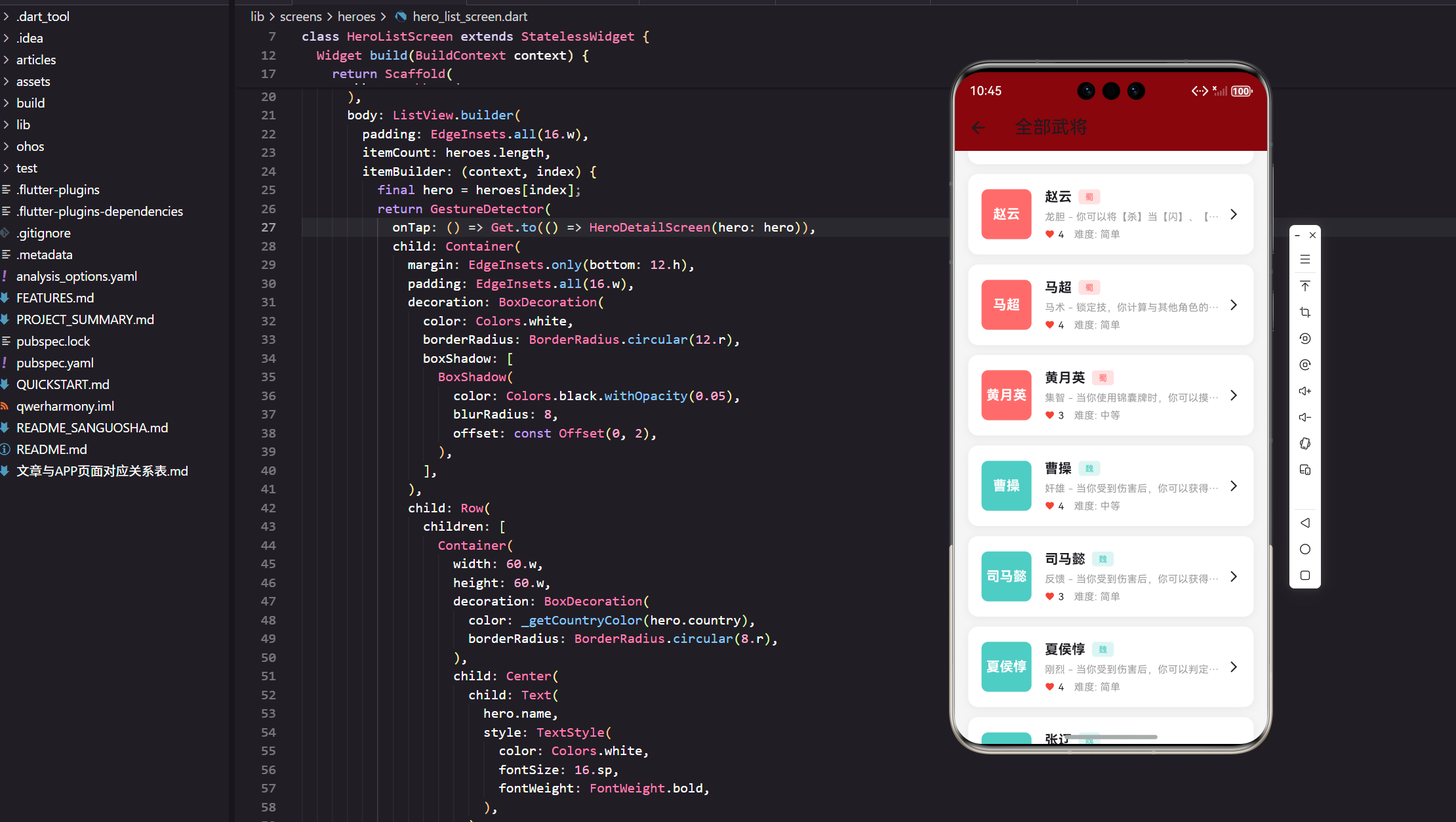
在前面的文章中,我们完成了项目初始化、主屏幕框架和武将数据模型的设计。本文将深入实现武将列表页面,这是整个武将模块的核心功能。我们将基于真实的项目代码,详细讲解如何构建一个功能完善、性能优秀的武将列表界面。
武将Tab页面的整体架构
首先,让我们来看看武将Tab页面的整体设计。在 lib/screens/tabs/heroes_tab.dart 中,我们构建了一个功能丰富的武将主页:
import 'package:flutter/material.dart';
import 'package:flutter_screenutil/flutter_screenutil.dart';
import 'package:get/get.dart';
import '../../models/hero_model.dart' as model;
import '../heroes/hero_list_screen.dart';
这里的导入语句展现了我们的项目结构。使用 as model 别名是一个很好的实践,它避免了命名冲突,特别是当我们有多个模块都定义了相似的类名时。flutter_screenutil 包帮助我们实现屏幕适配,确保在不同尺寸的设备上都能有良好的显示效果。
构建顶部横幅区域
Widget _buildBanner() {
  return Container(
    height: 180.h,
    margin: EdgeInsets.all(16.w),
    decoration: BoxDecoration(
      gradient: const LinearGradient(
        colors: [Color(0xFF8B0000), Color(0xFFDC143C)],
      ),
      borderRadius: BorderRadius.circular(12.r),
    ),
    child: Center(
      child: Column(
        mainAxisAlignment: MainAxisAlignment.center,
        children: [
          Text(
            '三国杀武将图鉴',
            style: TextStyle(
              color: Colors.white,
              fontSize: 24.sp,
              fontWeight: FontWeight.bold,
            ),
          ),
          SizedBox(height: 8.h),
          Text(
            '共收录 ${model.HeroData.getAllHeroes().length} 名武将',
            style: TextStyle(color: Colors.white70, fontSize: 14.sp),
          ),
        ],
      ),
    ),
  );
}
这个横幅设计体现了几个重要的UI设计原则。渐变背景使用了三国杀经典的红色调,营造出浓厚的游戏氛围。动态显示武将总数不仅提供了有用信息,还增强了用户对内容丰富度的感知。使用 flutter_screenutil 的响应式单位确保了在不同设备上的一致性体验。
快速访问功能区域
Widget _buildQuickAccess() {
  final items = [
    {'icon': Icons.list, 'title': '武将列表', 'screen': const HeroListScreen()},
    {'icon': Icons.compare_arrows, 'title': '武将对比', 'screen': const HeroCompareScreen()},
    {'icon': Icons.leaderboard, 'title': '强度排行', 'screen': const HeroTierScreen()},
    {'icon': Icons.shield, 'title': '克制关系', 'screen': const HeroCounterScreen()},
    {'icon': Icons.group_work, 'title': '配合推荐', 'screen': const HeroComboScreen()},
  ];
这种数据驱动的UI构建方式非常优雅。通过将功能项定义为Map列表,我们可以轻松地添加、删除或修改功能项,而不需要重复编写相似的UI代码。这种模式在实际项目中经常使用,特别是当我们需要构建类似的卡片或按钮组时。
势力分类浏览区域
Widget _buildCountrySection() {
  final countries = [
    {'name': '蜀', 'color': const Color(0xFFFF6B6B), 'count': 7},
    {'name': '魏', 'color': const Color(0xFF4ECDC4), 'count': 7},
    {'name': '吴', 'color': const Color(0xFF95E1D3), 'count': 8},
    {'name': '群', 'color': const Color(0xFFF38181), 'count': 3},
  ];
势力分类是三国杀游戏的核心概念,我们为每个势力分配了独特的颜色。这些颜色的选择不是随意的,它们既要符合三国历史文化的色彩印象,又要在UI设计中保持良好的视觉效果和可读性。
武将列表页面的核心实现
现在让我们深入到武将列表页面的具体实现。在 lib/screens/heroes/hero_list_screen.dart 中:
class HeroListScreen extends StatelessWidget {
final String? country;
const HeroListScreen({Key? key, this.country}) : super(key: key);
Widget build(BuildContext context) {
final heroes = country == null
? model.HeroData.getAllHeroes()
: model.HeroData.getAllHeroes().where((h) => h.country == country).toList();
这里的设计体现了良好的组件复用性。通过可选的 country 参数,同一个组件既可以显示全部武将,也可以显示特定势力的武将。这种设计避免了代码重复,提高了维护性。
列表项的卡片设计
return GestureDetector(
  onTap: () => Get.to(() => HeroDetailScreen(hero: hero)),
  child: Container(
    margin: EdgeInsets.only(bottom: 12.h),
    padding: EdgeInsets.all(16.w),
    decoration: BoxDecoration(
      color: Colors.white,
      borderRadius: BorderRadius.circular(12.r),
      boxShadow: [
        BoxShadow(
          color: Colors.black.withOpacity(0.05),
          blurRadius: 8,
          offset: const Offset(0, 2),
        ),
      ],
    ),
卡片式设计是现代移动应用的主流趋势。微妙的阴影效果(opacity: 0.05)创造了层次感,而不会显得过于突兀。圆角设计(12.r)让界面更加友好和现代化。这些细节虽小,但对用户体验有着重要影响。
武将信息的布局设计
child: Row(
  children: [
    Container(
      width: 60.w,
      height: 60.w,
      decoration: BoxDecoration(
        color: _getCountryColor(hero.country),
        borderRadius: BorderRadius.circular(8.r),
      ),
      child: Center(
        child: Text(
          hero.name,
          style: TextStyle(
            color: Colors.white,
            fontSize: 16.sp,
            fontWeight: FontWeight.bold,
          ),
        ),
      ),
    ),
左侧的武将头像区域使用了势力颜色作为背景,这不仅美观,还能让用户快速识别武将的势力归属。在实际的游戏应用中,这里通常会放置武将的真实头像,但在我们的演示项目中,使用武将名字作为占位符是一个很好的解决方案。
势力颜色的统一管理
Color _getCountryColor(String country) {
  switch (country) {
    case '蜀':
      return const Color(0xFFFF6B6B);
    case '魏':
      return const Color(0xFF4ECDC4);
    case '吴':
      return const Color(0xFF95E1D3);
    case '群':
      return const Color(0xFFF38181);
    default:
      return Colors.grey;
  }
}
颜色管理的一致性对于用户体验至关重要。通过统一的颜色映射函数,我们确保了在整个应用中,同一势力始终使用相同的颜色。这种一致性帮助用户建立视觉记忆,提高应用的易用性。
武将信息的详细展示
在列表项中,我们需要展示武将的关键信息:
Expanded(
  child: Column(
    crossAxisAlignment: CrossAxisAlignment.start,
    children: [
      Row(
        children: [
          Text(
            hero.name,
            style: TextStyle(fontSize: 16.sp, fontWeight: FontWeight.bold),
          ),
          SizedBox(width: 8.w),
          Container(
            padding: EdgeInsets.symmetric(horizontal: 8.w, vertical: 2.h),
            decoration: BoxDecoration(
              color: _getCountryColor(hero.country).withOpacity(0.2),
              borderRadius: BorderRadius.circular(4.r),
            ),
            child: Text(
              hero.country,
              style: TextStyle(fontSize: 10.sp, color: _getCountryColor(hero.country)),
            ),
          ),
        ],
      ),
势力标签的设计使用了半透明背景,这种设计既突出了势力信息,又不会过于抢眼。withOpacity(0.2) 创造了一个柔和的背景色,配合深色的文字,确保了良好的可读性。
技能信息的展示
Text(
  '${hero.skill} - ${hero.skillDesc}',
  style: TextStyle(fontSize: 12.sp, color: Colors.grey),
  maxLines: 1,
  overflow: TextOverflow.ellipsis,
),
技能描述的处理体现了移动端UI设计的重要原则:空间有限时,要优雅地处理文本溢出。TextOverflow.ellipsis 确保了长文本不会破坏布局,而省略号提示用户还有更多内容。
武将属性的图标化展示
Row(
  children: [
    Icon(Icons.favorite, size: 12.sp, color: Colors.red),
    SizedBox(width: 4.w),
    Text('${hero.hp}', style: TextStyle(fontSize: 12.sp)),
    SizedBox(width: 12.w),
    Text('难度: ${hero.difficulty}', style: TextStyle(fontSize: 12.sp, color: Colors.grey)),
  ],
),
使用图标来表示武将属性是一个很好的UX设计。红心图标直观地表示体力值,用户无需阅读文字就能理解其含义。这种图标化的设计在游戏应用中特别重要,因为它能快速传达信息。
导航和交互设计
整个列表项被包装在 GestureDetector 中:
GestureDetector(
  onTap: () => Get.to(() => HeroDetailScreen(hero: hero)),
  child: Container(
    // ... 卡片内容
  ),
),
使用GetX进行页面导航是现代Flutter开发的最佳实践之一。Get.to() 方法不仅简洁,还提供了丰富的页面转场动画和参数传递功能。将整个卡片作为可点击区域,而不仅仅是某个按钮,提高了用户操作的便利性。
性能优化考虑
在实际项目中,武将列表可能包含大量数据。我们的实现使用了 ListView.builder:
ListView.builder(
  padding: EdgeInsets.all(16.w),
  itemCount: heroes.length,
  itemBuilder: (context, index) {
    final hero = heroes[index];
    return GestureDetector(
      // ... 列表项内容
    );
  },
),
ListView.builder 是处理长列表的最佳选择,它只会构建当前可见的列表项,大大提高了性能。这种懒加载机制确保了即使有数百个武将,应用也能保持流畅的滚动体验。
OpenHarmony适配要点
在OpenHarmony平台上,我们需要特别注意以下几点:
- 响应式设计:使用
flutter_screenutil确保在不同屏幕尺寸上的适配 - 颜色适配:考虑到OpenHarmony的主题系统,颜色选择要兼容深色模式
- 触摸反馈:确保触摸区域足够大,符合OpenHarmony的交互规范
数据流管理
我们的武将数据通过 HeroData.getAllHeroes() 获取:
final heroes = country == null
    ? model.HeroData.getAllHeroes()
    : model.HeroData.getAllHeroes().where((h) => h.country == country).toList();
这种数据过滤方式简洁高效。在实际项目中,这里可能会连接到数据库或网络API。当前的实现为将来的扩展留下了良好的接口。
用户体验细节
每个设计决策都考虑了用户体验:
- 视觉层次:通过字体大小、颜色深浅建立信息层次
- 空间利用:合理的边距和间距确保内容不会显得拥挤
- 交互反馈:清晰的可点击区域和视觉提示
- 信息密度:在有限空间内展示最重要的信息
扩展性设计
当前的实现为未来功能扩展预留了空间:
- 可以轻松添加搜索功能
- 支持不同的排序方式
- 可以集成收藏功能
- 支持更复杂的筛选条件
总结
本文详细介绍了武将列表功能的实现,从整体架构到具体细节,每个部分都体现了现代移动应用开发的最佳实践。通过真实项目代码的分析,我们看到了如何将设计理念转化为具体的实现。
在下一篇文章中,我们将深入武将详情页面的实现,探讨如何展示更丰富的武将信息和交互功能。
欢迎加入开源鸿蒙跨平台社区:https://openharmonycrossplatform.csdn.net

腾讯云面向开发者汇聚海量精品云计算使用和开发经验,营造开放的云计算技术生态圈。
更多推荐
 14
14 0
0- 0


 已为社区贡献20条内容

所有评论(0)