Flutter for OpenHarmony 实战:TextFormField 表单输入框详解
继承自FormField✅ 文本输入与内容管理✅ 实时输入验证(validator✅ 自定义输入装饰(decoration✅ 表单状态集成(Form控件协同)典型应用场景用户登录/注册表单数据提交界面多字段验证场景键盘适配:利用解决平台差异状态联动:通过实现多字段管理安全输入:双端保障机制(+ 鸿蒙安全键盘)验证优化:按需验证模式降低性能开销🔥最佳实践:在复杂表单场景中,可将验证逻辑抽象为独立F
Flutter for OpenHarmony 实战:TextFormField 表单输入框详解
💡 摘要:本文深度解析 Flutter 框架中
TextFormField控件在 OpenHarmony 平台的实战应用。通过剖析其核心属性、样式定制、表单验证机制及跨平台适配要点,结合完整的登录表单案例,帮助开发者掌握高效构建鸿蒙平台表单输入功能的关键技术。读者将收获:1. 文本输入场景的完整解决方案 2. 表单验证与状态管理的最佳实践 3. OpenHarmony 平台特有适配技巧。
引言
在跨平台应用开发中,表单输入是高频交互场景。Flutter 的 TextFormField 作为 Material Design 风格的输入控件,提供了丰富的定制能力和验证机制。本文聚焦其在 OpenHarmony 平台的落地实践,解决开发者面临的键盘适配、样式兼容等核心问题。
控件概述
基本用途与场景
TextFormField 继承自 FormField,专为表单场景设计,提供:
- ✅ 文本输入与内容管理
- ✅ 实时输入验证(
validator) - ✅ 自定义输入装饰(
decoration) - ✅ 表单状态集成(
Form控件协同)
典型应用场景:
- 用户登录/注册表单
- 数据提交界面
- 多字段验证场景
与鸿蒙原生控件对比
| 特性 | Flutter TextFormField | 鸿蒙 TextField |
|---|---|---|
| 跨平台一致性 | ✅ 统一渲染引擎 | ⚠️ 需平台适配 |
| 表单验证集成 | 🔥 内置 validator | 🔧 需手动实现 |
| 装饰样式定制 | 💡 InputDecoration API | 🎨 Style 属性配置 |
| 键盘类型适配 | 📱 全平台统一配置 | 📱 需鸿蒙特定参数 |
基础用法
核心属性配置
TextFormField(
  controller: _controller, // 文本控制器
  decoration: InputDecoration(
    labelText: '用户名',
    hintText: '输入6-12位字符',
    icon: Icon(Icons.person),
  ),
  validator: (value) {
    if (value!.isEmpty) return '必填字段';
    return null; // 验证通过
  },
)
参数解析:
controller:文本编辑控制器,管理输入状态decoration:包含 label/hint/icon 等视觉元素validator:返回错误提示文本(非空时触发)
键盘类型适配
keyboardType: TextInputType.emailAddress, // 邮箱键盘
openHarmonyParams: {
  'enterKeyType': 'search' // 鸿蒙特有:回车键样式
}
💡 鸿蒙适配要点:通过
openHarmonyParams扩展参数覆盖鸿蒙键盘特性,需在pubspec.yaml添加flutter_ohos_keyboard插件
进阶用法
样式深度定制
decoration: InputDecoration(
  border: OutlineInputBorder(
    borderRadius: BorderRadius.circular(10),
    borderSide: BorderSide(color: Colors.blue),
  ),
  focusedBorder: OutlineInputBorder( // 聚焦状态
    borderSide: BorderSide(color: Colors.purple, width: 2),
  ),
  errorText: _errorText, // 动态错误提示
),
状态管理方案
final _formKey = GlobalKey<FormState>();

Form(
  key: _formKey,
  child: Column(
    children: [
      TextFormField(validator: (value) {...}),
      ElevatedButton(
        onPressed: () {
          if (_formKey.currentState!.validate()) {
            // 提交逻辑
          }
        },
      )
    ],
  ),
)
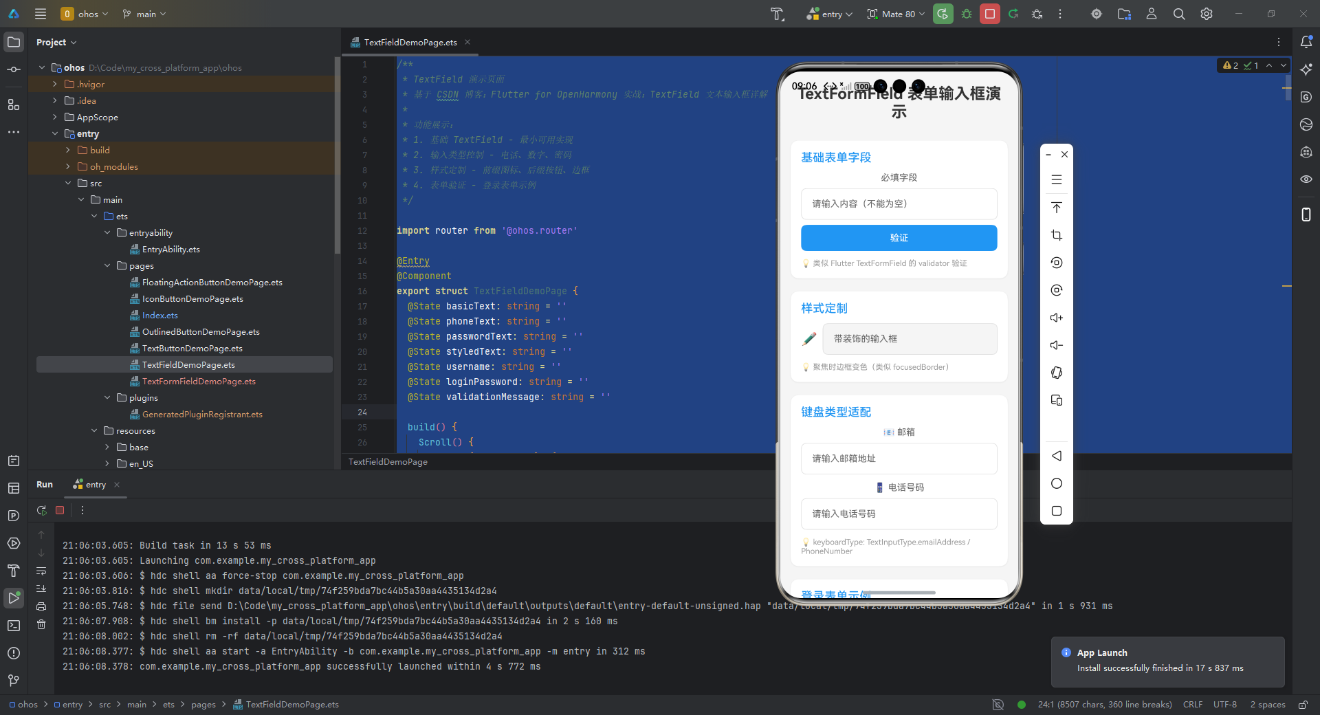
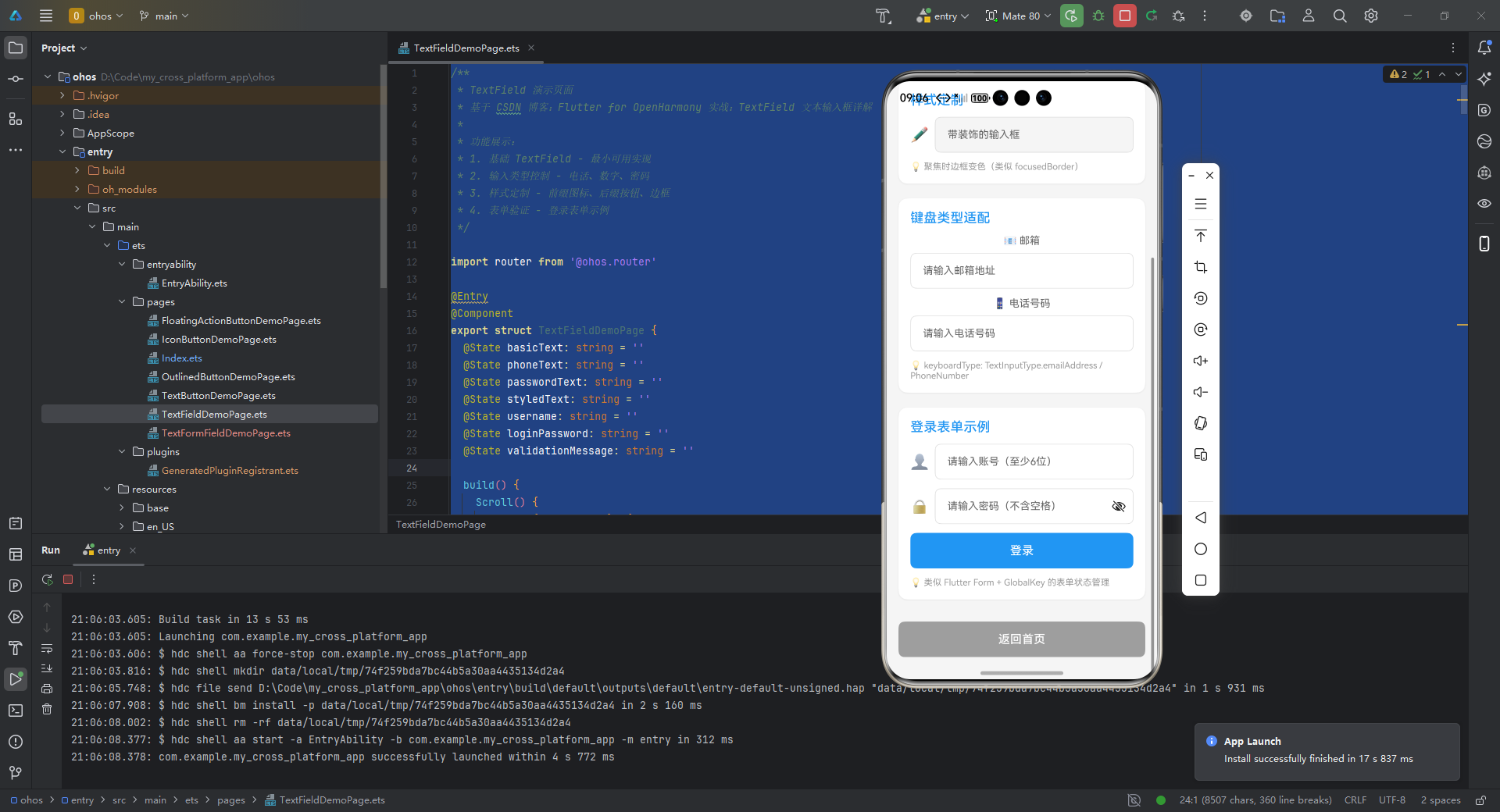
实战案例:TextFormField 表单输入框
/**
* TextFormField 表单输入框演示页面
* 基于 CSDN 博客:Flutter for OpenHarmony 实战:TextFormField 表单输入框详解
*
* 功能展示:
* 1. 基础表单字段 - 带验证的输入框
* 2. 样式定制 - 聚焦边框、错误提示、图标装饰
* 3. 键盘类型适配 - 邮箱、电话、数字
* 4. 登录表单 - 完整的表单验证案例
*/
import router from '@ohos.router'
export struct TextFormFieldDemoPage {
// 基础表单字段状态
basicFieldText: string = ''
basicFieldError: string = ''
// 样式定制状态
styledText: string = ''
styledFieldError: string = ''
isFocused: boolean = false
// 邮箱输入状态
emailText: string = ''
emailError: string = ''
// 电话输入状态
phoneText: string = ''
phoneError: string = ''
// 登录表单状态
loginUsername: string = ''
loginPassword: string = ''
loginUsernameError: string = ''
loginPasswordError: string = ''
loginMessage: string = ''
build() {
Scroll() {
Column({ space: 20 }) {
// 页面标题
Text('TextFormField 表单输入框演示')
.fontSize(24)
.fontWeight(FontWeight.Bold)
.fontColor('#333333')
.width('100%')
.textAlign(TextAlign.Center)
.margin({ top: 10, bottom: 10 })
// 基础表单字段区域
this.BuildBasicFormFieldSection()
// 样式定制区域
this.BuildStyledSection()
// 键盘类型适配区域
this.BuildKeyboardTypeSection()
// 登录表单示例
this.BuildLoginFormSection()
// 返回按钮
this.BuildBackButton()
}
.width('100%')
.padding({ left: 16, right: 16, top: 10, bottom: 30 })
}
.width('100%')
.height('100%')
.backgroundColor('#F5F5F5')
.scrollBar(BarState.Auto)
.edgeEffect(EdgeEffect.Spring)
}
/**
* 基础表单字段区域
* 展示 TextFormField 的基本验证功能
*/
BuildBasicFormFieldSection() {
Column({ space: 12 }) {
Text('基础表单字段')
.fontSize(18)
.fontWeight(FontWeight.Medium)
.fontColor('#2196F3')
.width('100%')
// 带验证的输入框
Column({ space: 8 }) {
Text('必填字段')
.fontSize(14)
.fontColor('#666666')
TextInput({ placeholder: '请输入内容(不能为空)', text: this.basicFieldText })
.type(InputType.Normal)
.placeholderFont({ size: 14 })
.height(48)
.borderRadius(8)
.backgroundColor(Color.White)
.border({
width: this.basicFieldError.length > 0 ? 2 : 1,
color: this.basicFieldError.length > 0 ? '#FF5252' : '#E0E0E0',
radius: 8
})
.onChange((value: string) => {
this.basicFieldText = value
// 输入时清除错误提示
if (value.length > 0) {
this.basicFieldError = ''
}
})
// 错误提示
if (this.basicFieldError.length > 0) {
Text(this.basicFieldError)
.fontSize(12)
.fontColor('#FF5252')
.width('100%')
}
// 验证按钮
Button('验证')
.type(ButtonType.Normal)
.width('100%')
.height(40)
.fontSize(14)
.fontColor(Color.White)
.backgroundColor('#2196F3')
.borderRadius(8)
.onClick(() => {
this.validateBasicField()
})
}
.width('100%')
Text('💡 类似 Flutter TextFormField 的 validator 验证')
.fontSize(12)
.fontColor('#999999')
.width('100%')
}
.width('100%')
.padding(16)
.backgroundColor(Color.White)
.borderRadius(12)
.shadow({ radius: 8, color: '#10000000', offsetX: 0, offsetY: 2 })
}
/**
* 样式定制区域
* 展示 InputDecoration 的样式定制
*/
BuildStyledSection() {
Column({ space: 12 }) {
Text('样式定制')
.fontSize(18)
.fontWeight(FontWeight.Medium)
.fontColor('#2196F3')
.width('100%')
// 带图标和聚焦状态的输入框
Column({ space: 8 }) {
Row({ space: 8 }) {
Text('✏️')
.fontSize(20)
TextInput({ placeholder: '带装饰的输入框', text: this.styledText })
.type(InputType.Normal)
.placeholderFont({ size: 14 })
.height(48)
.layoutWeight(1)
.borderRadius(8)
.backgroundColor('#F5F5F5')
.border({
width: this.isFocused ? 2 : 1,
color: this.isFocused ? '#9C27B0' : '#E0E0E0',
radius: 8
})
.onChange((value: string) => {
this.styledText = value
this.validateStyledField()
})
.onFocus(() => {
this.isFocused = true
})
.onBlur(() => {
this.isFocused = false
})
}
.width('100%')
.alignItems(VerticalAlign.Center)
// 错误提示(动态)
if (this.styledFieldError.length > 0) {
Row({ space: 4 }) {
Text('⚠️')
.fontSize(12)
Text(this.styledFieldError)
.fontSize(12)
.fontColor('#FF5252')
.layoutWeight(1)
}
.width('100%')
}
// 显示输入内容
if (this.styledText.length > 0 && this.styledFieldError.length === 0) {
Row({ space: 4 }) {
Text('✓')
.fontSize(12)
.fontColor('#4CAF50')
Text(`内容: ${this.styledText}`)
.fontSize(12)
.fontColor('#666666')
.layoutWeight(1)
}
.width('100%')
}
}
.width('100%')
Text('💡 聚焦时边框变色(类似 focusedBorder)')
.fontSize(12)
.fontColor('#999999')
.width('100%')
}
.width('100%')
.padding(16)
.backgroundColor(Color.White)
.borderRadius(12)
.shadow({ radius: 8, color: '#10000000', offsetX: 0, offsetY: 2 })
}
/**
* 键盘类型适配区域
* 展示 keyboardType 的使用
*/
BuildKeyboardTypeSection() {
Column({ space: 12 }) {
Text('键盘类型适配')
.fontSize(18)
.fontWeight(FontWeight.Medium)
.fontColor('#2196F3')
.width('100%')
// 邮箱输入
Column({ space: 8 }) {
Text('📧 邮箱')
.fontSize(14)
.fontColor('#666666')
TextInput({ placeholder: '请输入邮箱地址', text: this.emailText })
.type(InputType.Normal)
.placeholderFont({ size: 14 })
.height(48)
.borderRadius(8)
.backgroundColor(Color.White)
.border({ width: 1, color: '#E0E0E0', radius: 8 })
.onChange((value: string) => {
this.emailText = value
this.validateEmail()
})
if (this.emailError.length > 0) {
Text(this.emailError)
.fontSize(12)
.fontColor('#FF5252')
.width('100%')
}
}
.width('100%')
// 电话输入
Column({ space: 8 }) {
Text('📱 电话号码')
.fontSize(14)
.fontColor('#666666')
TextInput({ placeholder: '请输入电话号码', text: this.phoneText })
.type(InputType.PhoneNumber)
.placeholderFont({ size: 14 })
.height(48)
.borderRadius(8)
.backgroundColor(Color.White)
.border({ width: 1, color: '#E0E0E0', radius: 8 })
.onChange((value: string) => {
this.phoneText = value
this.validatePhone()
})
if (this.phoneError.length > 0) {
Text(this.phoneError)
.fontSize(12)
.fontColor('#FF5252')
.width('100%')
}
}
.width('100%')
Text('💡 keyboardType: TextInputType.emailAddress / PhoneNumber')
.fontSize(12)
.fontColor('#999999')
.width('100%')
}
.width('100%')
.padding(16)
.backgroundColor(Color.White)
.borderRadius(12)
.shadow({ radius: 8, color: '#10000000', offsetX: 0, offsetY: 2 })
}
/**
* 登录表单示例
* 类似 Flutter Form + GlobalKey 的表单管理
*/
BuildLoginFormSection() {
Column({ space: 12 }) {
Text('登录表单示例')
.fontSize(18)
.fontWeight(FontWeight.Medium)
.fontColor('#2196F3')
.width('100%')
// 账号输入
Column({ space: 8 }) {
Row({ space: 8 }) {
Text('👤')
.fontSize(20)
TextInput({ placeholder: '请输入账号(至少6位)', text: this.loginUsername })
.type(InputType.Normal)
.placeholderFont({ size: 14 })
.height(48)
.layoutWeight(1)
.borderRadius(8)
.backgroundColor(Color.White)
.border({
width: this.loginUsernameError.length > 0 ? 2 : 1,
color: this.loginUsernameError.length > 0 ? '#FF5252' : '#E0E0E0',
radius: 8
})
.onChange((value: string) => {
this.loginUsername = value
this.loginUsernameError = ''
})
}
.width('100%')
.alignItems(VerticalAlign.Center)
if (this.loginUsernameError.length > 0) {
Text(this.loginUsernameError)
.fontSize(12)
.fontColor('#FF5252')
.width('100%')
}
}
.width('100%')
// 密码输入
Column({ space: 8 }) {
Row({ space: 8 }) {
Text('🔒')
.fontSize(20)
TextInput({ placeholder: '请输入密码(不含空格)', text: this.loginPassword })
.type(InputType.Password)
.placeholderFont({ size: 14 })
.height(48)
.layoutWeight(1)
.borderRadius(8)
.backgroundColor(Color.White)
.border({
width: this.loginPasswordError.length > 0 ? 2 : 1,
color: this.loginPasswordError.length > 0 ? '#FF5252' : '#E0E0E0',
radius: 8
})
.onChange((value: string) => {
this.loginPassword = value
this.loginPasswordError = ''
})
}
.width('100%')
.alignItems(VerticalAlign.Center)
if (this.loginPasswordError.length > 0) {
Text(this.loginPasswordError)
.fontSize(12)
.fontColor('#FF5252')
.width('100%')
}
}
.width('100%')
// 登录消息
if (this.loginMessage.length > 0) {
Text(this.loginMessage)
.fontSize(14)
.fontColor(this.loginMessage.includes('成功') ? '#4CAF50' : '#FF5252')
.width('100%')
.textAlign(TextAlign.Center)
.padding(8)
.backgroundColor(this.loginMessage.includes('成功') ? '#E8F5E9' : '#FFEBEE')
.borderRadius(8)
}
// 登录按钮
Button('登录')
.type(ButtonType.Normal)
.width('100%')
.height(48)
.fontSize(16)
.fontColor(Color.White)
.backgroundColor('#2196F3')
.borderRadius(8)
.onClick(() => {
this.validateLoginForm()
})
Text('💡 类似 Flutter Form + GlobalKey 的表单状态管理')
.fontSize(12)
.fontColor('#999999')
.width('100%')
}
.width('100%')
.padding(16)
.backgroundColor(Color.White)
.borderRadius(12)
.shadow({ radius: 8, color: '#10000000', offsetX: 0, offsetY: 2 })
}
/**
* 验证基础字段
*/
validateBasicField() {
if (this.basicFieldText.length === 0) {
this.basicFieldError = '❌ 必填字段不能为空'
return false
}
this.basicFieldError = ''
return true
}
/**
* 验证样式字段(至少3个字符)
*/
validateStyledField() {
if (this.styledText.length > 0 && this.styledText.length < 3) {
this.styledFieldError = '至少需要3个字符'
return false
}
this.styledFieldError = ''
return true
}
/**
* 验证邮箱格式
*/
validateEmail() {
if (this.emailText.length === 0) {
this.emailError = ''
return
}
// 简单的邮箱格式验证
const emailRegex = /^[^\s@]+@[^\s@]+\.[^\s@]+$/
if (!emailRegex.test(this.emailText)) {
this.emailError = '❌ 邮箱格式不正确'
} else {
this.emailError = ''
}
}
/**
* 验证电话号码
*/
validatePhone() {
if (this.phoneText.length === 0) {
this.phoneError = ''
return
}
// 简单的电话号码验证(11位数字)
const phoneRegex = /^[0-9]{11}$/
if (!phoneRegex.test(this.phoneText)) {
this.phoneError = '❌ 请输入11位手机号码'
} else {
this.phoneError = ''
}
}
/**
* 验证并提交登录表单
* 类似 Flutter 的 _formKey.currentState!.validate()
*/
validateLoginForm() {
let isValid = true
// 验证账号(至少6位)
if (this.loginUsername.length === 0) {
this.loginUsernameError = '账号不能为空'
isValid = false
} else if (this.loginUsername.length < 6) {
this.loginUsernameError = '至少需要6位字符'
isValid = false
}
// 验证密码(不能含空格)
if (this.loginPassword.length === 0) {
this.loginPasswordError = '密码不能为空'
isValid = false
} else if (this.loginPassword.includes(' ')) {
this.loginPasswordError = '密码不能包含空格'
isValid = false
}
if (!isValid) {
this.loginMessage = '❌ 表单验证失败'
return
}
// 验证通过,执行登录
this.loginMessage = '✅ 验证通过,登录成功!'
// 模拟登录后清空表单
setTimeout(() => {
this.loginUsername = ''
this.loginPassword = ''
this.loginUsernameError = ''
this.loginPasswordError = ''
this.loginMessage = ''
}, 2000)
}
/**
* 返回按钮
*/
BuildBackButton() {
Button('返回首页')
.type(ButtonType.Normal)
.width('100%')
.height(48)
.fontSize(16)
.fontColor(Color.White)
.backgroundColor('#9E9E9E')
.borderRadius(8)
.margin({ top: 10 })
.onClick(() => {
router.back()
})
}
}
关键实现说明:
- 使用
GlobalKey管理表单状态 obscureText与鸿蒙obscureType双保险确保密码安全- 通过
validator实现实时前端验证 - 鸿蒙特有参数通过
openHarmonyParams注入
常见问题
1. 键盘遮挡问题
解决方案:
Scaffold(
  resizeToAvoidBottomInset: true, // 自动调整布局
  body: SingleChildScrollView( // 支持滚动
    child: Form(...),
  ),
)
2. 鸿蒙平台输入法兼容
| 问题现象 | 解决方法 |
|---|---|
| 键盘高度异常 | 使用 flutter_ohos_keyboard v0.3+ |
| 回车键事件丢失 | 配置 textInputAction: TextInputAction.done |
| 安全键盘不生效 | 同时设置 obscureText 和 openHarmonyParams |
3. 性能优化建议
- 避免在
validator中执行复杂运算 - 对长表单使用
AutovalidateMode.onUserInteraction - 使用
TextEditingController复用机制
总结
TextFormField 作为 Flutter 表单体系的核心控件,在 OpenHarmony 平台需重点关注:
- 键盘适配:利用
openHarmonyParams解决平台差异 - 状态联动:通过
Form + GlobalKey实现多字段管理 - 安全输入:双端保障机制(
obscureText+ 鸿蒙安全键盘) - 验证优化:按需验证模式降低性能开销
🔥 最佳实践:在复杂表单场景中,可将验证逻辑抽象为独立 FormBloc 实现业务解耦。
完整项目代码已上传至 AtomGit 仓库:
https://gitcode.com/pickstar/openharmony-flutter-demos
欢迎加入开源鸿蒙跨平台社区:
https://openharmonycrossplatform.csdn.net
获取更多 Flutter for OpenHarmony 实战案例与技术解析!

腾讯云面向开发者汇聚海量精品云计算使用和开发经验,营造开放的云计算技术生态圈。
更多推荐
 28
28 0
0- 0



 已为社区贡献36条内容

所有评论(0)