Flutter for OpenHarmony 健康管理App应用实战 - 计划选择卡路里预算实现
用户填完所有个人信息后,终于到了最后一步:选择减重/增重计划。不同的计划对应不同的"激进程度"——每周减1磅还是2磅?卡路里预算是1600还是1400?选得太激进容易坚持不下去,选得太保守又见效慢。选完计划后,我们用一个漂亮的动画圆环展示每日卡路里预算,给用户一个"仪式感",让他觉得"好,从今天开始我要认真执行了"。这篇文章就来实现这两个页面。?支持卡路里和千焦两种单位切换。1卡路里 = 4.18
写在前面
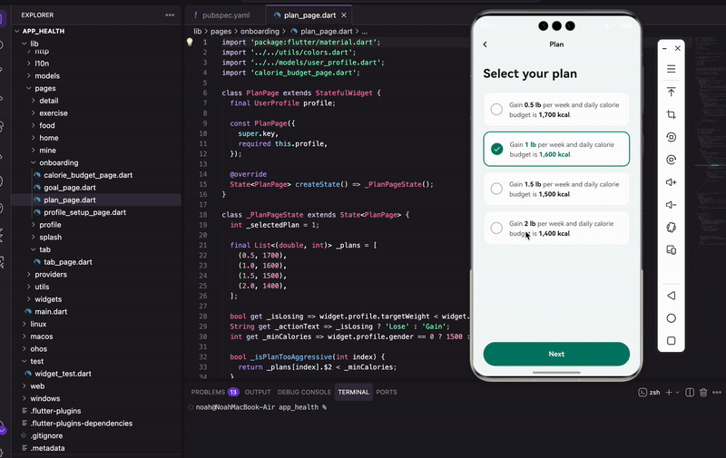
用户填完所有个人信息后,终于到了最后一步:选择减重/增重计划。
不同的计划对应不同的"激进程度"——每周减1磅还是2磅?卡路里预算是1600还是1400?选得太激进容易坚持不下去,选得太保守又见效慢。
选完计划后,我们用一个漂亮的动画圆环展示每日卡路里预算,给用户一个"仪式感",让他觉得"好,从今天开始我要认真执行了"。
这篇文章就来实现这两个页面。
计划选择页面
页面结构
import 'package:flutter/material.dart';
import '../../utils/colors.dart';
import '../../models/user_profile.dart';
import 'calorie_budget_page.dart';
class PlanPage extends StatefulWidget {
final UserProfile profile;
const PlanPage({
super.key,
required this.profile,
});
State<PlanPage> createState() => _PlanPageState();
}
接收上一页传来的用户资料,里面有体重、身高、目标体重等所有数据。
计划数据
class _PlanPageState extends State<PlanPage> {
  int _selectedPlan = 1;

  final List<(double, int)> _plans = [
    (0.5, 1700),
    (1.0, 1600),
    (1.5, 1500),
    (2.0, 1400),
  ];
四个计划选项,用 Record 类型存储:
- 第一个值是每周体重变化(磅)
- 第二个值是每日卡路里预算
默认选中第二个(每周1磅,1600卡路里),这是比较温和的选择,大多数人能坚持下来。
为啥用磅不用公斤?
因为"每周减1磅"比"每周减0.45公斤"听起来更整齐。而且很多健身资料都用磅,用户可能更熟悉。
动态文案
bool get _isLosing => widget.profile.targetWeight < widget.profile.weight;
String get _actionText => _isLosing ? 'Lose' : 'Gain';
int get _minCalories => widget.profile.gender == 0 ? 1500 : 1200;

bool _isPlanTooAggressive(int index) {
  return _plans[index].$2 < _minCalories;
}
根据目标体重和当前体重的关系判断是减重还是增重。目标比现在轻就是减重,显示"Lose";目标比现在重就是增重,显示"Gain"。
_minCalories 是最低卡路里建议值。NIH(美国国立卫生研究院)建议男性每日最低1500卡路里,女性1200卡路里。低于这个值可能影响健康。
_isPlanTooAggressive 判断某个计划是否太激进。如果卡路里预算低于最低建议值,就显示警告。
页面布局
Widget build(BuildContext context) {
return Scaffold(
backgroundColor: const Color(0xFFF5F9F8),
appBar: AppBar(
backgroundColor: Colors.transparent,
elevation: 0,
leading: IconButton(
icon: const Icon(Icons.chevron_left, color: AppColors.dark, size: 28),
onPressed: () => Navigator.of(context).pop(),
),
title: const Text(
'Plan',
style: TextStyle(
color: AppColors.dark,
fontSize: 16,
fontWeight: FontWeight.w600,
),
),
centerTitle: true,
),
AppBar 背景透明,和页面背景融为一体。返回按钮用 chevron_left 图标,比默认的箭头好看。
    body: Padding(
      padding: const EdgeInsets.symmetric(horizontal: 24),
      child: Column(
        crossAxisAlignment: CrossAxisAlignment.start,
        children: [
          const SizedBox(height: 20),
          const Text(
            'Select your plan',
            style: TextStyle(
              fontSize: 28,
              fontWeight: FontWeight.bold,
              color: AppColors.dark,
            ),
          ),
          const SizedBox(height: 24),
          Expanded(
            child: ListView.separated(
              itemCount: _plans.length,
              separatorBuilder: (_, __) => const SizedBox(height: 12),
              itemBuilder: (context, index) => _buildPlanCard(index),
            ),
          ),
标准的列表布局。ListView.separated 自动在卡片之间加12像素间距。
警告提示
          if (_isPlanTooAggressive(_selectedPlan)) ...[
            Padding(
              padding: const EdgeInsets.only(bottom: 16),
              child: Text(
                'Too aggressive. The NIH recommends a minimum daily calorie intake of ${_formatNumber(_minCalories)} calories for ${widget.profile.gender == 0 ? 'men' : 'women'}.',
                style: const TextStyle(
                  fontSize: 14,
                  color: Color(0xFFE91E63),
                  height: 1.4,
                ),
              ),
            ),
          ],
          _buildNextButton(),
          const SizedBox(height: 24),
        ],
      ),
    ),
  );
}
如果选择的计划卡路里低于最低建议值,显示粉红色警告文字。
用 if 配合展开操作符 ...[],条件为真时才渲染这段内容。这是 Flutter 里条件渲染的常用写法。
计划卡片
Widget _buildPlanCard(int index) {
  final isSelected = _selectedPlan == index;
  final plan = _plans[index];
  final weightLoss = plan.$1;
  final calories = plan.$2;

  return GestureDetector(
    onTap: () => setState(() => _selectedPlan = index),
    child: AnimatedContainer(
      duration: const Duration(milliseconds: 200),
      padding: const EdgeInsets.all(16),
      decoration: BoxDecoration(
        color: Colors.white,
        borderRadius: BorderRadius.circular(16),
        border: Border.all(
          color: isSelected ? AppColors.primary : Colors.grey.shade200,
          width: isSelected ? 2 : 1,
        ),
      ),
选中的卡片边框变粗变色,有200毫秒的过渡动画。
卡片内容
      child: Row(
        children: [
          _buildCheckCircle(isSelected),
          const SizedBox(width: 16),
          Expanded(
            child: RichText(
              text: TextSpan(
                style: TextStyle(
                  fontSize: 15,
                  color: Colors.grey.shade700,
                  height: 1.5,
                ),
                children: [
                  TextSpan(text: '$_actionText '),
                  TextSpan(
                    text: weightLoss == weightLoss.toInt()
                        ? '${weightLoss.toInt()} lb'
                        : '$weightLoss lb',
                    style: TextStyle(
                      fontWeight: FontWeight.bold,
                      color: isSelected ? AppColors.primary : AppColors.dark,
                    ),
                  ),
                  const TextSpan(text: ' per week and daily calorie budget is '),
                  TextSpan(
                    text: '${_formatNumber(calories)} kcal',
                    style: TextStyle(
                      fontWeight: FontWeight.bold,
                      color: isSelected ? AppColors.primary : AppColors.dark,
                    ),
                  ),
                  const TextSpan(text: '.'),
                ],
              ),
            ),
          ),
        ],
      ),
    ),
  );
}
用 RichText 让关键数字加粗高亮。整句话读起来像自然语言:“Lose 1 lb per week and daily calorie budget is 1,600 kcal.”
体重变化的显示逻辑:如果是整数(如1.0),显示为"1 lb"而不是"1.0 lb"。用 weightLoss == weightLoss.toInt() 判断是否是整数。
数字格式化
String _formatNumber(int number) {
  return number.toString().replaceAllMapped(
    RegExp(r'(\d{1,3})(?=(\d{3})+(?!\d))'),
    (m) => '${m[1]},',
  );
}
给数字加千位分隔符,1600变成1,600。这个正则表达式看起来吓人,但其实就是"每三位数字前面加个逗号"。
下一步按钮
Widget _buildNextButton() {
  return SizedBox(
    width: double.infinity,
    height: 56,
    child: ElevatedButton(
      onPressed: () {
        final selectedPlan = _plans[_selectedPlan];
        final updatedProfile = widget.profile.copyWith(
          weeklyWeightChange: selectedPlan.$1,
          dailyCalories: selectedPlan.$2,
        );
        Navigator.of(context).push(
          MaterialPageRoute(
            builder: (_) => CalorieBudgetPage(
              calories: selectedPlan.$2,
              profile: updatedProfile,
            ),
          ),
        );
      },
点击后用 copyWith 更新用户资料,把选择的计划数据填进去,然后跳转到卡路里预算页面。
copyWith 是个好东西,可以基于现有对象创建一个新对象,只修改指定的字段,其他字段保持不变。比手动 new 一个新对象方便多了。
卡路里预算页面
这是引导流程的最后一页,用动画圆环展示每日卡路里预算,给用户一个"仪式感"。
页面结构
import 'package:flutter/material.dart';
import 'dart:math' as math;
import 'package:provider/provider.dart';
import '../../utils/colors.dart';
import '../../providers/user_provider.dart';
import '../../models/user_profile.dart';
import '../tab/tab_page.dart';
class CalorieBudgetPage extends StatefulWidget {
final int calories;
final UserProfile profile;
const CalorieBudgetPage({
super.key,
required this.calories,
required this.profile,
});
State<CalorieBudgetPage> createState() => _CalorieBudgetPageState();
}
导入了 dart:math,后面画圆环要用到 pi。provider 用来保存用户数据。
状态定义
class _CalorieBudgetPageState extends State<CalorieBudgetPage>
    with SingleTickerProviderStateMixin {
  int _unitIndex = 0; // 0: Calories, 1: Kilojoules
  late AnimationController _animationController;
  late Animation<double> _progressAnimation;

  int get _displayValue => _unitIndex == 0
      ? widget.calories
      : (widget.calories * 4.184).round();

  String get _unitLabel => _unitIndex == 0 ? 'Calories' : 'Kilojoules';
支持卡路里和千焦两种单位切换。1卡路里 = 4.184千焦。
SingleTickerProviderStateMixin 是动画必须的,提供 vsync 信号来驱动动画帧刷新。
初始化动画
void initState() {
super.initState();
_animationController = AnimationController(
vsync: this,
duration: const Duration(milliseconds: 1500),
);
_progressAnimation = Tween<double>(begin: 0, end: 0.75).animate(
CurvedAnimation(
parent: _animationController,
curve: Curves.easeOutCubic,
),
);
_animationController.forward();
}
圆环从0动画到75%(0.75),时长1.5秒。
为啥是75%不是100%? 因为100%是个满圆,看起来像"已经完成了"。75%留个缺口,暗示"还有空间可以努力",心理上更有动力。
Curves.easeOutCubic 是缓动曲线,先快后慢。圆环一开始快速增长,然后慢慢停下来,视觉上更有冲击力。
资源释放
void dispose() {
_animationController.dispose();
super.dispose();
}
AnimationController 用完要释放,老生常谈了。
页面布局
Widget build(BuildContext context) {
return Scaffold(
backgroundColor: const Color(0xFFF5F9F8),
appBar: AppBar(
backgroundColor: Colors.transparent,
elevation: 0,
leading: IconButton(
icon: const Icon(Icons.chevron_left, color: AppColors.dark, size: 28),
onPressed: () => Navigator.of(context).pop(),
),
title: const Text(
'Plan',
style: TextStyle(
color: AppColors.dark,
fontSize: 16,
fontWeight: FontWeight.w600,
),
),
centerTitle: true,
),
body: Padding(
padding: const EdgeInsets.symmetric(horizontal: 24),
child: Column(
children: [
const SizedBox(height: 20),
_buildUnitSelector(),
const Spacer(),
_buildCalorieRing(),
const Spacer(),
const Text(
'Daily calorie budget',
style: TextStyle(
fontSize: 18,
color: AppColors.dark,
fontWeight: FontWeight.w500,
),
),
const SizedBox(height: 24),
_buildNextButton(),
const SizedBox(height: 24),
],
),
),
);
}
页面中间是圆环,上面是单位选择器,下面是说明文字和按钮。用 Spacer 让圆环垂直居中。
单位选择器
Widget _buildUnitSelector() {
  final units = ['Calories', 'Kilojoules'];
  return Container(
    height: 52,
    decoration: BoxDecoration(
      color: Colors.white,
      borderRadius: BorderRadius.circular(26),
    ),
    child: Row(
      children: List.generate(2, (index) {
        final isSelected = _unitIndex == index;
        return Expanded(
          child: GestureDetector(
            onTap: () => setState(() => _unitIndex = index),
            child: Container(
              margin: const EdgeInsets.all(4),
              decoration: BoxDecoration(
                color: isSelected ? AppColors.primary : Colors.transparent,
                borderRadius: BorderRadius.circular(22),
              ),
              child: Center(
                child: Text(
                  units[index],
                  style: TextStyle(
                    fontSize: 15,
                    fontWeight: FontWeight.w600,
                    color: isSelected ? Colors.white : Colors.grey.shade600,
                  ),
                ),
              ),
            ),
          ),
        );
      }),
    ),
  );
}
和体重页面的单位选择器一样的样式,保持一致性。
卡路里圆环
Widget _buildCalorieRing() {
  return SizedBox(
    width: 280,
    height: 280,
    child: Stack(
      alignment: Alignment.center,
      children: [
        ..._buildDecorations(),
        AnimatedBuilder(
          animation: _progressAnimation,
          builder: (context, child) {
            return CustomPaint(
              size: const Size(240, 240),
              painter: _CalorieRingPainter(
                progress: _progressAnimation.value,
              ),
            );
          },
        ),
用 Stack 叠加三层:装饰元素、圆环、中心数字。
AnimatedBuilder 监听动画值变化,每一帧都触发 CustomPaint 重绘。
中心数字动画
        Column(
          mainAxisSize: MainAxisSize.min,
          children: [
            TweenAnimationBuilder<int>(
              tween: IntTween(begin: 0, end: _displayValue),
              duration: const Duration(milliseconds: 1200),
              builder: (context, value, child) {
                return Text(
                  _formatNumber(value),
                  style: const TextStyle(
                    fontSize: 52,
                    fontWeight: FontWeight.bold,
                    color: AppColors.primary,
                  ),
                );
              },
            ),
            Text(
              _unitLabel,
              style: TextStyle(
                fontSize: 16,
                color: Colors.grey.shade500,
              ),
            ),
          ],
        ),
      ],
    ),
  );
}
TweenAnimationBuilder 让数字从0滚动到目标值。用 IntTween 而不是普通的 Tween<double>,因为卡路里是整数,不需要小数。
数字滚动和圆环动画同步进行,视觉效果很棒。
装饰元素
List<Widget> _buildDecorations() {
  return [
    Positioned(
      left: 40,
      top: 30,
      child: Container(
        width: 8,
        height: 8,
        decoration: BoxDecoration(
          color: AppColors.primary.withOpacity(0.3),
          shape: BoxShape.circle,
        ),
      ),
    ),
    Positioned(
      right: 20,
      top: 80,
      child: Container(
        width: 6,
        height: 6,
        decoration: BoxDecoration(
          color: AppColors.primary.withOpacity(0.2),
          shape: BoxShape.circle,
        ),
      ),
    ),
    Positioned(
      left: 30,
      bottom: 60,
      child: Icon(
        Icons.star,
        size: 16,
        color: AppColors.primary.withOpacity(0.3),
      ),
    ),
    // 更多装饰...
  ];
}
在圆环周围散布一些小圆点和星星,让页面更活泼。这些装饰元素用半透明的主题色,不会喧宾夺主。
圆环绘制
用 CustomPainter 绘制双层圆环:
class _CalorieRingPainter extends CustomPainter {
final double progress;
_CalorieRingPainter({required this.progress});
void paint(Canvas canvas, Size size) {
final center = Offset(size.width / 2, size.height / 2);
final radius = size.width / 2 - 15;
const strokeWidth = 12.0;
center 是画布中心点,radius 是圆环半径(留15像素边距),strokeWidth 是线宽。
外圈背景
    final outerBgPaint = Paint()
      ..color = const Color(0xFFE0F2F1)
      ..style = PaintingStyle.stroke
      ..strokeWidth = strokeWidth;

    canvas.drawCircle(center, radius, outerBgPaint);
先画一个完整的浅色圆作为背景轨道。PaintingStyle.stroke 表示只画边框不填充。
外圈进度
    final outerProgressPaint = Paint()
      ..color = AppColors.primary
      ..style = PaintingStyle.stroke
      ..strokeWidth = strokeWidth
      ..strokeCap = StrokeCap.round;

    canvas.drawArc(
      Rect.fromCircle(center: center, radius: radius),
      -math.pi / 2,
      2 * math.pi * progress,
      false,
      outerProgressPaint,
    );
drawArc 画弧线。参数解释:
- 第一个是外接矩形,决定圆弧的位置和大小
-math.pi / 2是起始角度,12点钟方向(Flutter的角度是从3点钟方向开始算的,所以要减90度)2 * math.pi * progress是扫过的角度,progress=0.75时就是270度false表示不连接到圆心(画弧不画扇形)
strokeCap = StrokeCap.round 让端点圆润,不是平的。
内圈
    final innerBgPaint = Paint()
      ..color = Colors.white
      ..style = PaintingStyle.fill;
    canvas.drawCircle(center, radius - 25, innerBgPaint);

    final innerBorderPaint = Paint()
      ..color = const Color(0xFFE8F5E9)
      ..style = PaintingStyle.stroke
      ..strokeWidth = 3;
    canvas.drawCircle(center, radius - 25, innerBorderPaint);

    final innerProgressPaint = Paint()
      ..color = const Color(0xFFB2DFDB)
      ..style = PaintingStyle.stroke
      ..strokeWidth = 4
      ..strokeCap = StrokeCap.round;

    canvas.drawArc(
      Rect.fromCircle(center: center, radius: radius - 25),
      -math.pi / 2,
      2 * math.pi * progress * 0.9,
      false,
      innerProgressPaint,
    );
  }
内圈是白色填充圆,上面叠加一个浅色进度弧。
内圈进度比外圈慢一点(乘以0.9),形成层次感。两个圆环不同步,看起来更有动感。
重绘判断
bool shouldRepaint(covariant _CalorieRingPainter oldDelegate) {
return oldDelegate.progress != progress;
}
}
只有 progress 变化时才重绘,避免不必要的性能开销。
完成引导
点击"Next"按钮保存数据并进入主页:
Widget _buildNextButton() {
  return SizedBox(
    width: double.infinity,
    height: 56,
    child: ElevatedButton(
      onPressed: () async {
        final userProvider = context.read<UserProvider>();

        await userProvider.saveProfile(widget.profile.copyWith(
          dailyCalories: widget.calories,
        ));
        await userProvider.completeOnboarding();

        if (mounted) {
          Navigator.of(context).pushAndRemoveUntil(
            MaterialPageRoute(builder: (_) => const TabPage()),
            (route) => false,
          );
        }
      },
saveProfile 保存用户资料到本地存储(SharedPreferences),completeOnboarding 标记引导流程已完成。
pushAndRemoveUntil 清空导航栈,用户按返回键不会回到引导流程。(route) => false 表示移除所有页面,只保留新push的 TabPage。
踩过的坑
1. 圆环动画和数字动画不同步
一开始圆环用 AnimationController,数字用 TweenAnimationBuilder,两个动画时长不一样,看起来很奇怪。后来把时长调成差不多(1500ms vs 1200ms),数字稍微快一点结束,视觉上更舒服。
2. 切换单位后数字没更新
TweenAnimationBuilder 的 end 值变了,但动画不会重新播放。后来发现是因为 key 没变,Flutter 认为是同一个 widget。加个 key: ValueKey(_unitIndex) 就好了。
3. 保存数据时页面已销毁
saveProfile 是异步操作,如果用户在保存过程中按了返回键,页面销毁了,后面的导航代码会报错。加了 if (mounted) 检查。
小结
这篇文章完成了引导流程的最后两个页面:
- 计划选择页面:让用户选择减重速度,并显示对应的卡路里预算
- 卡路里预算页面:用动画圆环展示数值,给用户仪式感
至此,整个用户引导流程就完成了。用户从选择目标开始,经过体重、身高、性别、生日、目标体重、运动强度、计划选择,最终看到自己的每日卡路里预算。
欢迎加入开源鸿蒙跨平台社区:https://openharmonycrossplatform.csdn.net

腾讯云面向开发者汇聚海量精品云计算使用和开发经验,营造开放的云计算技术生态圈。
更多推荐
 10
10 0
0- 0


 已为社区贡献56条内容

所有评论(0)